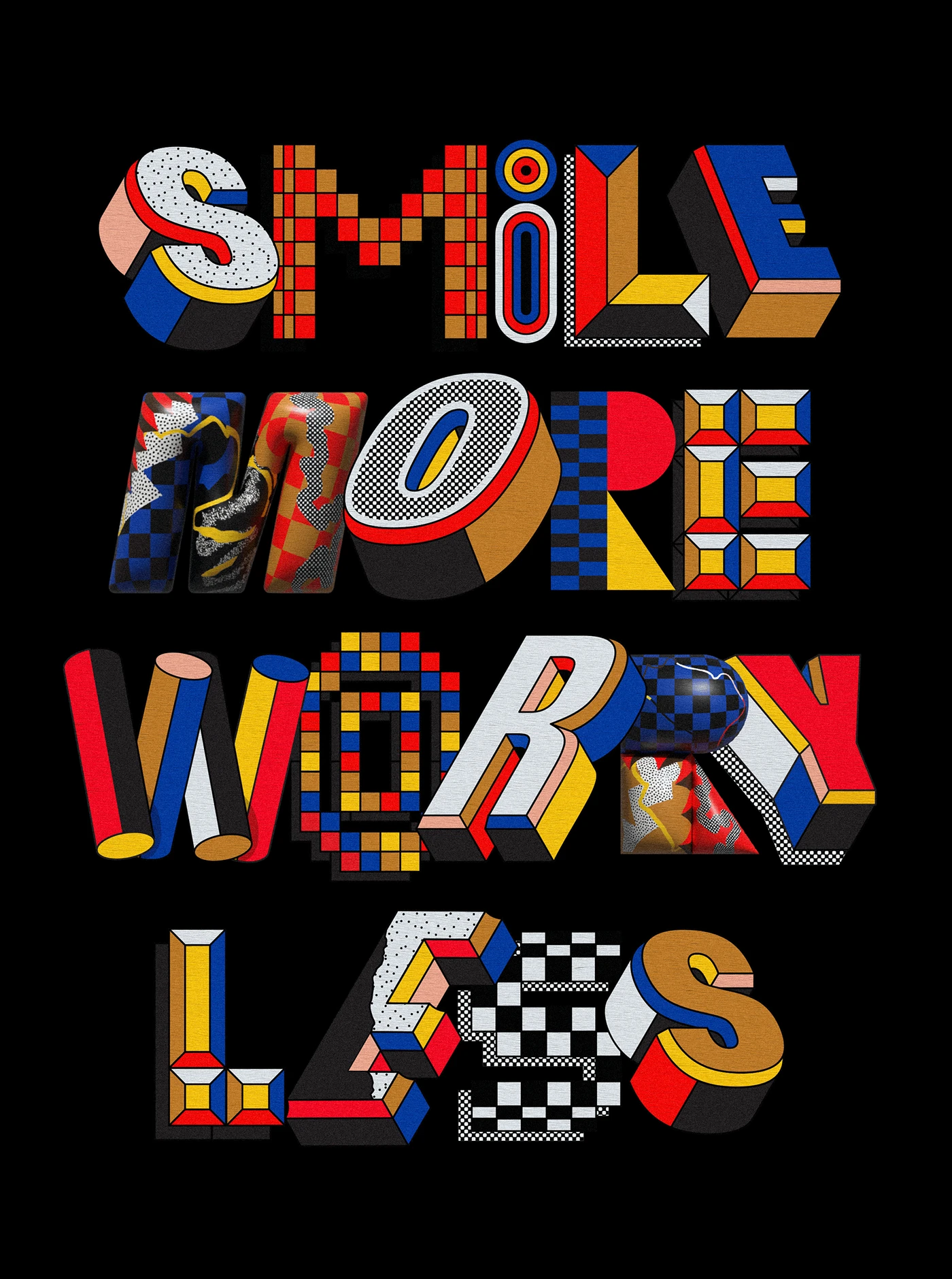
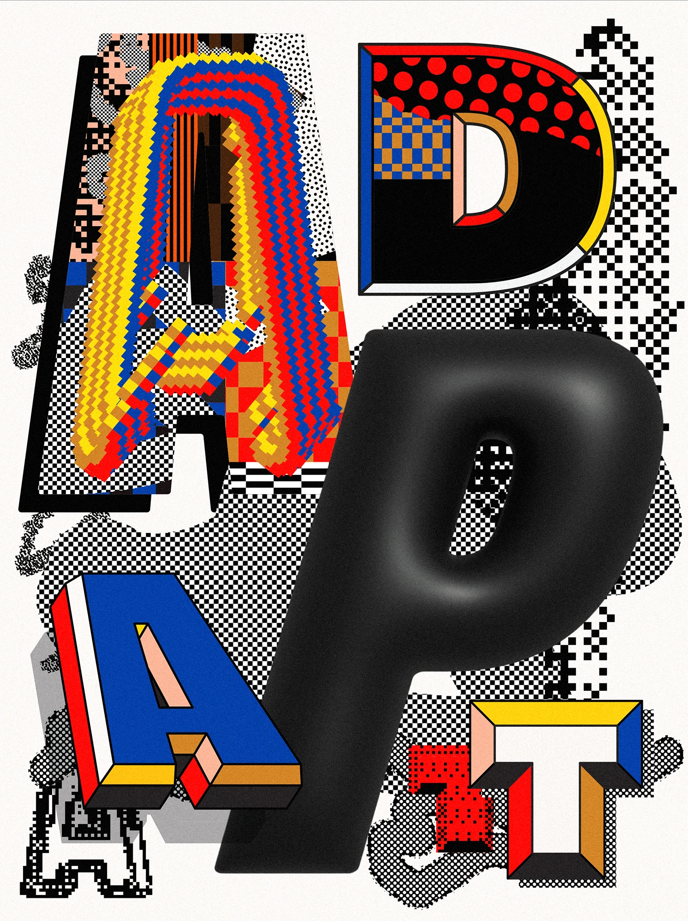
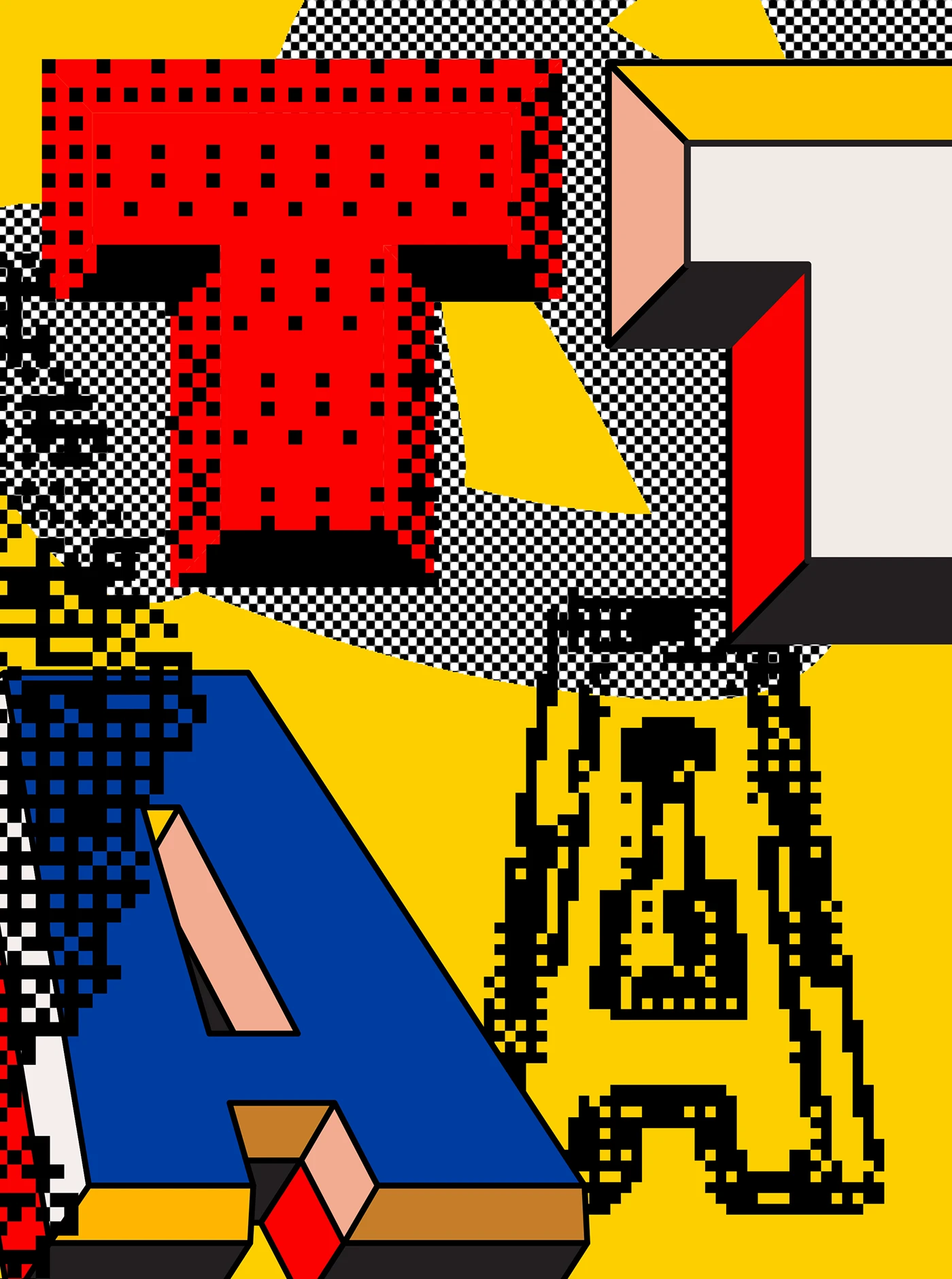
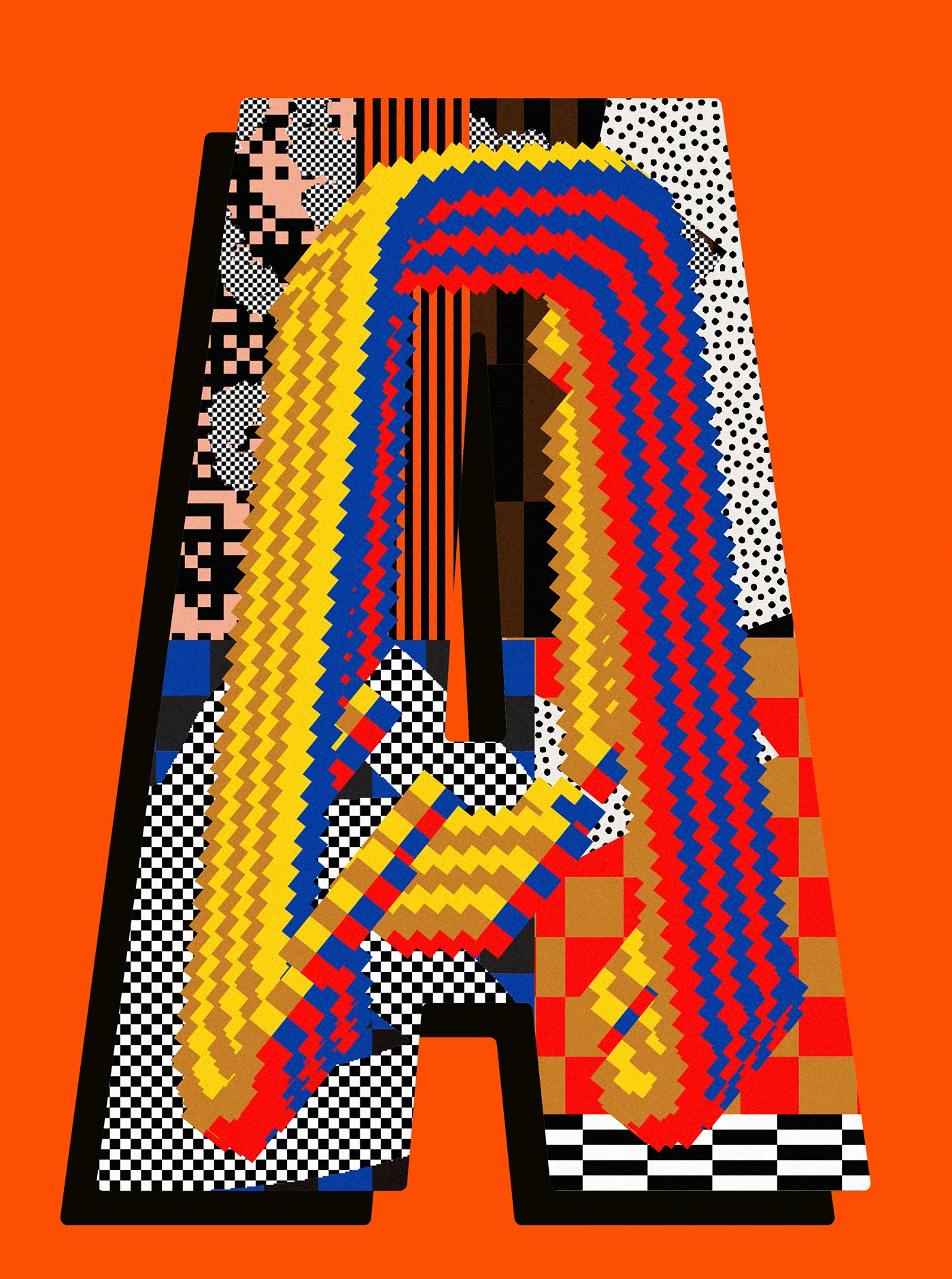
Adding Texture to Type: Andrew Footit's TypeWorks Vol. 5
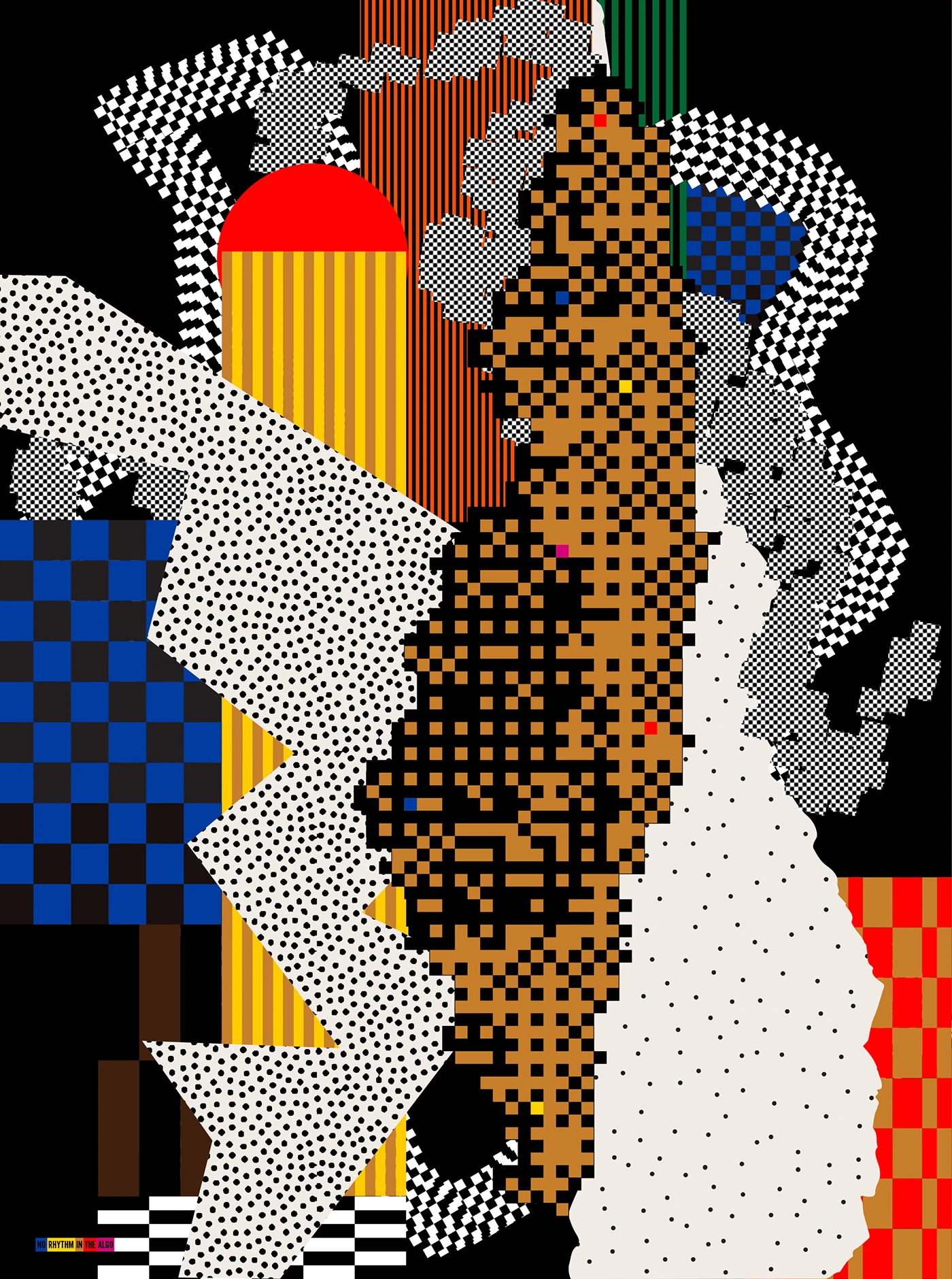
Andrew Footit layers halftone, patterns, and grid systems into custom typeface experiments. Typography gains depth through texture, perspective. The work starts with a problem: how do you add texture to type without losing readability? Footit answers by treating letters as surfaces. Halftone dots and geometric patterns don't replace the forms—they sit inside them. A grid system wraps around letter construction, keeping the depth and perspective he's known for intact. The textures are hand-built in Adobe software, each one custom. No filters. No shortcuts.
Layering Texture into Typography
The grid approach is key. Letters become vessels for pattern. What looks like collage is actually restraint: the texture never overwhelms the letter's underlying structure. Each piece shows typography as both form and surface—the letter holds the pattern, not the other way around. The result is type that reads as image without abandoning its job as type. Footit maintains that balance across the series, proving texture in typography works best when it serves the letterforms, not just decorates them.