Skip to main content
Typography Laboratory
Press
F
to close
Main Font (Site)
Mundial
Inter
Outfit
Bricolage
Secondary Font (Titles)
Mundial
Libre Caslon
Playfair
Lora
Blog Article Body
Mundial
Lora
Merriweather
EB Garamond
Inter
Bricolage Width
ABDUZEEDO
ALL
3D
BOOKS
BRANDING
EDITORIAL DESIGN
GRAPHIC DESIGN
ILLUSTRATION
TUTORIALS
TYPOGRAPHY
UI/UX
COLLECTIONS
SEARCH
ABOUT
GET FEATURED
01.
Best of the Week: Code Rhythms and Temporal Systems
02.
Personal Brand Identity Designer: The Playmaker Logic
03.
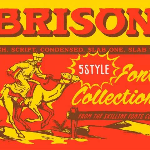
SFC Brison — Bold Retro Western Typeface Bundle
04.
CGI product visualization design: The Craft of Material Presence
05.
Book Design: Between the Lines by Kirill Gluschenko
06.
Packaging Design: Balancing Heritage and Modernity via Silhouette
07.
Generative Design System: Bengal Classical Music Festival
08.
MORION Cosmetics Packaging Design by Darina Selischeva
09.
YARI CLUB Restaurant Brand Identity by Studio NinetyOne
10.
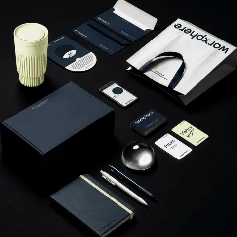
Worxphere Brand Identity: Plus X Rebrands Jobkorea for 2026
11.
Conceptual Brand Identity Design: Memory of Home
12.
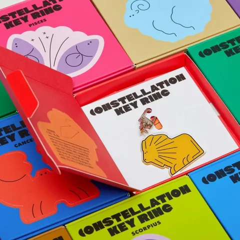
Starville Goods: Constellation Packaging Design by MAUM STUDIO
13.
Adobe Expands AI Design Tools Across Firefly and Creative Cloud
14.
Technology Company Brand Identity AI Chip: NUON's Minimalist N
15.
Brand Identity Design: Navigating 300 Years Of Maritime Heritage
16.
PLOP #02 — Polish Graphic Design Revue by Slanted
17.
Editorial Design: OFF SPACE Visual Exploration
18.
Dynamic brand identity rotating color system: The Daily Form
19.
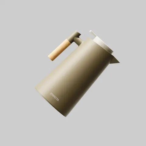
Invicta — Brand Identity Redesign by Valkiria Inteligência Criativa
20.
Bold Condensed Display Typeface: Overzero by Fredella Agatha
21.
Museum Brand Identity Design: Resonance in Motion for MOMU
22.
Wildpetals: Brand Identity Design by Joshua Oladele
23.
Packaging Design: UNBLACKIT by Backbone Branding
24.
Denim Brand Identity for CAPRICHO by Marta Cantero Fiol