AI workspace UX UI design dashboard: Notis+
Notis+ represents a shift in product design. It establishes a disciplined AI workspace UX UI design dashboard where productivity takes priority. Rather than highlighting conversational model interfaces, this system treats utility as the core objective. The layout establishes a solid structural hierarchy.
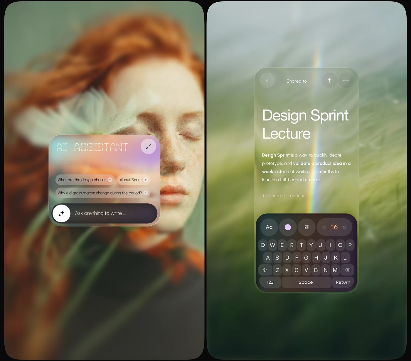
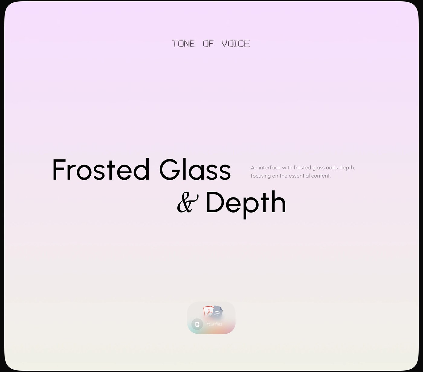
The interface uses a functional column layout to organize information. A primary sidebar manages core navigation, while the central workspace handles active content blocks. To the right, a secondary panel displays contextual actions and metadata. This CRM-style layout places generative tools directly within the existing content flow. Information moves through defined channels. The visual rhythm remains quiet and predictable. It avoids the visual noise common in modern digital workspaces. By organizing tools this way, the system maintains high focus.
The Functional Logic of an AI workspace UX UI design dashboard
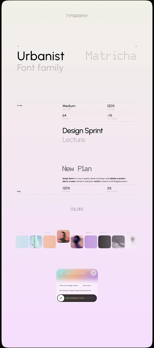
Restraint dictates the color system. The interface pairs a clean off-white background with charcoal text to reduce eye strain. Saturated accent colors indicate active states and system notifications. A single sans-serif typeface scales across all screen layouts. High typographic contrast separates system headers from user notes. The typeface uses generous letter-spacing at small sizes to preserve legibility in dense lists. This attention to detail ensures the interface functions under heavy data loads.
In the current landscape, software often highlights technology instead of user tasks. This project resists that trend by focusing on basic organization principles. Jack R. demonstrates that clean architecture is highly effective for complex software. By prioritizing task management over features, the system offers a sustainable path for tools. The disciplined AI workspace UX UI design dashboard acts as a quiet partner for professional creators. This UI treats modern technology as a tool, not a spectacle.
Product teams can learn from this clean layout. The design proves that utility builds long-term engagement. When building an AI workspace UX UI design dashboard, creators must balance power with visual simplicity. This release sets a clear standard for professional tools in a crowded market.
See the full project by Jack R. on Behance.