Argea Brand Identity Design: Geometry by Camila Polinelli
Argea brand identity design by Camila Polinelli is a strict black-and-white geometric system with cobalt and orange-red accents, built in Cancún, Mexico.
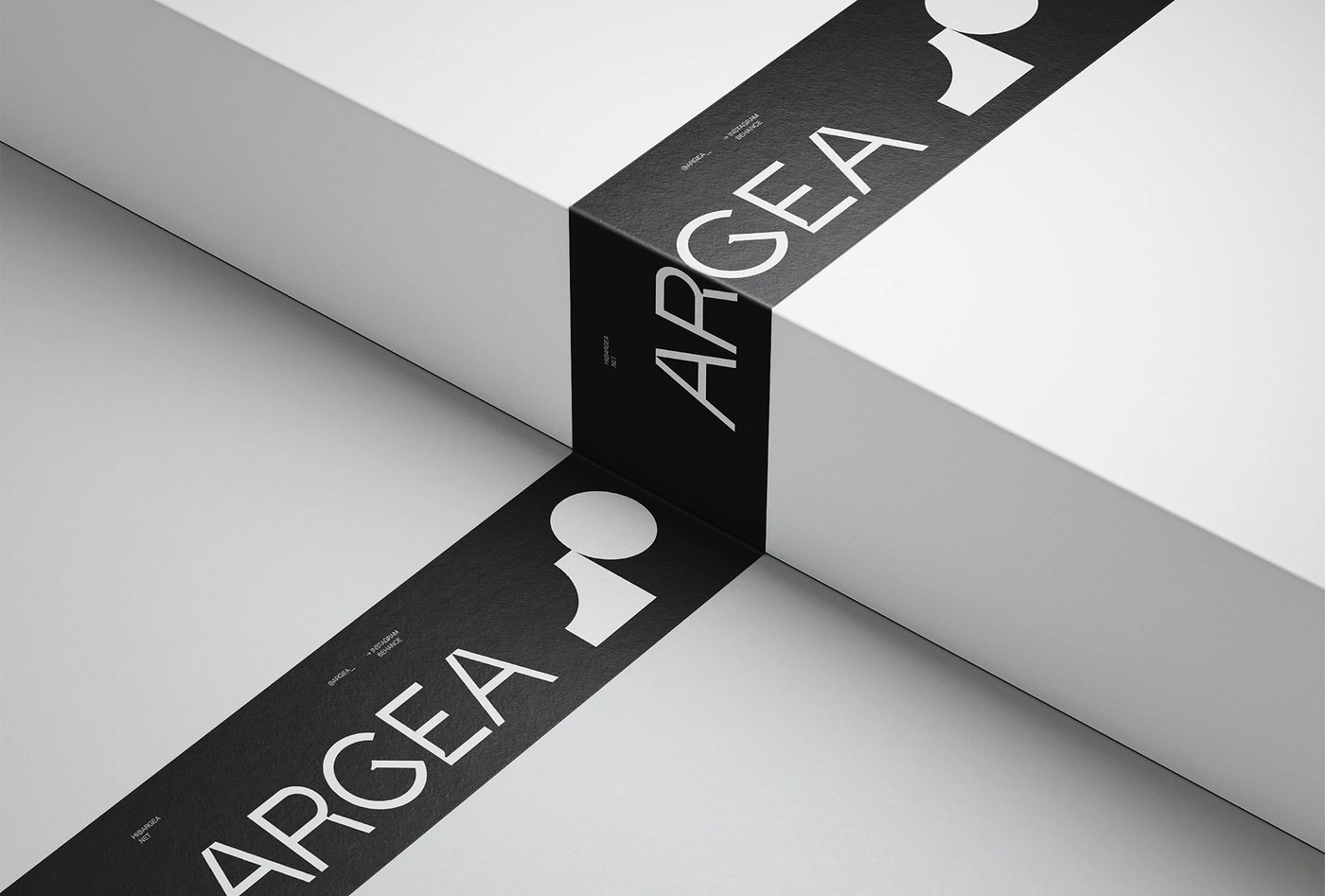
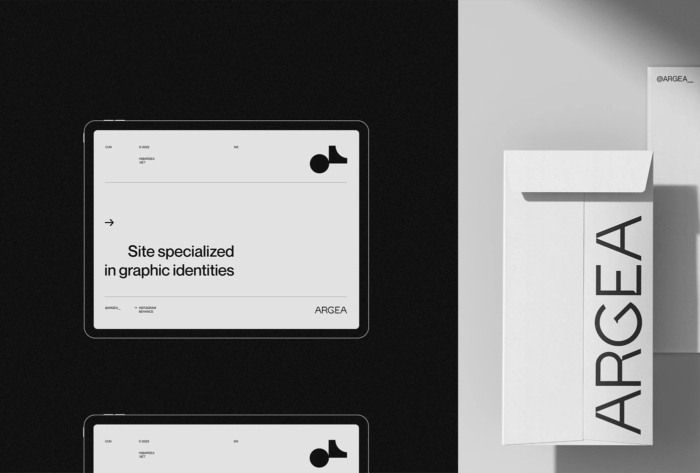
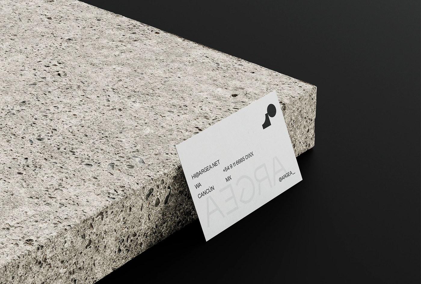
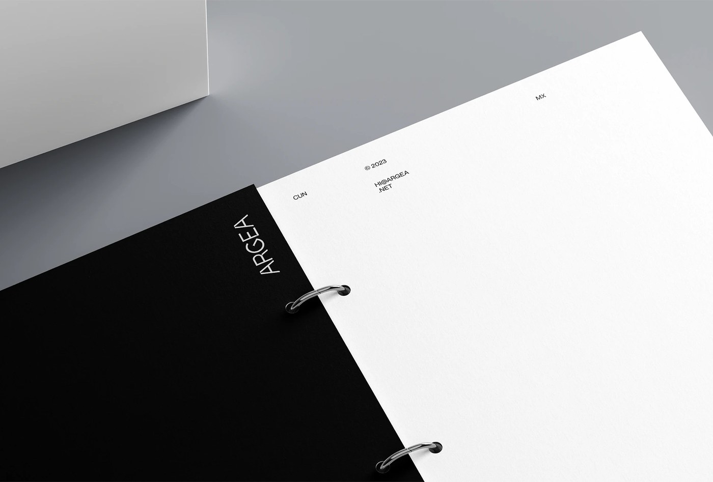
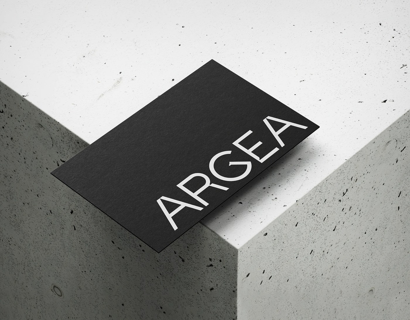
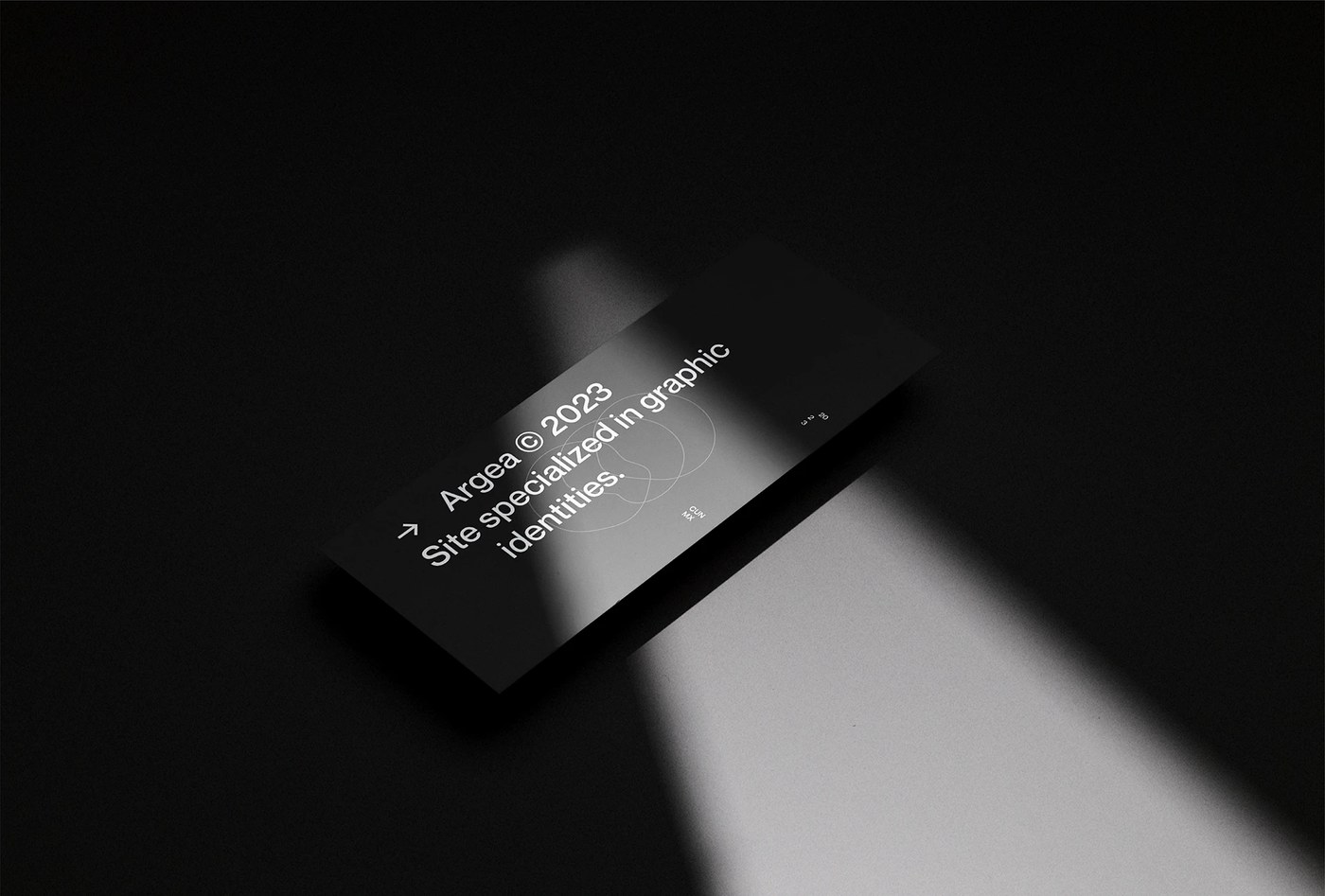
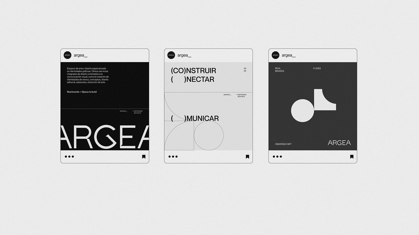
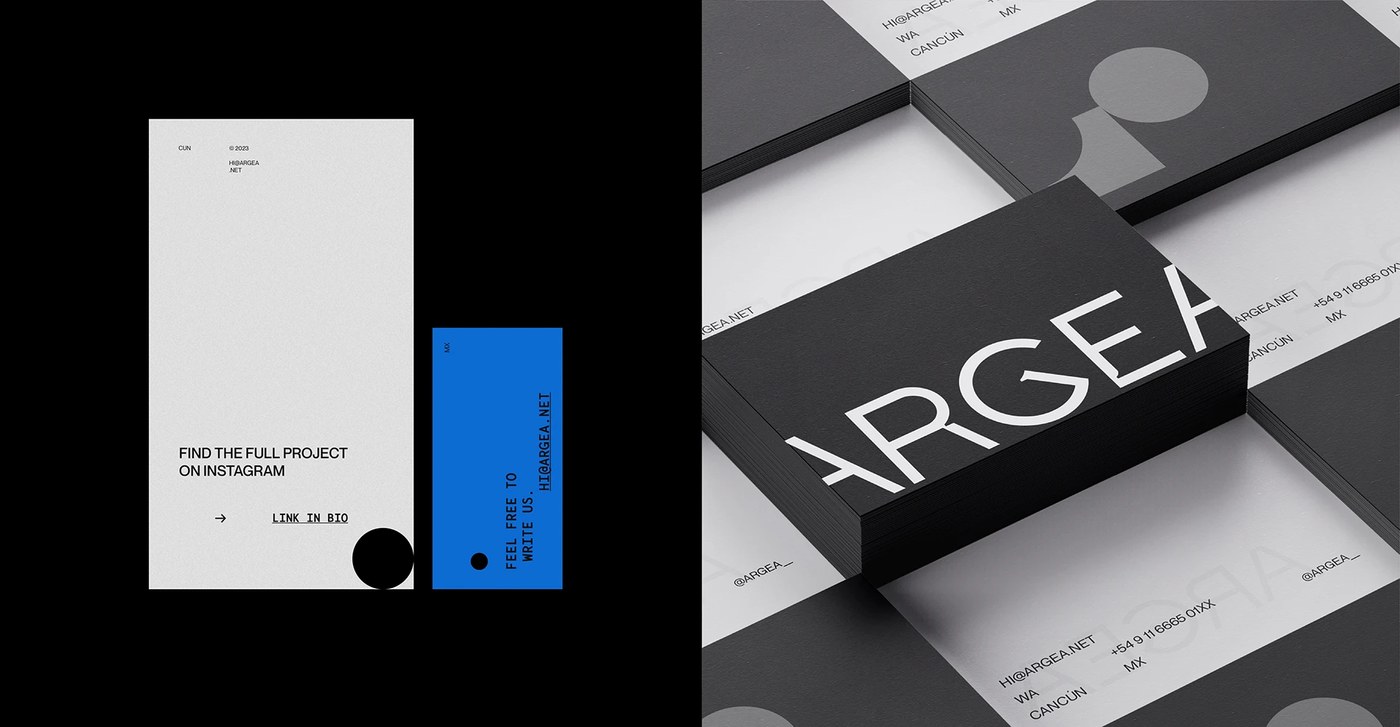
The mark is the engine of this brand identity design. A circle suspended above a square with a quarter-circle notch — abstract enough to read as a figure, modular enough to tile into a repeat across brand tape, business cards, and collateral. Polinelli locks the base palette to black and white, then introduces cobalt blue (#1B4BFF) and orange-red (#E8391A) only where contrast needs to work: full-bleed digital screens, hero panels, call-to-action blocks. Printed pieces — thick dark-stock business cards, a ring-bound brand book with chrome ring hardware — stay entirely monochrome. The restraint reads as confidence.
Argea Brand Identity Design: Geometry Doing All the Work
Self-branding for a studio is a particular kind of test — the brand identity design has to sell the designer's taste as much as the work itself. Argea passes by being ruthlessly specific: the parenthetical word splits in social templates ("(CO)NSTRUIR / ( )NECTAR / ( )MUNICAR") signal that the system has a concept, not just a look. The hairline grid and bracketed navigation on the website carry the same logic into digital. Nothing here is decorative noise.
See the full brand identity design project by Camila Polinelli on Behance.