Aurora l Coffee Packaging Design by Pial Biswas
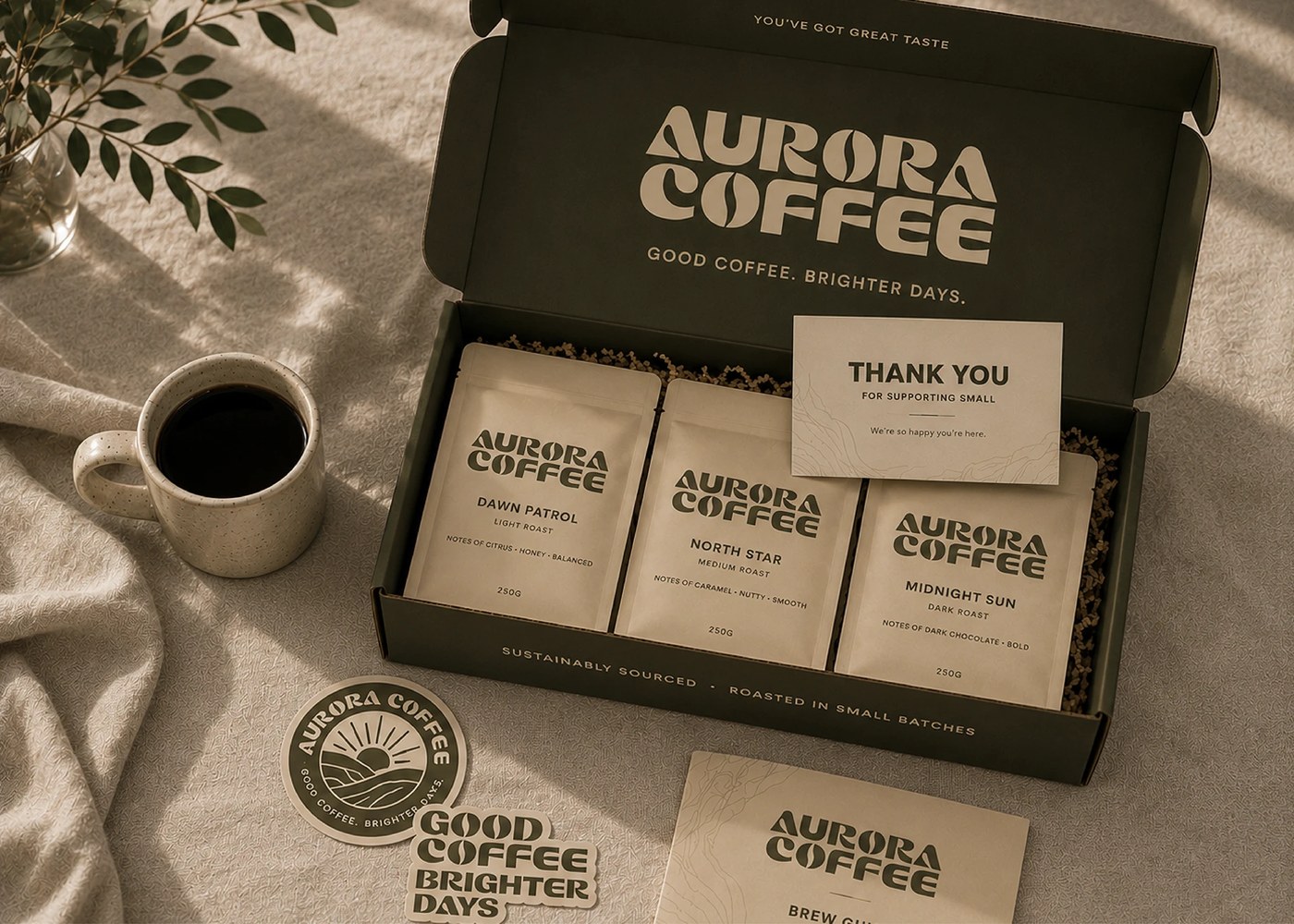
Inspired by the first light of sunrise, this specialty coffee brand uses a warm palette and organic shapes to slow down the morning ritual. The packaging design centers on custom typography that mirrors the curves of coffee beans and rising suns.
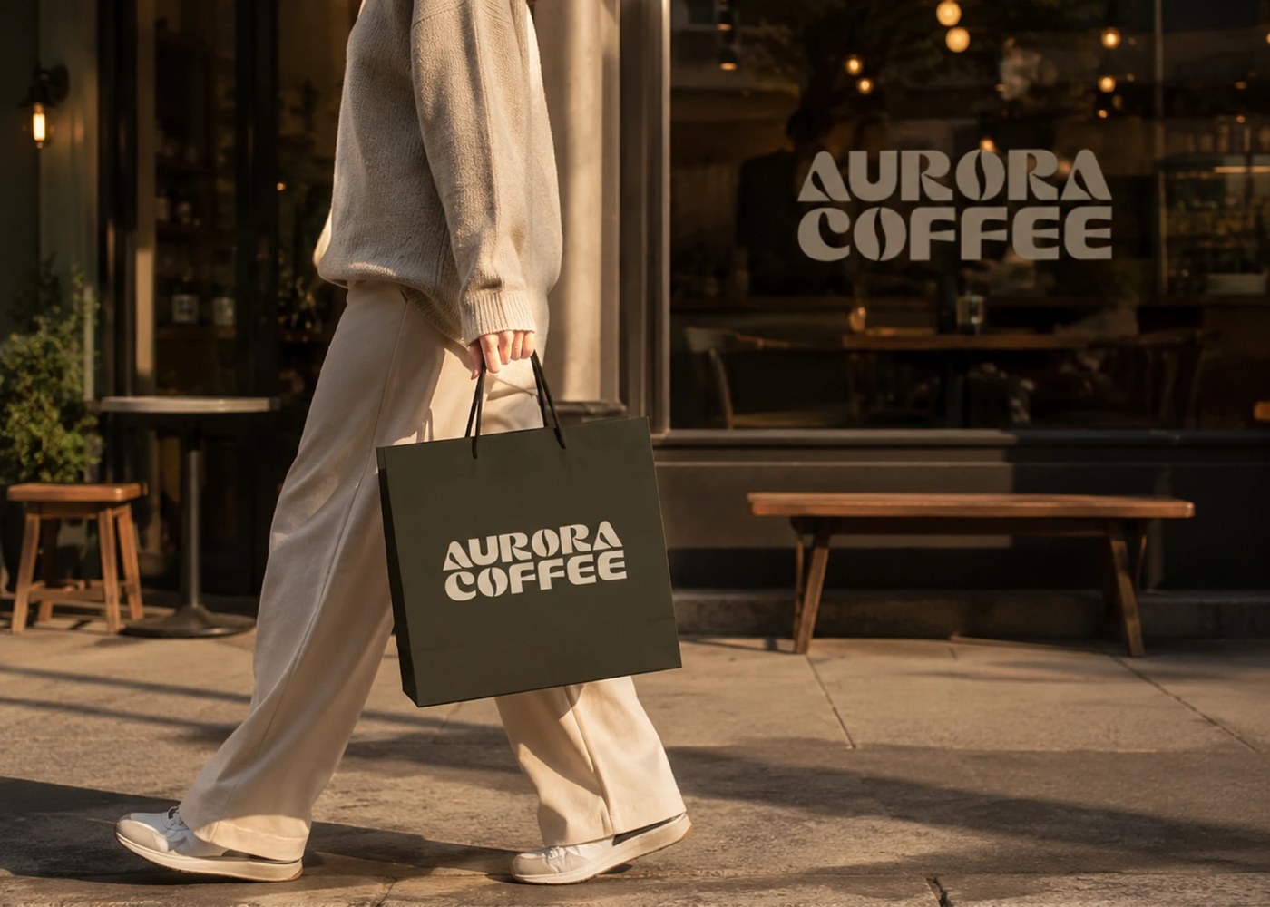
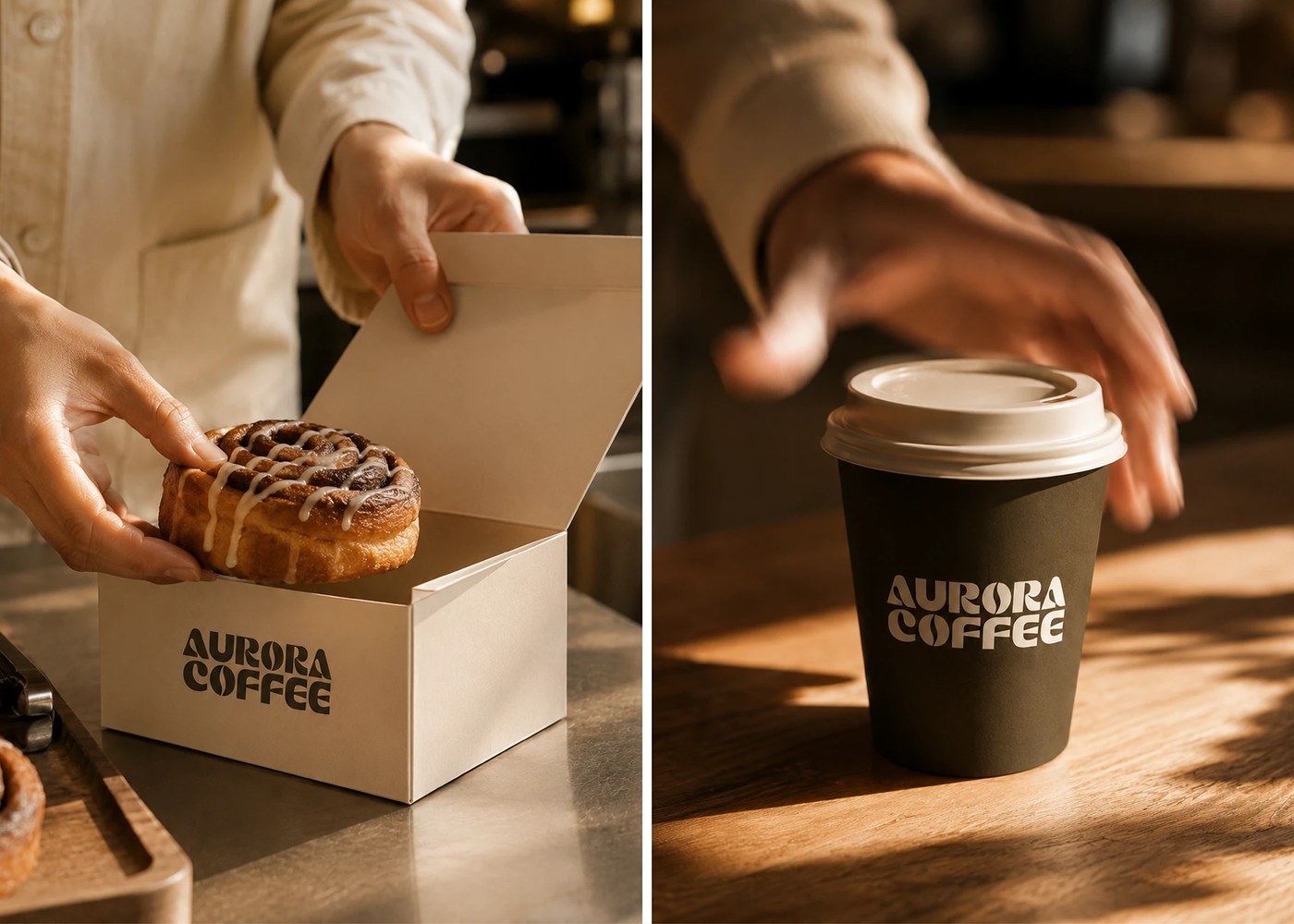
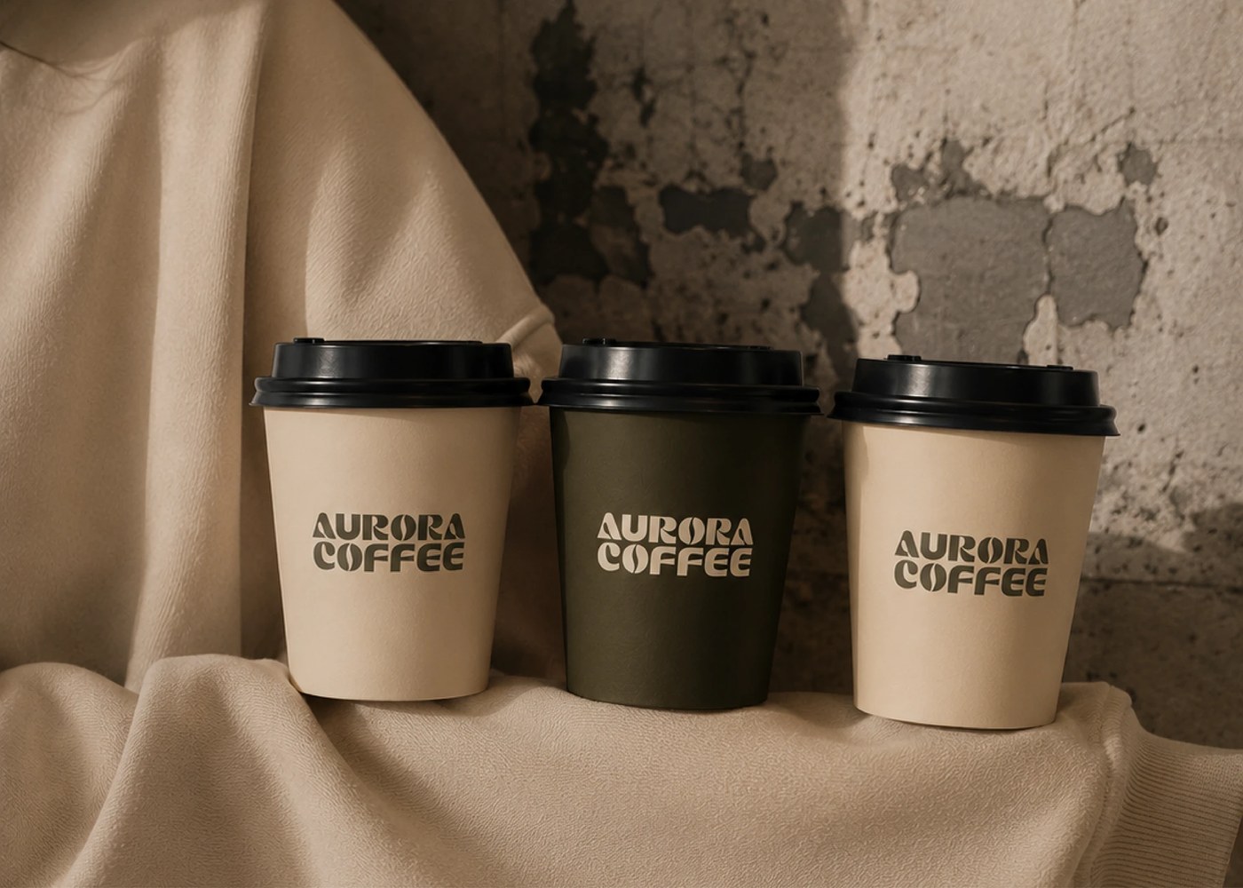
Deep olive-brown tones meet soft cream accents in an effort to move away from fast-paced coffee culture. Pial Biswas builds a visual identity around these earthy colors to reflect both roasted beans and premium quality. The custom wordmark serves as the primary anchor, utilizing smooth geometric shapes that feel approachable rather than overly formal. This specific typographic direction helps establish a calm atmosphere for a brand focused on meaningful conversations.
Refined details in packaging design
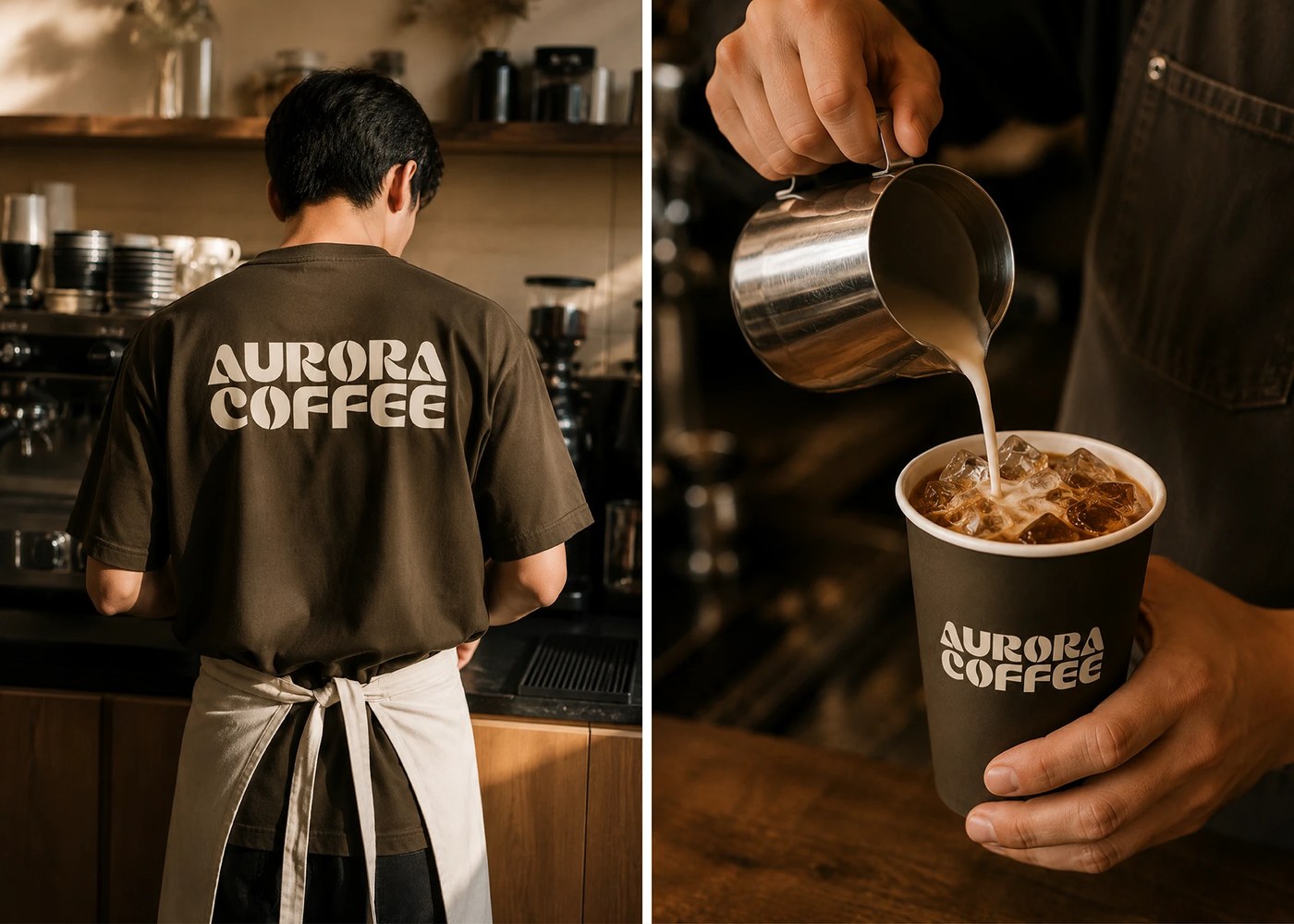
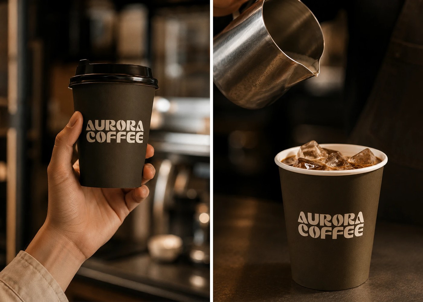
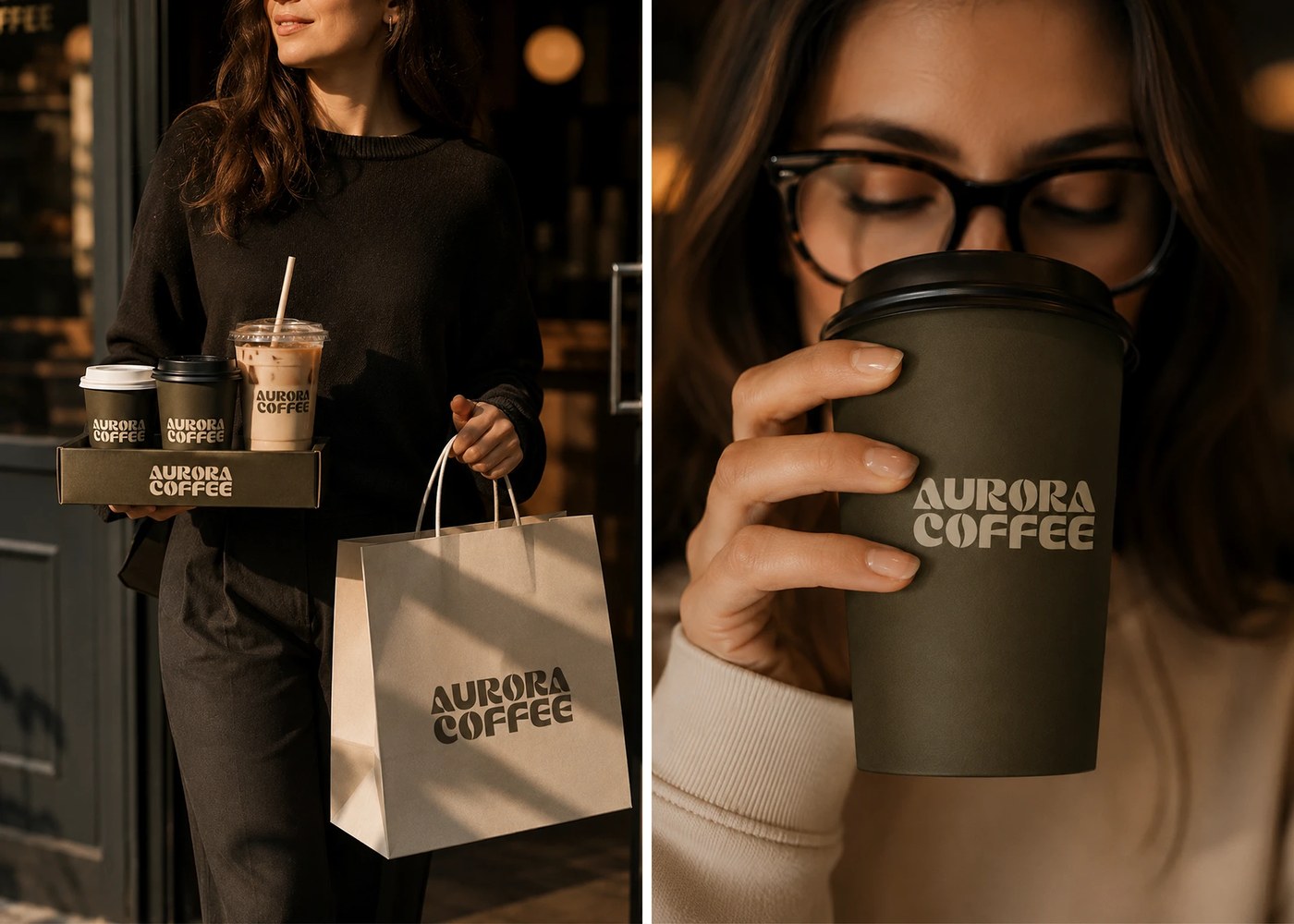
The visual system relies on generous spacing and clean layouts to avoid unnecessary complexity. A dark olive-brown tone provides the base for various touchpoints, while cream highlights add necessary warmth. On coffee bags and merchandise, these elements work together to maintain a consistent look that scales from small cups to larger environmental branding. The combination of bold typography and minimal graphic elements ensures the brand remains recognizable without relying on heavy ornamentation.
Pial Biswas extends this identity beyond just paper goods into physical retail experiences. Small details like custom lids and signage follow the same geometric logic established in the primary logo. Whether appearing on a simple cup or a packaged snack, the design maintains its quiet sophistication through consistent use of color and form. This approach ensures that every customer interaction feels intentional and grounded.
See the full project by Pial Biswas ✪ on Behance.