AXIA Energia: Branding and Motion Design
AXIA is born as the new name and the new expression of Eletrobras — a milestone that translates the, a branding and motion design project.
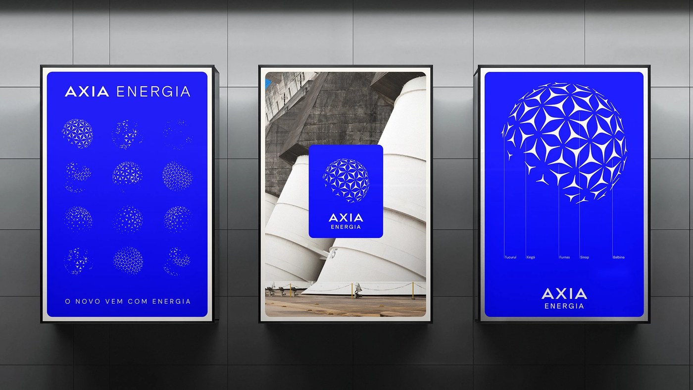
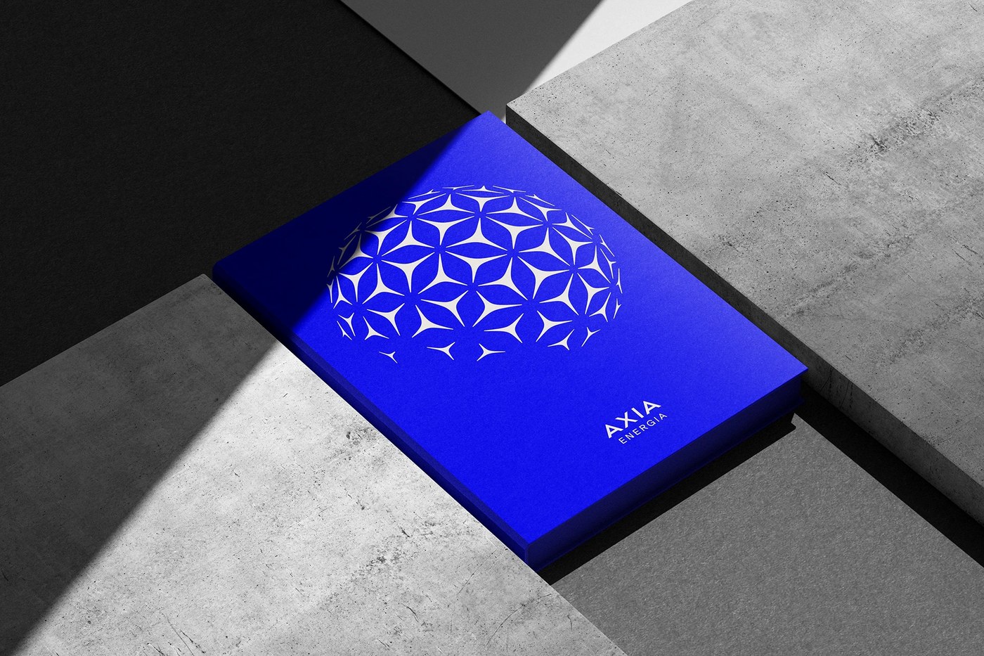
The transition from a legacy of engineering to a future of articulation requires a delicate balance between institutional weight and fluid movement. Pedro Melo ;) managed this shift by moving away from the concept of simple energy generation toward a role of orchestrating possibilities. The studio utilized the concept of an axis—derived from the Latin "axis" and Greek "axia"—to ground the visual identity. This approach centers on a system where expanding points connect to form a larger network.
Visualizing transformation through motion design
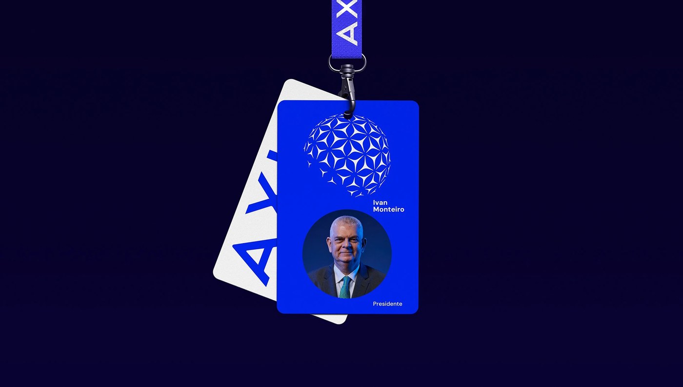
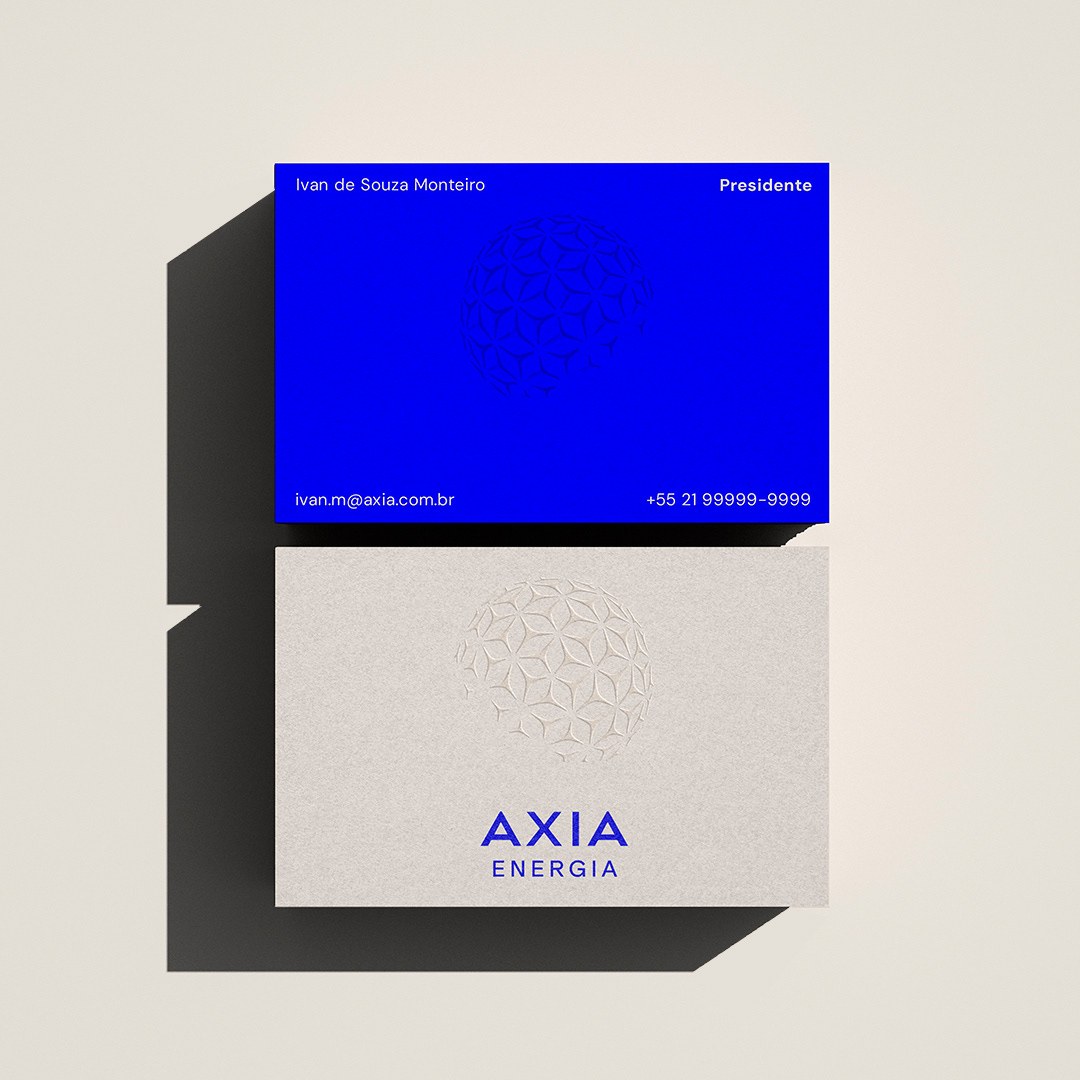
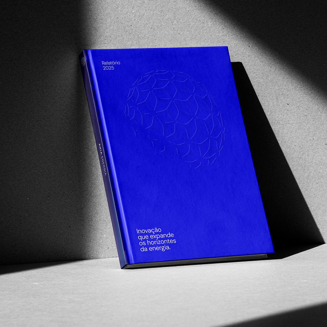
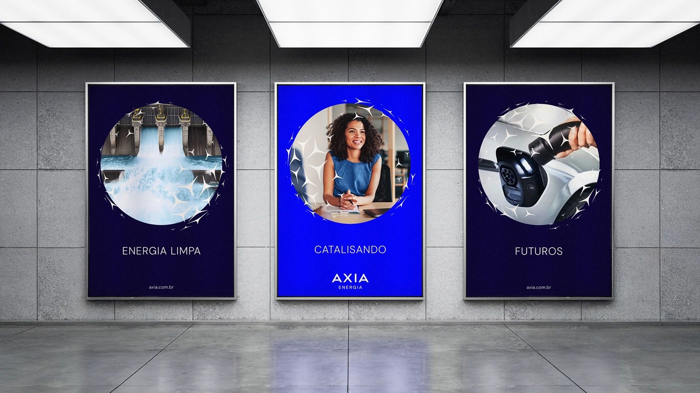
The identity system relies on majorelle blue and electric blue tones to establish a sense of scale and connectivity. In the motion design work, the visual language manifests through a shape that links multiple expanding points, mirroring a value network. Six video pieces demonstrate this rhythm, using symmetry and graphic elements to communicate a shift from infrastructure to imagination. The motion design maintains a presence through action-oriented visuals, ensuring the brand feels active rather than static.
See the full project by Pedro Melo ;) on Behance.