Best of the Week 2026-W21: 12 Design Picks Worth Saving
This week ran on two threads: type and brand systems built to hold at display scale, and material studies that treat surface as content. Twelve picks below — nine from Abduzeedo's coverage of week 2026-W21, plus three Brand New entries worth flagging. Every project on this list earns its weight by what it leaves out.
From Abduzeedo this week
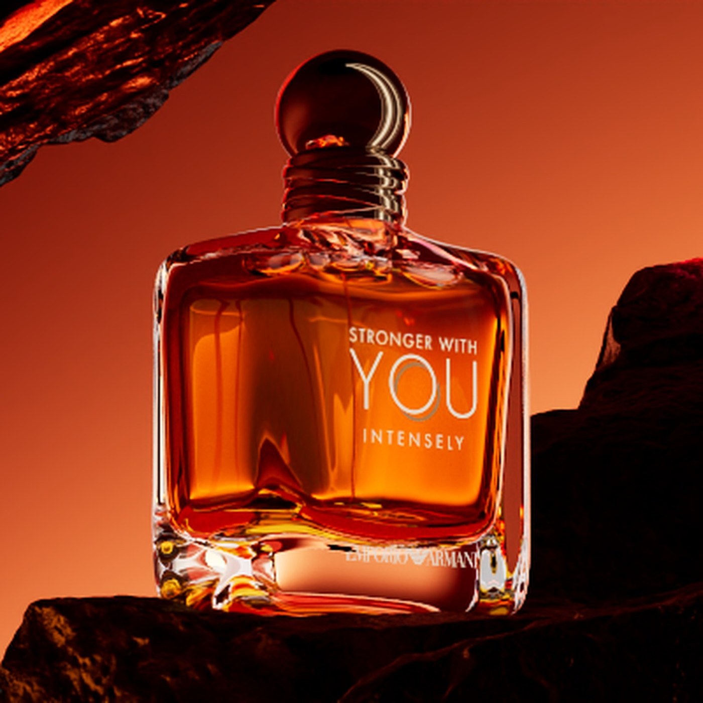
1. Stronger With You — Egor Brodunov
Brodunov treats the fragrance bottle as a study object, not a hero. Houdini fluid simulation and Redshift lighting do the heavy lifting; the glass exists so the simulation has something to react to. Every still holds because the composition was built around the behavior of light on wet surfaces, not around the product label. Read on Abduzeedo.
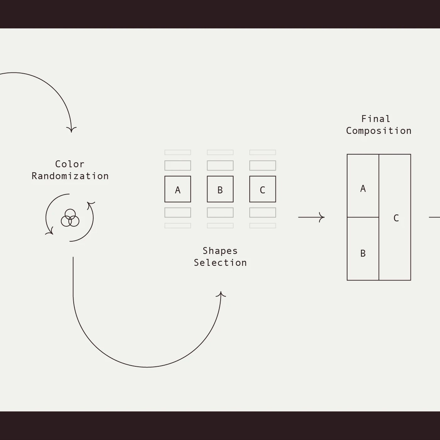
2. Viva Generative System — ILLO Studio
Three shape groups, three palettes, and one Figma file generate over 2,000 illustration variants. ILLO's system works because the rules stay visible in the output — no AI guesswork, just legible combinatorics. The constraint is the feature. Read on Abduzeedo.
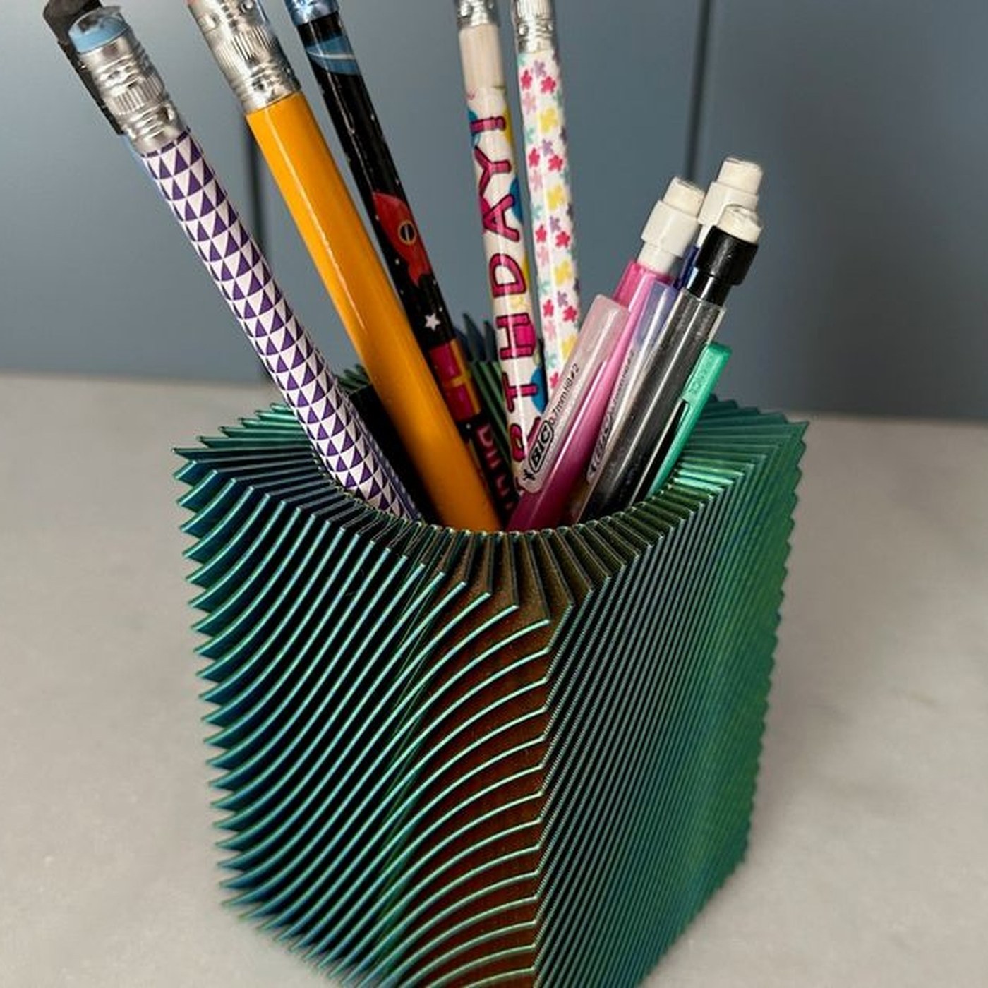
3. Spiral Vase Pencil Holder — nechiswa
A single continuous helical sweep, printed in vase mode at 0.6mm line width. The geometry comes from Onshape rather than a remix and the proportions show that design discipline; tri-color filament does the visual work, with each facet catching light at a different hue so the object changes from every angle. Read on Abduzeedo.
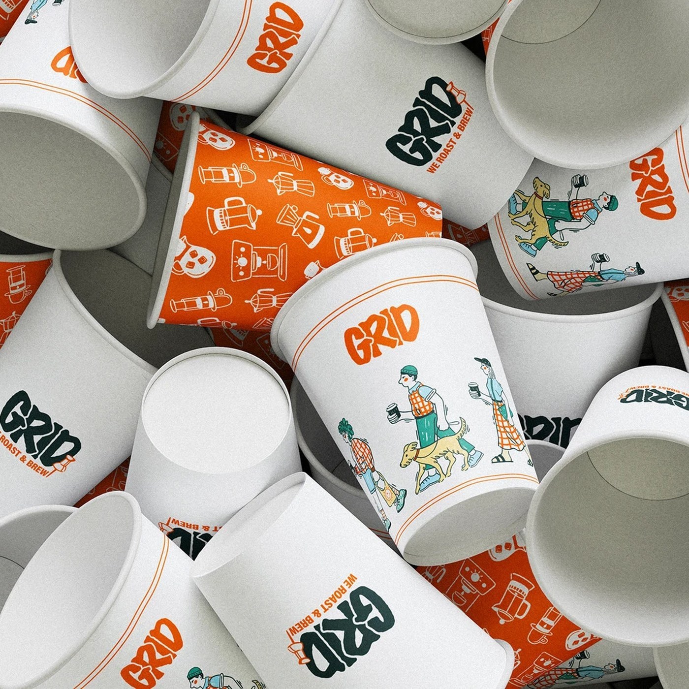
4. GRID — Elizaveta Kharchenko
A coffee identity built on urban-grid logic instead of craft-cafe warmth. One orange accent on a neutral field, packaging that reads like an architectural drawing, hand-rendered illustration that enters only as deliberate softness against the structural framework. Read on Abduzeedo.
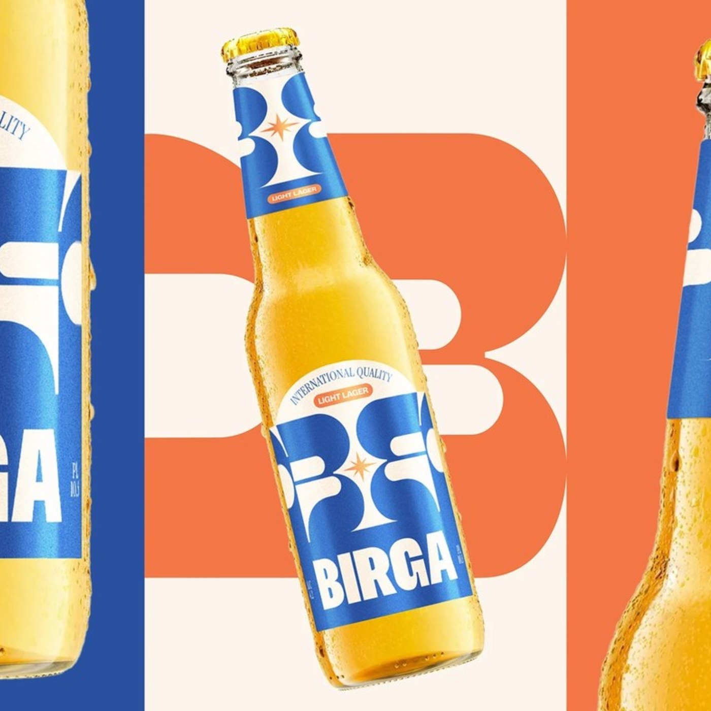
5. Birga Beer — FCB Artgroup Tbilisi
The brief was cultural: reposition beer for young Central Asian consumers who don't traditionally drink it. The answer is type-forward at can scale — the wordmark functions as the primary visual, illustration plays off it, and each flavor variant gets its own palette inside one typographic system. Read on Abduzeedo.
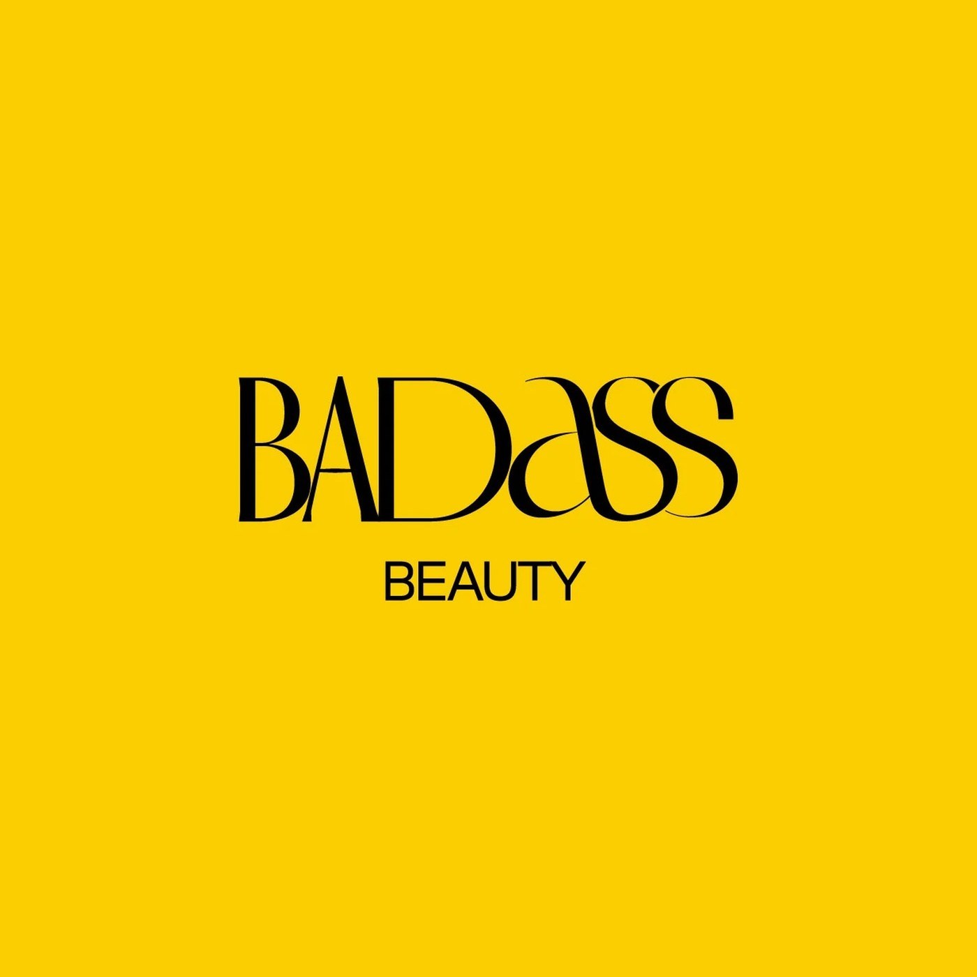
6. Badass Beauty — FAST Studio
A skincare brand that earns a confrontational name through restraint rather than volume. The wordmark is confident and quiet, the packaging looks like professional skincare instead of provocation, and the attitude enters through composition and scale. Harder design brief than it looks. Read on Abduzeedo.
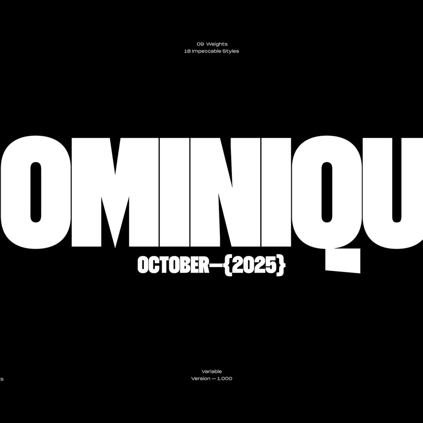
7. Dominique Typeface — Rajesh Rajput
A condensed display variable with nine weights and matching italics — 18 styles from one file on one axis. The specimens treat letterforms at true display scale, where individual strokes start to read as physical objects rather than text. Read on Abduzeedo.
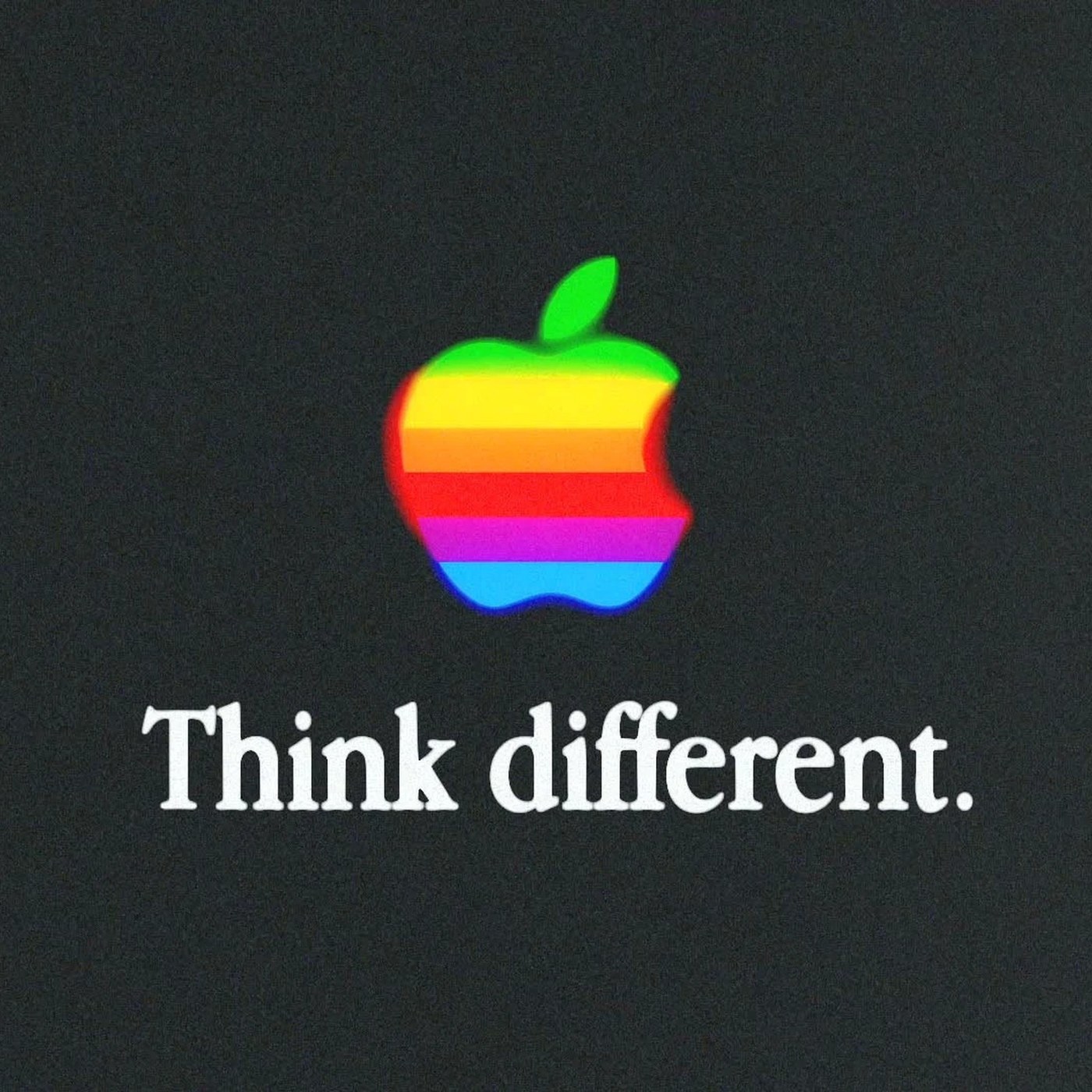
8. Apple Think Different — Mat Voyce
Voyce rebuilt the 1990s campaign as a personal motion exercise, but his version is fundamentally different — texture and kinetic letterform physics give every frame mass the original never carried. Each still holds as a composition because the cuts follow typographic logic, not story beats. Read on Abduzeedo.
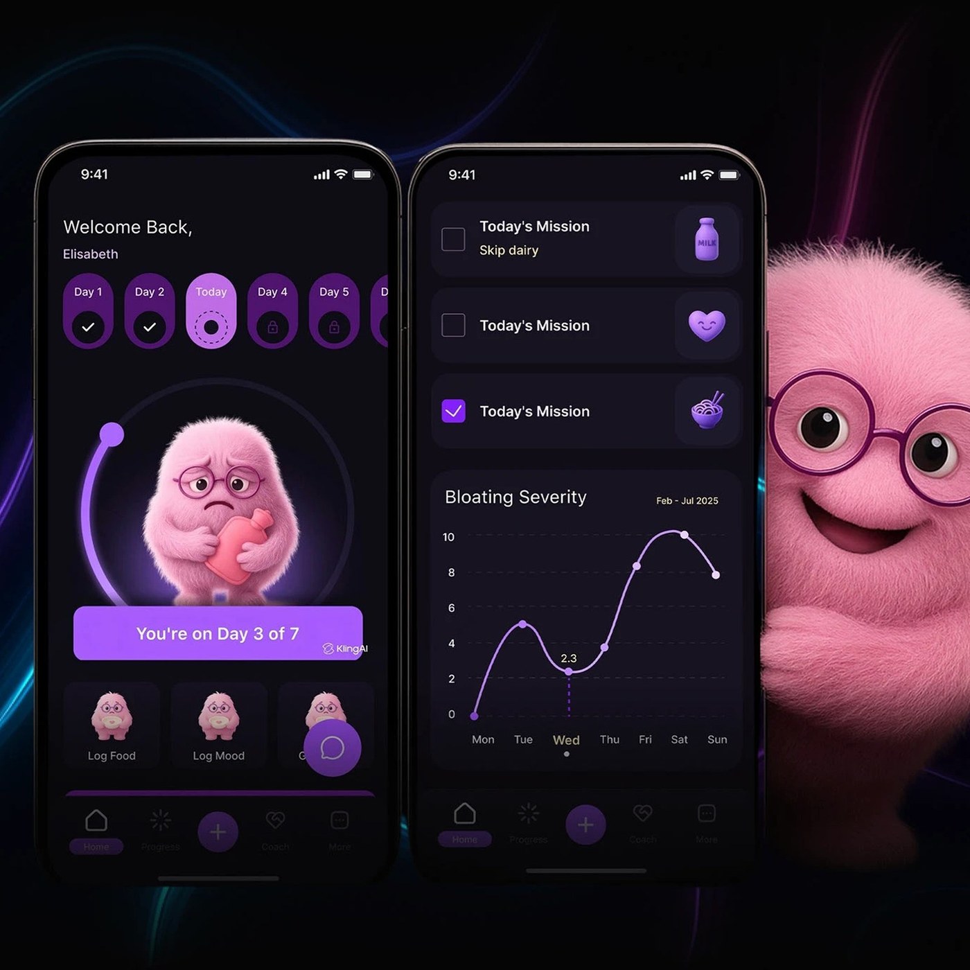
9. Unbloated — Farba Digital
A gut-health app concept that breaks the category's clinical-white default with a dark purple interface and a conversational AI coach. Rounded type, soft transitions, and an onboarding flow that feels like a nutritionist consult instead of a hospital intake form. Design as therapeutic register. Read on Abduzeedo.
External picks from Brand New
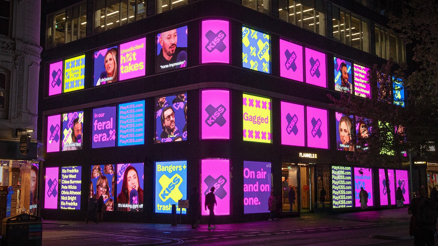
10. KISS Identity — NOT Wieden+Kennedy
NOT W+K rebuilt the KISS FM identity around a single structural device — the X — which works as connector, frame, and crop mark across the system. The result reads as a confident broadcast brand at storefront scale without leaning on era-default neon-and-noise. View on Brand New.
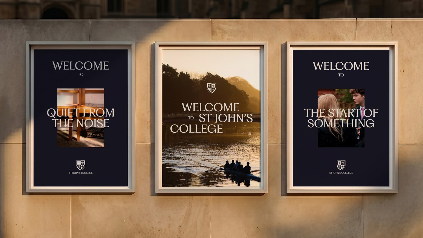
11. Durham University St John's College — Kit Studio
Kit reframed a 100-year-old crest as a modular system rather than a fixed mark. A flared serif and sharper sans hold heritage and present-day institutional comms in one voice; the crest dismantles into components and recomposes around imagery — smarter than the usual flat-emblem refresh. View on Brand New.
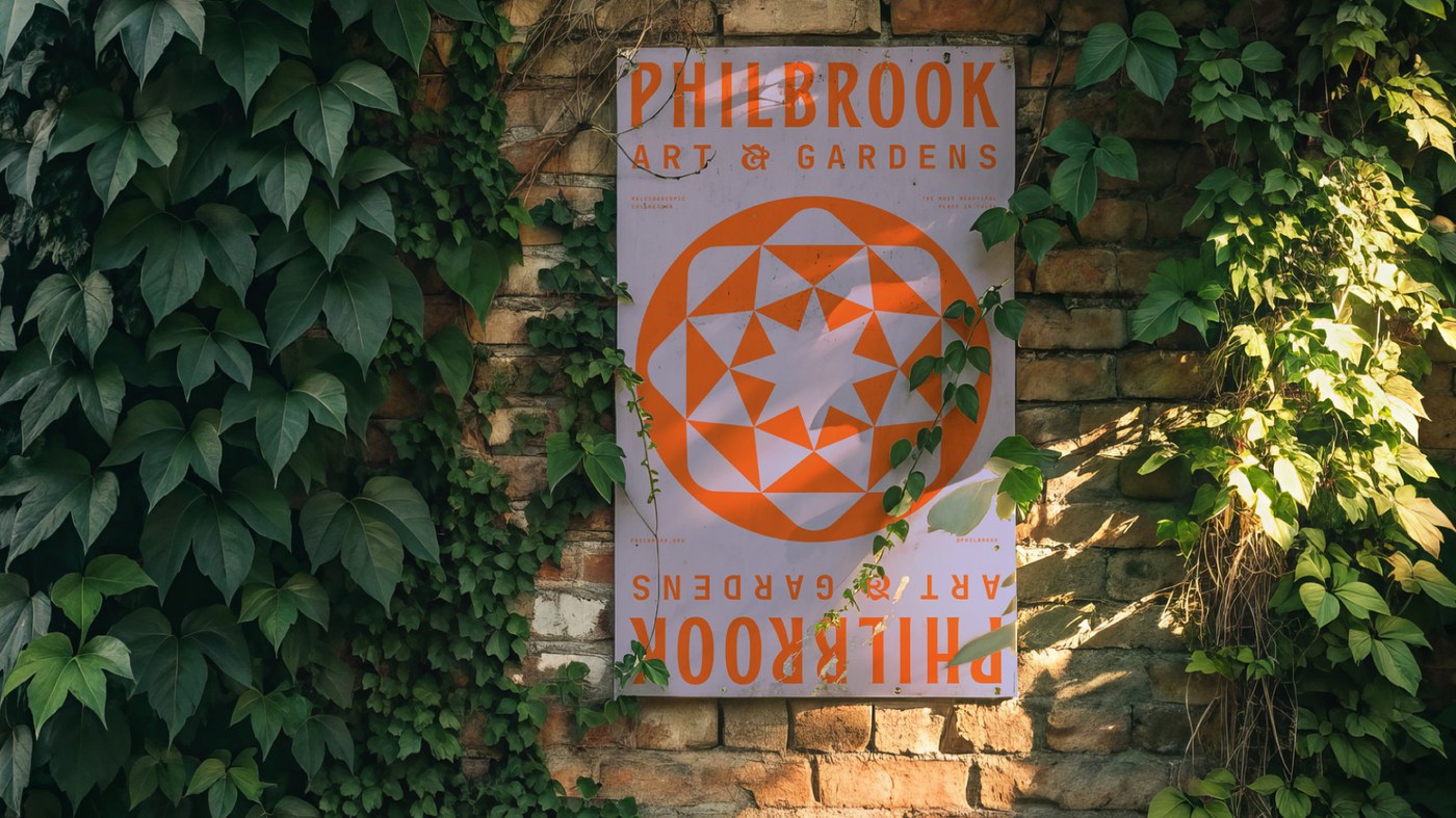
12. Philbrook Art & Gardens — Scott Allen Hill
The rename from "Museum of Art" to "Art & Gardens" is backed by a geometric flared sans and a custom botanical-meets-architectural icon set that holds detail at signage scale. A museum identity that earns its rename through the system, not just the wordmark. View on Brand New.
Next week
W22 opens the early-summer release calendar — type foundries and packaging studios both run quarter-two drops in the next ten days. We'll have the rundown here Sunday.