Best of the Week: Type, Motion, and Material in W22
INFO
Date May 31, 2026
Author abduzeedo
BLOG
This week’s curated design selection highlights the structural tension between physical materials, dynamic motion, and typographic systems. From tactile restaurant branding to variable condensed typefaces, the featured work demonstrates how strict layout rules and disciplined aesthetics establish enduring visual identity systems.
Our top picks include the following projects:
- cancan Food Design by Lung-Hao Chiang: Treats food design as a packaging system, utilizing hand-crafted strokes and organic silhouettes that reject digital perfection.
- Million Typeface by Rajesh Rajput: Compresses 18 display weights into a single variable axis, creating structural density at display scales.
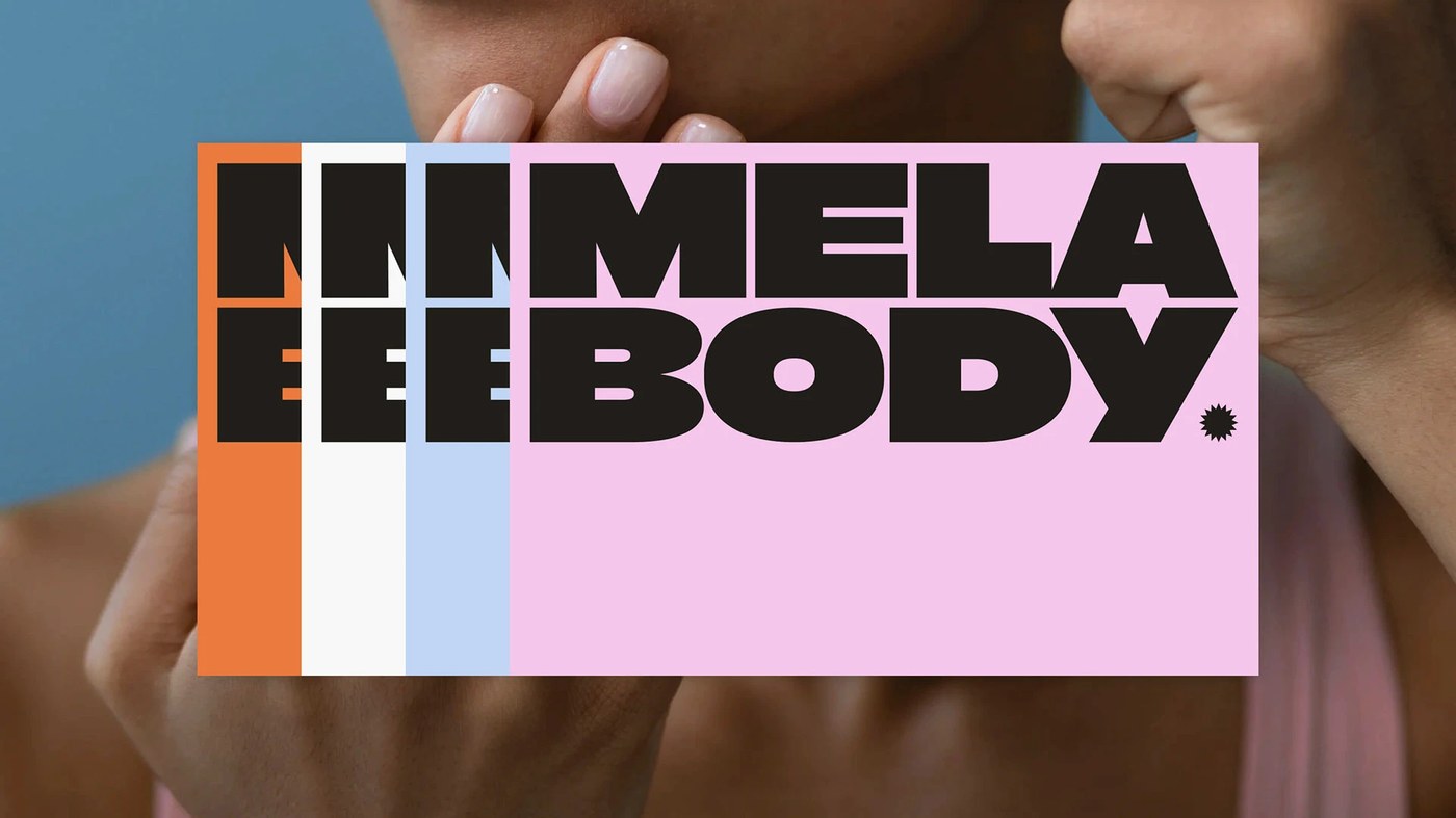
- MELABODY Skincare by CAPS Design Studio: Deploys lived-in, saturated color blocks that establish gender-neutral family packaging without corporate aggression.
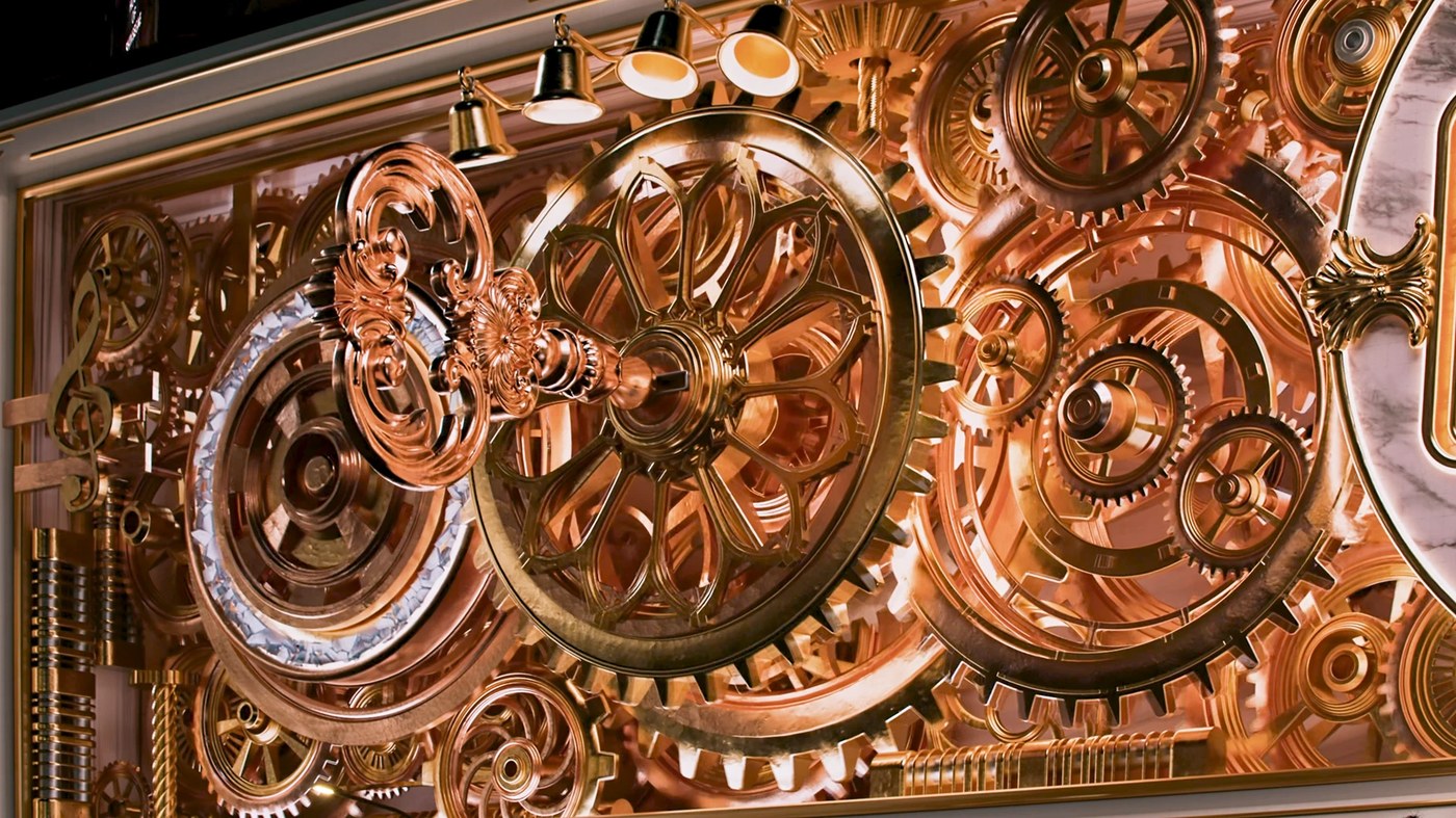
- Shinsegae Facade Art by DIVE STUDIO: Transforms a city-block department store screen into a nostalgia-filled mechanical waltz music box.
- Notis+ Dashboard by Rondesignlab: Subordinates voice and AI-integrated workspace tools to serious, content-driven interface hierarchies.
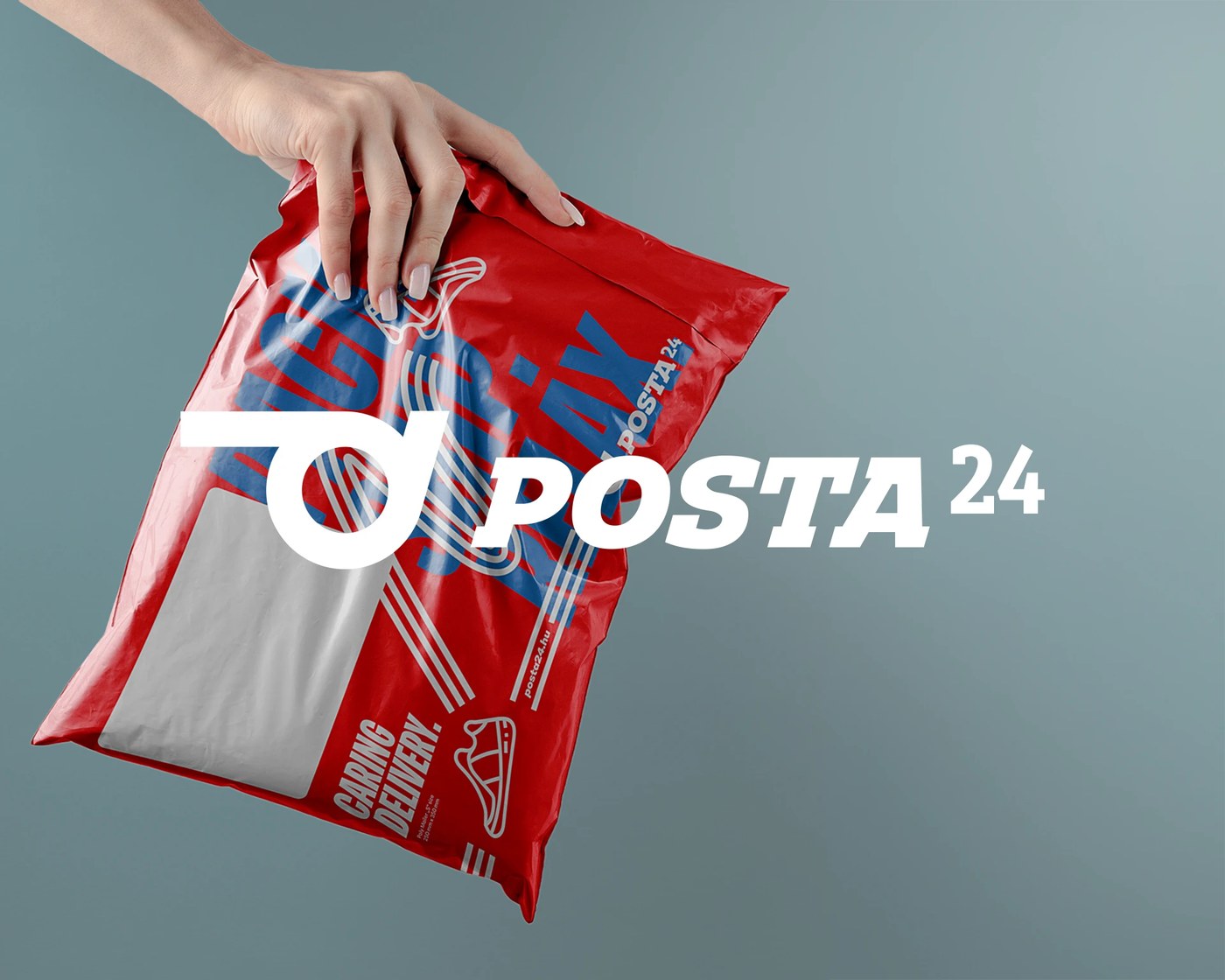
- Posta24 Courier by Molnár Péter: Collapses postal horns and pigeons into a single directional mark scaling from stamps to logistics vehicles.
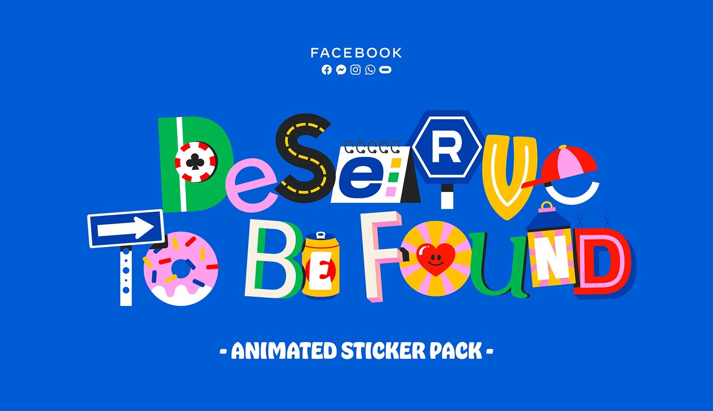
- Facebook Kinetic stickers by Mat Voyce: Illustrated letterforms animated into playful vector loops.
- The Standard Hotel Ibiza by Socio Design: Brutalist typography meets Mediterranean heritage.
- Nike Air Max Dn by ManvsMachine: Physics-driven CGI that renders soft-body motion.
- Oatly Spreads by Oatly In-House: Expressive typographic packaging challenging supermarket layouts.
Next week, we explore how spatial identities shape modern digital workplaces.
ADS
