Bora Brasil Naming and Brand Identity by Foresti Design
Discover the Bora Brasil brand identity by Foresti Design: a corporate branding system with cultural naming and modern typography.
Uniting two of the country's haircare giants, Skala and Lola From Rio, this corporate branding and visual identity project showcases expert positioning, cultural naming, and a dynamic design system. Built to communicate global scale while remaining rooted in Brazilian culture, the holding company identity bridges enterprise strategy with vibrant consumer appeal.
When Skala and Lola From Rio merged into a single holding group, the challenge was cohesion. Managing a combined revenue nearing R$ 2 billion across 82 countries required a high level corporate brand to anchor the ecosystem without overshadowing the unique consumer brands.
Foresti Design built the strategic foundation around a shared, innovative approach to Brazilian beauty.
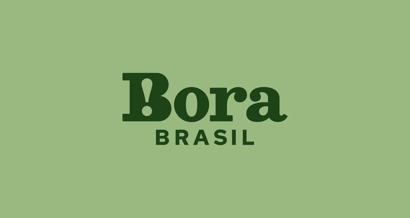
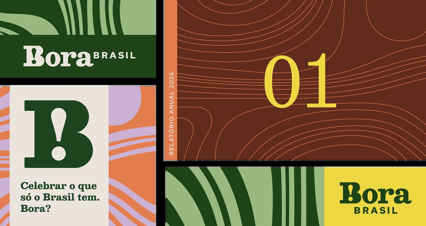
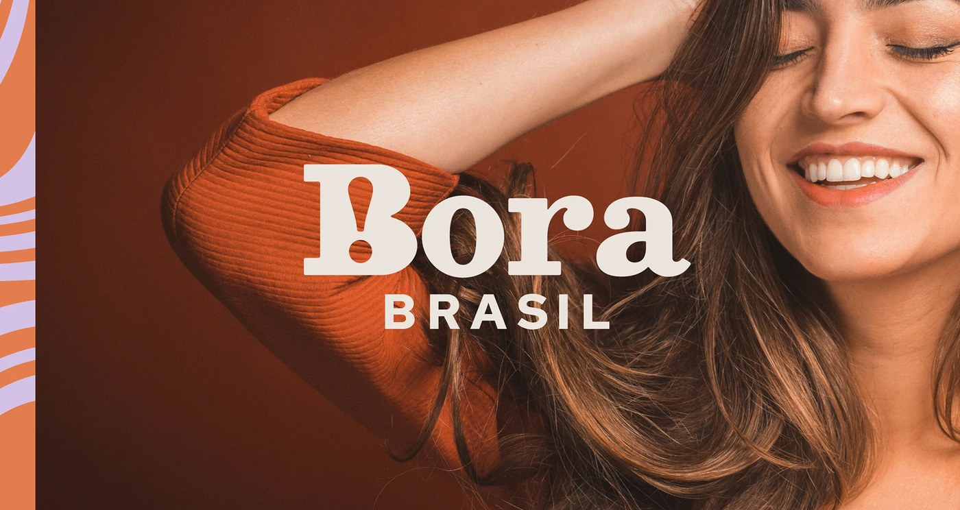
The name Bora Brasil translates to a colloquial call to action ("Let's go, Brazil"). This choice delivers an immediate cultural punch domestically, while remaining rhythmic and phonetic for international audiences.
The logic of this brand identity design
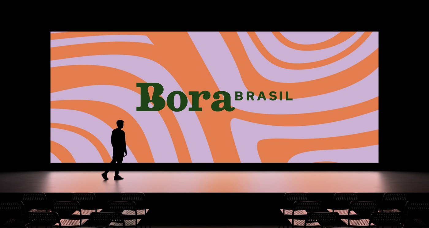
The visual identity steers clear of predictable corporate tropes, reframing traditional Brazilian aesthetics through a sophisticated, contemporary lens.
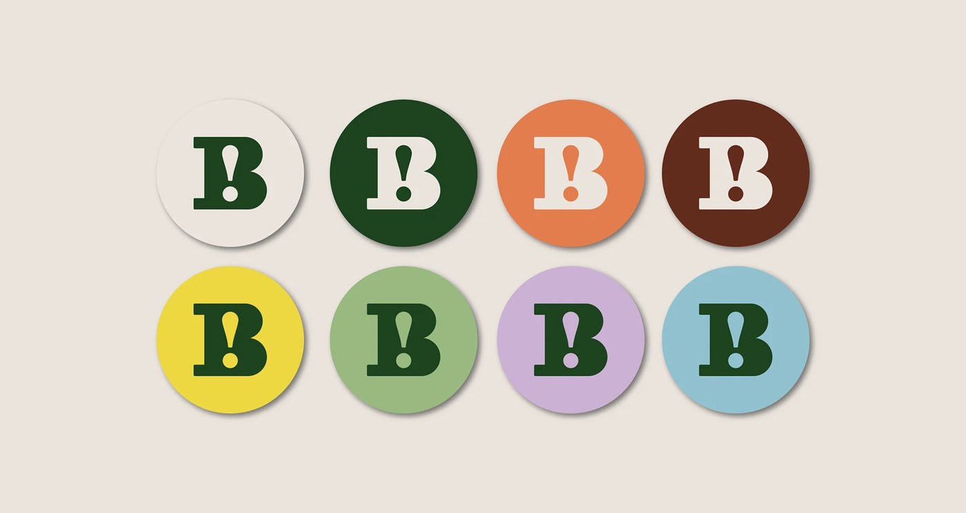
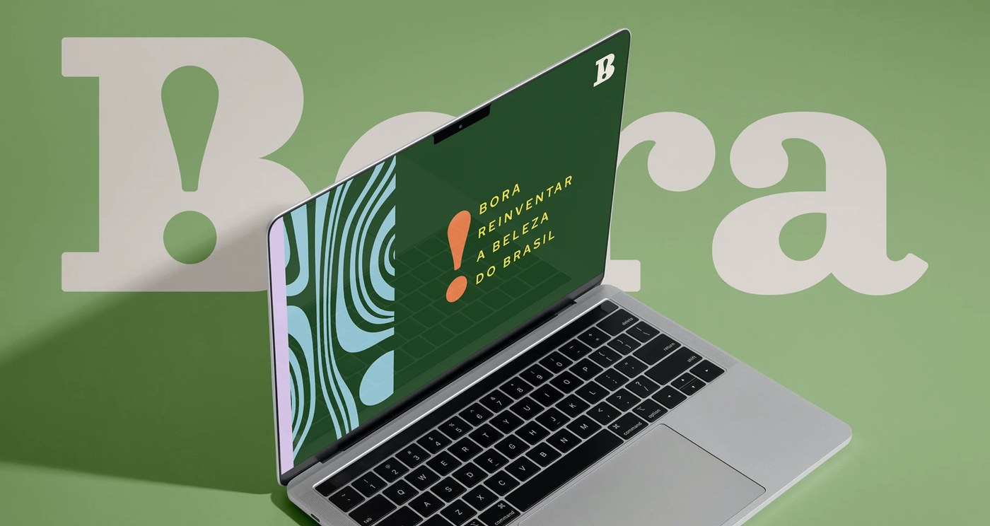
- The Typography: The wordmark uses a heavy, expressive serif display typeface for "Bora," grounded by a geometric sans serif for "BRASIL." An exclamation point is integrated directly into the counterspace of the capital B, echoing the energy behind the name.
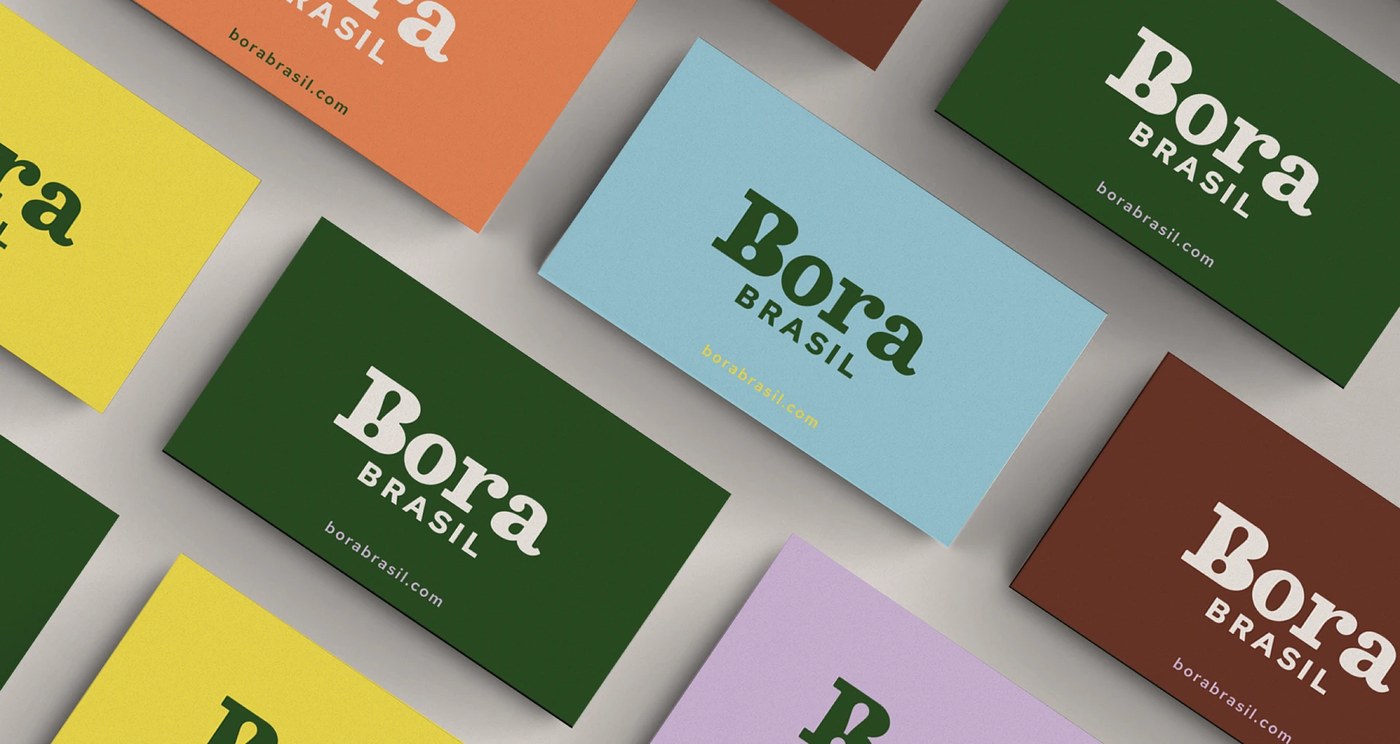
- The Palette: Replacing literal flag colors, the system uses an earthy, sophisticated mix of deep forest greens, rich terracotta, mustard yellows, sky blues, soft lavender, and chocolate browns.
- Systemic Versatility: The wordmark scales effortlessly from stark, high contrast white on green applications to playful tone on tone colorways across business collateral.
Foresti Design created a system that feels structurally sound for a global corporate audience, yet remains deeply proud of its roots. See the full project by Foresti Design on Behance.