Brand Identity Design: Navigating 300 Years Of Maritime Heritage
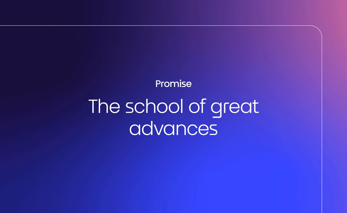
Merging two campuses into a single engineering entity required a visual system that honors 18th-century maritime roots while signaling future technological progress. This brand identity design uses directional momentum to transform historical weight into modern speed. The resulting framework centers on the concept of "great advances" through sharp, geometric precision.
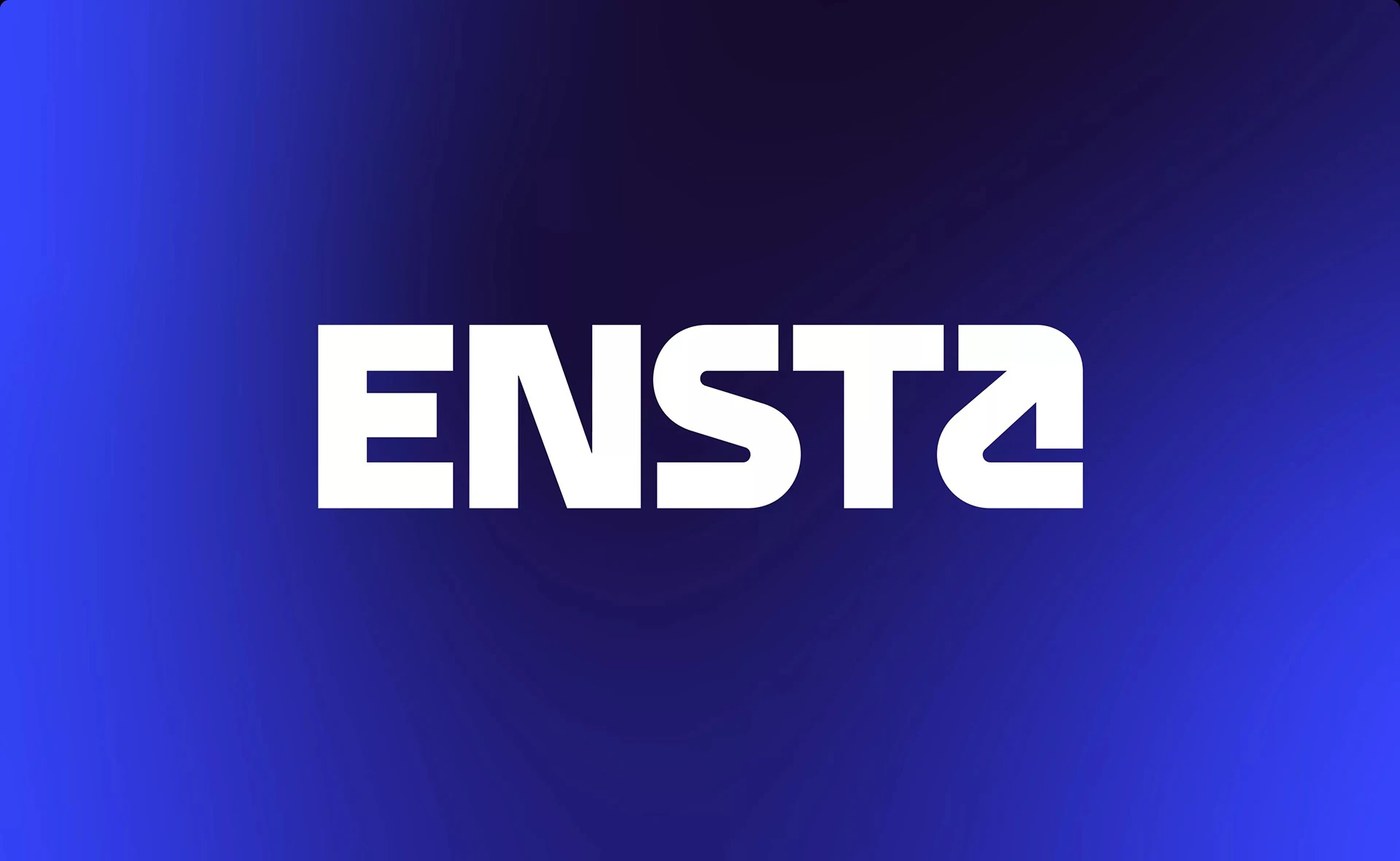
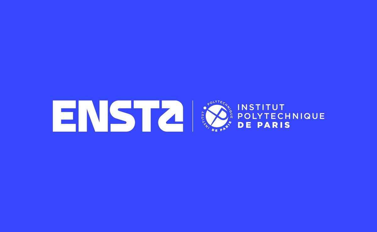
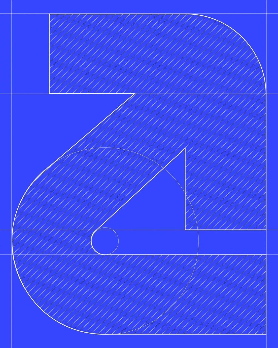
The tension between a 1741 naval heritage and 2025 engineering requirements defines the core challenge of this unification project. Graphéine navigated these conflicting timelines by translating maritime history into an abstract visual language. Instead of traditional navy tones, they selected a vivid electric blue that feels more like high-tech signal lighting than old-world military uniforms. This choice is anchored by a bespoke typeface characterized by sharp edges and geometric structure. By focusing on the "A" as a symbol for advancement and creating symmetry within the letter "S," the studio established a rhythmic, technical cadence.
Navigating progress through brand identity design
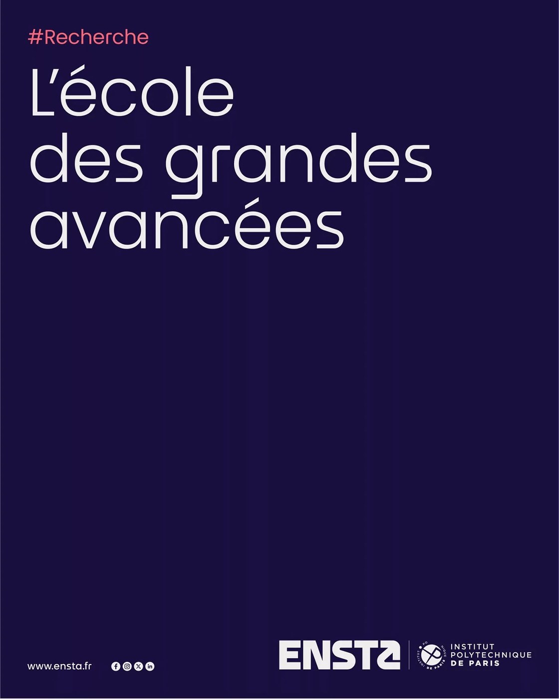
Visual momentum is embedded directly into the typography through a system of integrated directional arrows. These graphic elements point upward and forward across compositions to physically embody the school's mission of exploration. The palette relies on high-contrast pairings, specifically an electric blue that transitions into a warm coral via soft gradients. This interaction between the cool signal blue and the energetic coral creates depth in digital applications and printed brochures. Every piece of communication follows a rigorous modular grid system characterized by rounded angles, ensuring the layout remains structured yet accessible across different media.
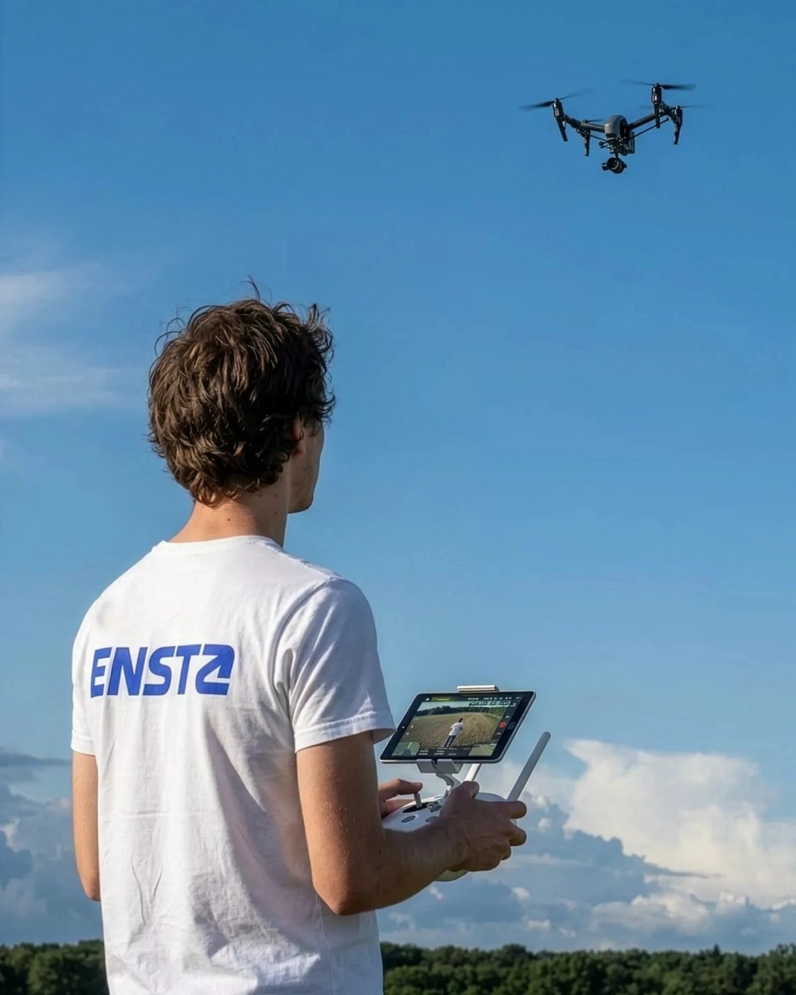
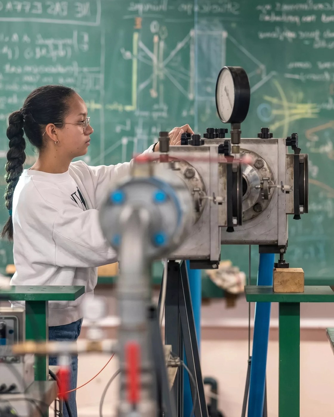
Graphéine expanded this visual territory into a comprehensive ecosystem for social media, signage, and institutional publications. The studio utilized deep Midnight Blue to provide a solid foundation for the lighter, more luminous gradients used in digital interfaces. This color strategy ensures that even when applied to stationary or complex technical diagrams, the brand maintains its distinct identity. By treating typography as a functional voice rather than just aesthetic styling, they created a versatile system capable of representing both historical prestige and experimental scientific research.
See the full project by 🟥⬜️ Graphéine on Behance.