Branding Design Studio Visual Identity: Heavy's Masterful Studio Rebranding
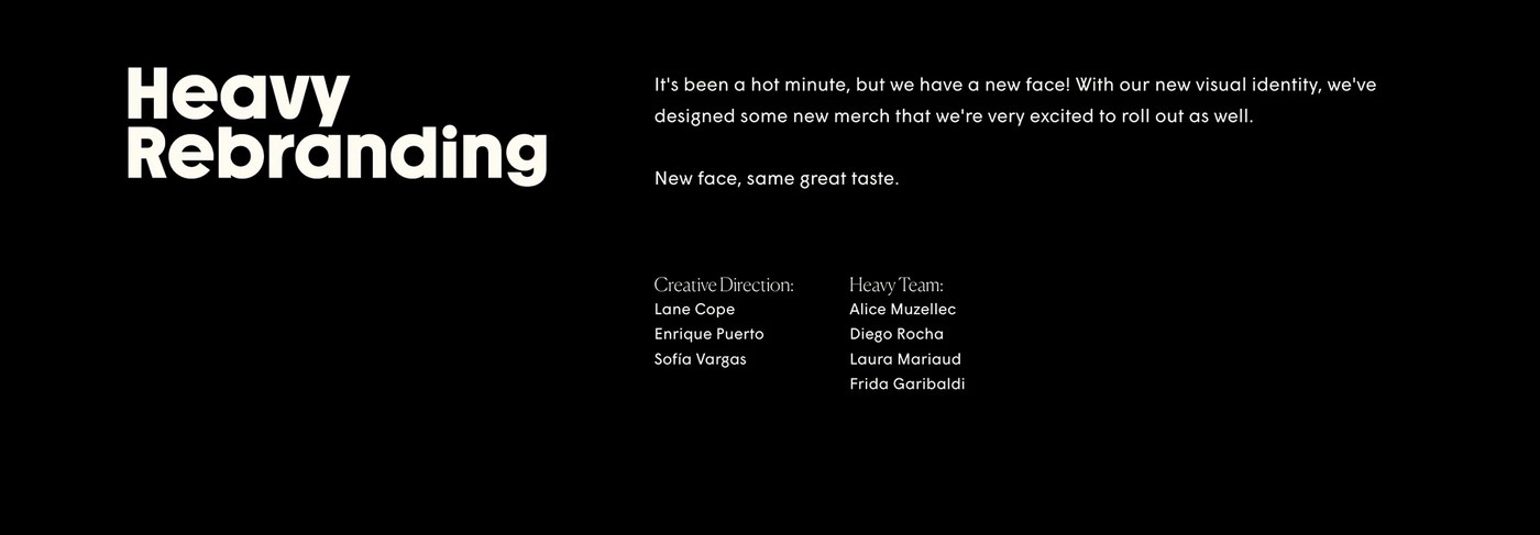
Heavy's latest self-identity project sets a benchmark for branding design studio visual identity. The Guadalajara-based studio delivers a sophisticated graphic system that redefines agency positioning. By treating their own brand as the primary subject, the studio showcases its design philosophy with extreme confidence.
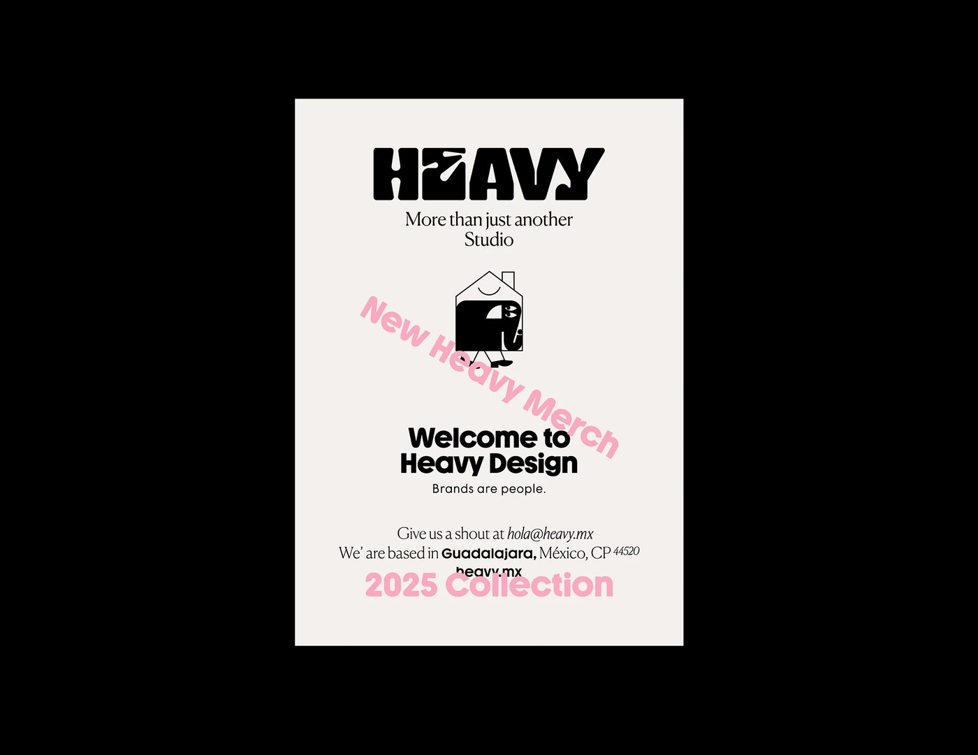
The visual system is built on a highly disciplined typographic grid. High contrast layouts dictate the visual flow. Generous negative space acts as a luxury asset. Pinned elements sit tightly on the outer margins. This extreme alignment creates deep compositional tension. The typographic lockup sits perfectly on the baseline. The stroke weight of the headers conveys physical mass. The letters feel like architectural structures. The counters form dramatic geometric negative spaces. A singular typographic hierarchy scales across all physical and digital collateral. Every layout element preserves structural integrity without losing balance. Large visual fields contrast with tiny metadata details. The composition relies entirely on scale rather than complex illustration. Every page shows clear rule-based logic.
A Modern Approach to Branding Design Studio Visual Identity
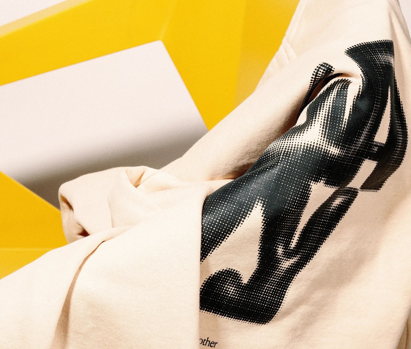
The chromatic system relies on severe spatial restraint. Near-monochrome fields dominate the visual landscape. A singular yellow accent color disrupts the quiet layouts. In the physical collateral, surface textures act as the primary focus. Heavy textured paper contrasts with smooth metallic elements. Debossed lettering and matte coatings enhance physical interaction. Digital channels reflect this premium tactile quality. A clean, minimal website redesign brings this branding design studio visual identity to the screen. The website interface avoids unnecessary clutter. It uses neutral sans-serif typography. Micro-interactions guide the user's eye. Every digital transition feels deliberate. The interface prioritizes spacious grids and quiet navigation.
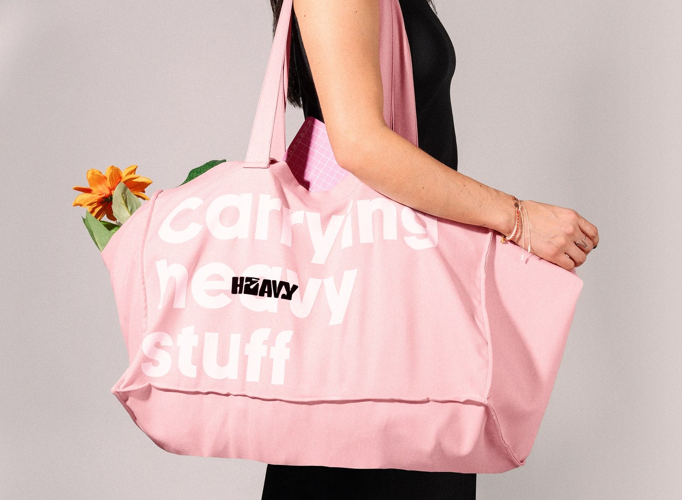
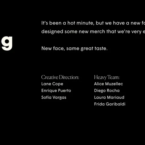
In 2026, leading creative agencies use physical merch to represent their visual viewpoints. Heavy utilizes curated shirts and fashion accessories to showcase their design perspective. This strategy moves agency branding past simple self-promotion. The brand system becomes an active cultural statement. By launching this branding design studio visual identity, Heavy demonstrates that self-branding requires absolute dedication. It establishes a clear strategic voice. The studio stands out in a crowded global marketplace.
Learn more about this project by visiting Heavy.