Breakout #2: Cihan Tamti's Poster Book Design
Cihan Tamti's Breakout #2 poster book design spans 100 works from 2022-2025, all given equal page weight across 128 hot-foil embossed spreads by Slanted.
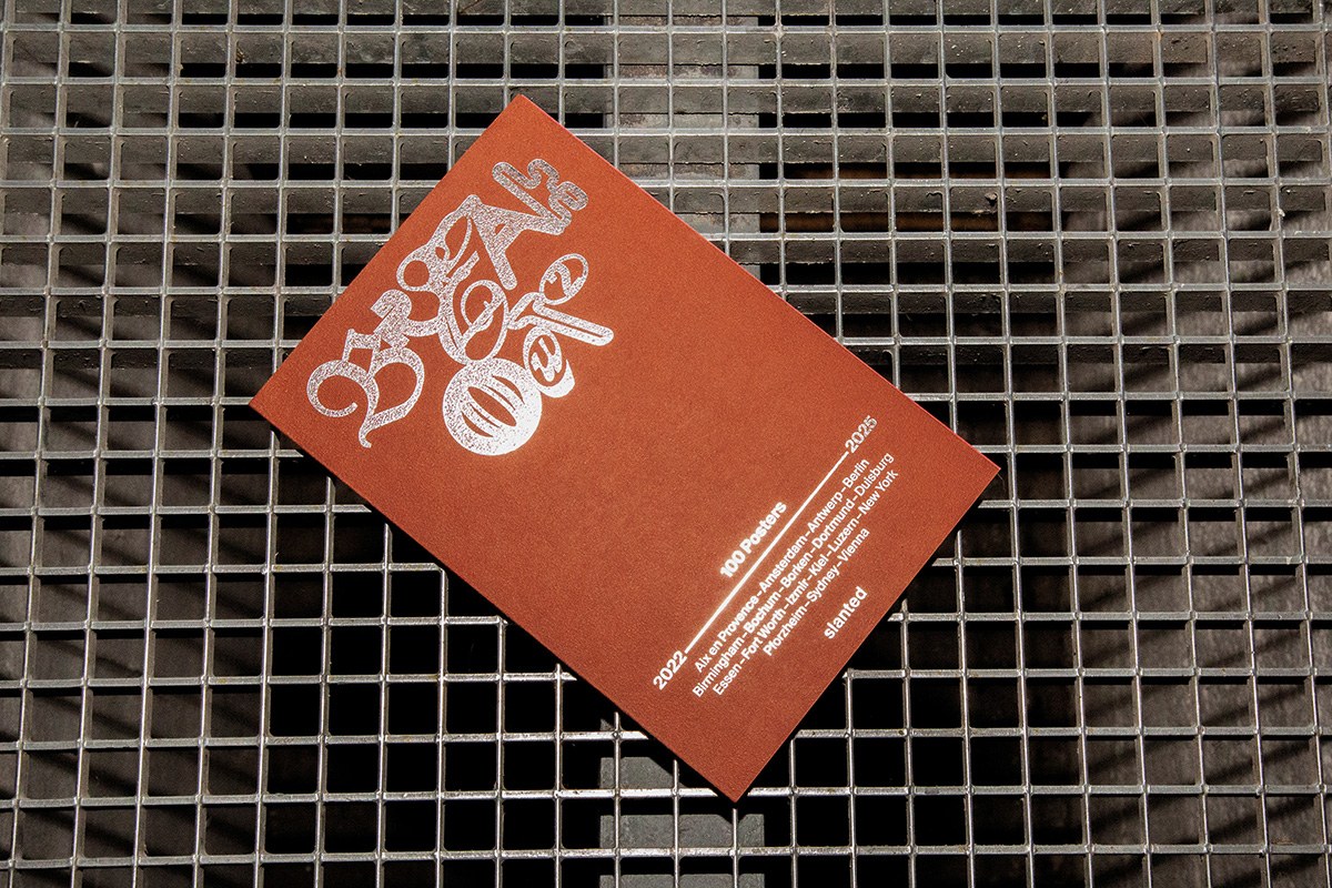
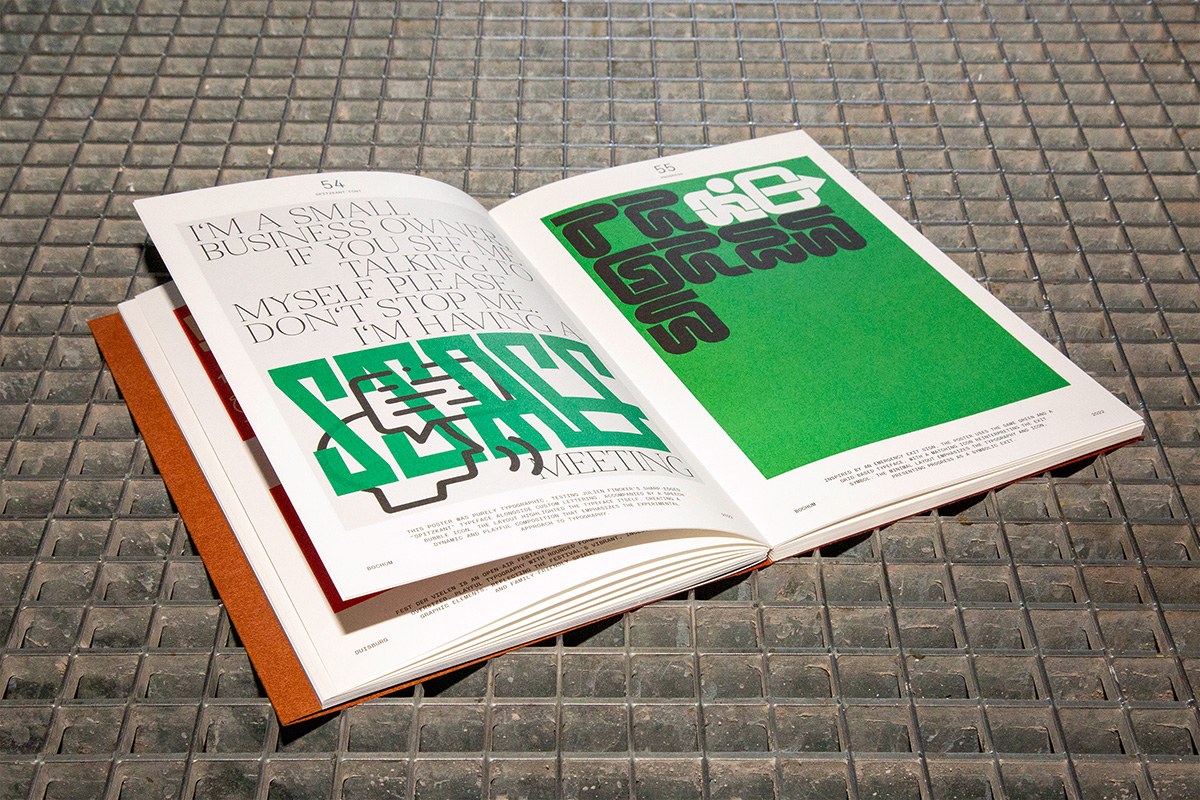
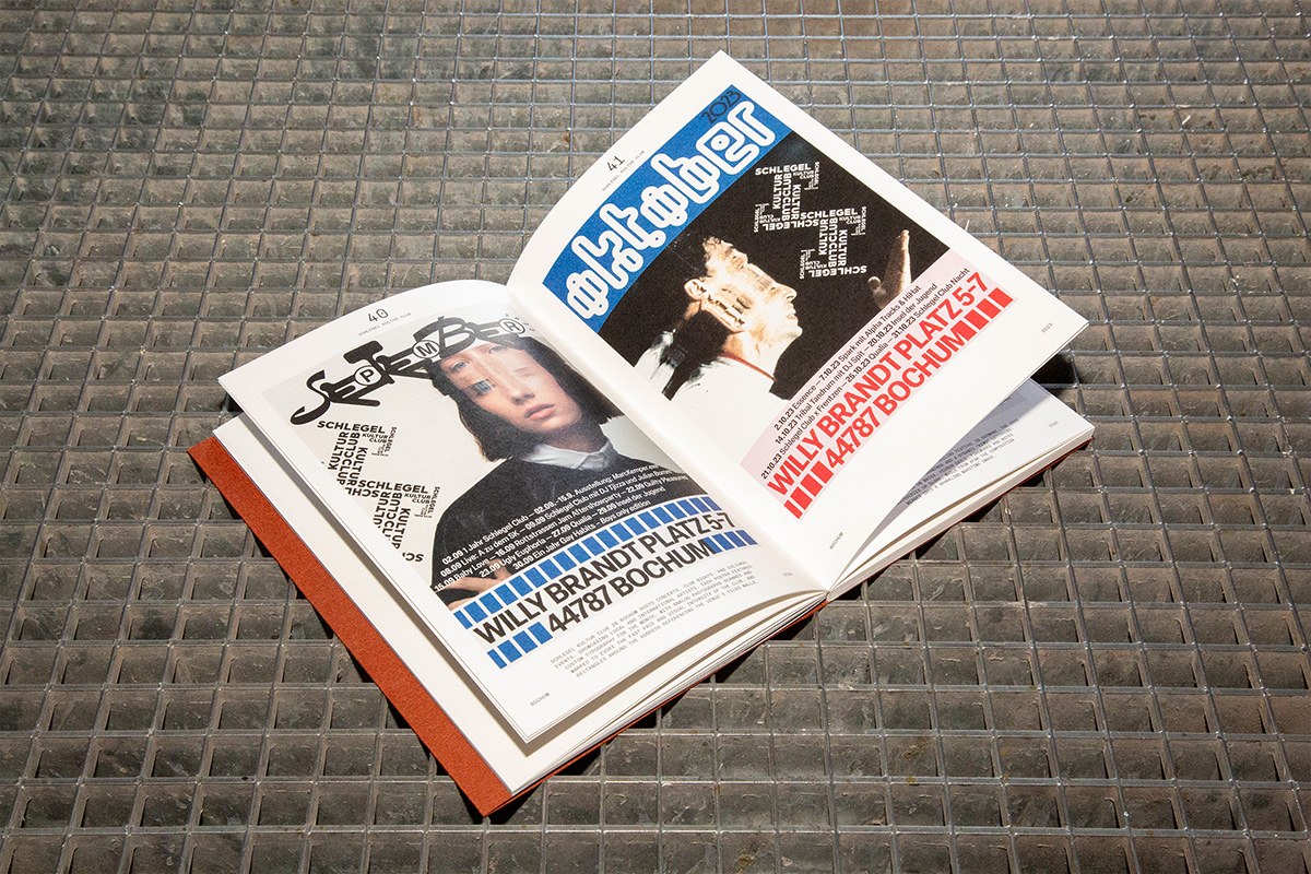
The cover announces the method before the book opens. Terracotta-red field, silver hot-foil embossed blackletter — "Breakout" rendered in overlapping, knotted strokes that read as texture before they read as text. Inside, this poster book design holds its structure flat. No hierarchy between personal work, client commissions, and community campaigns — all 100 posters fill their spreads identically, foreground to edge. On pp.64-65, a white page stacks condensed sans at roughly 200pt — "I'M A SMALL BUSINESS" — then switches mid-sentence to dense gothic block letters for "SERIAL MEETING." The facing page is pure vivid green, same gothic type reversed in black. Two-color, maximum weight, nothing else. Elsewhere, Arabic script tiles across a field on the left; opposite it, "WILLY GRANDT PLATZ 57 BOCHUM" in high-contrast condensed red and black. Cihan Tamti does not explain the pairing — the spread just sits there, generating its own pressure.
What Makes This Poster Book Design Worth Studying
Breakout #2 started as a daily Instagram practice in 2022, no client brief, no external constraint. The monograph format strips each piece of its original context — the feed, the caption, the scroll — and replaces it with only the visual decision. That is the poster book design argument: 100 works, equal weight, let the type do the rest. Gotz Gramlich wrote the foreword. Slanted Publishers printed this poster book design thread-stitched at 16x24 cm, full-color offset. The hot-foil cover is the one material gesture; everything else is ink on paper.
See the full project by Cihan Tamti / Slanted Publishers.