Budapest Cultural Center Brand Identity by DE_FORM Studio
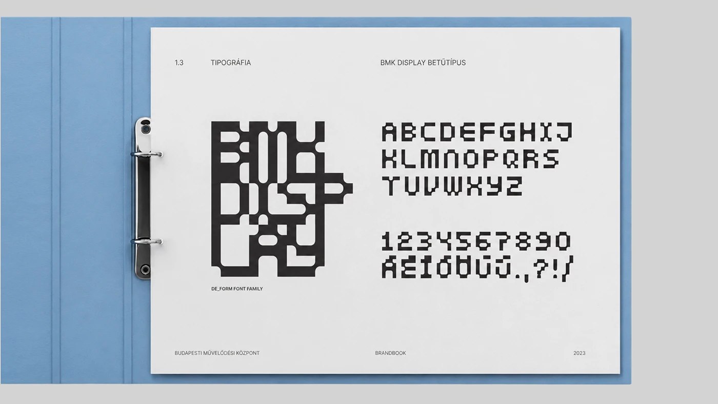
DE_FORM studio's Budapest cultural center brand identity for BMK uses arc segments, a condensed grotesque at 300-point display scale, and warm ochre ink.
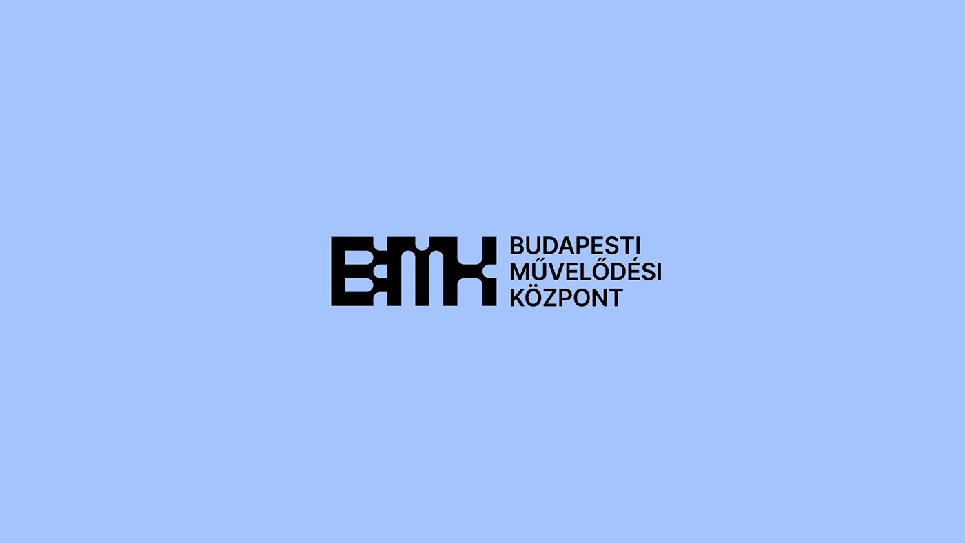
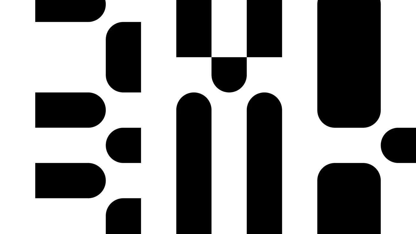
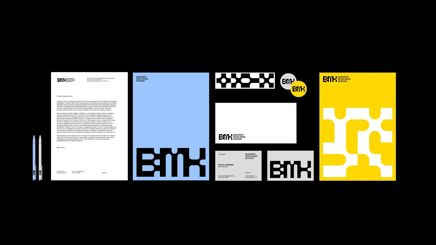
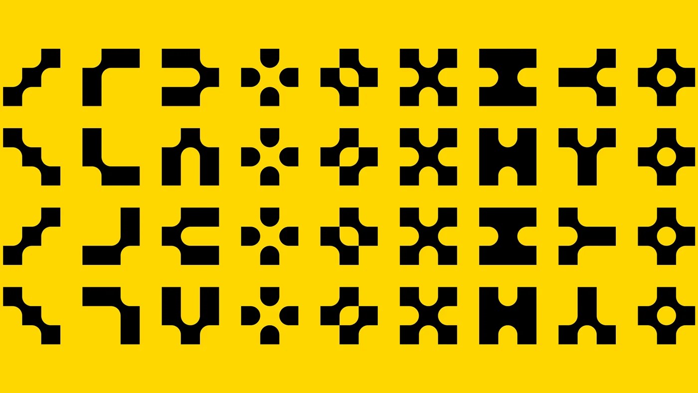
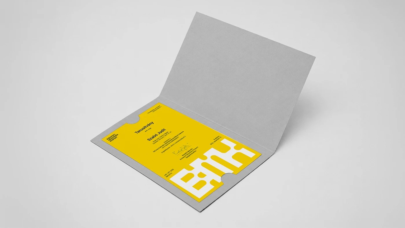
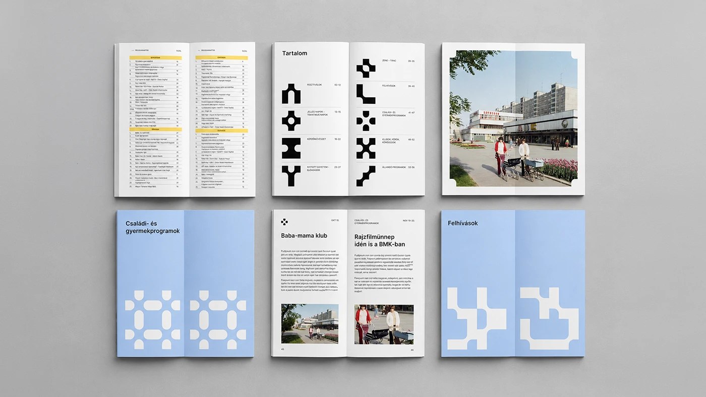
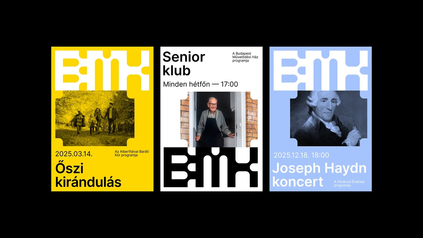
This Budapest cultural center brand identity starts with a deceptively simple move: a single arc segment, rotated and tiled into a circular grid. At logo scale, the modules read as a network of connected nodes. Scaled up across a full-bleed poster, the same element becomes dense, near-textile pattern — white reversed out of black, no margins, no breathing room. The same geometry does both jobs without modification. DE_FORM studio anchored the lockup with 'BMK' set in a condensed grotesque at roughly 300 points. The abbreviation isn't supporting type; it's the primary visual weight of the frame. One warm ochre accent — closer to amber than yellow — activates pattern areas sparingly. It never fills a background.
Budapest Cultural Center Brand Identity: Modular System, One Accent
Systems like this one live or die by their consistency. DE_FORM built this Budapest cultural center brand identity to hold across event programs, environmental signage, and digital formats without adaptation — the same module-based grid in every context. Developed in 2023 by Enikő Déri, Nóra Demeczky, Bertalan Bessenyey, and Benedek Regős, this Budapest cultural center brand identity signals institutional openness without resorting to the usual cultural-center softness. A hard-edged system that earns warmth through restraint — one accent color, one weight, and geometry that does the work.
See the full project by DE_FORM studio on Behance.