cancan: Food Design Studio Brand Identity Restaurant by Chiang
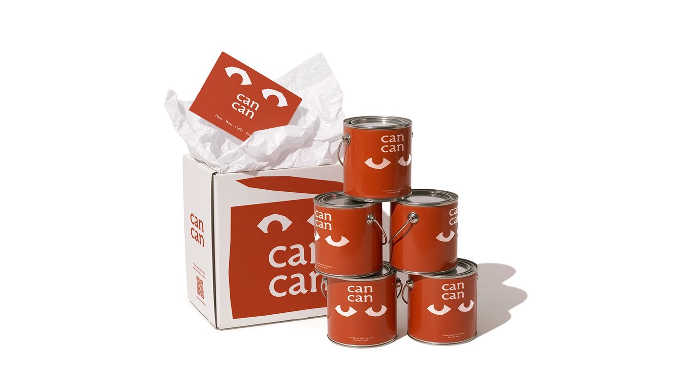
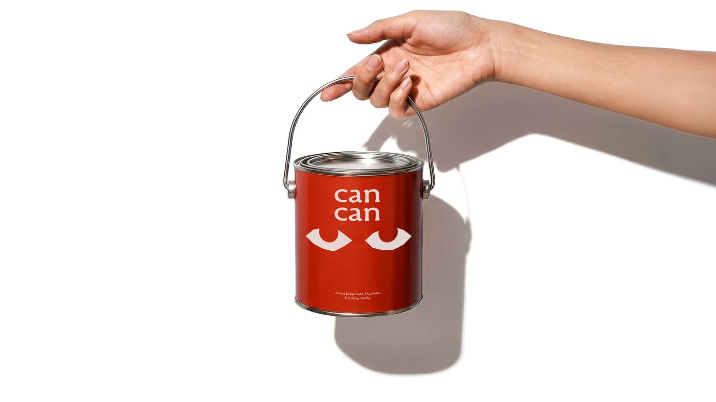
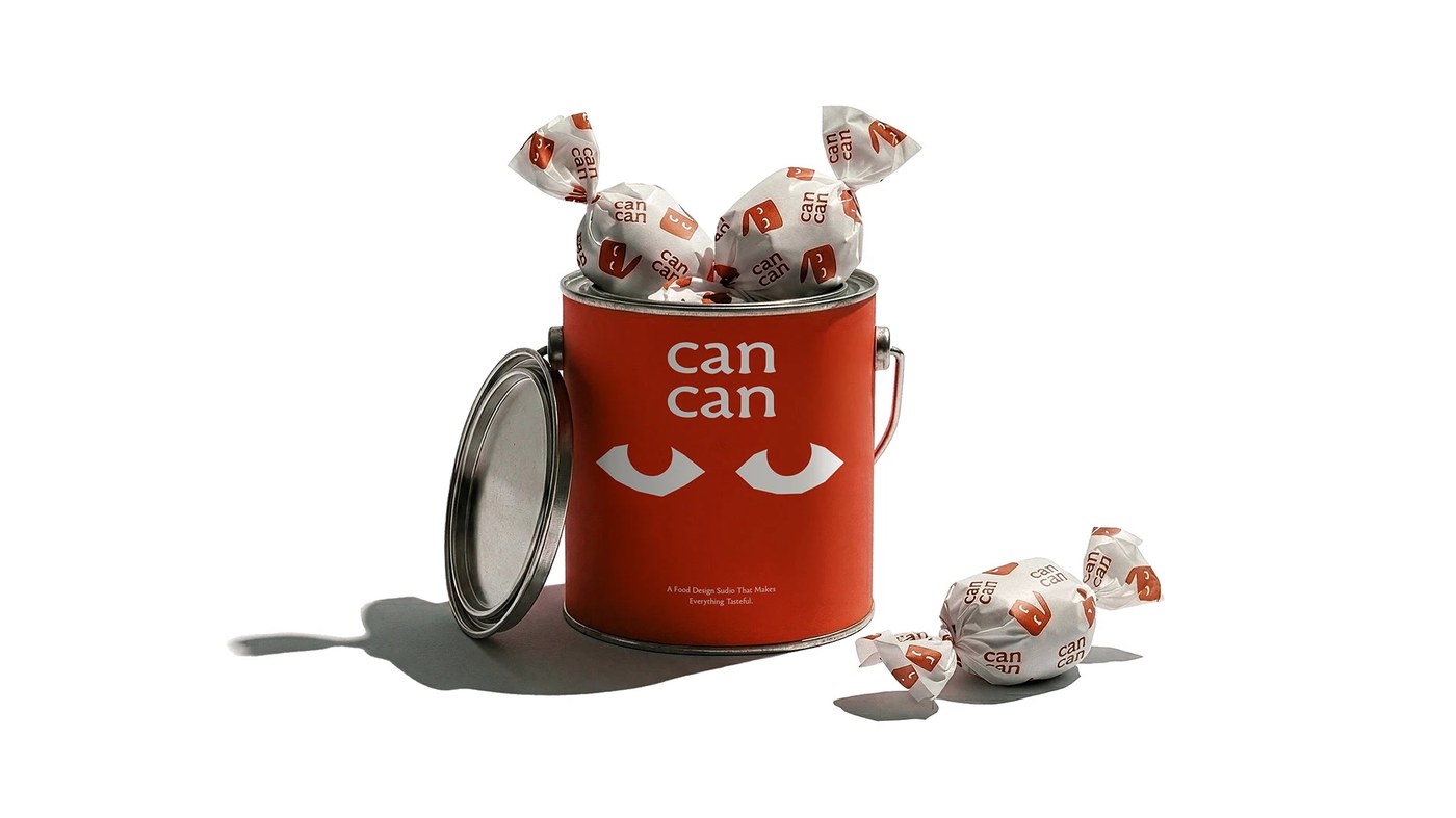
Lung-Hao Chiang's cancan food design studio brand identity restaurant uses a tin can as vessel and verb — preservation, scale, collective work in a mark.
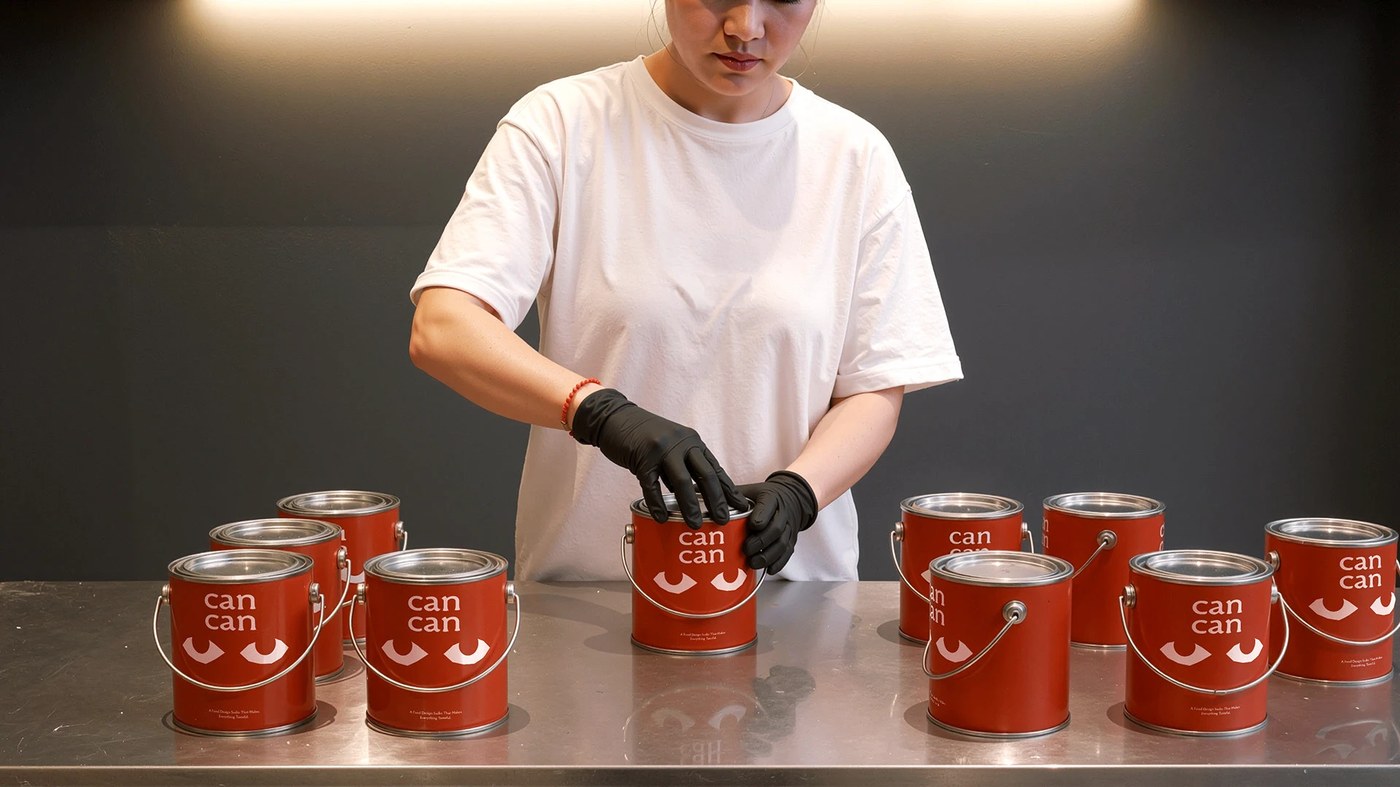
The food design studio brand identity restaurant builds nothing from clean digital primitives. Strokes wobble like they were drawn fast and kept. Silhouettes borrow from ripening fruit and the open pores of fermenting sourdough — biological, not geometric. On the tin packaging the texture reads as pressed into metal, not printed on it. Chiang treats the food design studio brand identity restaurant wordmark as the can itself: sealed, reopened in every application.
Inside cancan's Food Design Studio Brand Identity Restaurant System
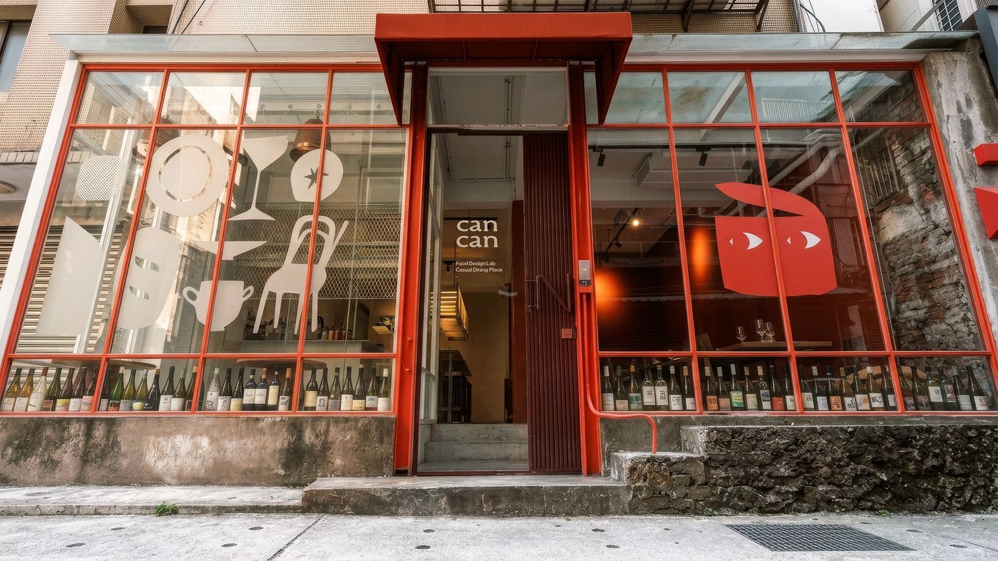
Chiang's argument is structural. 'Can' moves from 'I can' to 'we can.' The food design studio brand identity restaurant operates as one entity — kitchen as laboratory, studio as production. The system reads identical across coasters, signage, glassware, and aprons because the duality isn't a tagline. It's the architecture.
See the full food design studio brand identity restaurant project by Lung-Hao Chiang on Behance.