Courier brand identity: Posta24's modern postal design system
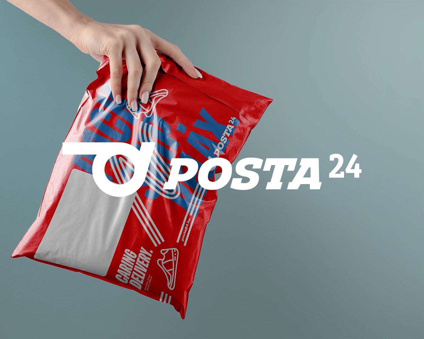
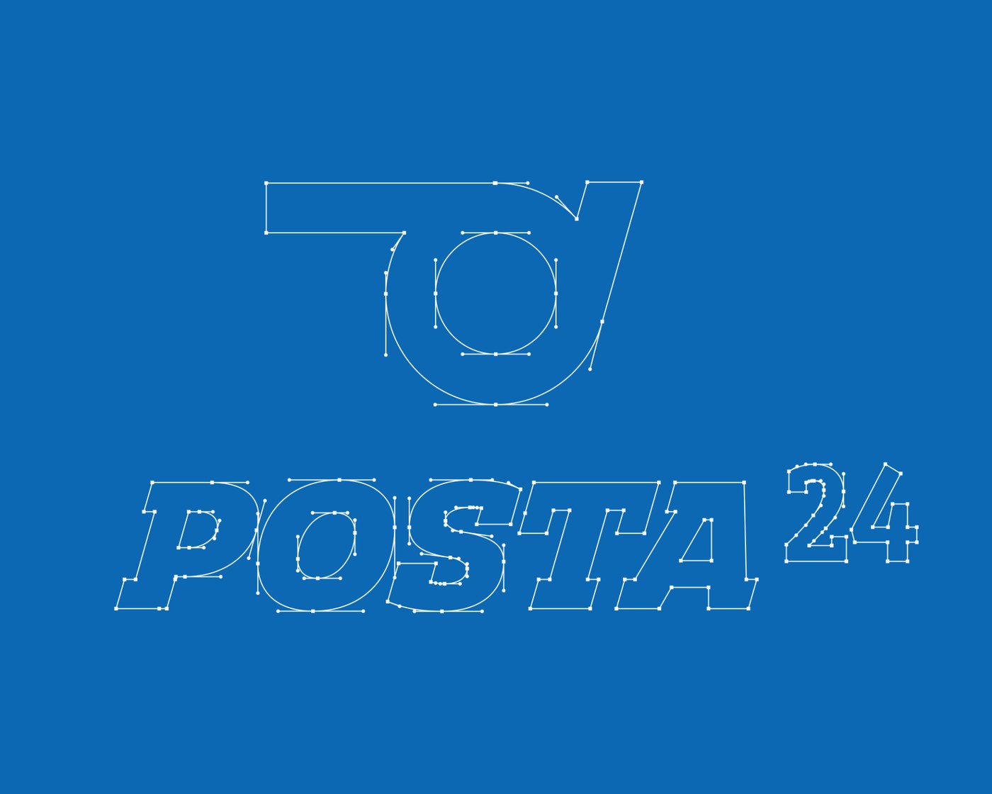
Posta24 introduces a clear courier brand identity designed by Molnár Péter. The Budapest-based designer merges three historical postal symbols into one clean glyph. The post horn, the carrier pigeon, and the fast wheel resolve into a single directional mark. This mark drives the visual rhythm across packaging and vehicle surfaces.
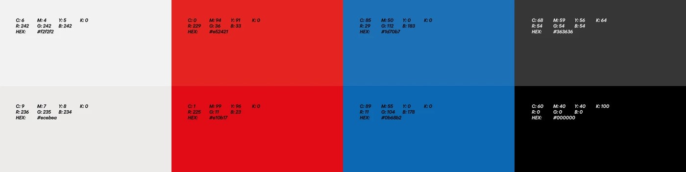
The visual system establishes strong compositional tension. A high-contrast color palette uses bright red, blue, and white to command urban spaces. Rather than relying on illustrative decorations, the layout maintains strict geometric restraint. The mark anchors the structural hierarchy of each physical mailer.
Courier Brand Identity Details
Typographic scaling provides immediate information legibility. The sans-serif logotype scales from small parcel stamps to large signage. Saturated red fields dominate the mailer surfaces. Simple white blocks create functional areas for shipping labels. The high-contrast color scheme ensures maximum visibility. The layout uses negative space to organize key shipping data.
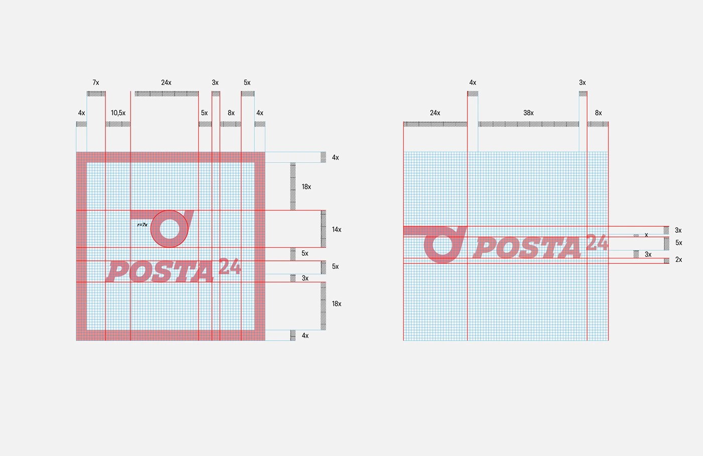
The designer developed a rigid grid system. Each label utilizes a clear modular grid. This alignment creates a strong sense of order. The design keeps baseline alignment clean across all surfaces. The tactile contrast of the paper mailers feels utilitarian and raw. This tactile contrast helps the user handle the packages in real life.
The brand communication runs on a clear question-and-answer logic. A bold question defines a delivery need. The brand slogan then resolves it directly. This approach grounds the courier brand identity in functional utility. The resulting system scales effortlessly. The design works on small digital screens and large physical trucks.
The Central European context shaped this design. Hungarian logistics brands often use busy, complex layouts. Posta24 takes a different path. It uses simple shapes to stand out. The bold colors help people find the brand on crowded city streets. This design shows how small courier companies can gain trust. A good system makes a new brand look safe and professional.
This courier brand identity rejects decorative trends. The work highlights how small service brands can build distinct visual systems through simple choices. Molnár Péter delivers a system that is both highly functional and memorable.