Display serif typeface design inspired by Giger's legacy
Forth+Back Studio releases Drool, a display serif typeface design inspired by H.R. Giger's Xenomorph, showcased in a striking 200-page type specimen book.
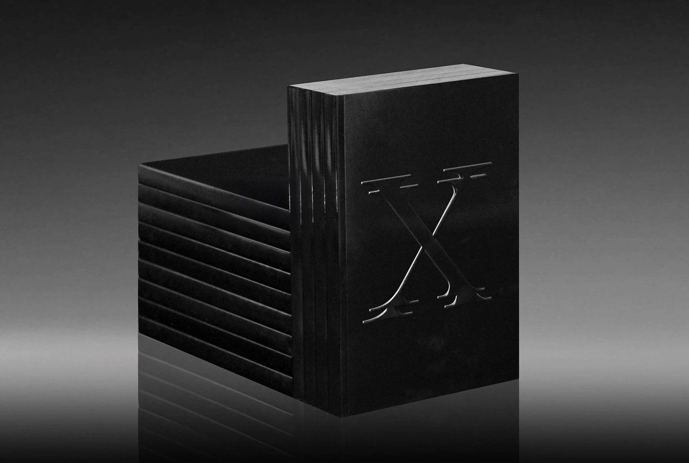
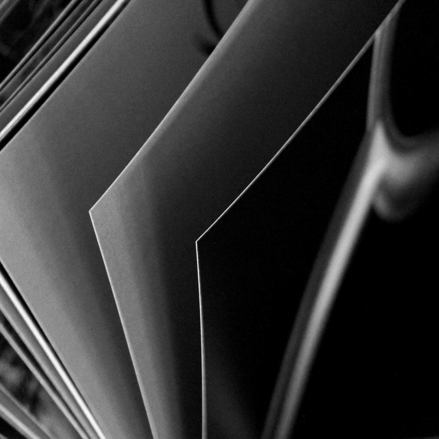
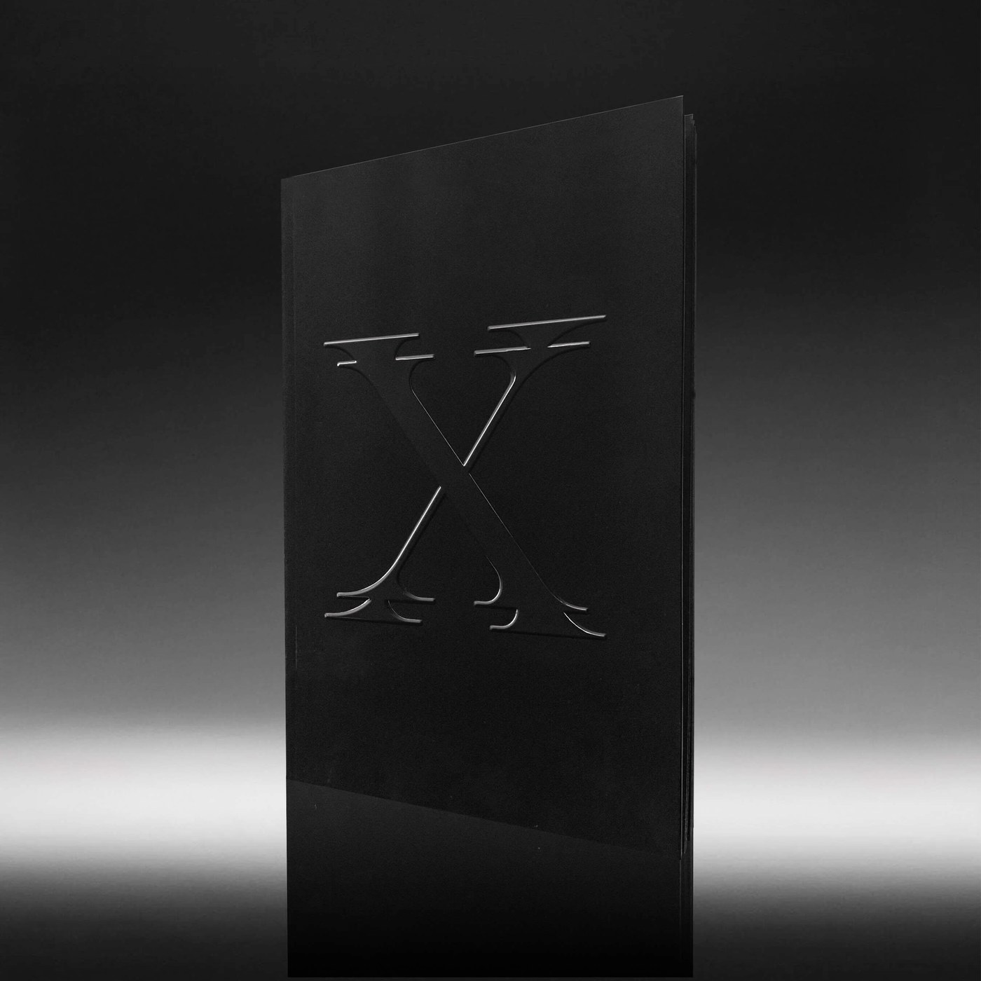
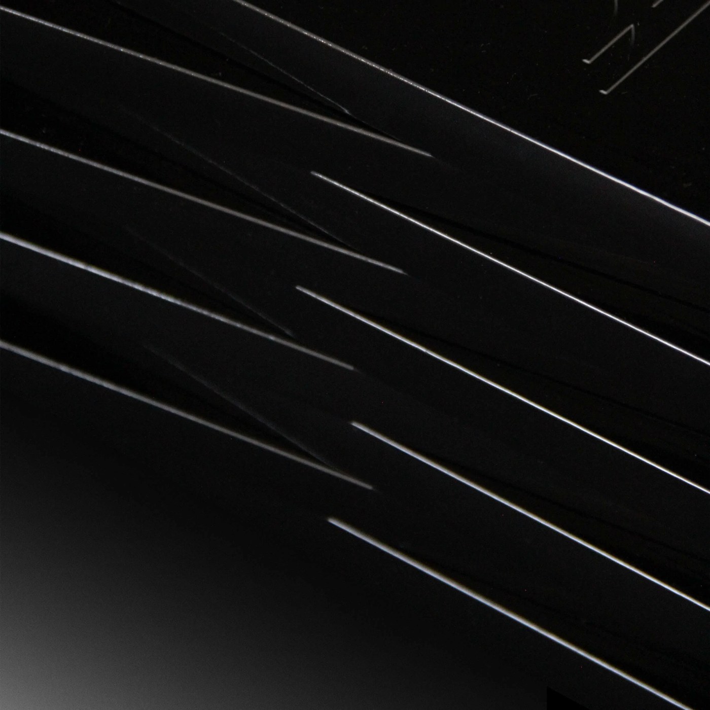
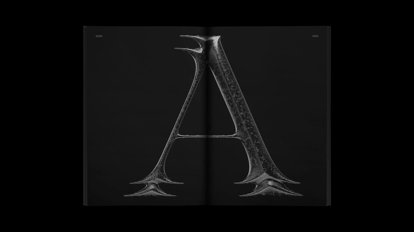
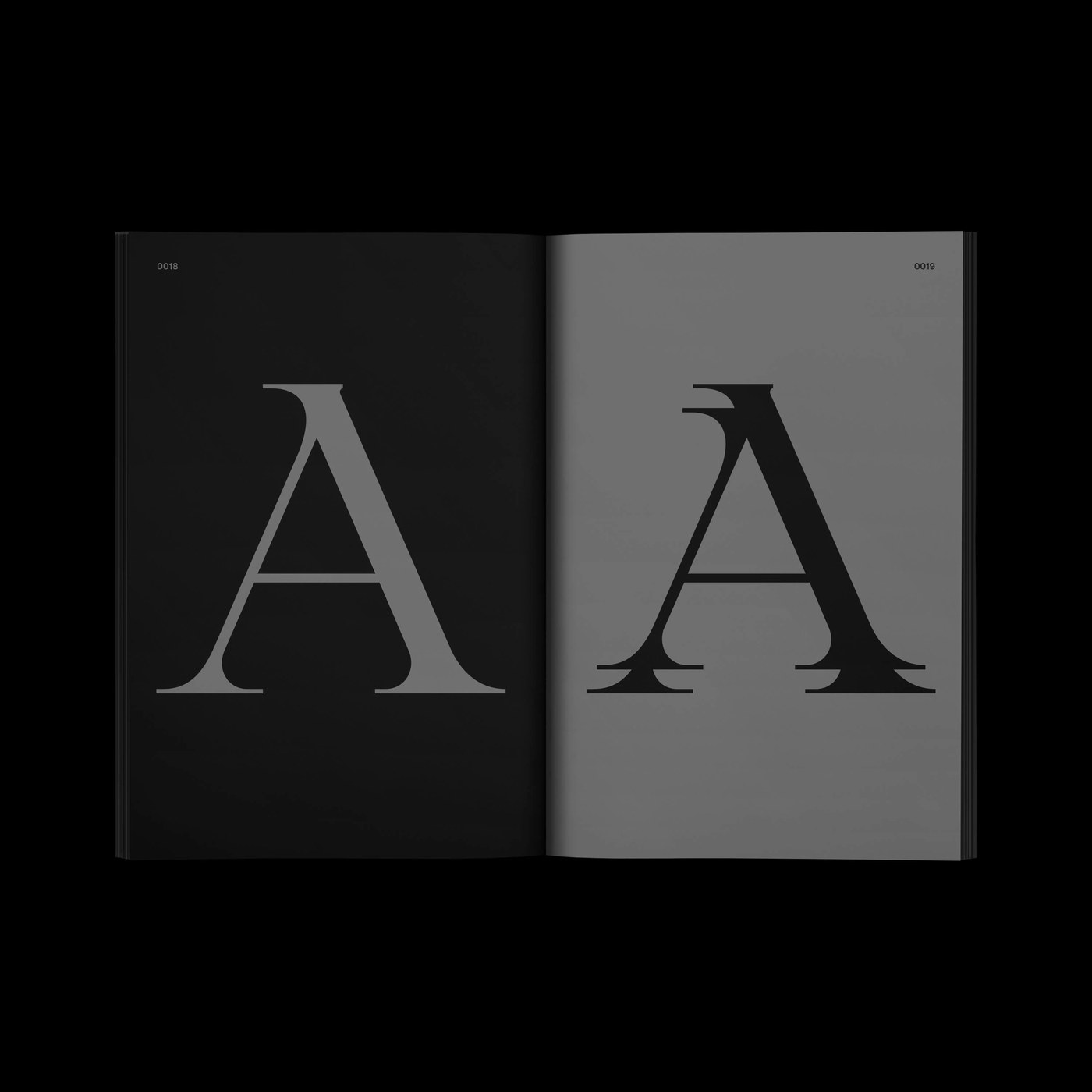
The visual system operates with a biomechanical aesthetic. The letterforms are characterized by curving terminals and organic connective tissue. This structural hierarchy creates compositional tension, making the glyphs feel grown rather than drawn. The serif anatomy pulses with fluid, structural connections, translating H.R. Giger's iconic cinematic design into physical typographic form.
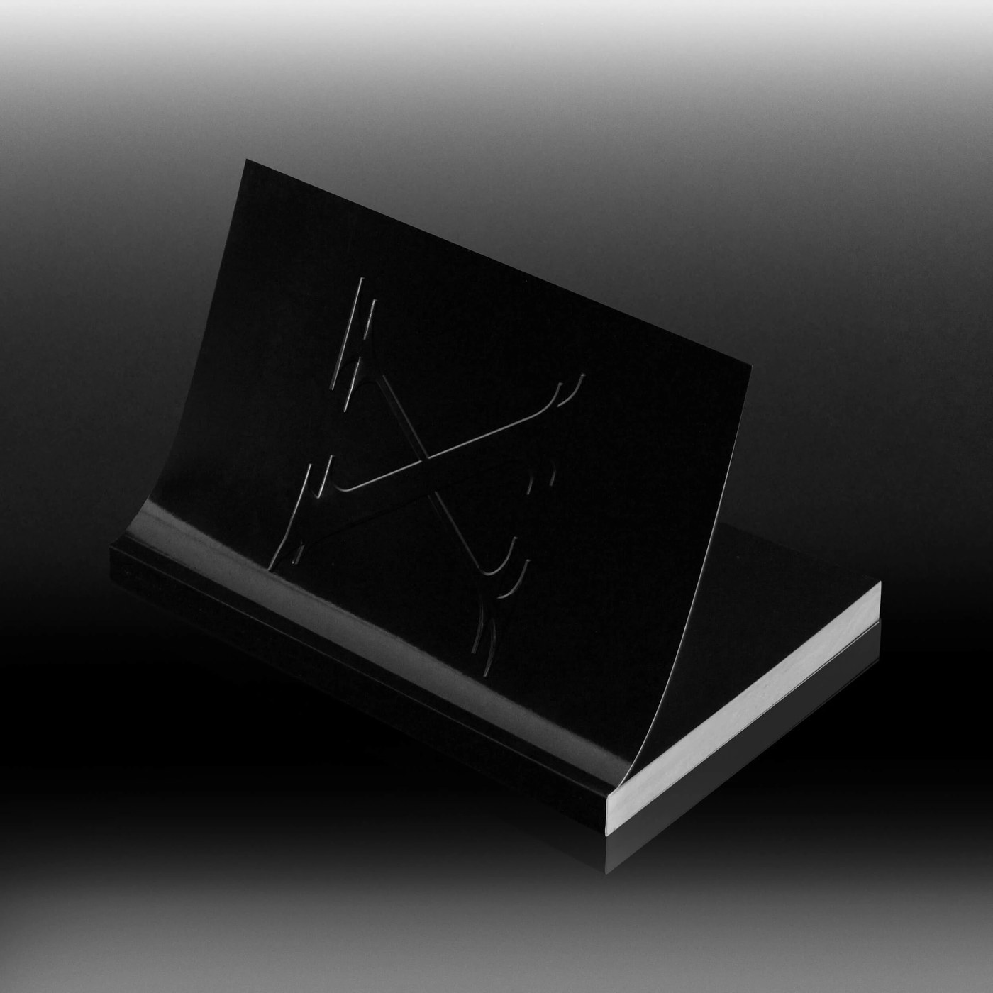
The 200-page publication utilizes a matte black, full gloss cover with a deep blind emboss. The typographic scaling and modular grids are paired with dark, tactile contrast. The interior layout documents this project through rendering, extraterrestrial collage, and technical type specimen spreads. Each page spread contrasts precise baseline alignment with raw texture, capturing the grotesque yet elegant nature of the typeface.
Display serif typeface design details
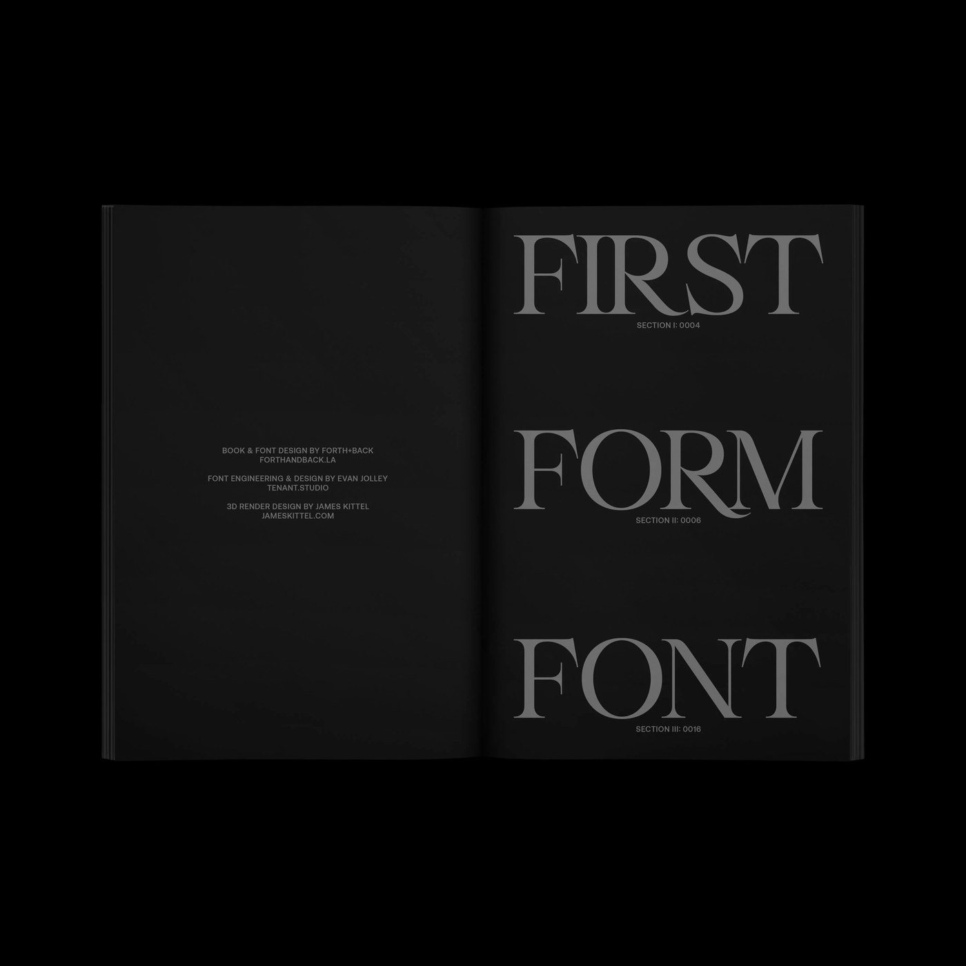
Forth+Back Studio collaborated with font engineer Evan Jolley and 3D designer James Kittel to bring the project to life. The physical publication measures nine by six inches, serving as a functional reference and a sculptural design object. This production framework highlights the tension between biological curves and mechanical structure, positioning Drool within a modern wave of dark typography projects.
The publication design makes use of high-contrast layouts. Bold, single-character spreads are juxtaposed against dense technical data sheets. This editorial pacing maintains reader interest across the massive page count. The production of the specimen reinforces the alien theme by treating ink as a physical fluid, capturing the biomechanical spirit of the typeface in every detail. Designers seeking a display serif typeface design for luxury branding, editorial headings, or packaging designs will find Drool to be a disciplined and expressive system. Designers can use this typeface to establish structural hierarchy on physical layouts and packaging systems that demand tactile contrast.
View the full project on the Behance project.