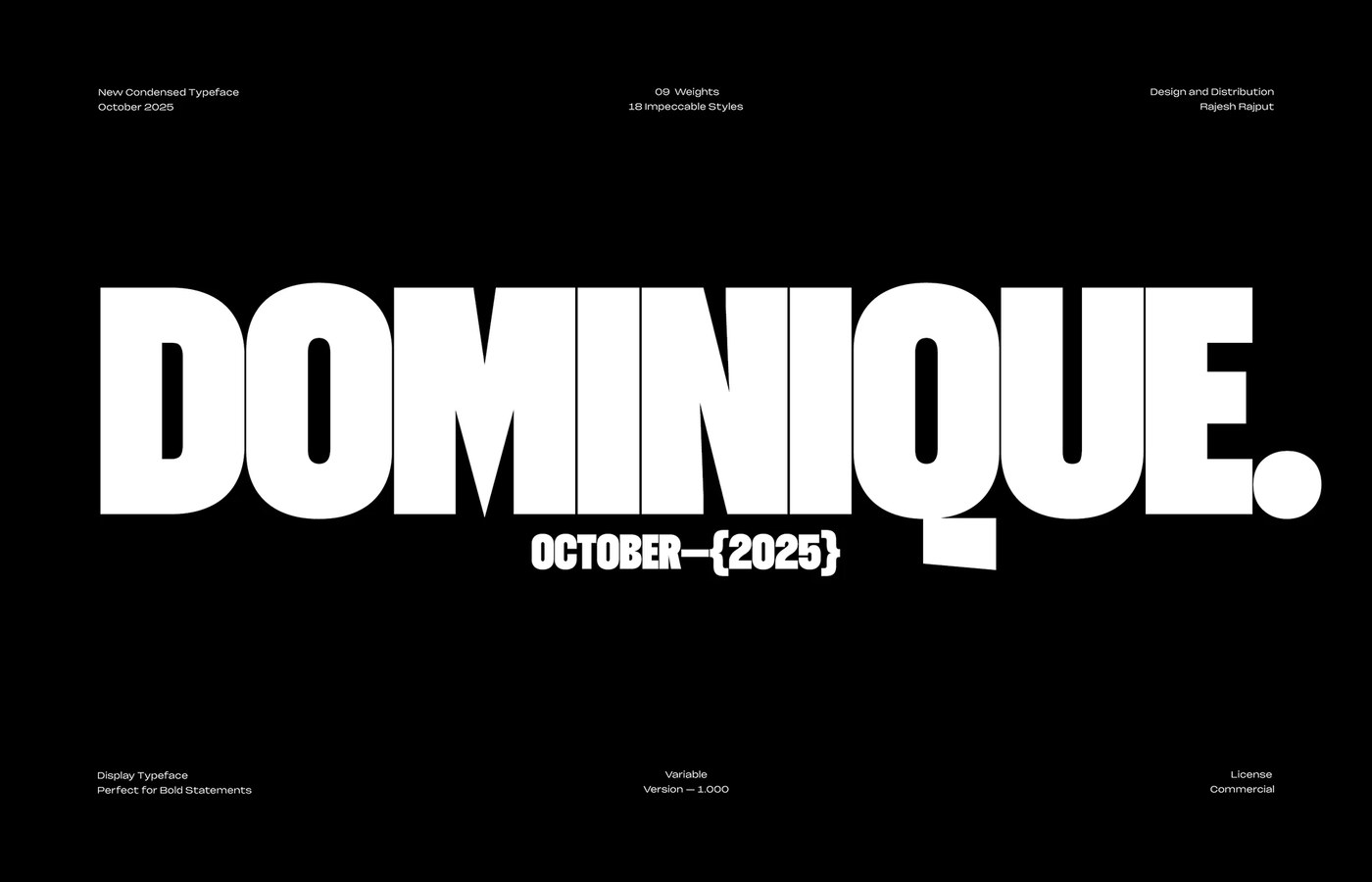
Display Typeface Variable Font: Dominique by Rajesh Rajput
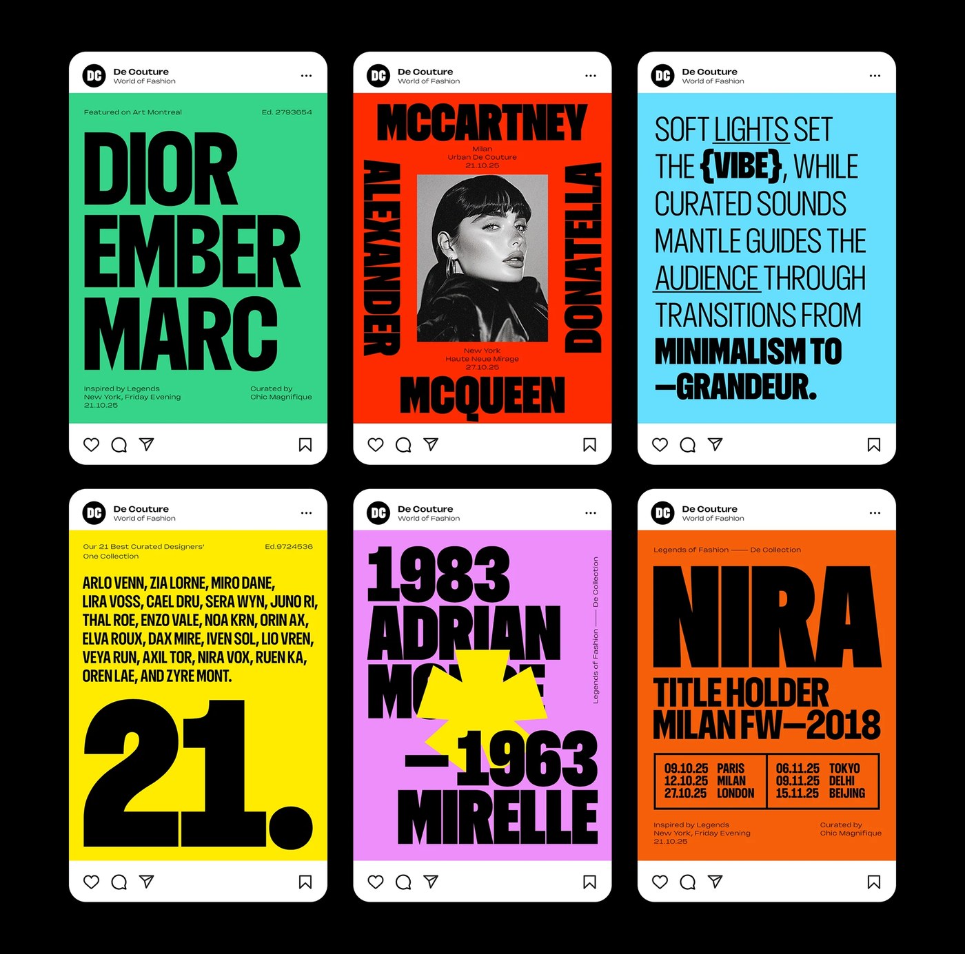
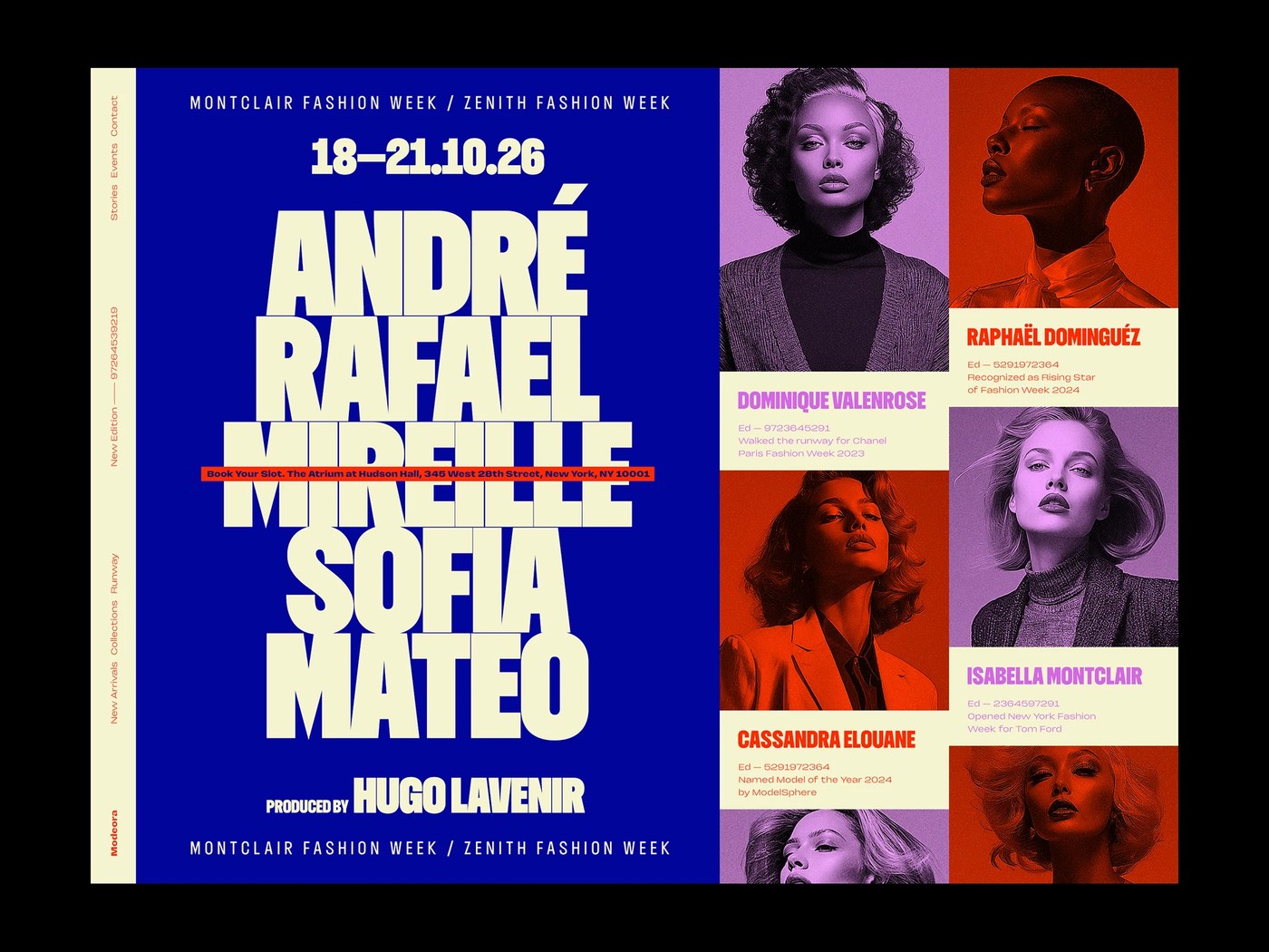
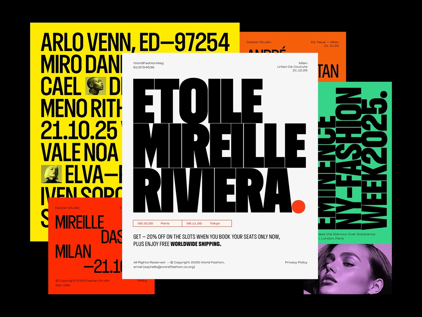
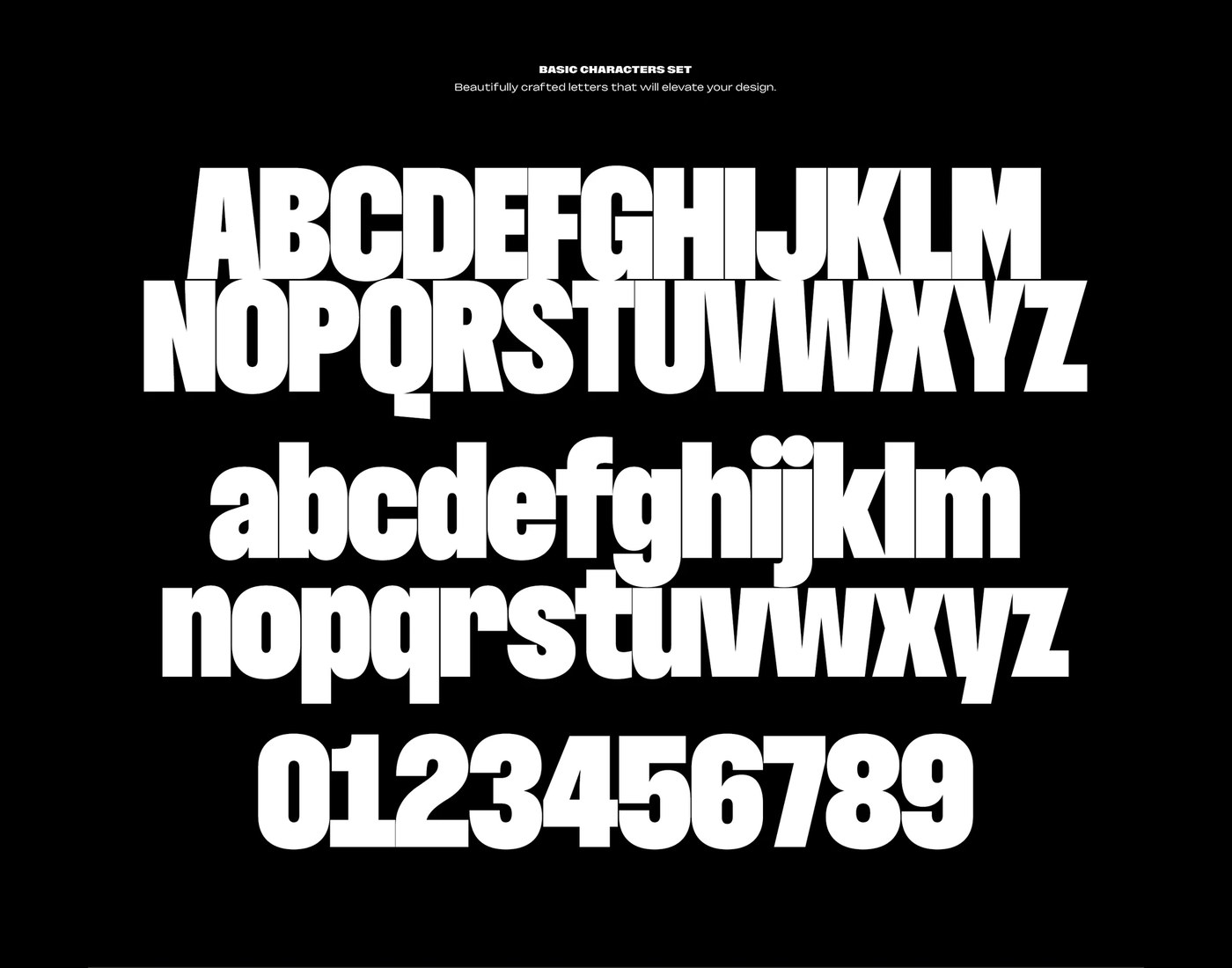
Dominique by Rajesh Rajput is a display typeface variable font. The design treats typographic letterforms as dense, physical structures. It packs eighteen distinct styles along a single variable axis. This specimen delivers a distinct condensed personality. The family commands immediate visual hierarchy across modern digital and editorial compositions.
At display scale, the compressed letterforms function as modular blocks of weight. Rajesh Rajput utilizes density as a deliberate spatial argument. He rejects typical technical limitations. The high-contrast stroke weights and sharp curves transform characters into architectural monuments. The negative space created within the counters forms dramatic, structural voids. These geometric shapes ensure that each word holds outstanding compositional tension. This disciplined structural approach allows the type system to scale cleanly across digital applications.
Architectural Depth in a Display Typeface Variable Font
What sets Dominique apart is the integration of eighteen distinct styles. They are built into a highly cohesive display typeface variable font. The extreme geometric contrast of the stroke weights makes the specimen dissection a fascinating study. Graphic designers can adjust the variable weight parameter. This allows them to define a precise baseline alignment. The curves remain sharp and modern across the entire weight spectrum. The extreme contrast between thin horizontals and heavy verticals ensures maximum visual rhythm. The family provides an excellent typographic scaling solution.
This typeface continues a rich design history of Swiss typographic scaling. The aesthetics are fully optimized for the screen realities of 2026. It excels in corporate identities where space is highly restricted. The designer prioritizes a tight baseline alignment. He uses raw geometric restraint to achieve balanced visual harmony. The specimen serves as a perfect reference for identity architects.
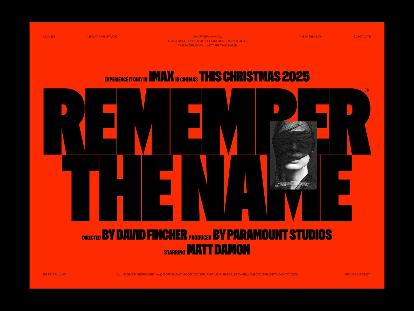
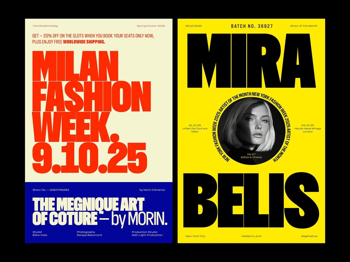
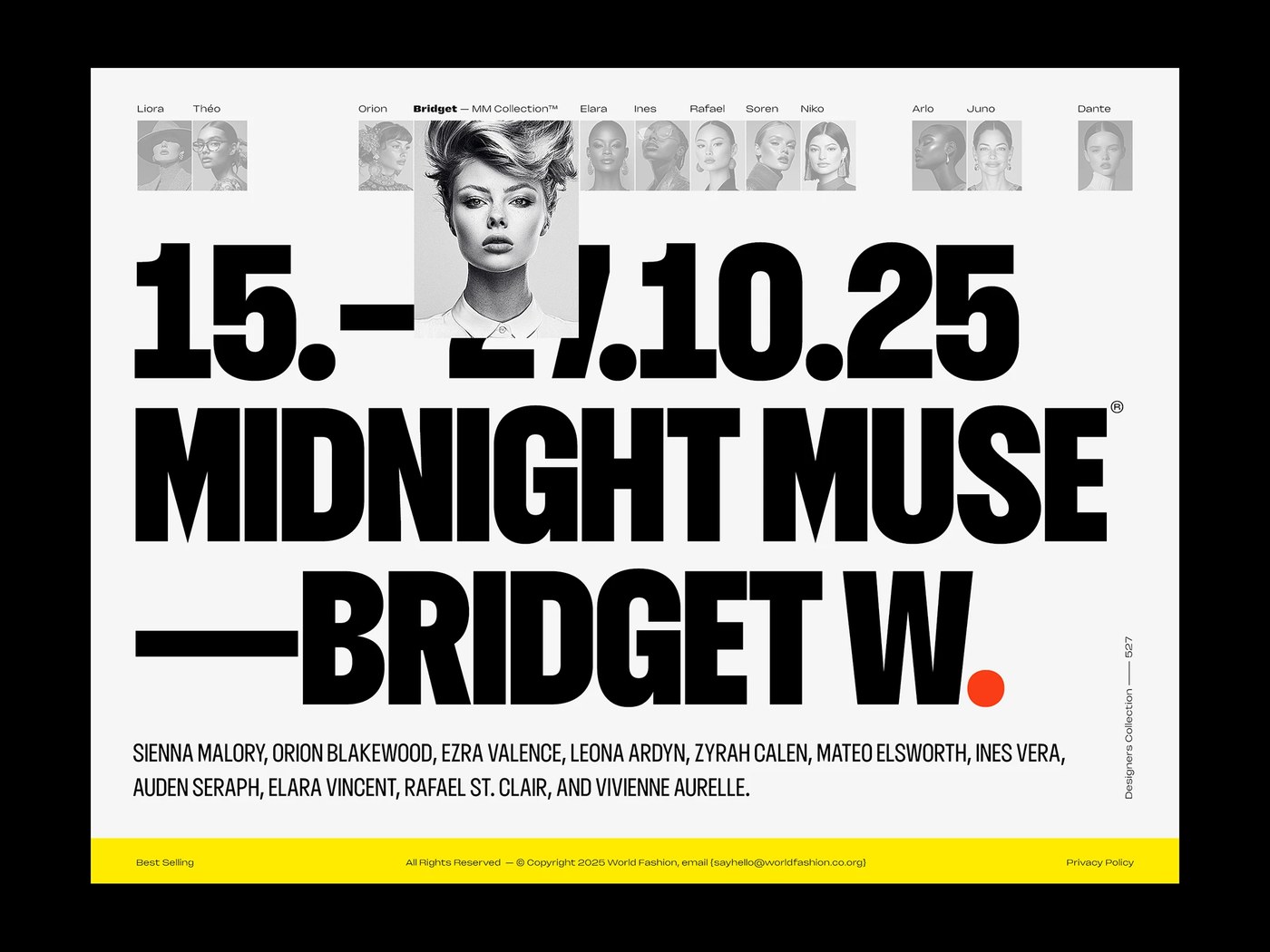
The variable typeface catalog from the studio offers a great resource for digital artists. Designers can combine these condensed letterforms with wider geometric sans-serifs. This combination creates an elegant structural hierarchy in high-impact posters. The family stands out instantly while maintaining readability.
See the full project by Rajesh Rajput on Behance.