Dominique: Condensed Display Variable Typeface in 18 Styles
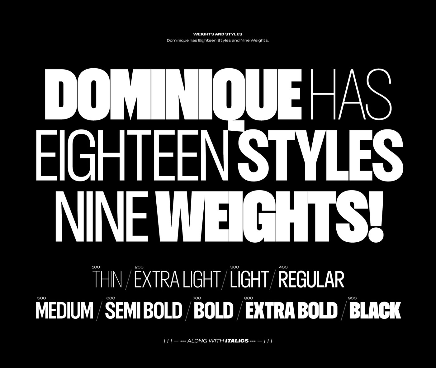
Rajesh Rajput's Dominique is a condensed display variable typeface with 9 weights and matching italics, delivering 18 distinct styles from one font file.
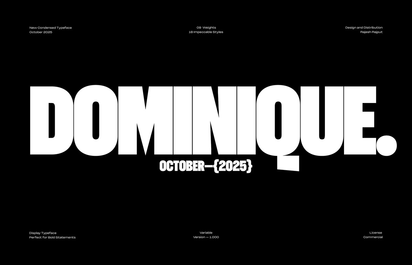
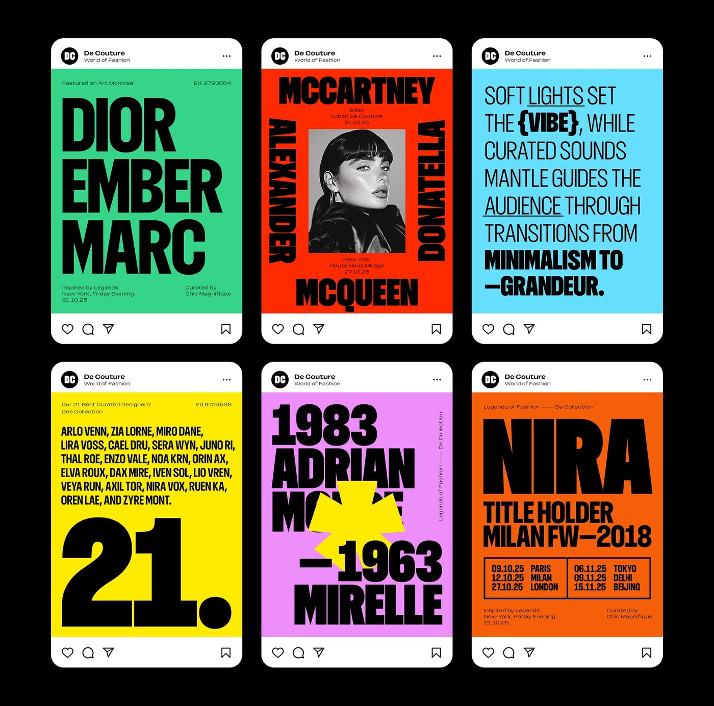
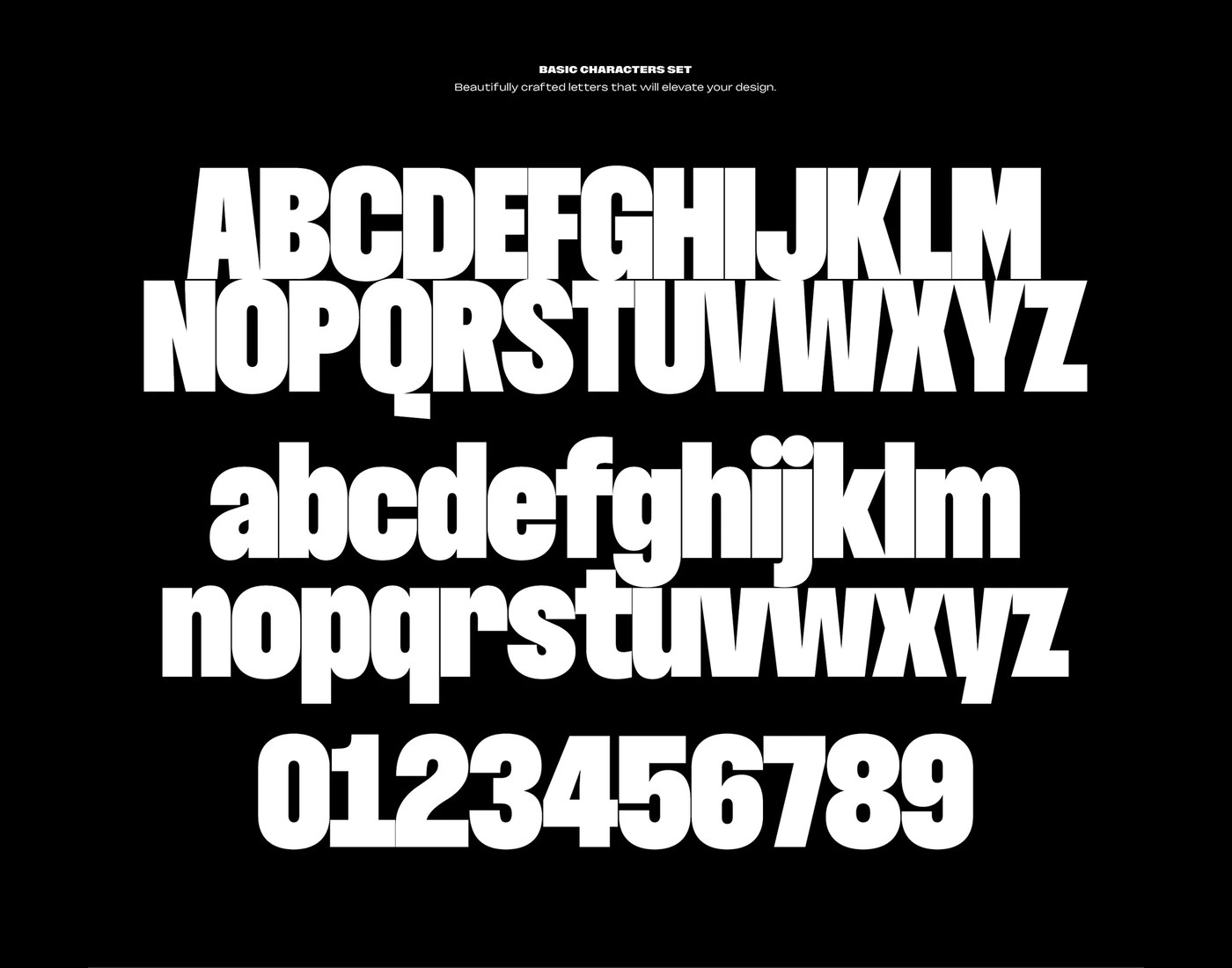
The specimen opens with DOMINIQUE. set in condensed black-weight white on pure black — strokes wide enough at roughly 300pt that the counters read as solid geometric shapes. A three-panel social grid follows: yellow, orange-red, and black backgrounds, each carrying a single word at full-bleed scale. MARC. MCQUEEN. MINIMALISM TO —GRANDEUR. The condensed proportion does the compositional work; no other element competes. Rajesh Rajput rounds out the specimen with a full a–z and 0–9 set on black, each character at around 200pt — stroke width, counter shape, and condensed proportion consistent across the whole set — confirming the condensed display variable typeface holds its logic at every character.
Dominique Condensed Display Variable Typeface: 18 Styles, One Axis
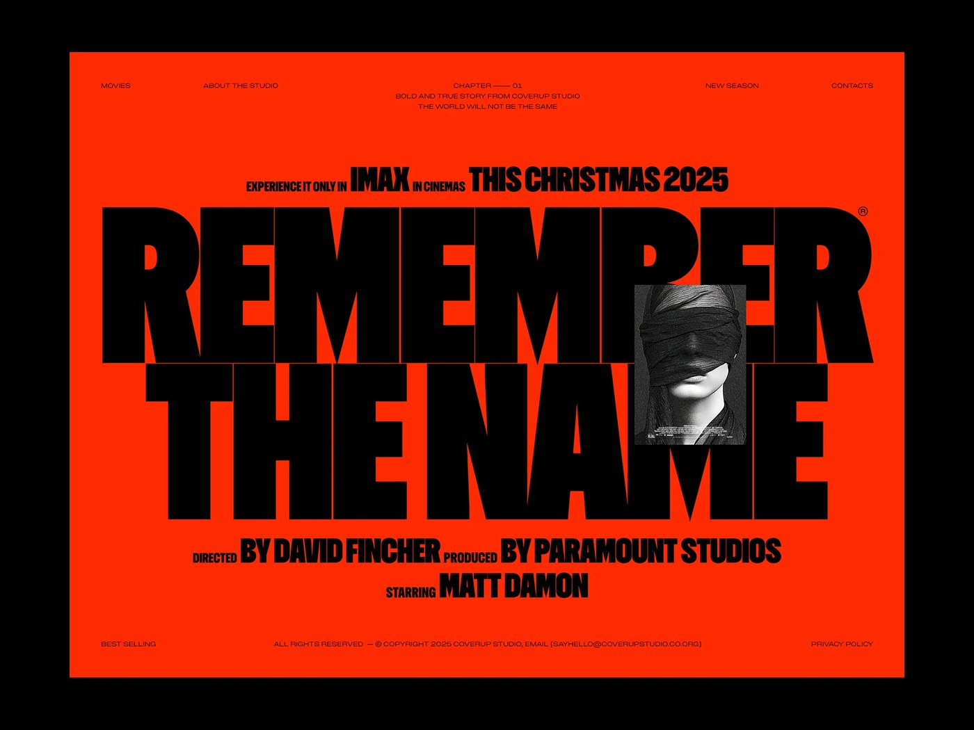
The variable axis runs through those 9 weights in a single file — from text-weight condensed all the way to the poster black that reads at 10 meters. Each weight pairs with a matching italic, giving the condensed display variable typeface 18 styles without 18 separate files. A fashion poster mockup places MILAN FASHION in red condensed type on warm cream beside MIRA in black on yellow — the condensed display variable typeface works equally well at single-word and multi-word scale. NEW YORK in massive black across a teal field, letterforms cropped at frame edges, shows what happens when scale becomes the design decision. See the full project by Rajesh Rajput on Behance.