Driving Conversations Visual Identity
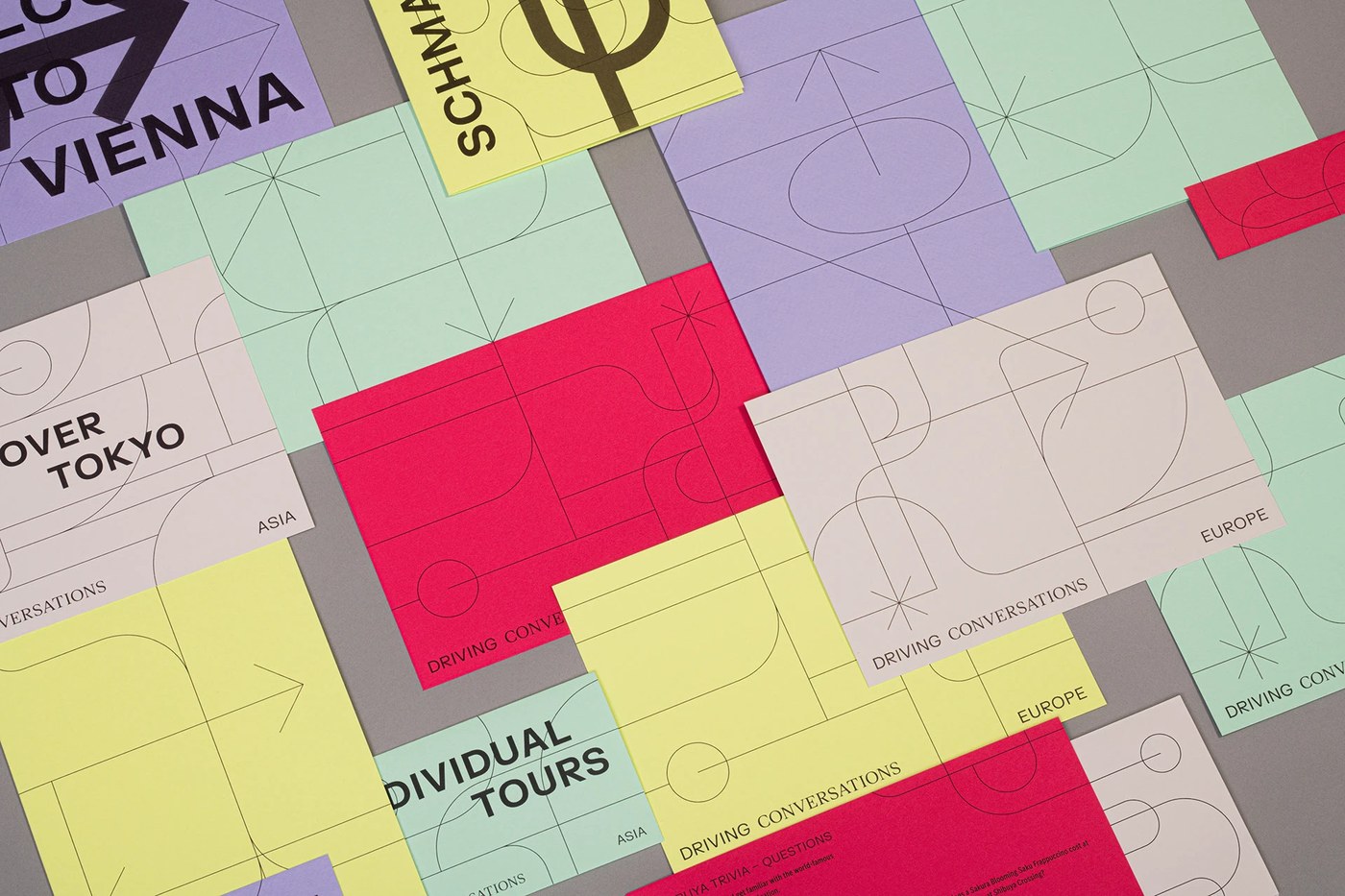
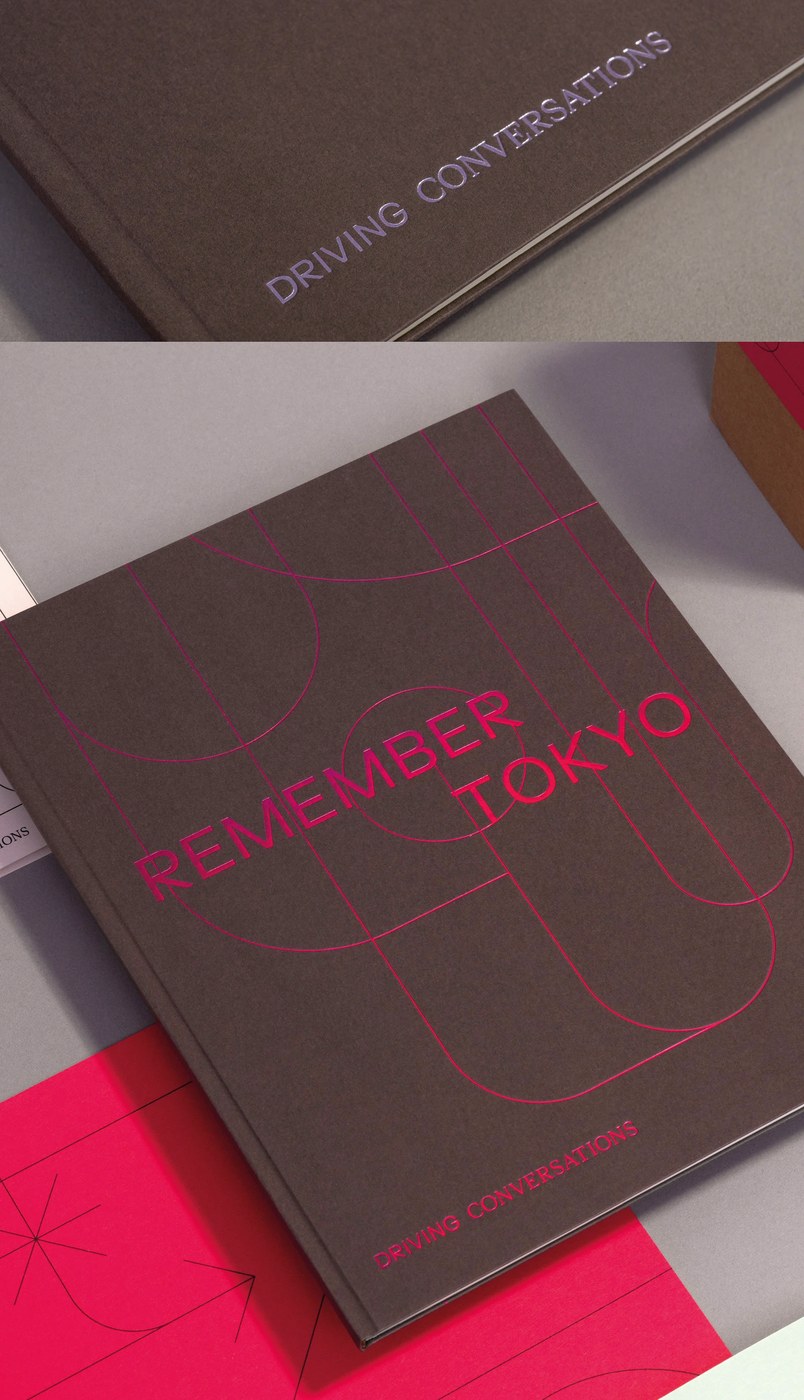
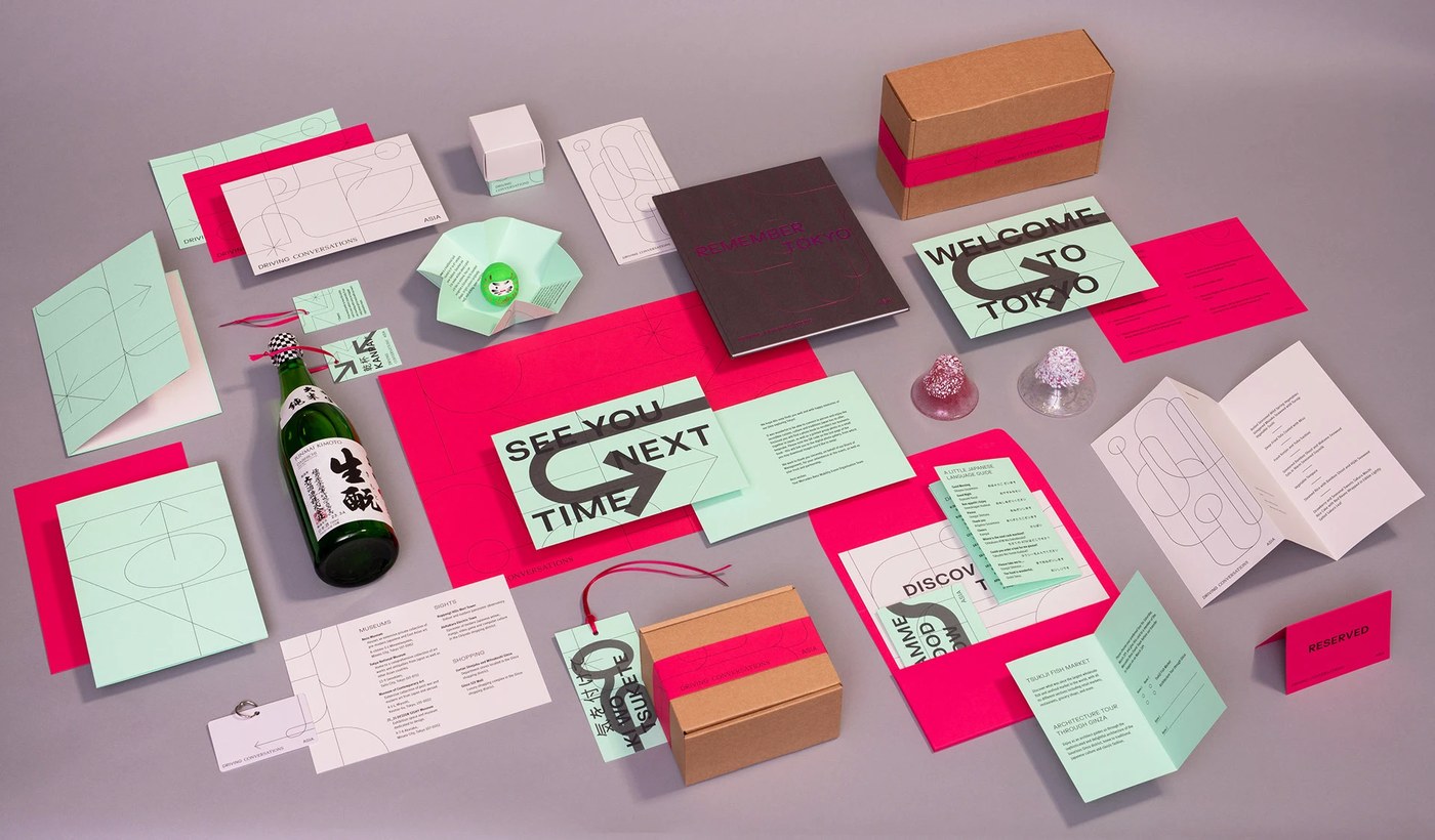
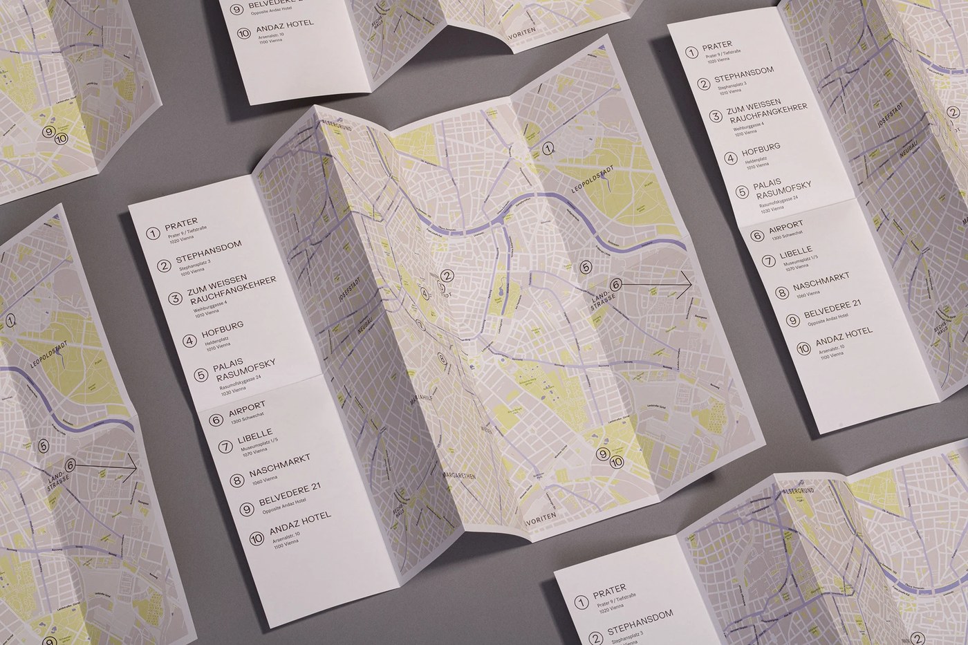
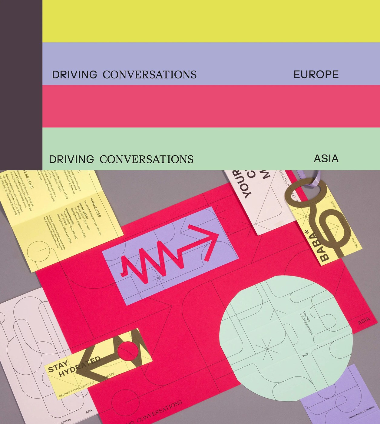
Paperlux Studio created a compelling visual identity for the World Partner Forum, using geometric paths to symbolize the flow of information. The project, titled "Driving Conversations," uses graphic simplicity to anchor complex event communication across multiple cities.
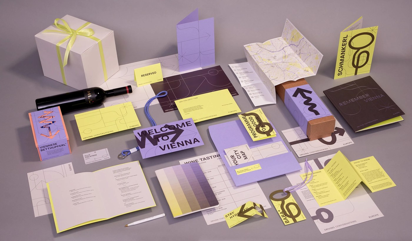
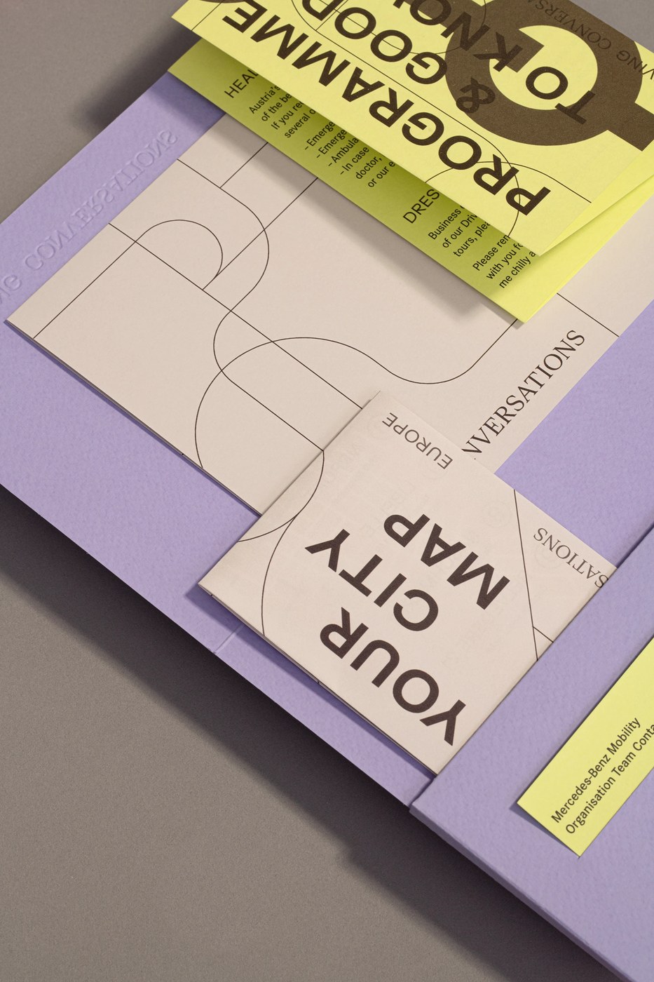
The visual system relies on a network of thin and thick lines that mimic running routes or urban maps. These paths intersect and diverge across the layouts, creating a sense of movement and direction. The studio developed two distinct color palettes to differentiate the Vienna and Tokyo editions of the forum, using high-contrast combinations like yellow and violet or red and mint green.
Tactile Visual Identity and Patterns
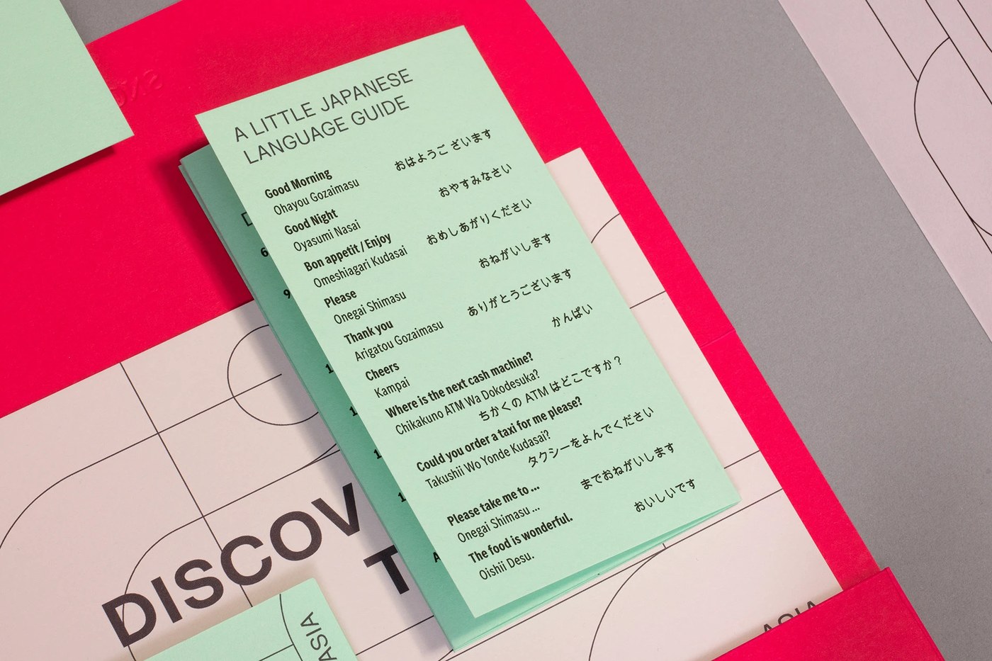
Beyond the digital application, the identity shines in its physical execution. Interactive booklets are designed to be folded in various ways, allowing participants to create their own patterns and paths. This hands-on approach reinforces the theme of active engagement and the evolving nature of dialogue within the forum.
More work at Paperlux Studio.