Entrelinhas Brand Identity Design by Chá de Bold Estúdio
Chá de Bold Estúdio’s identity for Entrelinhas pairs a custom ligature wordmark with halftone portraits and a striking maroon-to-violet palette.
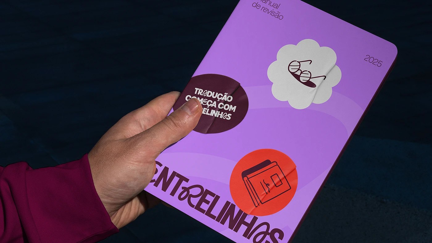
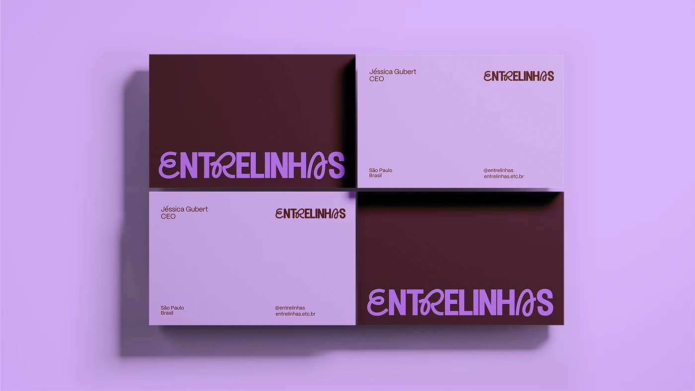
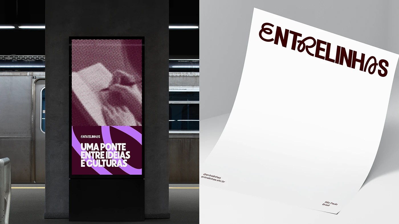
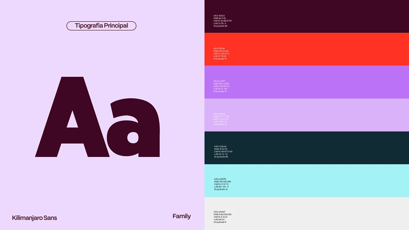
The brief for Entrelinhas was unconventional: a translation company operating simultaneously within corporate professional services and gaming subculture. Chá de Bold Estúdio resolved this tension directly through the typography. The wordmark sets ENTRELINHAS in Kilimanjaro Sans—a condensed display face—but replaces the R with a custom, outward-opening ligature. The crossbar peels back like a parenthesis, transforming the letterform into both a functional glyph and a literal metaphor for reading between the lines. In sharp contrast, PP Mori handles the body copy hierarchy at a precise, utilitarian 7pt. The identity balances both weights effortlessly.
Brand Identity Design Built From the Inside Out
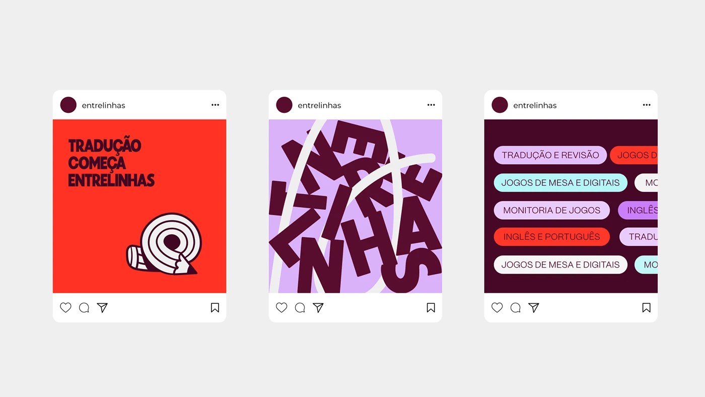
- The Palette: The color strategy runs from a deep maroon (
#402723) to an electric purple (#b072f7) and soft lavender (#d8b1f7), accented by a vibrant orange-red (#ff3224) for campaign focal points. - The Imagery: The halftone portrait treatment—featuring human faces dot-screened at roughly 60% purple over maroon—anchors the identity in print culture, evoking the raw texture of risograph or letterpress printing rather than a clean digital screen.
Across secondary applications, fragmented typography tumbles across lavender layouts at an intentional 300pt, treating individual glyphs as structural architecture. The final result feels entirely credible as a professional service, yet delightfully strange enough for the gaming world—occupying a space that modern print culture often misses.
See the full brand identity design project by Chá de Bold Estúdio on Behance.