Essence Visual Identity System Built on Structural Restraint
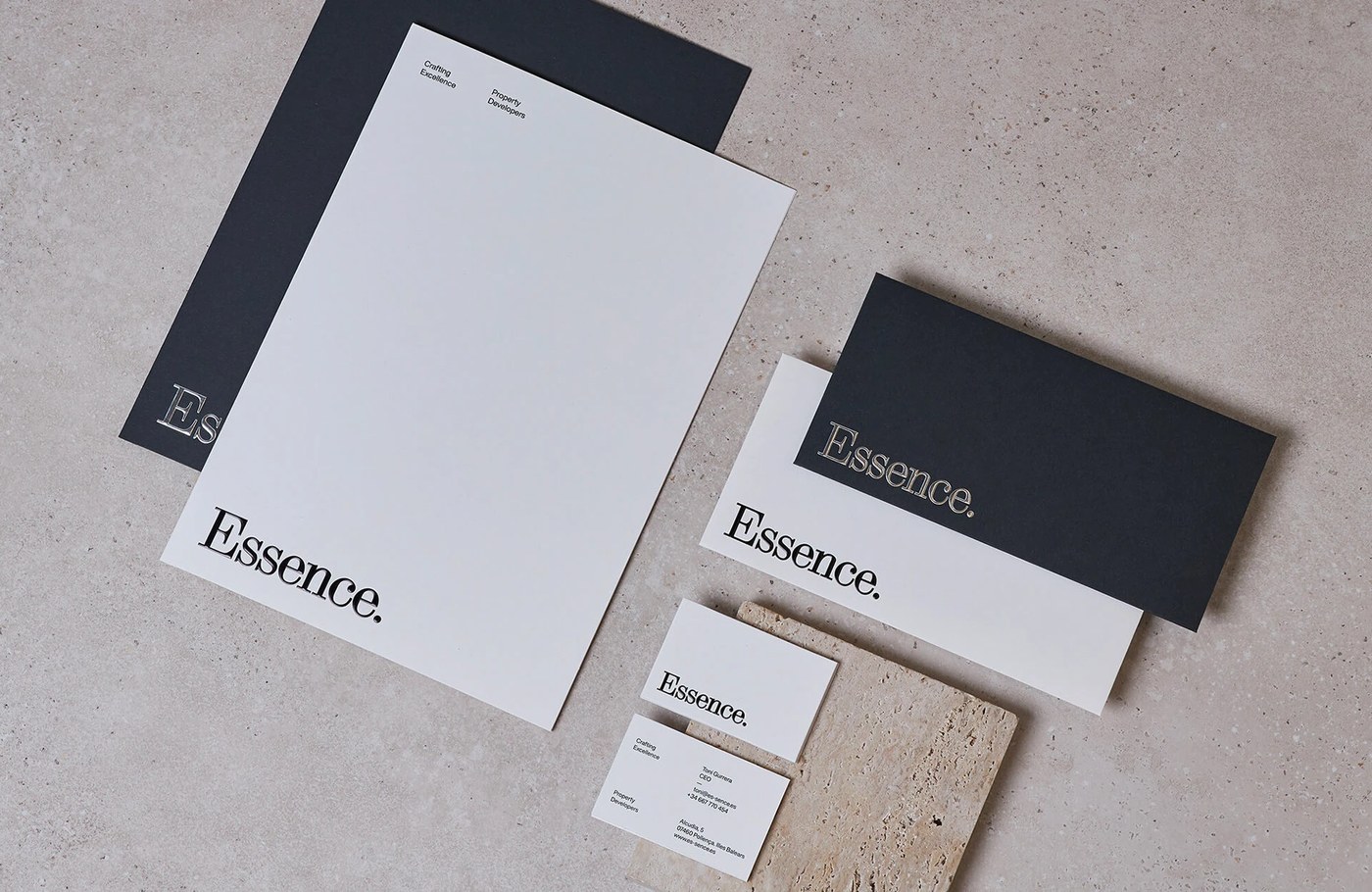
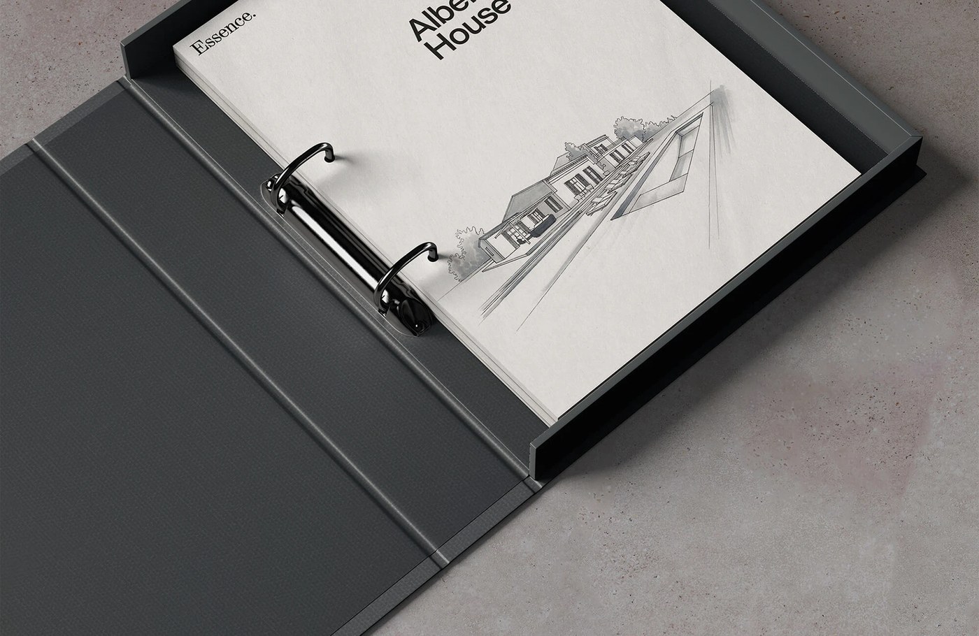
Enrique Presa Studio defines the Essence visual identity system, where structural layouts, micro-typography, and raw textures balance negative space scale. Grounded in architectural property development, the brand design acts as a bridge between structural rigor and visual restraint.
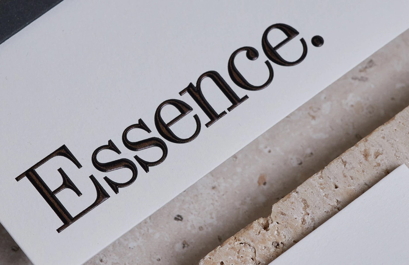
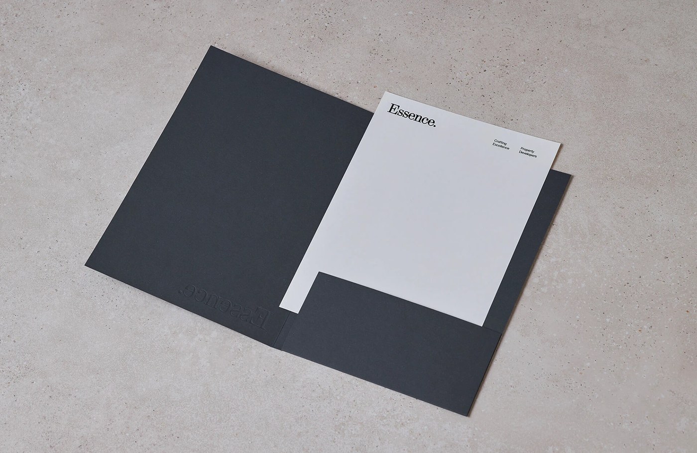
The composition leverages a modular grid system that echoes the geometric precision of the property architecture. A high-contrast grotesque typeface anchors the typographic hierarchy within the visual identity system, utilizing tight letterpress-like kerning for the logotype alongside generously tracked sans-serif utility captions. This typographic scaling creates an intentional structural hierarchy across stationery, editorial binders, and architectural assets. Raw tactile finishes—such as debossed lettering on heavyweight uncoated paper and blind-embossed textures on natural board—give the physical touchpoints a solid, physical mass. The chromatic scheme utilizes near-monochrome restraint to ensure the branding system never distracts from the visual weight of the architectural projects.
The Architectural Geometry of the Visual Identity System
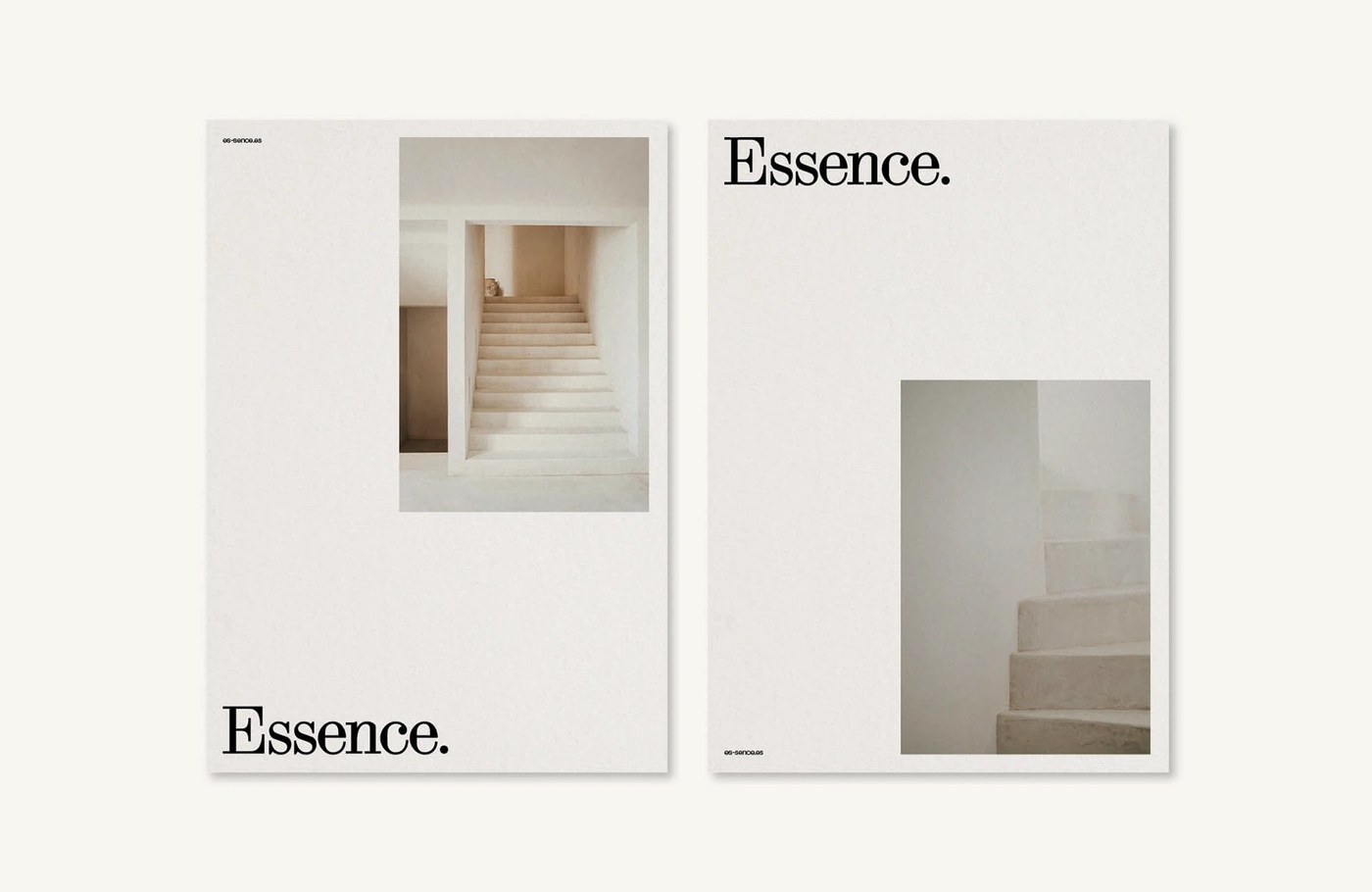
Based in Palma de Mallorca, Spain, Enrique Presa Studio is recognized for aligning brand design with spatial and physical environments. For Essence, the visual identity system works not merely as a logo but as a physical realization of architectural intent. By allowing the logotype to recede into the grid margins, the studio achieves a visual rhythm that values space as much as structure.
See the full visual identity system project by Enrique Presa Studio on Behance.