Foundation Coffee Roasters: Sample Box Packaging Design
Natalia Balabash’s coffee packaging design for Foundation Coffee Roasters treats the sample box as a layout problem: every panel composed, no weak sides.
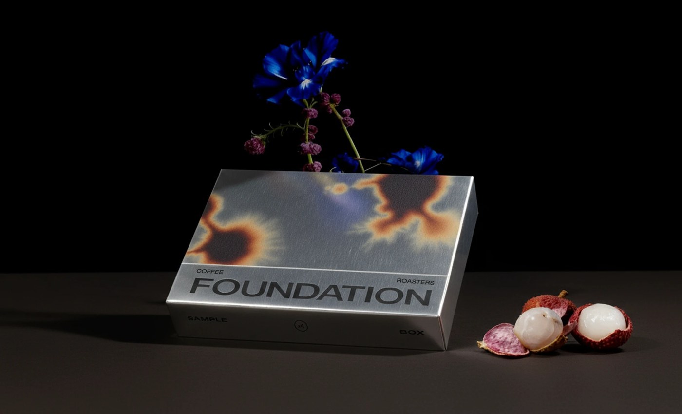
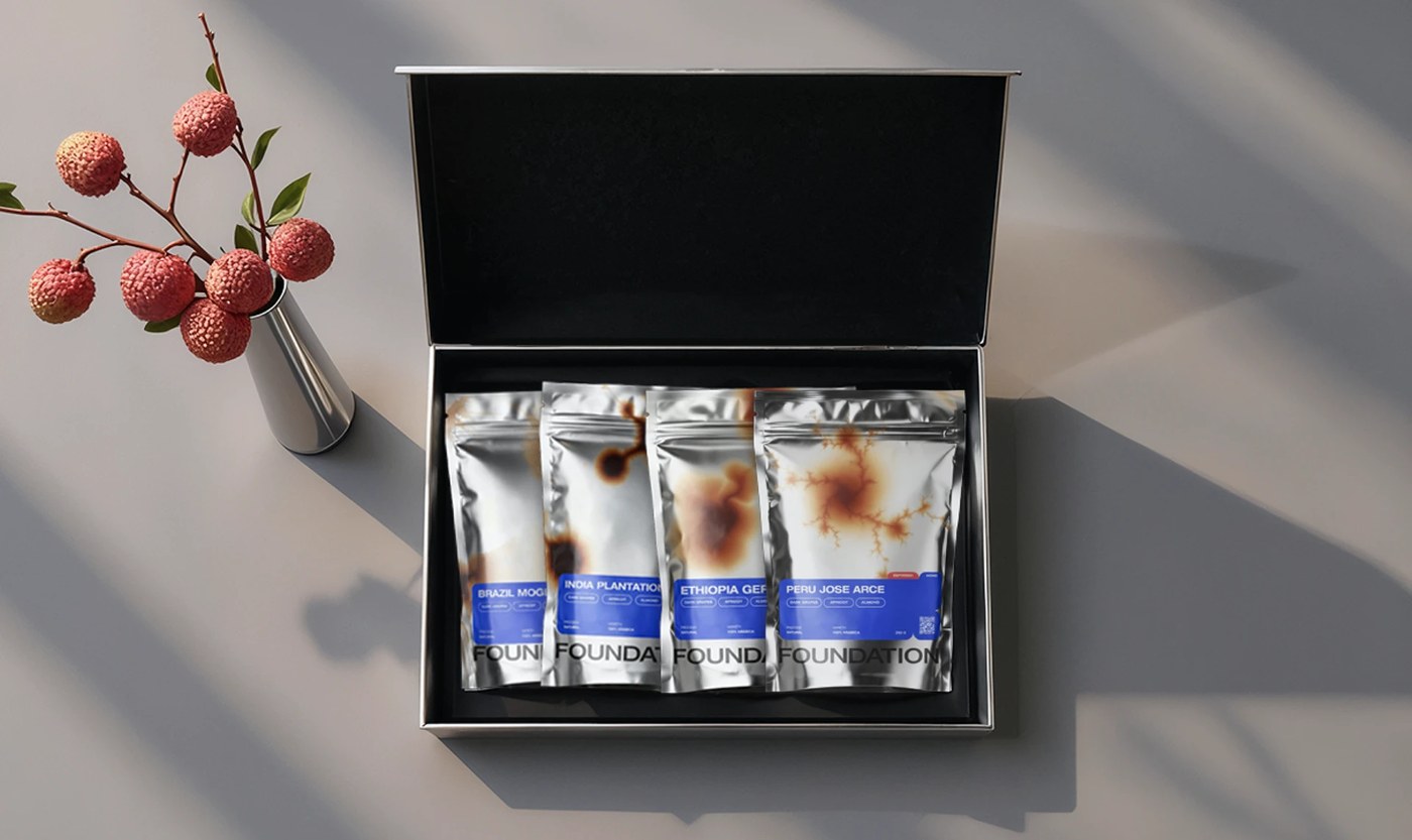
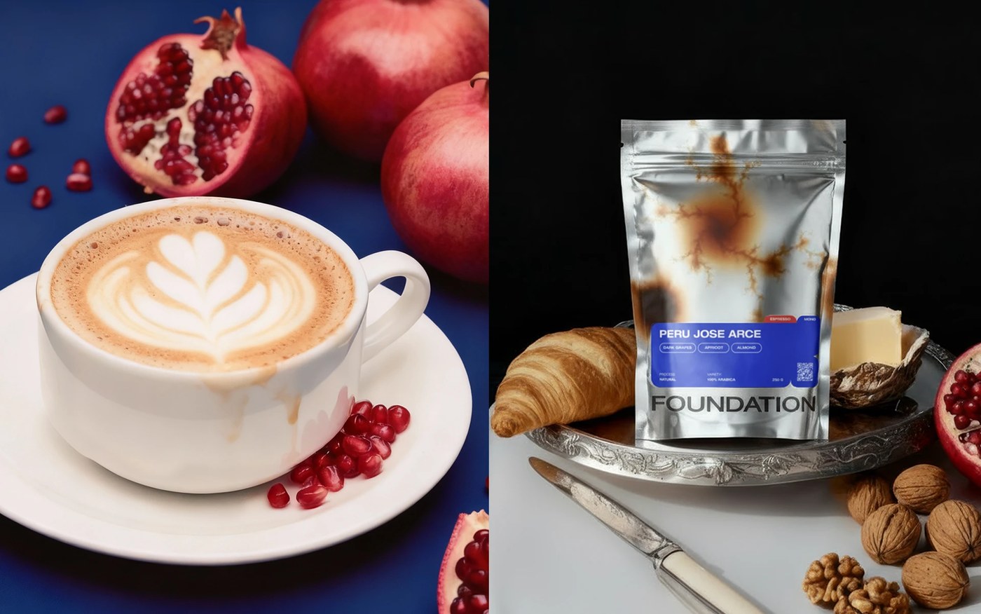
The rigid metallic slide-open box carries a single graphic on its face: a scorched amber-and-blue thermal pattern that occupies most of the lid, with a condensed grotesque wordmark anchoring the lower panel. Nothing else. The four brushed-silver foil pouches inside each carry a version of the same burn mark — the diffusion shifts per variety, so Brazil reads darker and more intense, Ethiopia lighter and more diffuse. A structured blue label panel locks the lower third of every bag: bold condensed white type announces origin at 28pt, and small rounded pill tags carry the tasting notes. The coffee packaging design holds because the grid is the same across all four bags and the outer box. The constraint is total — and that’s exactly what the sample box needed.
How Foundation Coffee Roasters’ Sample Box Brand Identity Holds Together
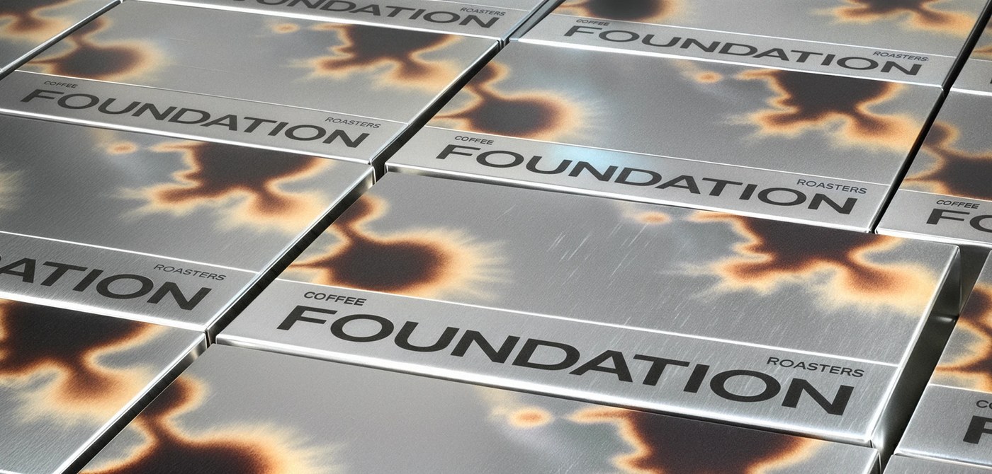
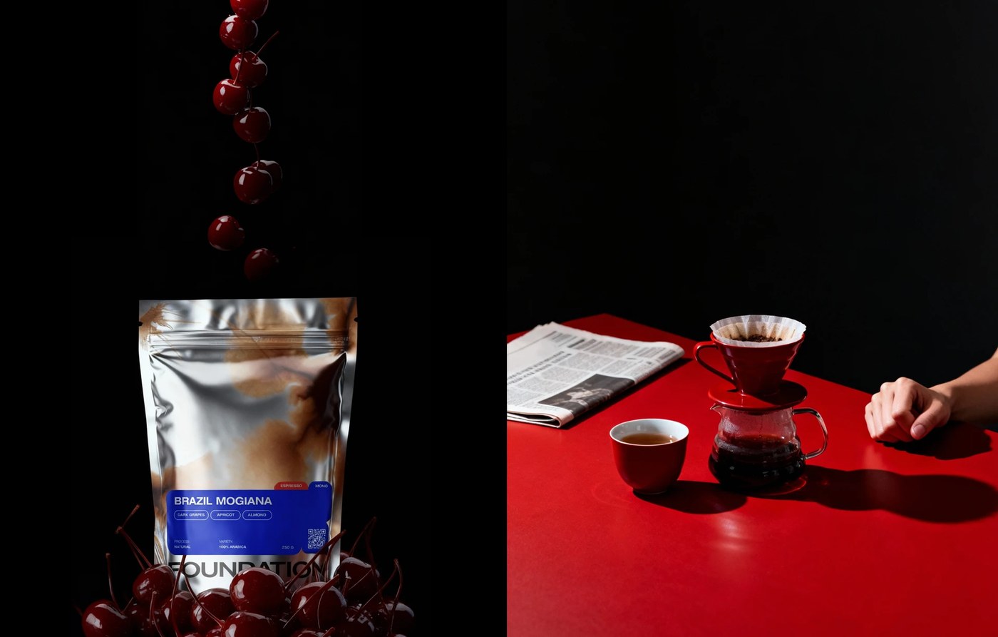
The still-life photography doubles down on the label logic. Each variety is staged with props that mirror its tasting notes directly — Brazil with deep-red cherries, Peru with croissant and pomegranate on a silver tray. Stack six boxes at an oblique angle and the repeating thermal pattern runs like a textile. Pattern plus wordmark is the entire coffee packaging system. No illustration, no secondary palette, no ornament. Natalia Balabash built a sample box brand identity that holds at every scale because the rules never relax.
See the full project by Natalia Balabash on Behance.