Genevitta's Brand Identity System Transforms Wellness
Brandigno® redesigns Genevitta with a living brand identity system where the letterform "g" becomes a continuous visual link. The new brand identity system evolved beyond simple nutrition into a full wellness ecosystem.
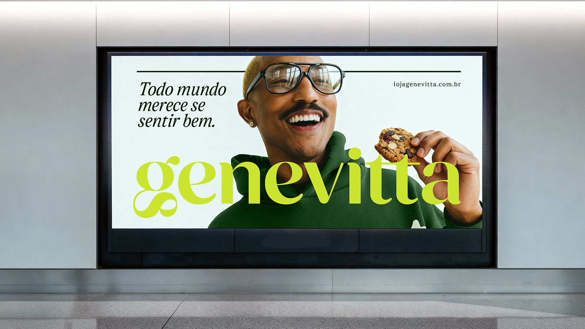
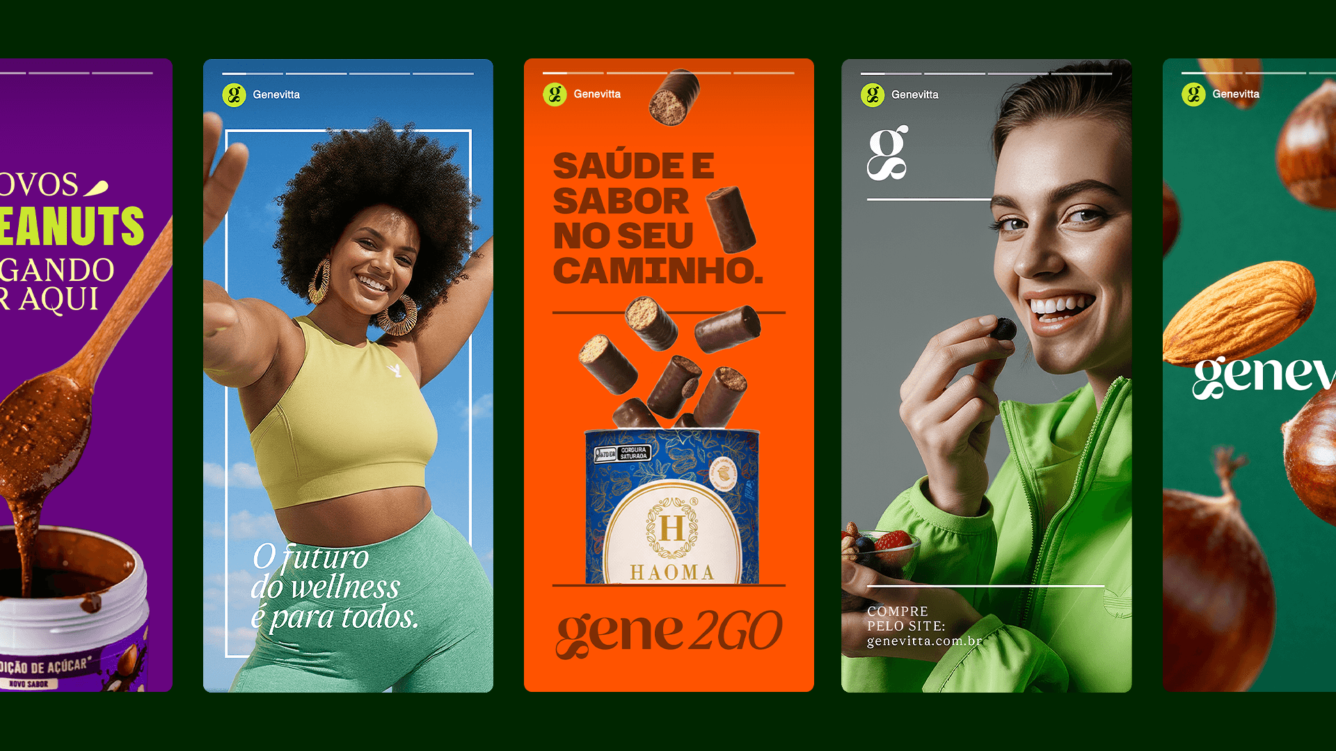
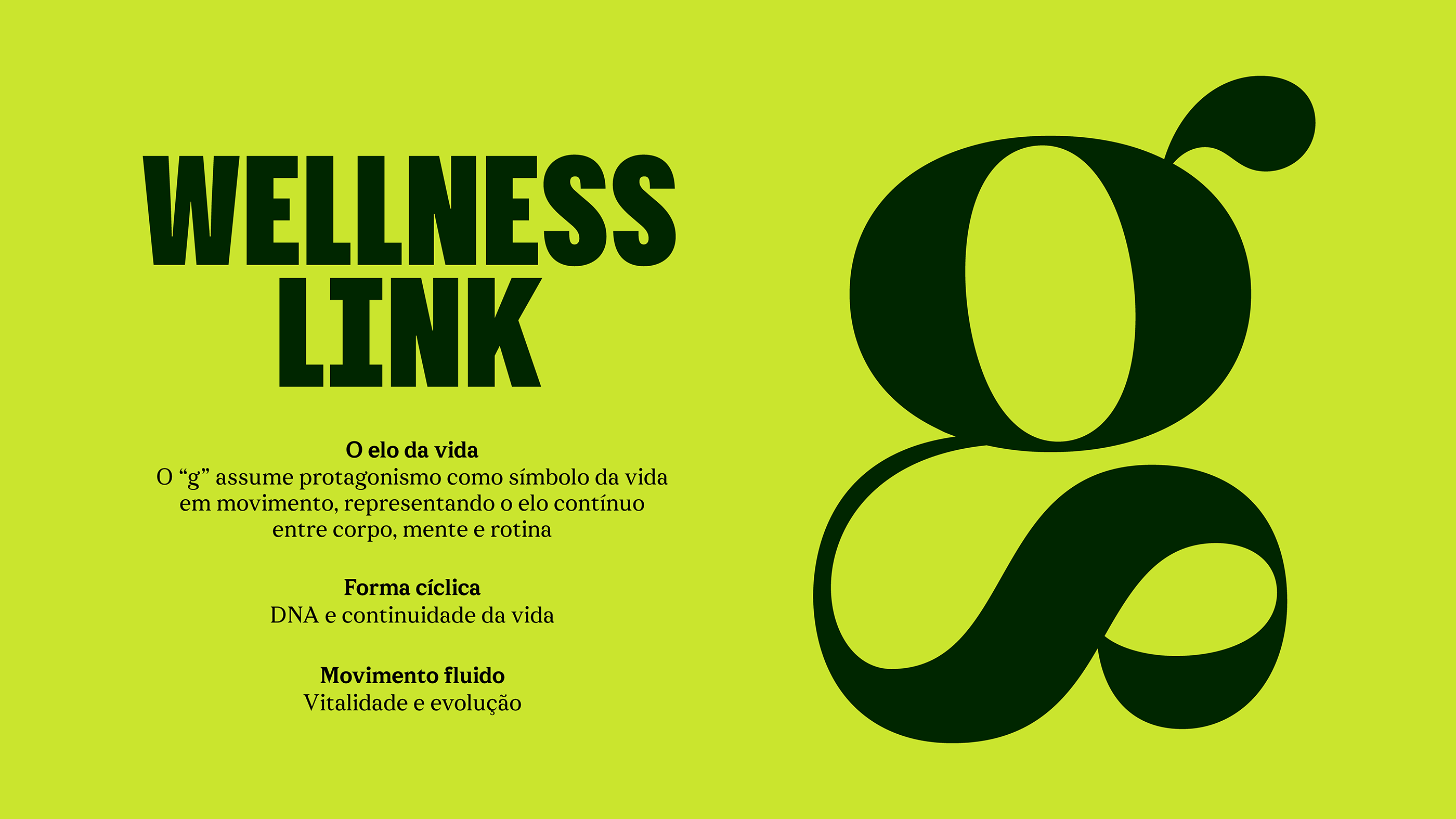
The São Paulo studio made one structural choice that drives the entire brand identity system: take the letter "g" and transform it into a loop. That loop becomes the signature—appearing in logos, apps, packaging, and environmental installations. It's a constraint that creates cohesion. The color palette shifts too. The original Genevitta green goes deeper, more timeless. Less energy drink, more foundational health. Three sub-brands (Genefit, Clube Nutregene, Gene2Go) inherit the system and adapt within it.
A Visual System That Scales
The brand identity system spans digital interfaces, stickers, signage, and retail touchpoints. Each application demonstrates how the core "g" device and color strategy remain recognizable without repetition. This is what a brand identity system should do—hold a clear intention while accommodating different contexts.