Grandiose Collection: Glassware Brand Identity by Benaglia
Grandiose Collection glassware brand identity by Agostina Benaglia uses a bold condensed serif and four radial gradients across packaging and print work.
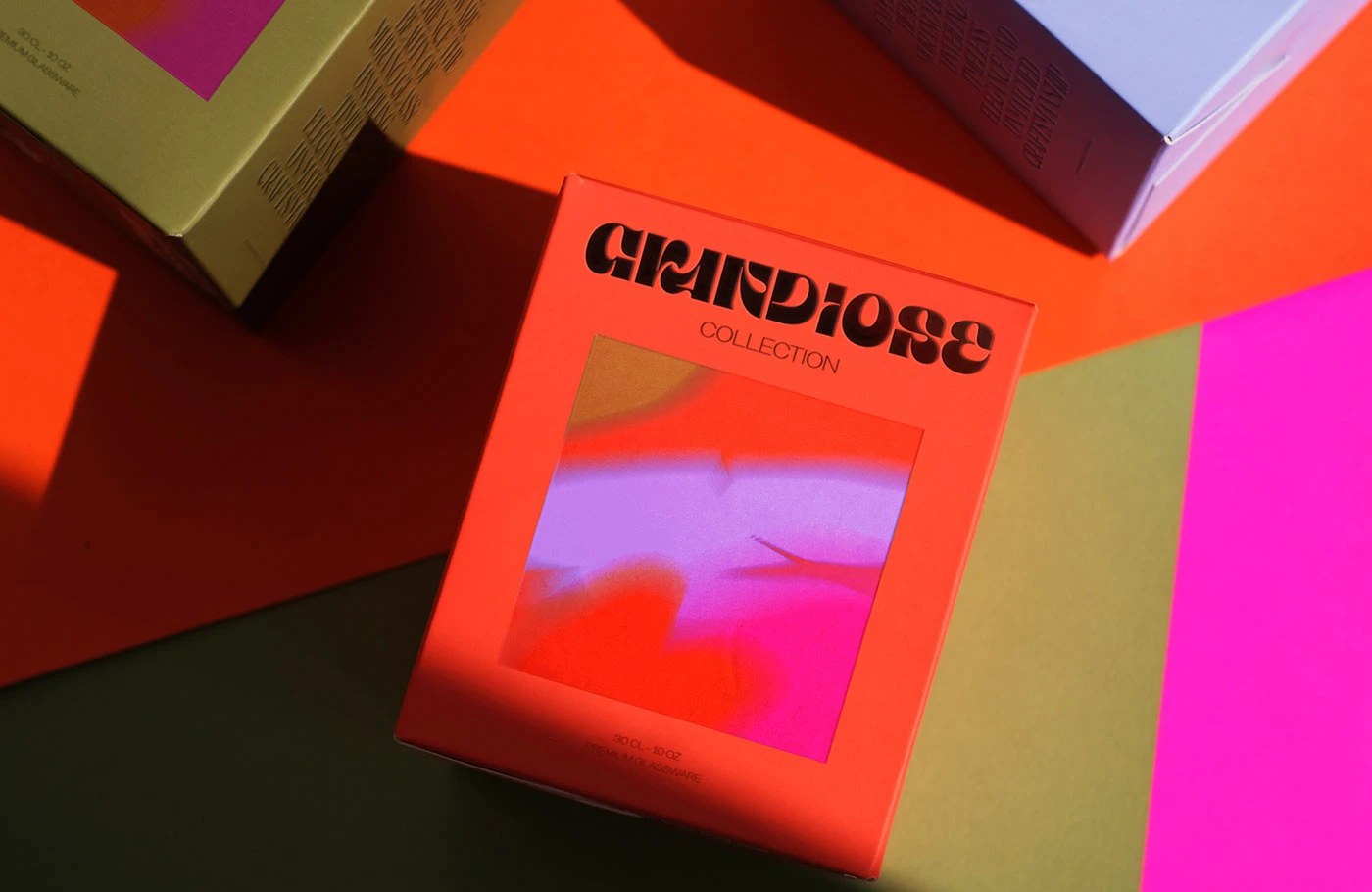
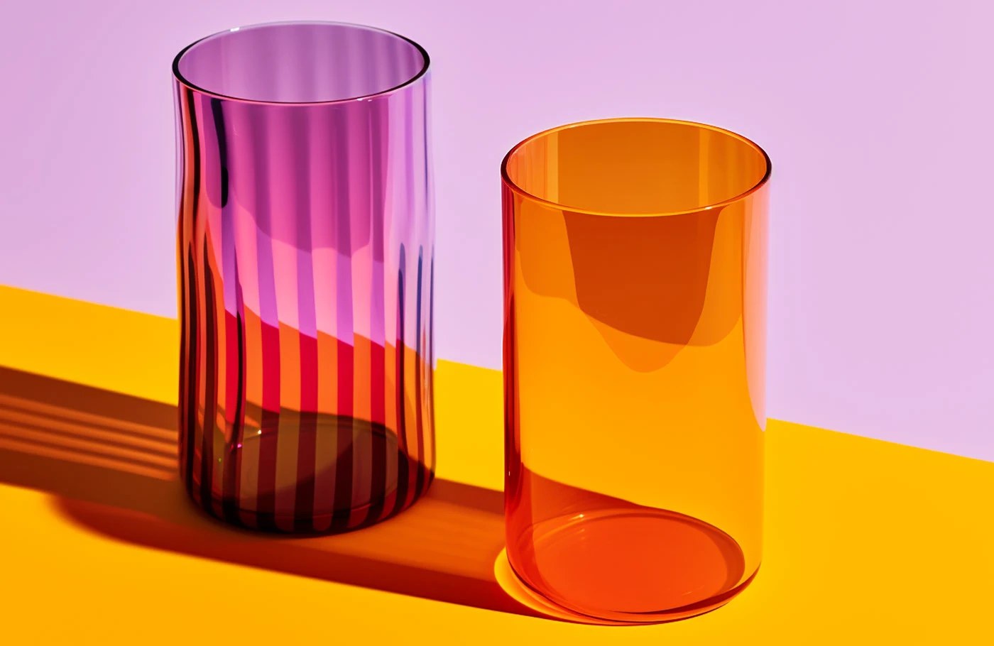
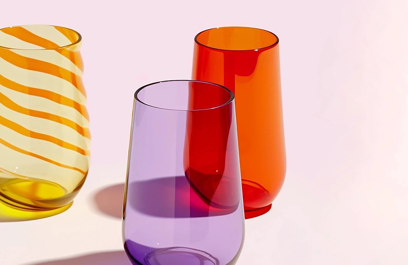
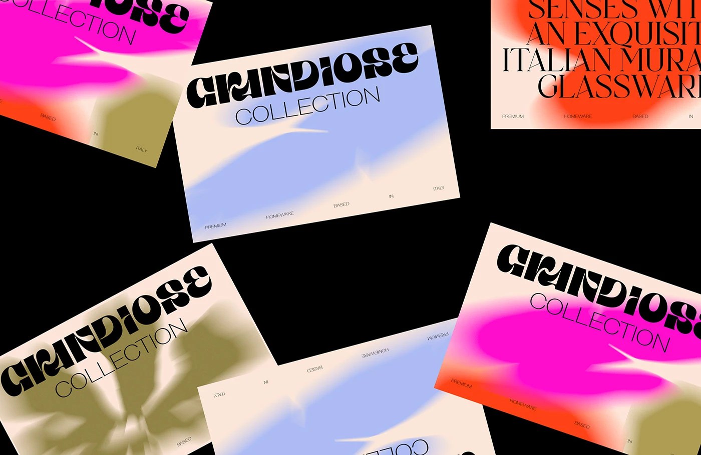
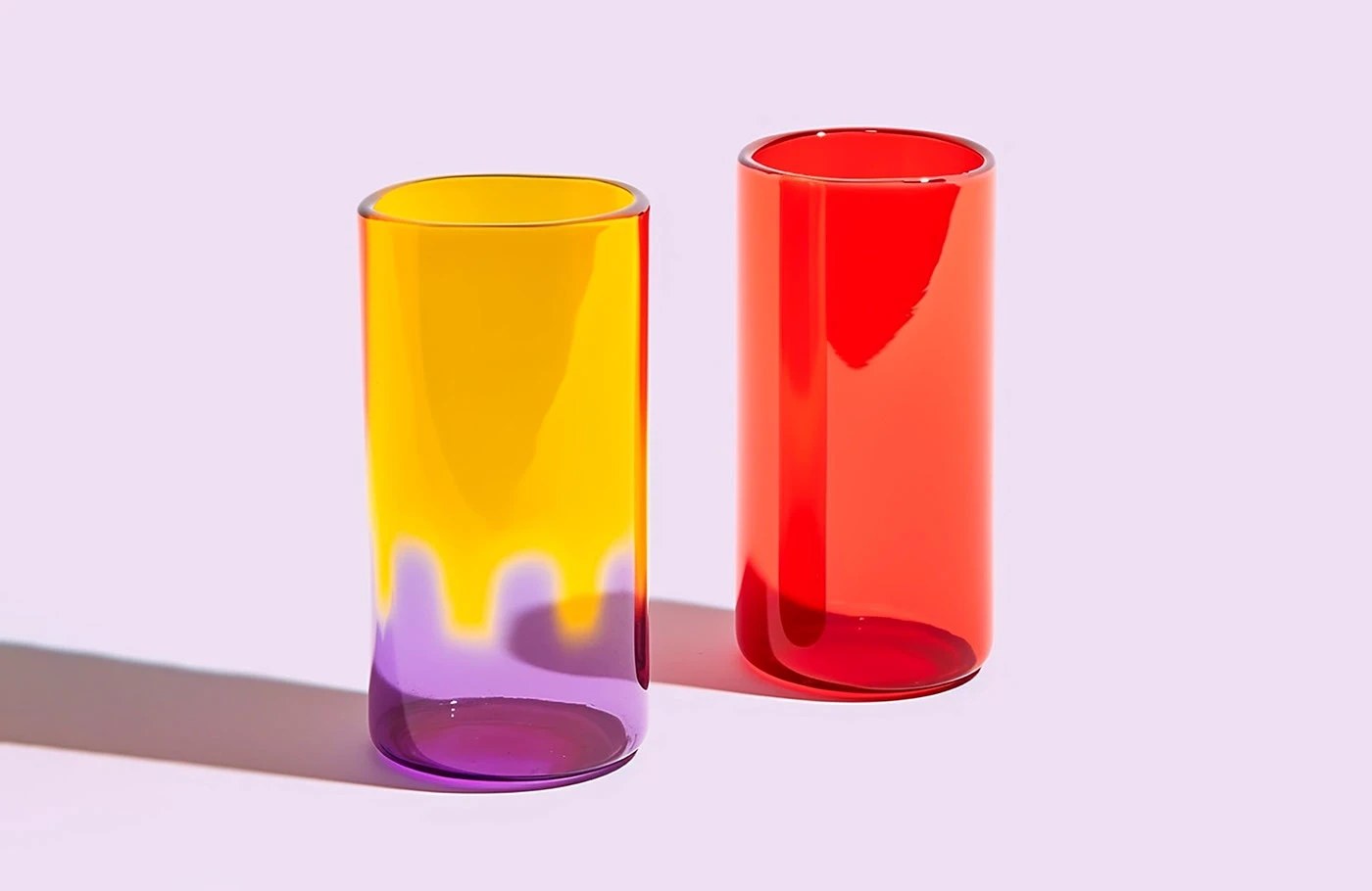
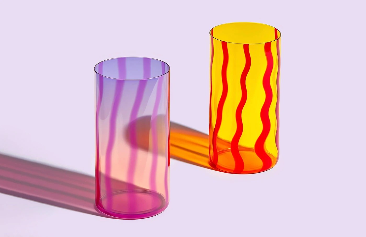
The logotype sets the register immediately: GRANDIOSE in a high-contrast condensed serif with inline cutout counters, black on every background, weight pressing against the letterform edges. DOMINGO. Creative Studio built this glassware brand identity around four chromatic fields — hot magenta, vermilion, olive, and lavender — deployed as radial gradients that bleed into packaging interiors, collateral cards, and animated sequences. The gift boxes are matte orange and matte olive cardboard, wordmark debossed in black, with "90 CL - 10 OZ / PREMIUM GLASSWARE" stamped in micro caps inside. Against these grounds the hand-blown vessels hold: amber and violet ribbed tall cylinders, ruby red tumblers, and translucent purple low glasses, each shot against a color-blocked surface that echoes the gradient logic without repeating it exactly.
The Glassware Brand Identity System: Color, Type, and Material
The glassware brand identity bet here is chromatic aggression over restraint. Murano glass usually gets handled with white space and distance — Benaglia and DOMINGO push the opposite, matching the palette intensity of the system to the palette intensity of the objects themselves. The editorial spreads run a 120pt condensed didone headline at full bleed on solid orange: "EXPERIENCE THE BEAUTY OF MURANO GLASS" — the same visual register as the vessels. The glassware brand identity ends up coherent not because everything matches, but because everything runs at the same temperature.
See the full project by Agostina Benaglia on Behance.