Granola Brand Identity Design by Ragged Edge
Granola's 2026 brand identity design by Ragged Edge pairs Quadrant slab serif with acid lime and a consciously rough hand-drawn spiral mark for meetings.
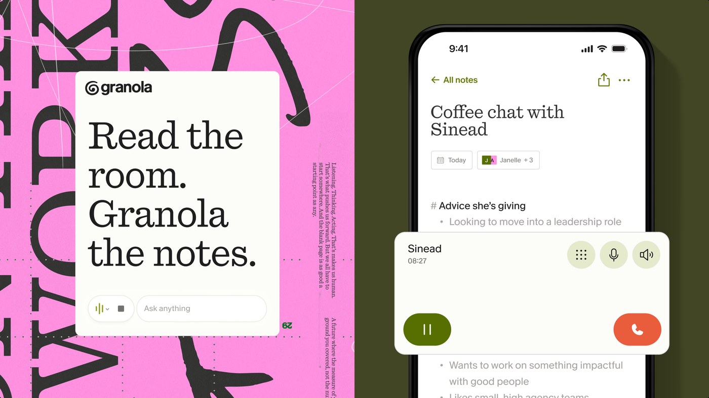
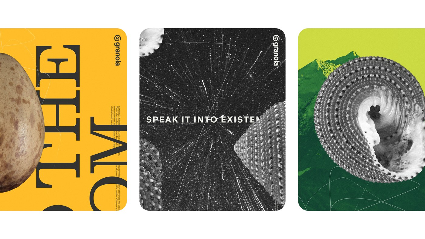
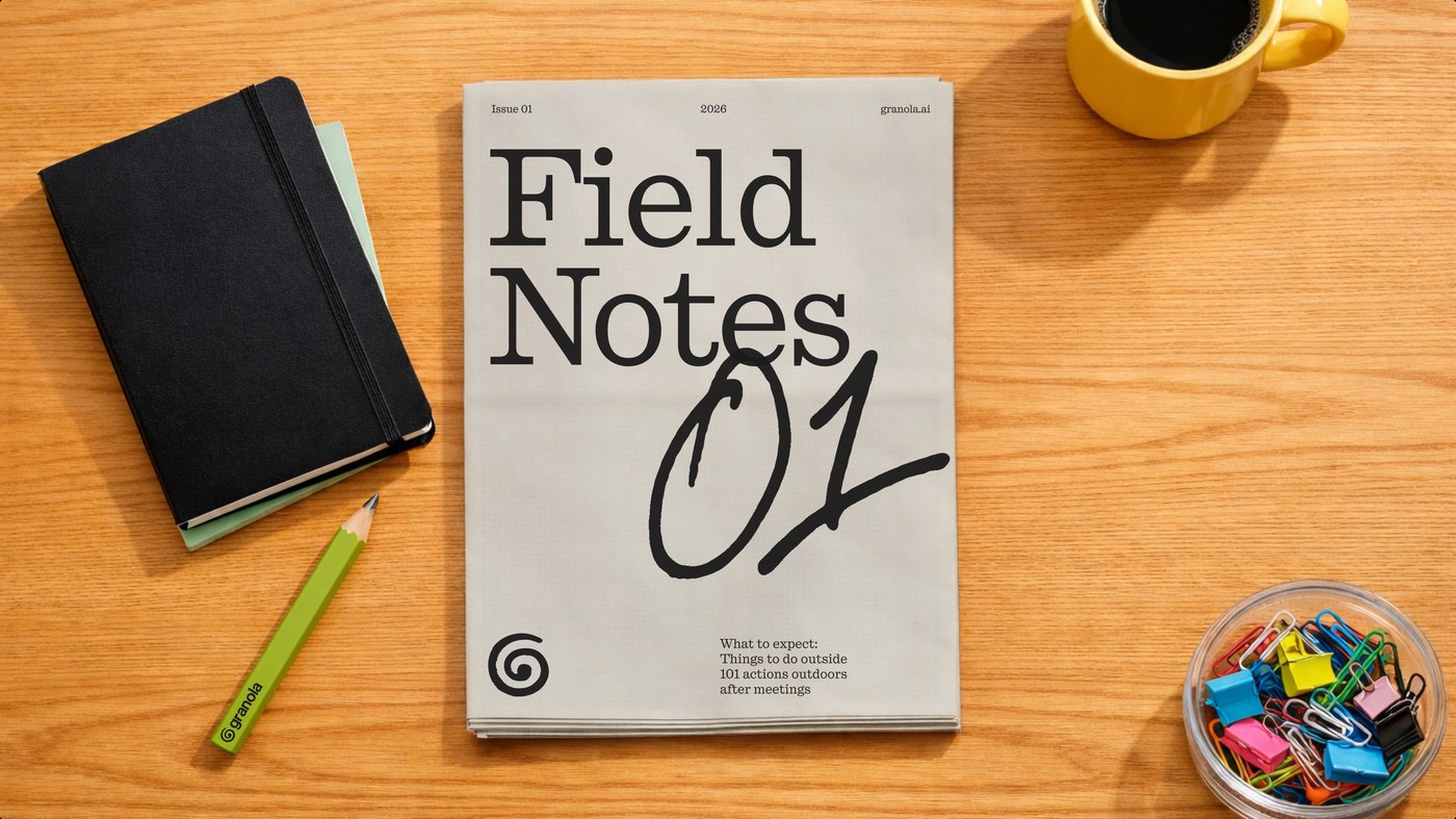
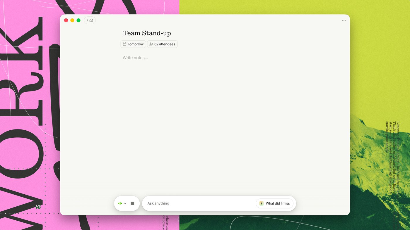
Ragged Edge approached this brand identity design by setting Quadrant at display scale for headlines, with Melange as the UI font — neutral but subtly characterful. The primary color is acid lime (#b5c832), saturated enough to read as a statement against the off-white near-paper canvas of the macOS app. The spiral logomark is hand-drawn with visible stroke irregularities at the tail; the imperfection is the point. Brand identity design extends to the collateral: brand cards use full-bleed macro photography — a potato surface, a spiral shell cross-section, a starfield — cropped to card format with white reversed type as the only text.
Brand Identity Design That Resists the AI-Tool Look
The system carries into the macOS app UI, where Melange runs at 14pt on that near-paper canvas and a bottom-docked command bar sits in a rounded pill. Granola is a London-built AI notepad — no meeting bots, just local audio transcription — so the brand identity design needed to carry human weight where the product deliberately stays out of the way.
See the full project at Granola.