GRID Coffee Shop Brand Identity Design Built on Urban Grid Logic
GRID is a coffee shop brand identity design where the city grid is the brand. One orange accent, hand-rendered type, bags that read like city blueprints.
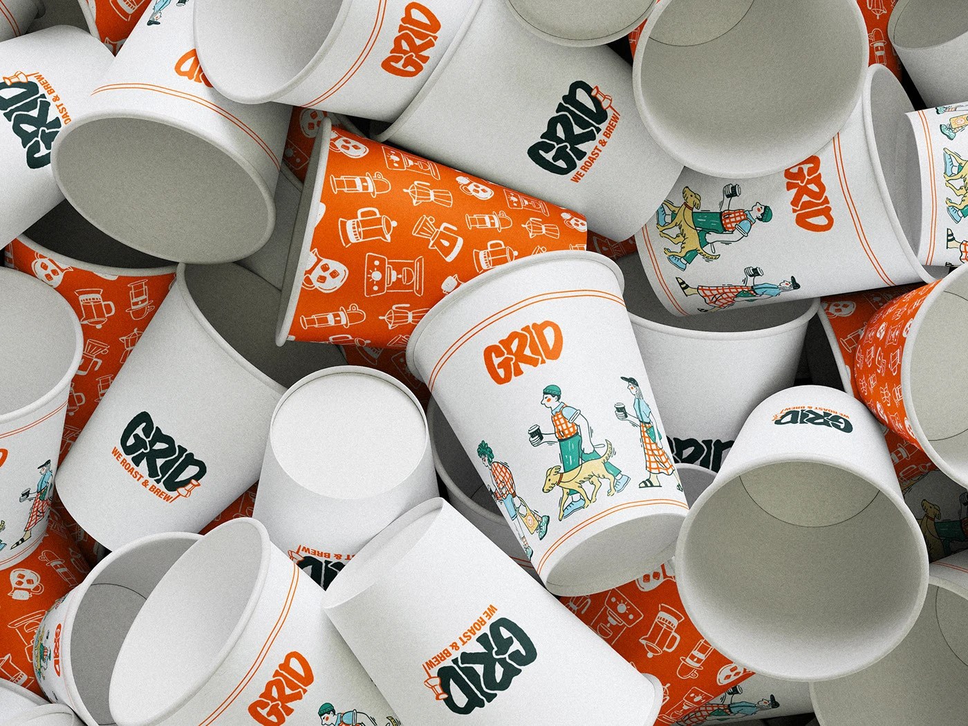
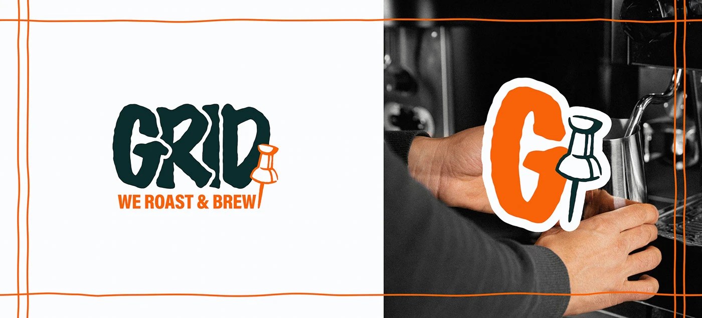
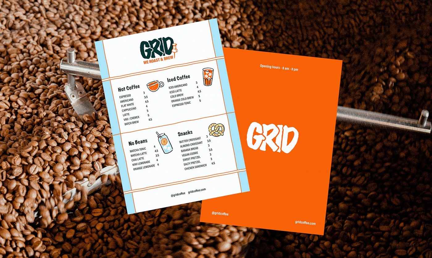
Elizaveta Kharchenko started with a premise: the grid connecting city blocks is the same logic that holds a brand together. The GRID wordmark is hand-rendered in dark teal, each letter carrying rough brush-stroke edges — physically drawn, not set. It does not look like a cafe sign. It looks like something stenciled onto an infrastructure diagram. A pin icon follows the "D" in orange, drawn at roughly one-quarter cap-height, tying the coffee shop brand identity design to geography without a tagline explaining it. That single color — urban orange in the #E85A1B range — is the only chromatic note in the entire coffee shop brand identity design. Everything else is white, off-white, dark teal, or desaturated photography.
Coffee Shop Brand Identity Design Grounded in Urban System Logic
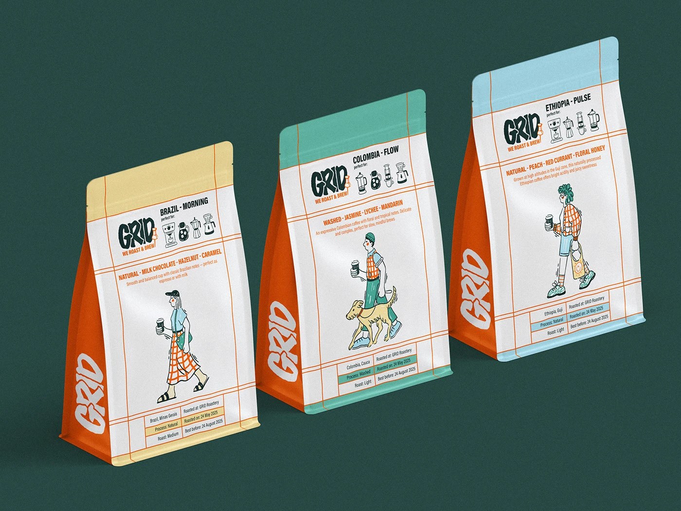
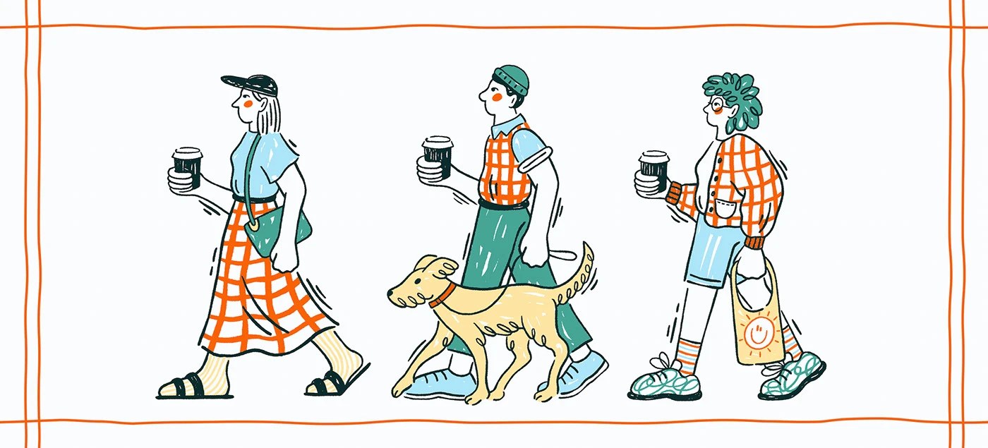
The packaging makes the concept concrete. Three coffee bag colorways — cream, teal, and powder blue — each carry a unique hand-drawn character: a woman with a dog, a man with a coffee, a skater. Each figure occupies roughly 60% of the bag height, scaled to be the primary thing you read before the label copy. Thin single-stroke orange rectangles frame the bags, cups, and menu cards — grid lines as border, not decoration. This coffee shop brand identity design scales from bags to branded socks without switching rules, which is the real test of a system. The result is a coffee shop brand identity that feels like it was extracted from the city, not applied to it. See the full project by Elizaveta Kharchenko on Behance.