Guardbase: AI Security Brand Identity Without the Fear
Guardbase brand identity by PixelOrb Studio rejects fear-based AI security visual language in favor of trust, precision, and electric periwinkle contrast
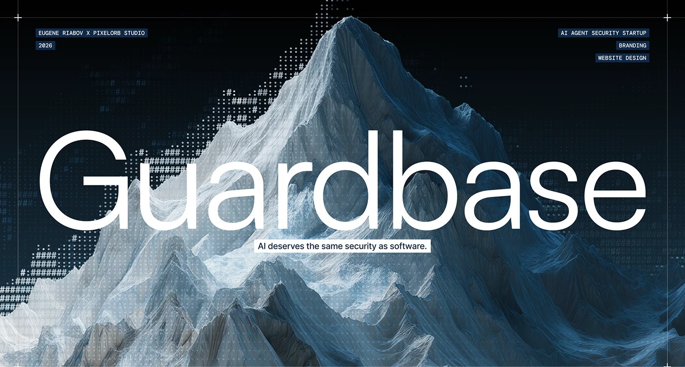
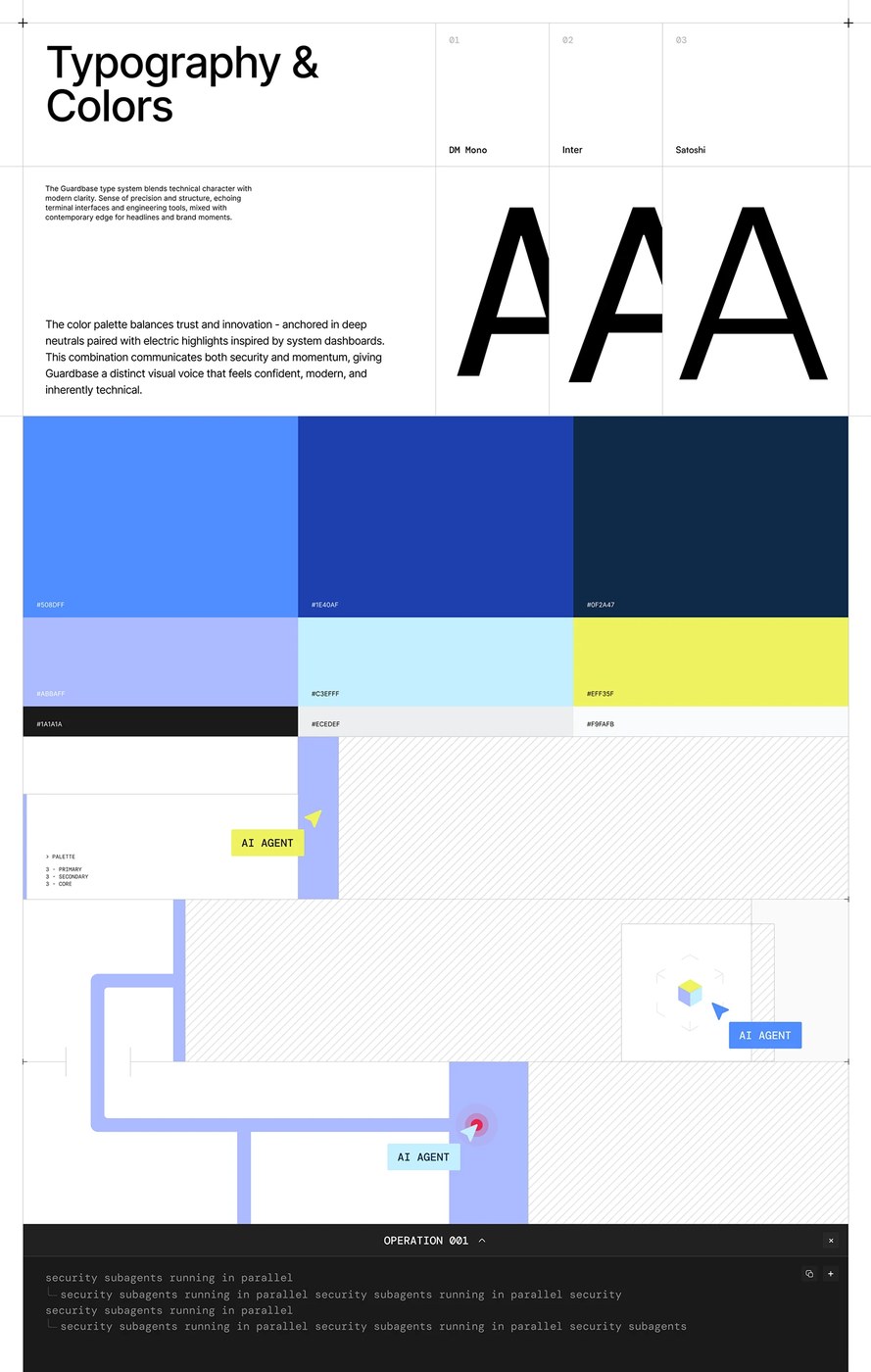
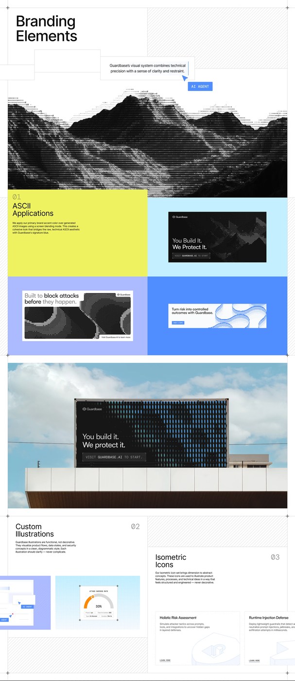
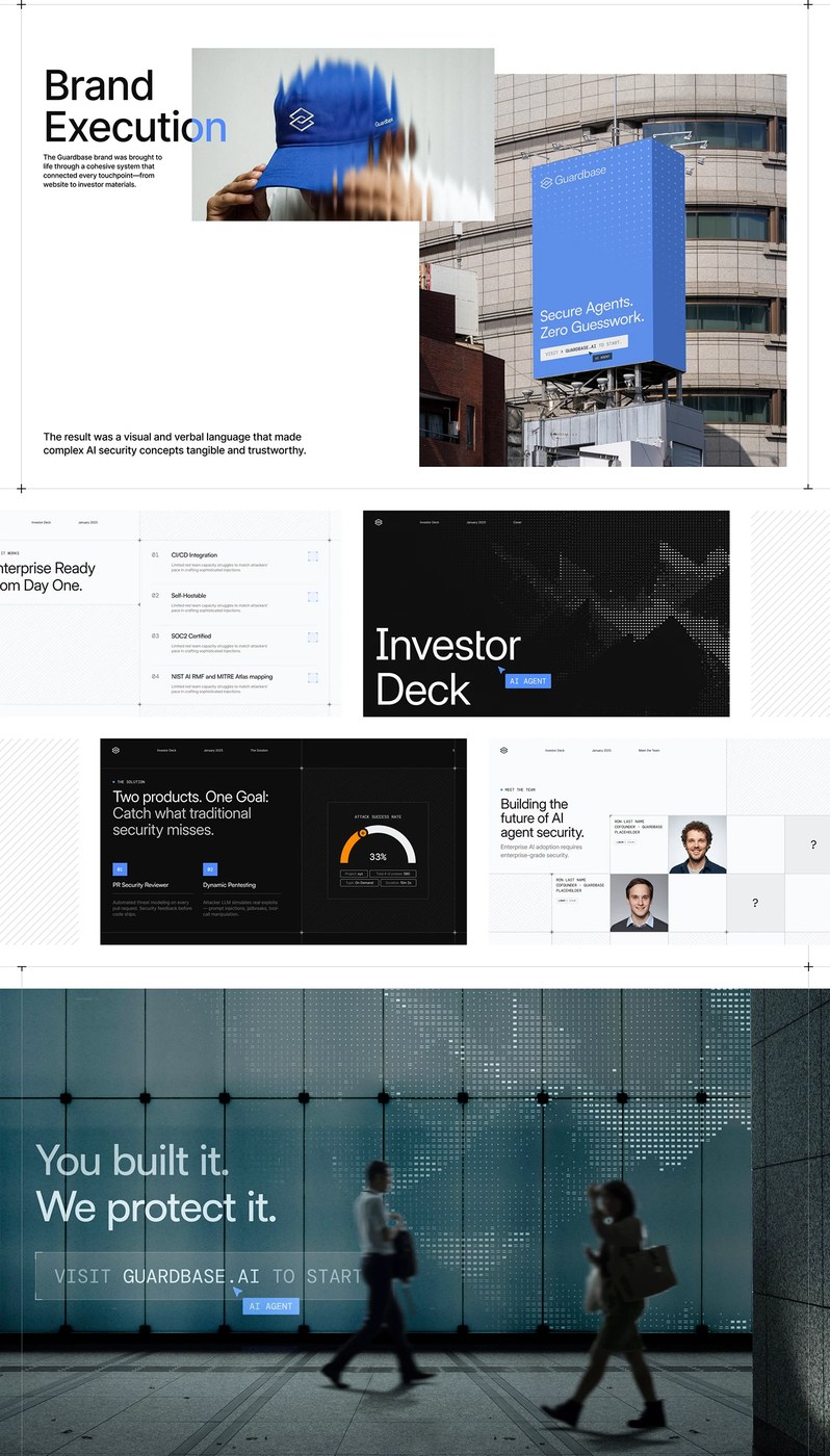
Eugene Riabov and Arnold Aron built the Guardbase AI security brand identity around three declared properties: trust, technical depth, focus. The logo is a shield reduced to two overlapping rounded squares — authority without aggression. The color system runs from deep navy (#0F2A47) and near-black through electric periwinkle (#508DFF) to acid yellow-green (#EFF35F), a palette that reads like a system dashboard rather than a threat alert. Across brand sheets, a dot-matrix ASCII mountain illustration — rendered entirely in # characters — carries the same logic: technical precision without decoration.
AI Security Startup Brand Identity Built on Trust, Not Fear
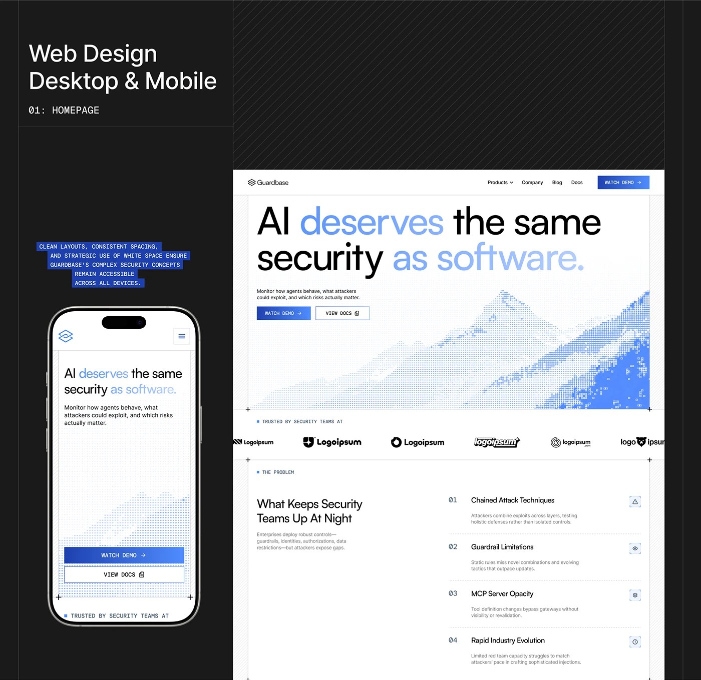
The web design work completes the argument. The homepage headline splits weight: “AI deserves” in black, “as software.” in electric blue — a typographic declaration that doubles as a product promise. PixelOrb extended the AI security startup brand identity system to investor decks and a full landing page web design, keeping the same restraint throughout. The category defaults to darkness and lock icons. This AI security brand identity went a different way — and 17.5K appreciations on Behance suggest the industry noticed.
See the full project by Eugene Riabov / PixelOrb Studio on Behance.