Juicy Foods: A Food Brand Identity That Mixes Type and Tech
Juicy Foods is a Brazilian food brand identity by Victor Berriel: condensed black wordmark, hand-drawn red marks, and a sharp secondary tech UI language.
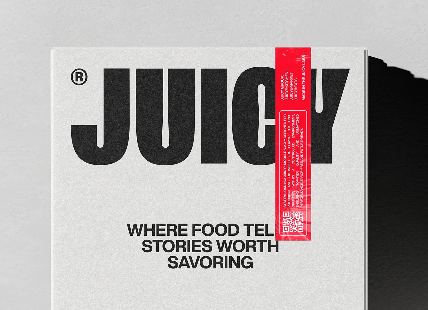
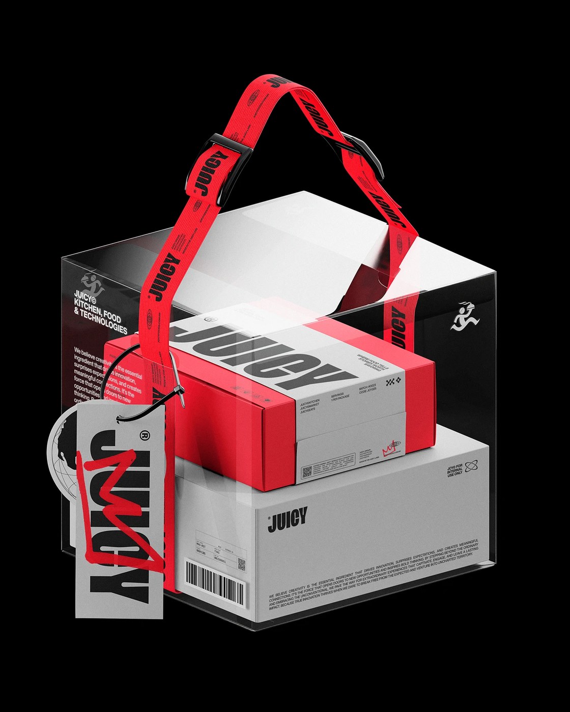
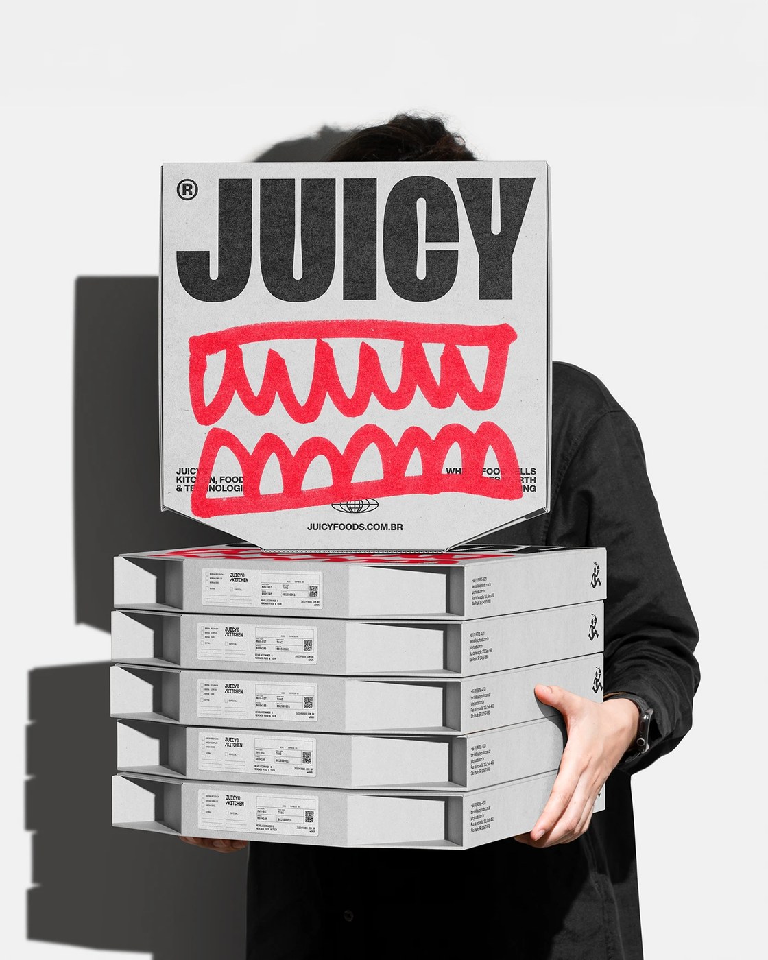
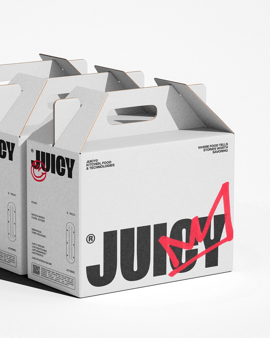
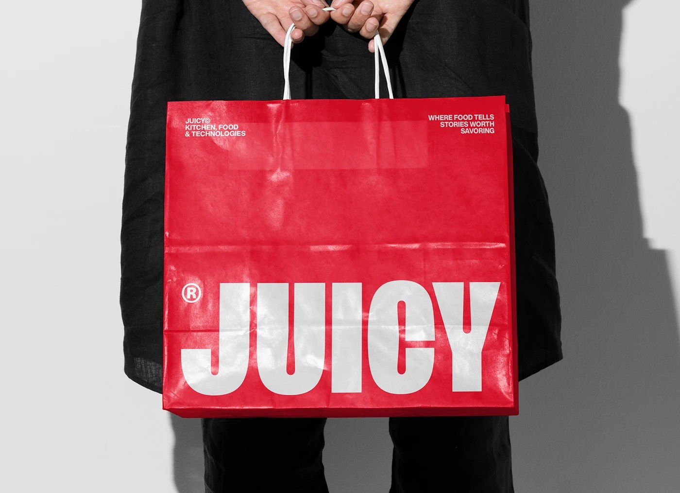
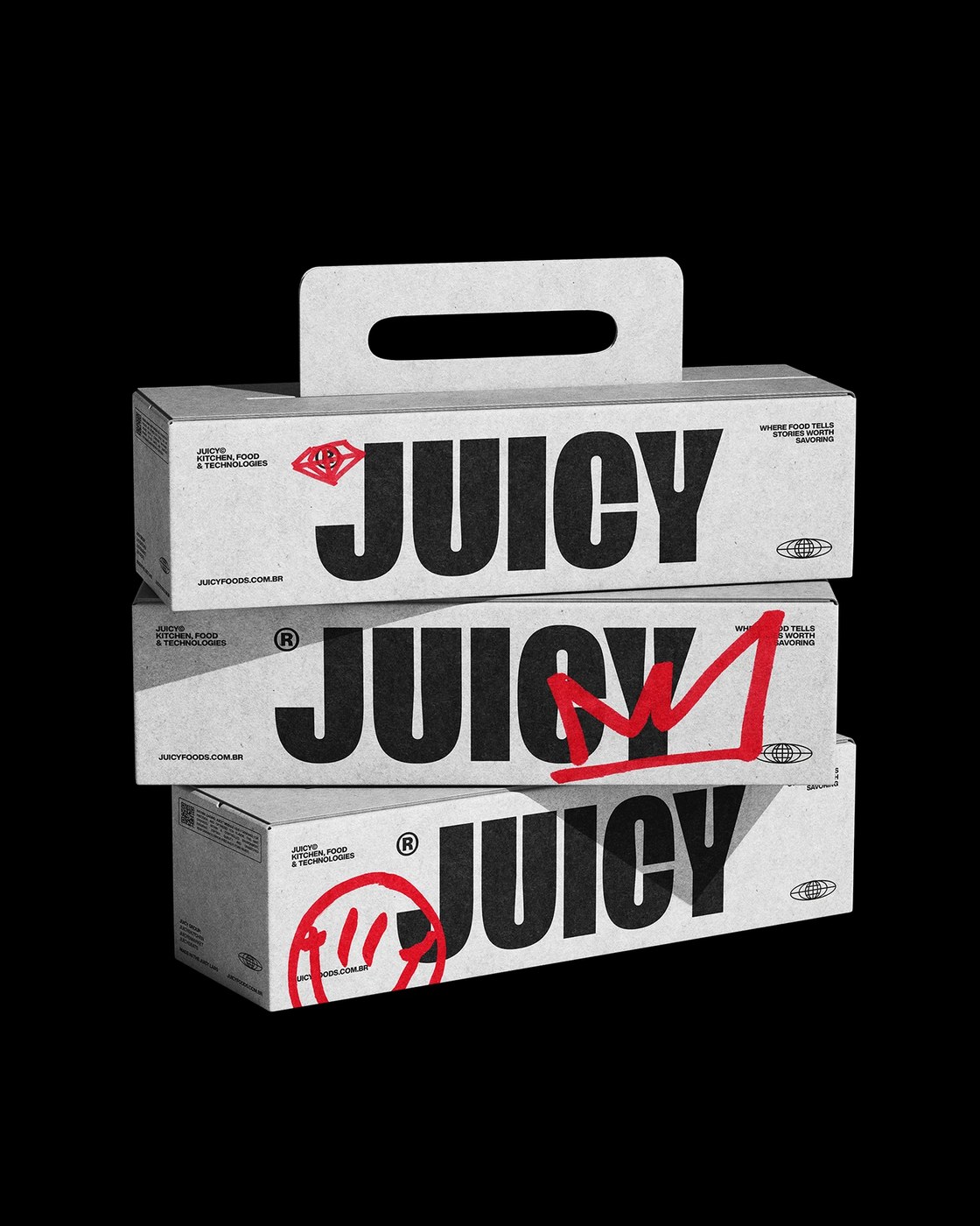
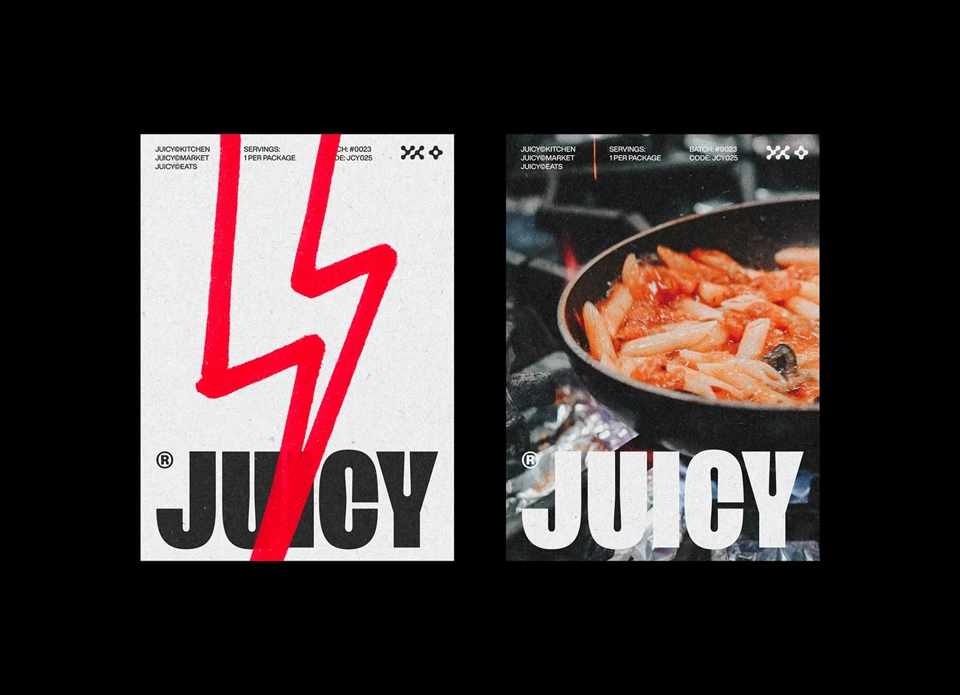
This food brand identity runs on a two-element contrast. JUICY in condensed black sans fills nearly the full frame — letterforms close to bleeding — and a diagonal red sticker bisects the C and Y before anything else registers. BerrielBrands then layers three hand-drawn marks across the food brand identity system: a crown scrawled over the U, a lightning bolt cutting through the wordmark, and a looping smile icon. Grey corrugated packaging keeps the ground neutral; the red scrawl is the only color, so it reads as intentional annotation rather than decoration.
How BerrielBrands Built a Food Brand Identity Around Two Competing Visual Languages
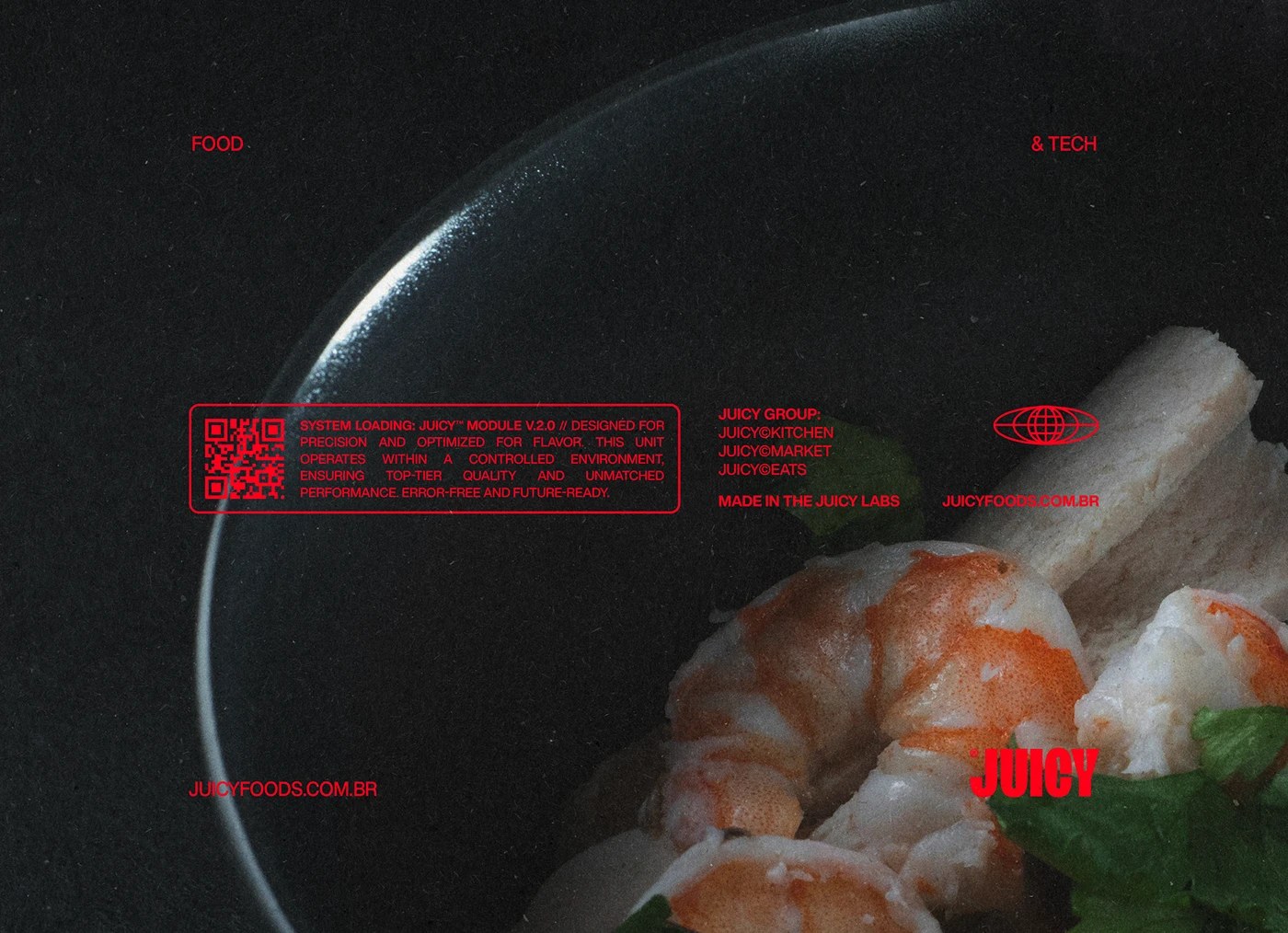
The second layer is where the brief gets interesting. Victor Berriel pulls from tech UI — HUD frames, monospaced loading copy (SYSTEM LOADING: JUICY MODULE V.2.0), QR code grids — and drops them over extreme macro food photography shot on near-black. The food brand identity argument is that a Brazilian kitchen brand and a software product can occupy the same visual register. The solid red shopping bag — white type at scale, letterforms nearly touching all four edges — closes the loop: stripped of the tech references, the type alone holds.
See the full food brand identity project by Victor Berriel / BerrielBrands on Behance.