KieranTimberlake Architecture Firm Brand Identity by Athletics
Athletics rebuilt KieranTimberlake’s architecture firm brand identity around one central tension: research-backed rigor held in the same frame as warmth.
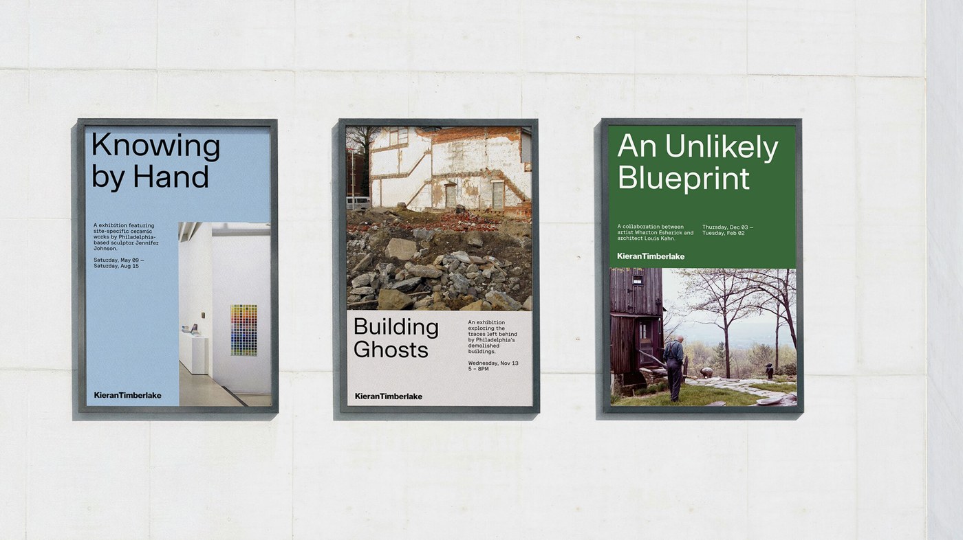
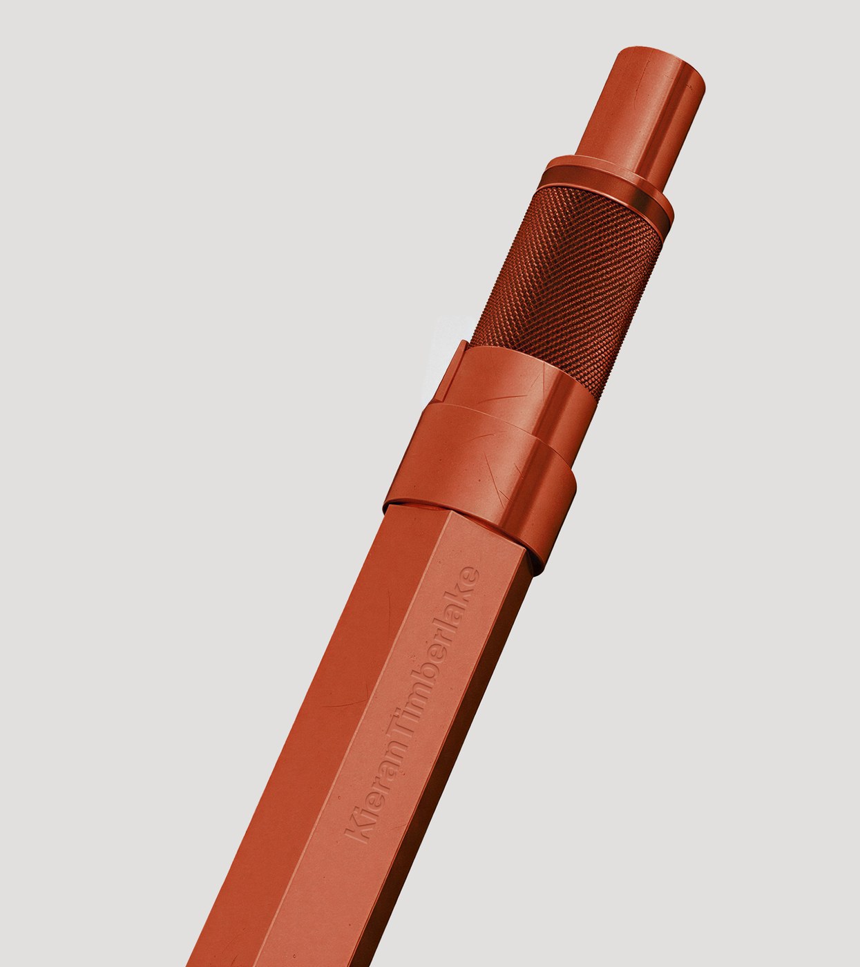
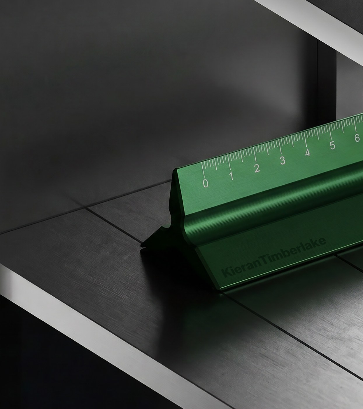
The visual system answers that tension through material specificity. A three-typeface stack — sans, serif, and semi-mono — gives the architecture firm brand identity a range that moves from spec-sheet precision to editorial storytelling without switching registers. The color palette draws directly from KieranTimberlake’s own buildings: brick, concrete, glass, earth — not a modernist reference board but an actual material inventory. The worksmark is solid and unadorned; an icon suite built from the same geometry extends the architecture firm brand identity into a working visual language. Out-of-home runs the identity at full scale across three-panel formats, while branded stationery — a custom ruler, a pen — brings the same architecture firm brand identity down to the level of the hand.
Architecture Firm Brand Identity Built From the Building Up
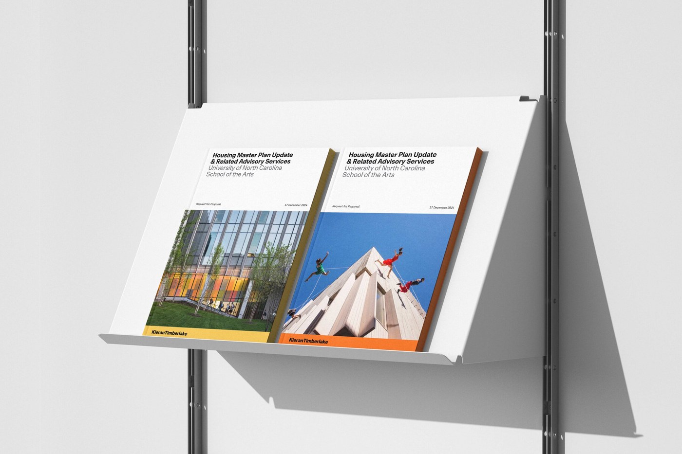
The site follows the same logic. A sidebar channel holds KieranTimberlake’s research practice alongside each project, surfacing the inquiry behind the built work. A scaling archive carries forty years of output in a single frame, with filtering built for two modes of visit: the researcher and the browser. Schematic drawings appear beside finished photography throughout — the work shown as it was thought, then as it was made. For a firm marking its 40th anniversary and a transition to employee-ownership, the architecture firm brand identity needed to hold continuity without nostalgia. Athletics held that line.
See the full project by Athletics.