Kinetic Typography Motion Design: Words Move Like Bodies
Knife Motion's second collection demonstrates how kinetic typography motion design can transcend programmatic software presets to feel like physical mass.
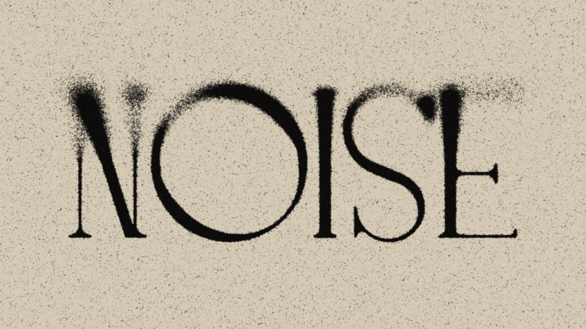
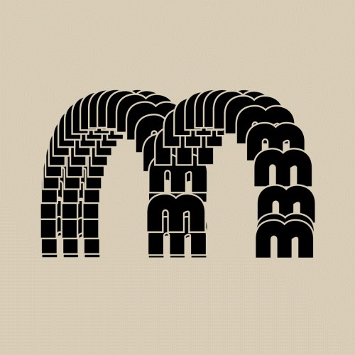
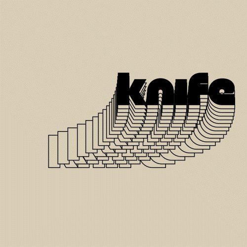
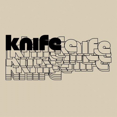
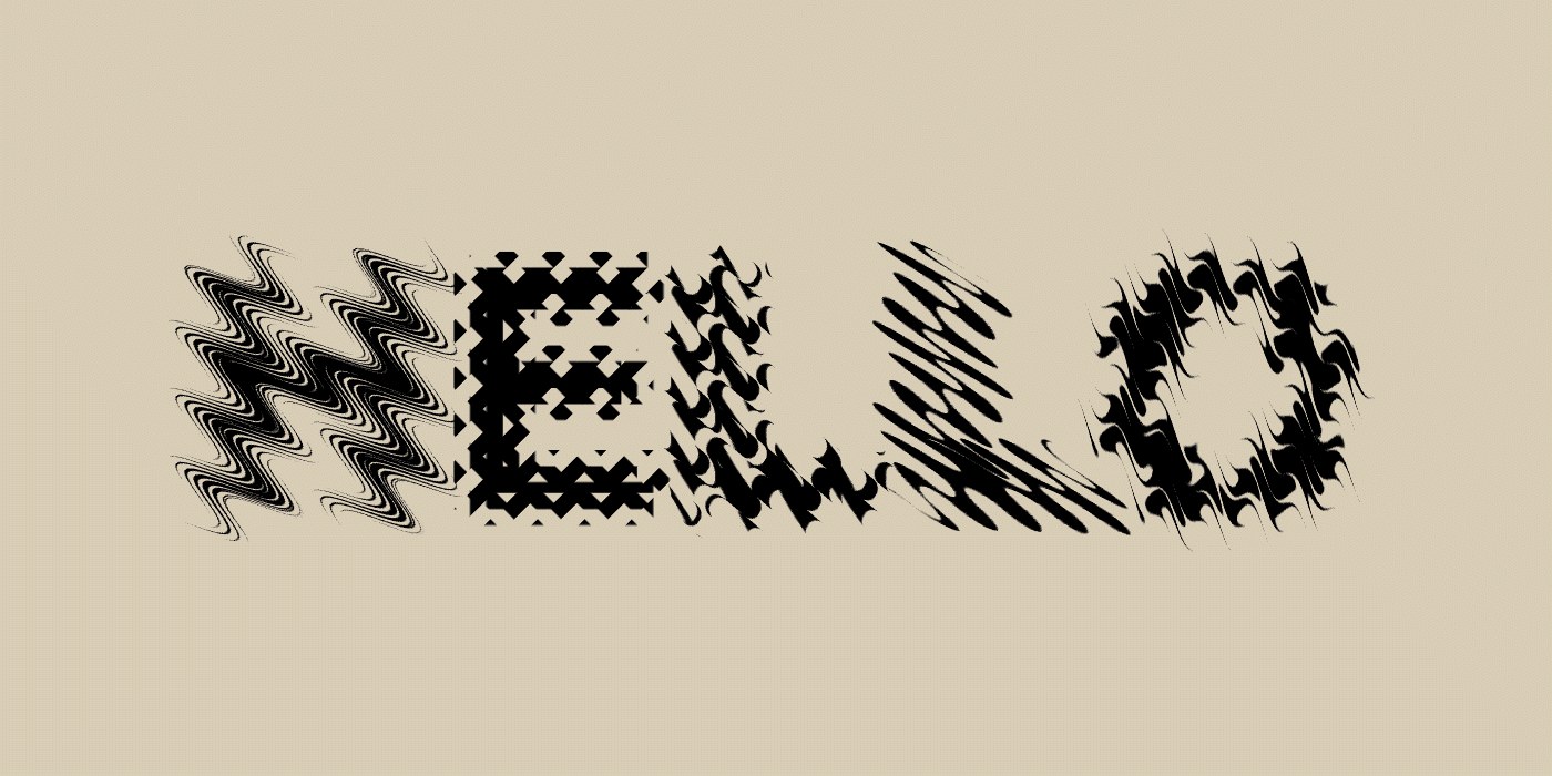
The four sequences in this series treat characters as physical objects. Letters accelerate, collide, resist, and release within a disciplined spatial grid. This approach defines a new standard for kinetic typography motion design using manual keyframing. Instead of linear paths, the movement exhibits mechanical inertia. Each frame showcases rigorous baseline alignment and calculated spatial margins. The resulting visual rhythm feels deliberate and structured. As a result, the type behaves like real bodies responding to external forces. Every movement feels earned and mathematically precise.
Applying Physical Forces to Kinetic Typography Motion Design
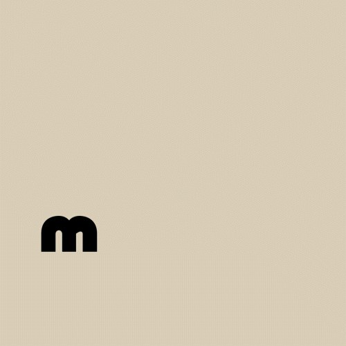
The visual system relies on a restrained color palette to emphasize structural form. High-contrast black typography sits against a warm, sandy cream background. This color choice emphasizes the geometric restraint of each letterform. The restricted color palette focuses attention entirely on the kinetic typography motion design details. The compositions show tactile contrast through simulated print textures on a digital screen. Typographic scaling creates compositional tension as words scale up to fill the frame. Every element sits in absolute balance, maintaining its structural hierarchy even during rapid motion sequences. This structural clarity keeps the work legible at any speed.
Knife Motion succeeds by addressing the gap between ambitious aesthetics and functional layouts. This collection sits between title sequences and social media formats. In 2026, motion designers must balance these formats for broadcast and digital campaigns. The studio's UK-based team uses these pieces to show how weight influences type. With over fourteen thousand appreciations, the project shows a growing appetite for physical motion design. Designers can study these loops to learn how to inject human feeling into digital tools. This method ensures that digital work retains a sense of craftsmanship.
The collection can be viewed in full on Knife Motion's Behance portfolio.