KOSTA by QARAJ ㅤ — Typography Project
KOSTA by QARAJ ㅤ is a display typography design project. Brand Identity for Baku Based Restaurant and Bar.
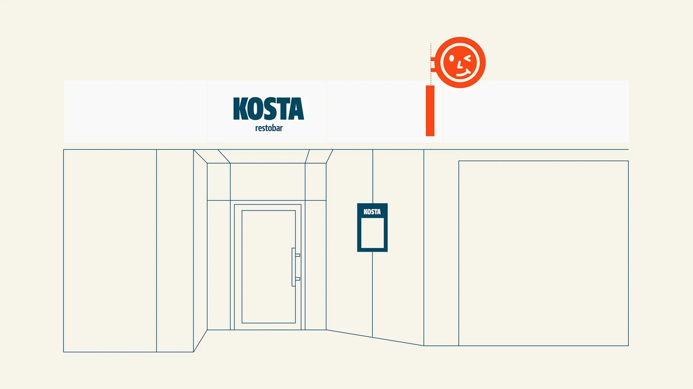
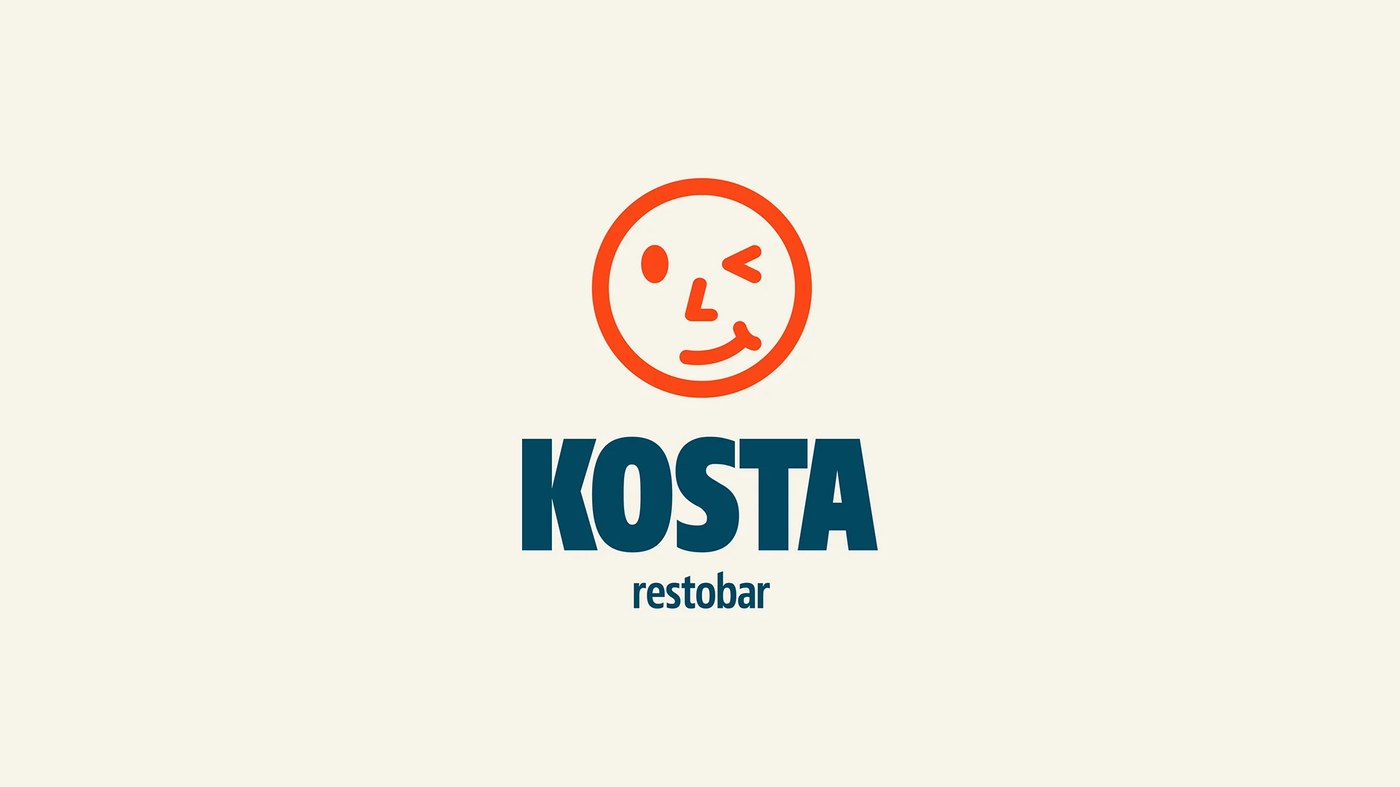
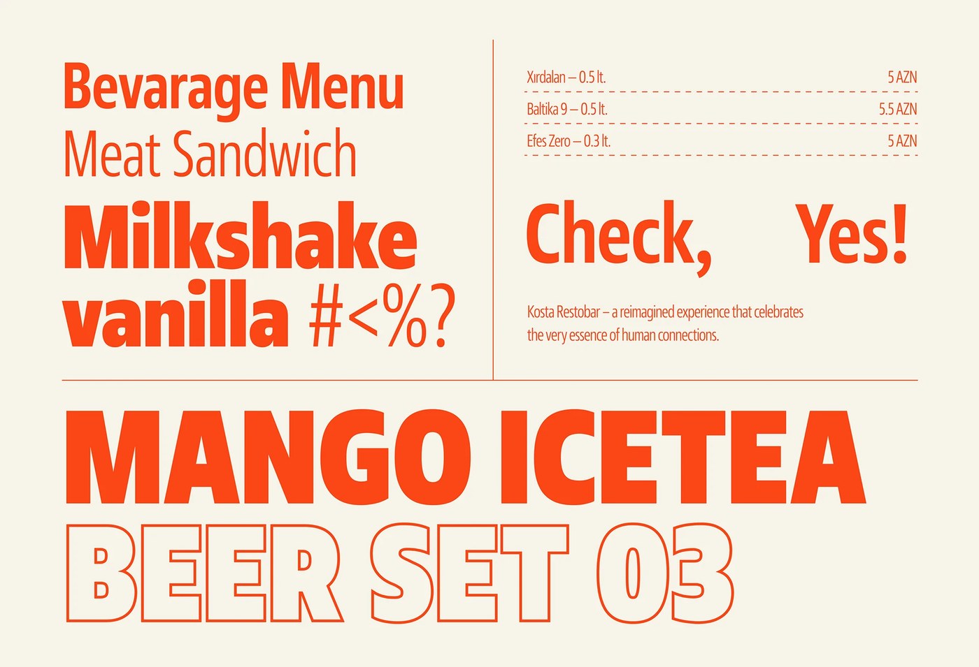
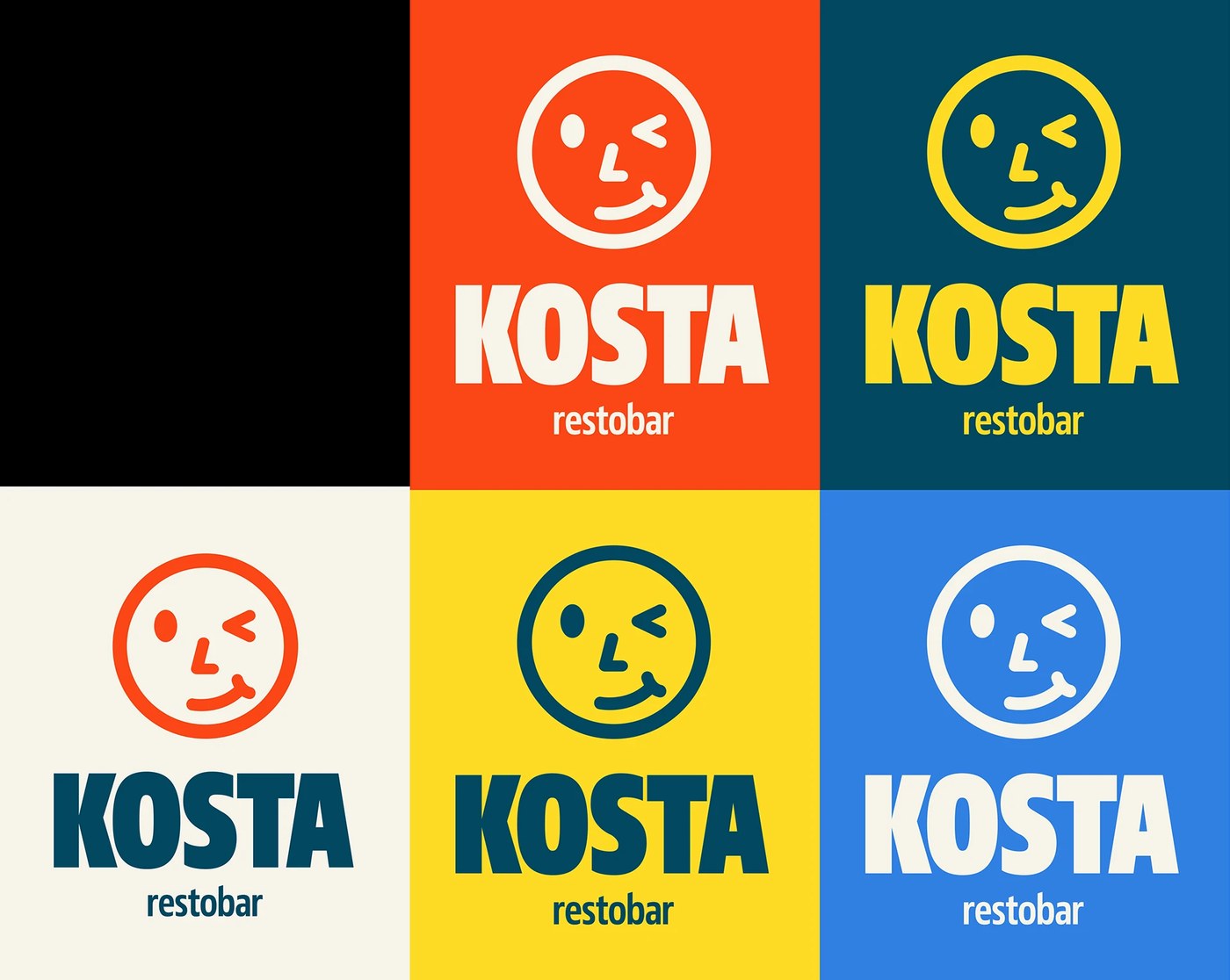
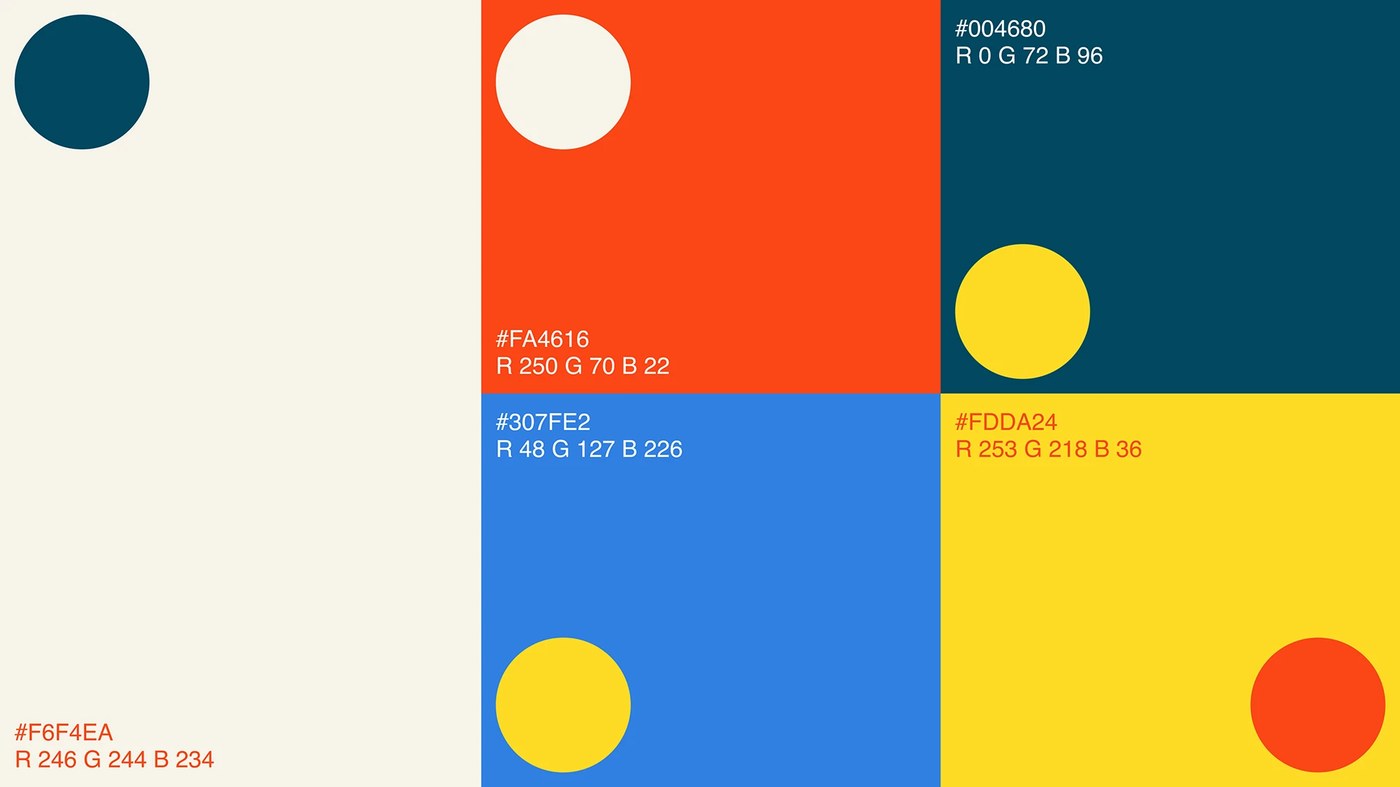
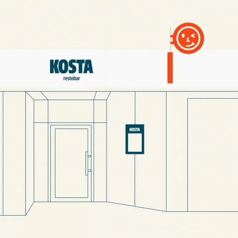
QARAJ ㅤ builds the visual language for KOSTA using a heavy-set, customized display typeface. The identity relies on high-contrast letterforms and a limited palette of deep black, off-white, and warm cream tones. The typographic system uses thick strokes and tight kerning to establish a dense, rhythmic presence across various brand touchpoints.
Exploring Custom Display Typography Design
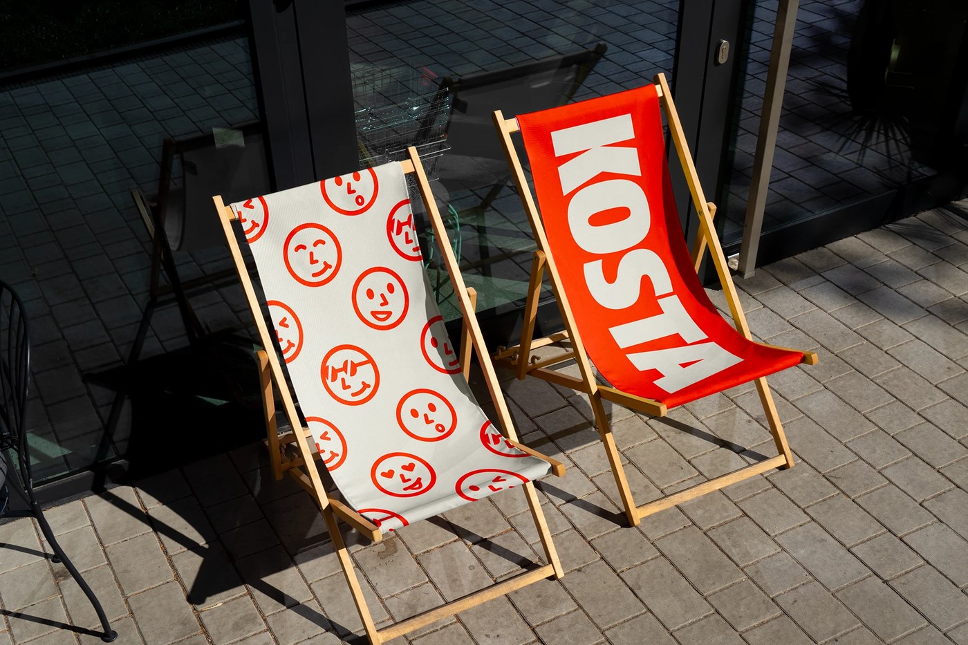
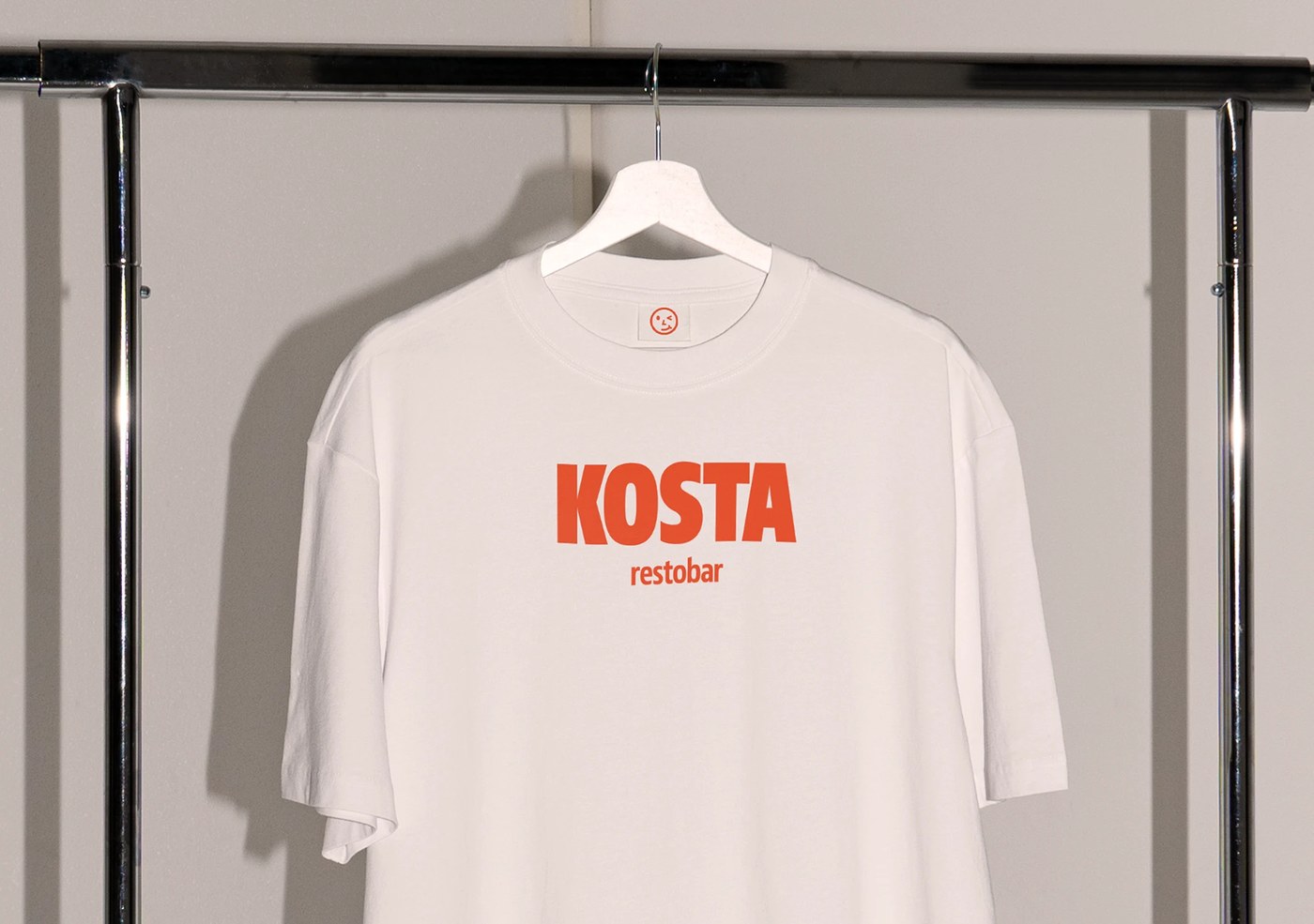
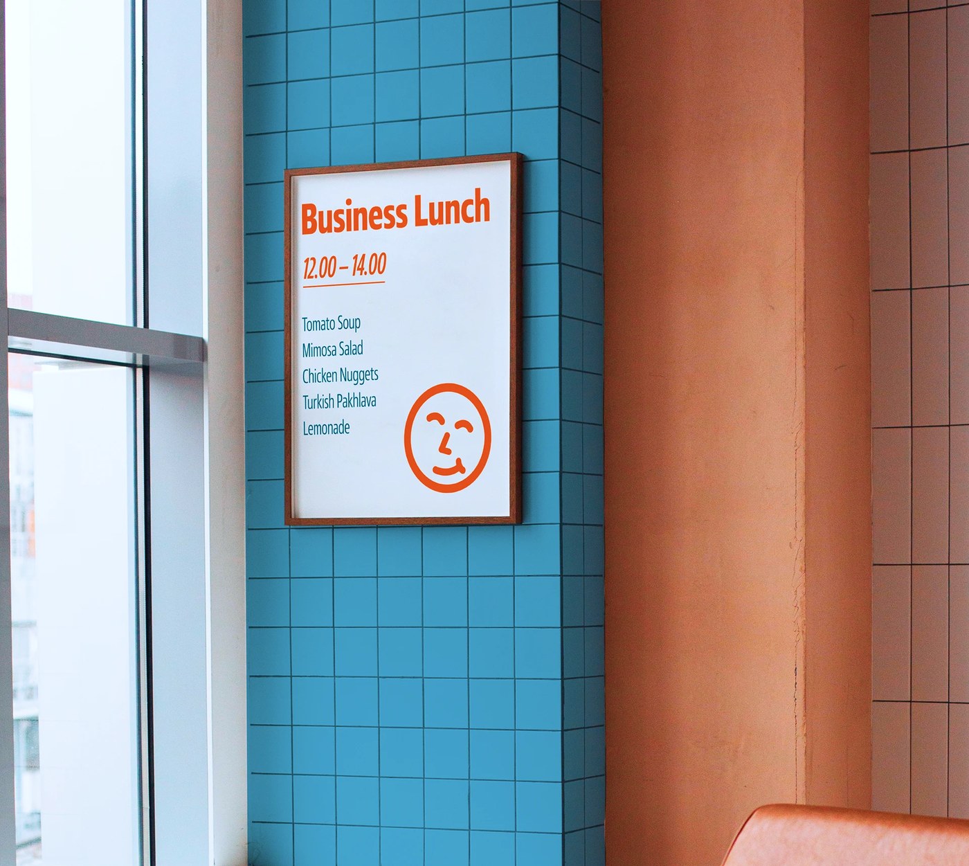
The project presents a cohesive system where the character of the typeface dictates the layout. On the menu layouts, the heavy weights of the letters anchor the white space, paired with clean, smaller sans-serifs for readability. Illustration elements appear alongside the type, featuring cartoon-style graphics that interact with the letterforms. The motion pieces further extend the typographic energy through fluid movement. Every piece of collateral, from coasters to stationery, maintains a strict hierarchy through consistent line weights.
For designers working in the hospitality sector, this approach demonstrates how a singular, strong typographic voice can define a physical space. The reliance on character-driven letterforms rather than complex imagery allows the brand to remain legible yet distinct. The project shows that a controlled typographic system can carry the entire weight of a brand identity without needing excessive decorative elements.
See the full project by QARAJ ㅤ on Behance.