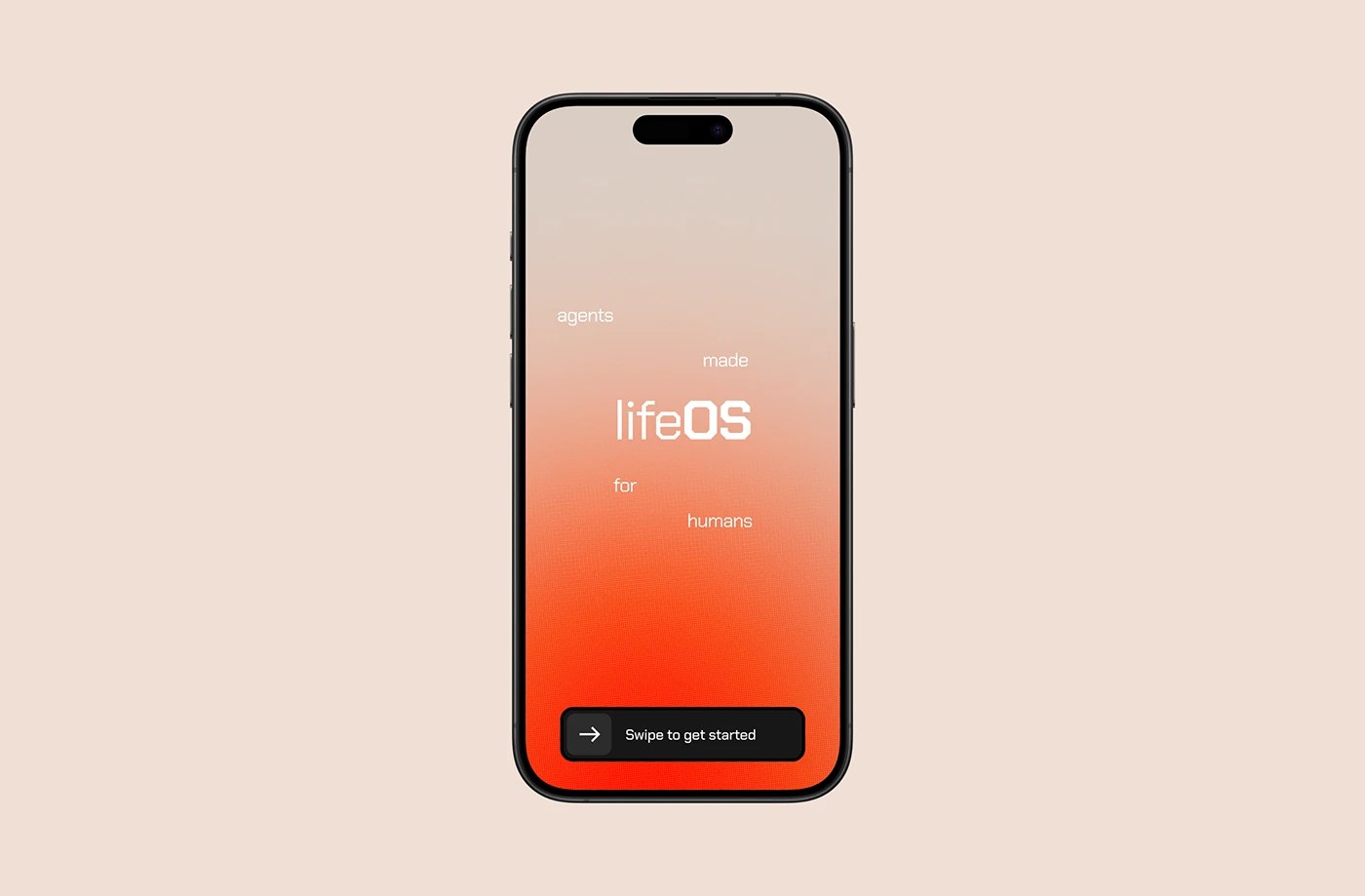
lifeOS App Design Makes AI Agents Feel Personal
lifeOS app design by h3ylab turns personal AI agents into a minimal mobile interface where multi-agent orchestration reads as an assistant, not software.
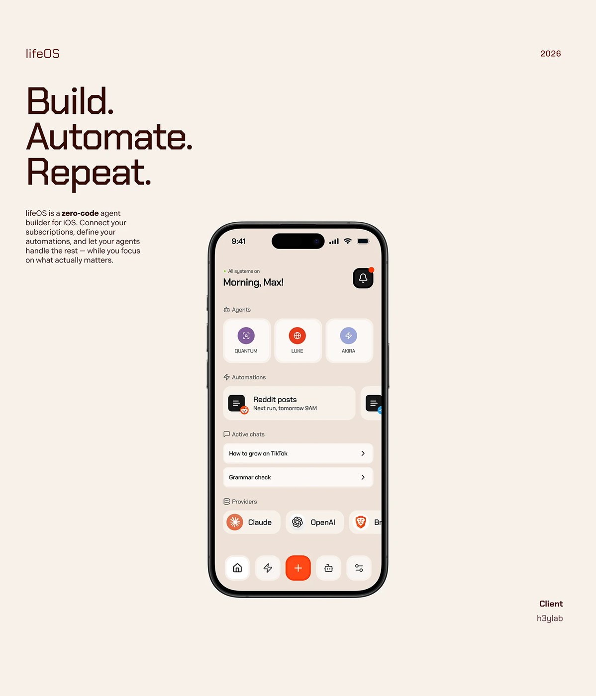
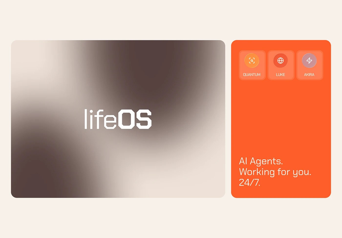
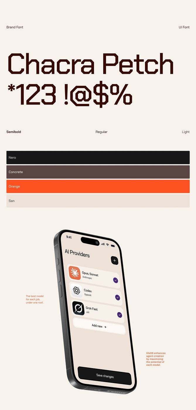
The lifeOS app design starts from a real problem: AI agent platforms built for power users tend to look like dashboards, which signals complexity before a user runs a single task. Buenos Aires studio h3ylab — Juan Pablo Cornalba and Delfina Gatti — chose a deep navy-to-black gradient as the ground, with electric violet and cyan reserved exclusively for agent status indicators. That color discipline keeps the interface quiet until an agent is active. Card-based agent modules carry soft inner-glow borders that shift color with activity state, a micro-interaction that replaces status text with spatial feedback. The voice interaction screen builds around a radial waveform visualizer centered on a frosted-glass orb — referencing the visual grammar of voice assistants without copying it. The workflow builder shows agent connections as node-link diagrams with rounded connector paths rather than hard-angled arrows, reducing the visual weight of what is, technically, a programmer's mental model.
lifeOS App Design and the Problem of Making Infrastructure Feel Intimate
The design challenge h3ylab accepted is a structural one: how do you surface a multi-agent orchestration system without foregrounding the architecture? The lifeOS app design answers by treating the agent layer as invisible until it acts — the interface remains a conversation surface, not a control panel. That constraint is where the lifeOS app design earns its position, choosing restraint at every decision point where a less disciplined approach would have added a feature toggle or a status widget.
Work by h3ylab.