Mat Voyce's Think Different Is Kinetic Typography With Mass
Mat Voyce rebuilt Apple's Think Different as a kinetic typography motion design sequence. Each frame holds as a typographic composition in its own right.
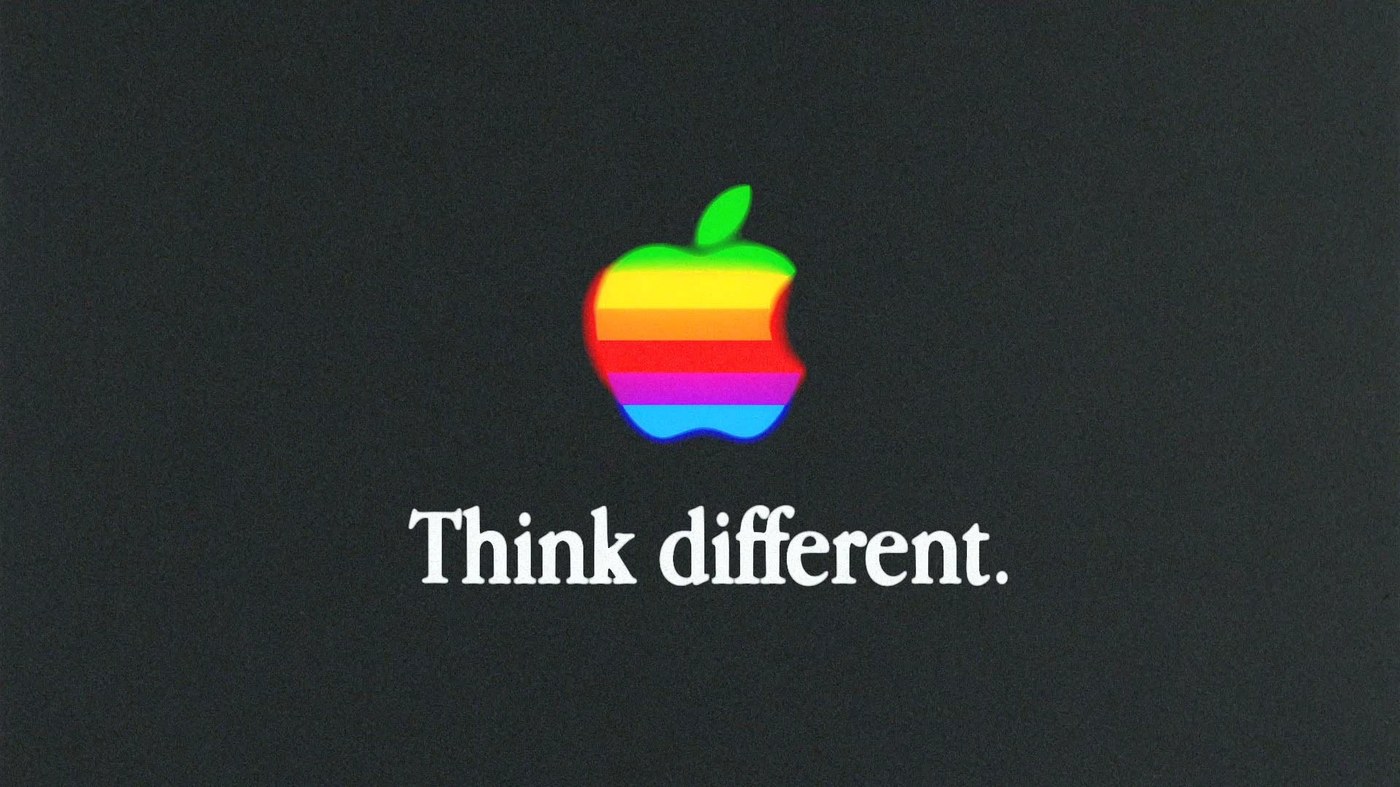
The foundation is a dark charcoal field saturated with grain — every frame reads as an analog artifact, not a screen render. Against that near-monochrome ground, the 1977-era six-stripe Apple logo sits centered at a fixed scale: the sole color payload in the whole composition. Below it, "Think different." in a clean white serif, lowercase d, flush center — the exact typographic spec from the 1997 campaign. Voyce didn't approximate the source material; he matched it, then gave it kinetic typography motion design physics. The type settles with inertia, not CSS easing. Letters carry mass.
Why This Kinetic Typography Motion Design Works as Still Frames
The original Apple Think Different campaign was built on graphic restraint — black and white portraits, one line, no decoration. Voyce's version keeps the restraint and adds texture as a temporal signal. The grain doesn't just soften the edges; it places the sequence in a different era. Each transition is typographic, not cinematic. No narrative cuts, only letterform physics. The result is a personal motion exercise that holds as portfolio work because the compositional logic is sound at every pause point. After Effects drove the animation; Photoshop layered the grain; Illustrator supplied the vectors. A standard 2D motion stack, used with uncommon discipline.
See the full project by Mat Voyce on Behance.