Mexican Restaurant Branding Visual Identity: Señor Gonzales by Heavy
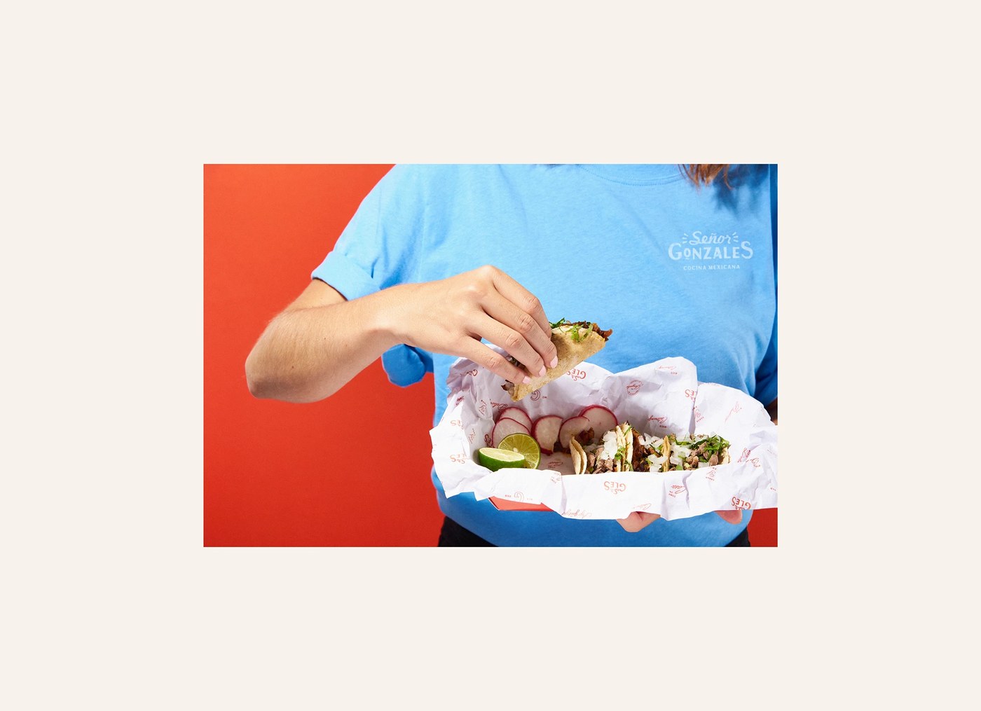
Guadalajara-based studio Heavy has crafted a comprehensive mexican restaurant branding visual identity for Señor Gonzales. Located in Dubai, this system rejects traditional cultural clichés. It introduces modern digital illustrations, custom lettering, and raw textures.
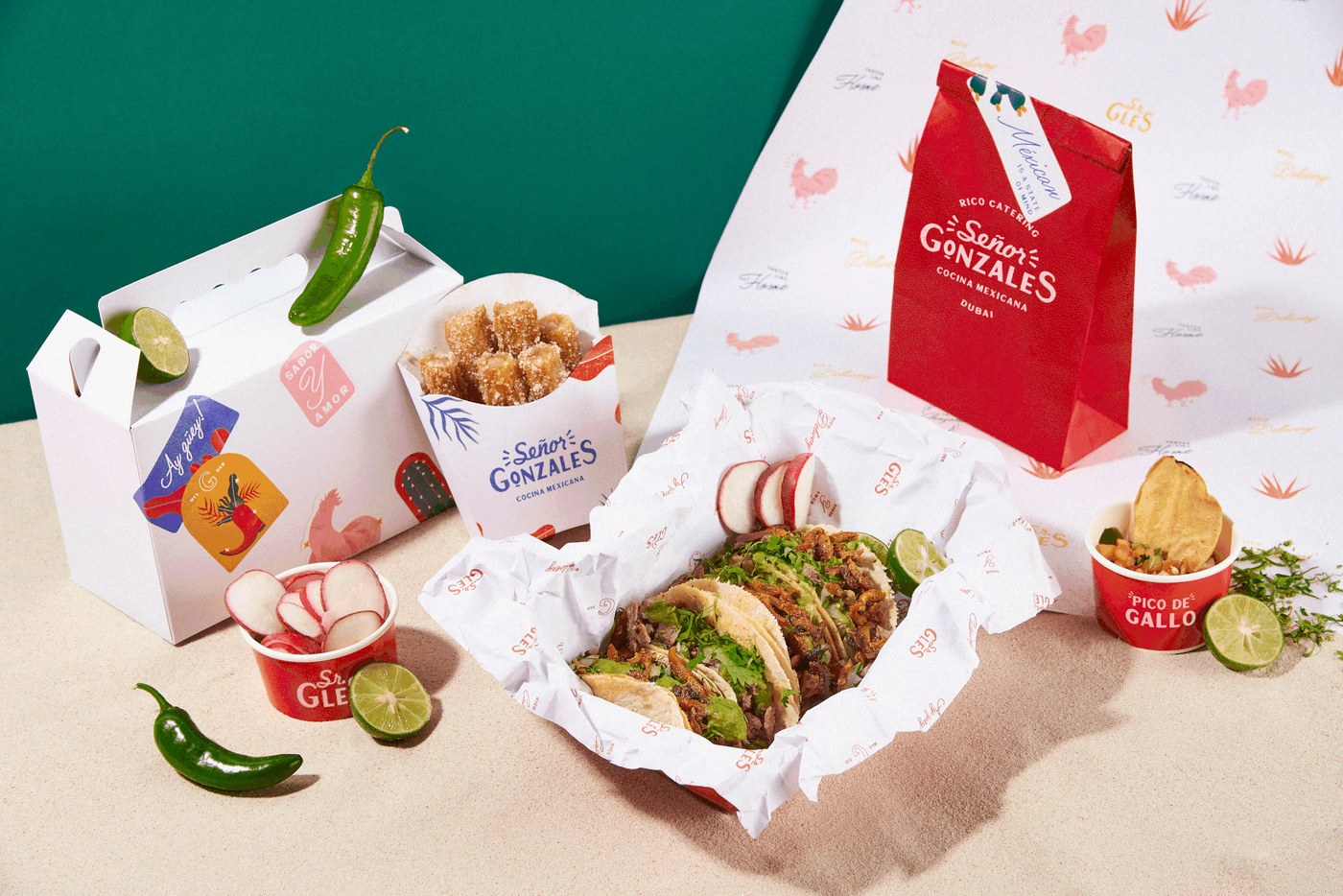
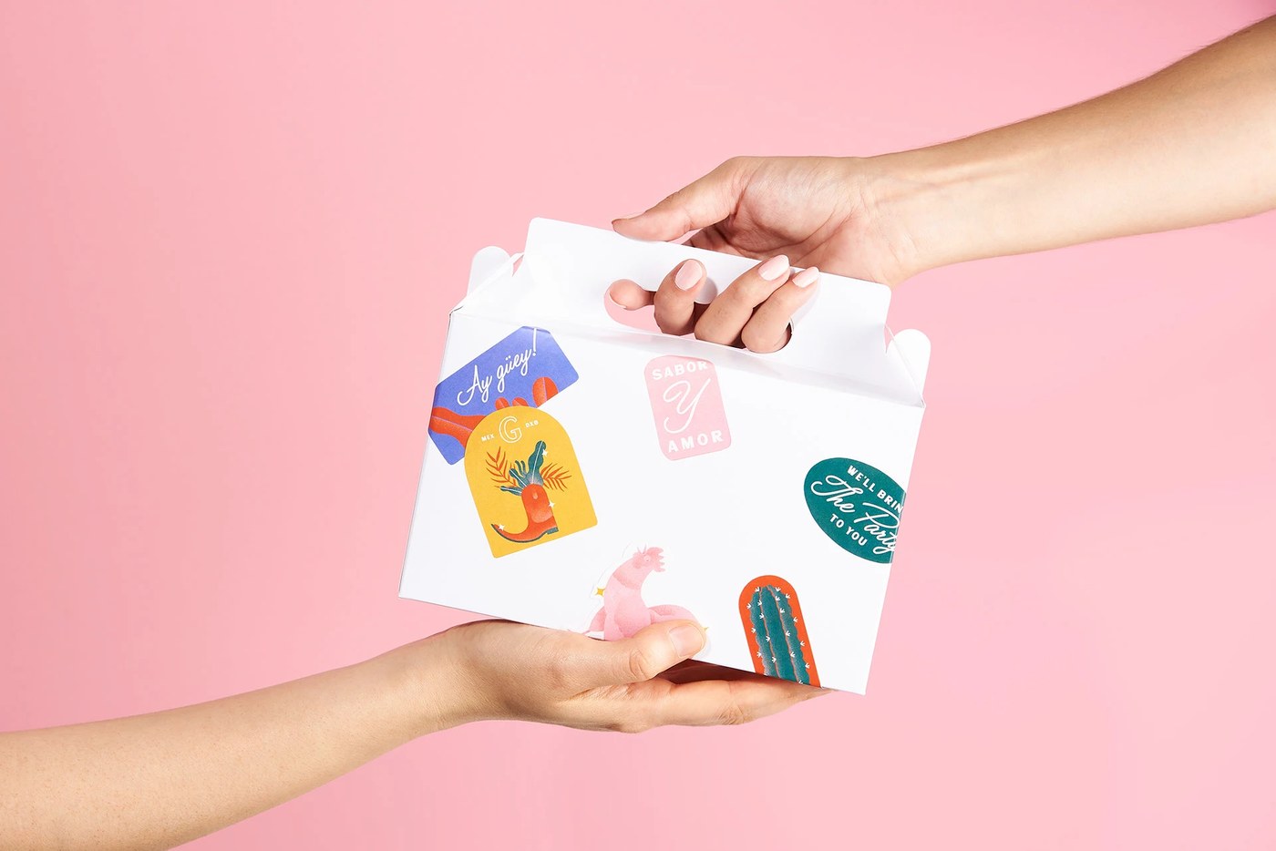
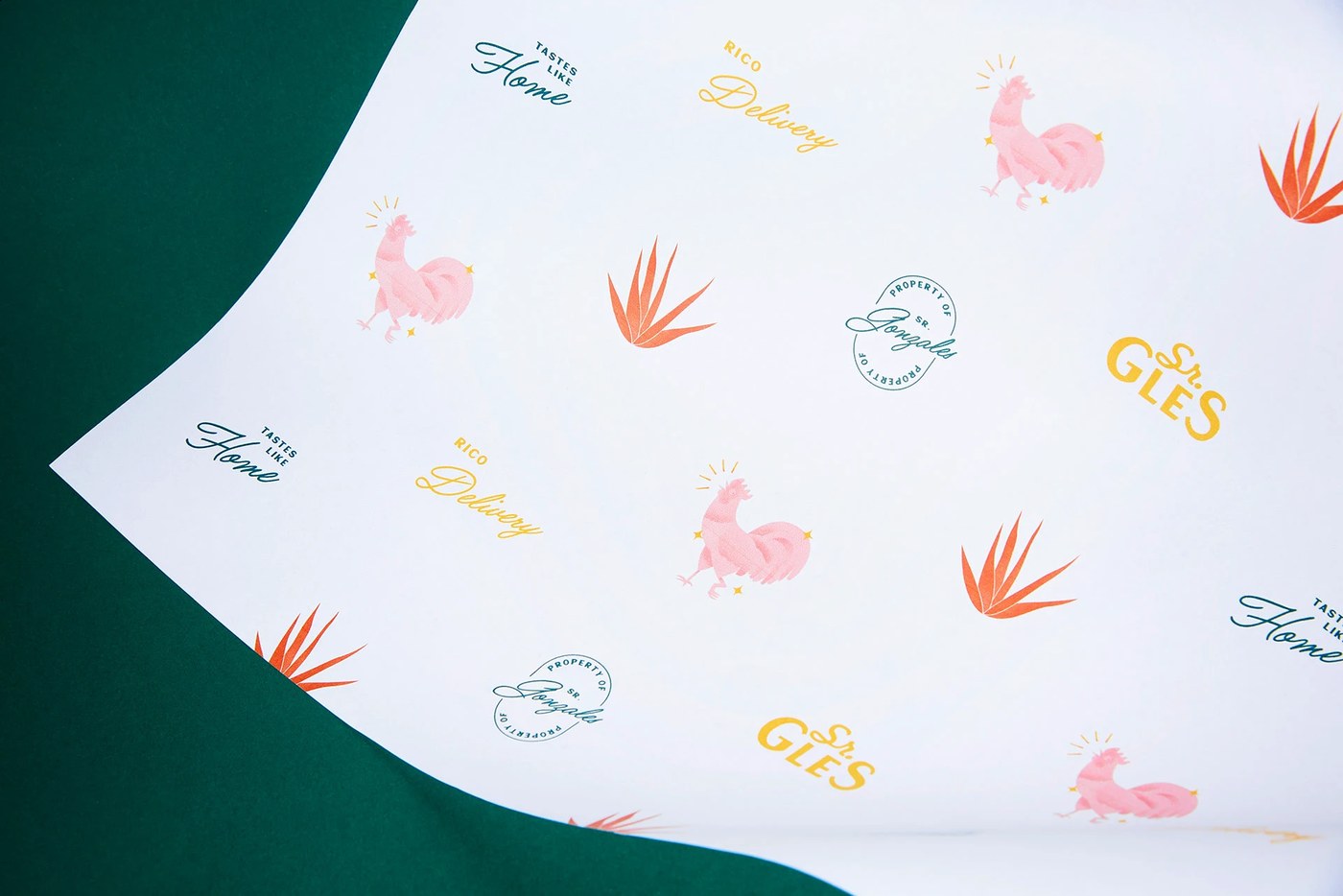
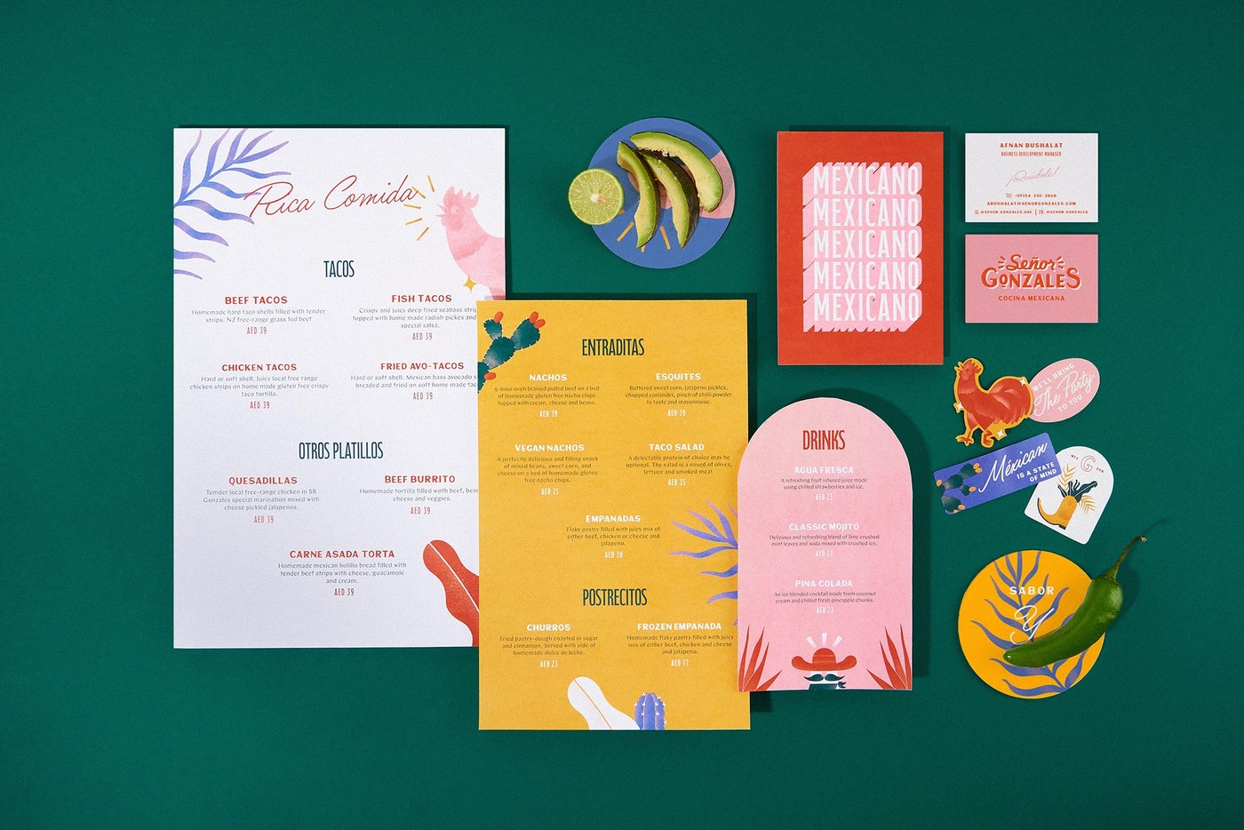
The visual system centers on structural balance. The layout maintains high compositional tension. Broad negative spaces allow the bold orange-red color fields to dominate the physical collateral. Heavy avoids complex textures or gradients. They prefer flat vector shapes. These shapes establish a strong structural hierarchy. Each layout component aligns to a strict modular grid. This grid ensures legibility across both digital menus and physical signage. The compositions balance organic vector lines with rigid geometric forms. This contrast creates a refined visual rhythm. This disciplined approach elevates the mexican restaurant branding visual identity. By stripping away extraneous ornament, the design emphasizes physical form factors. It allows the architecture of the space to communicate directly with visitors.
The Mechanics of a Mexican Restaurant Branding Visual Identity
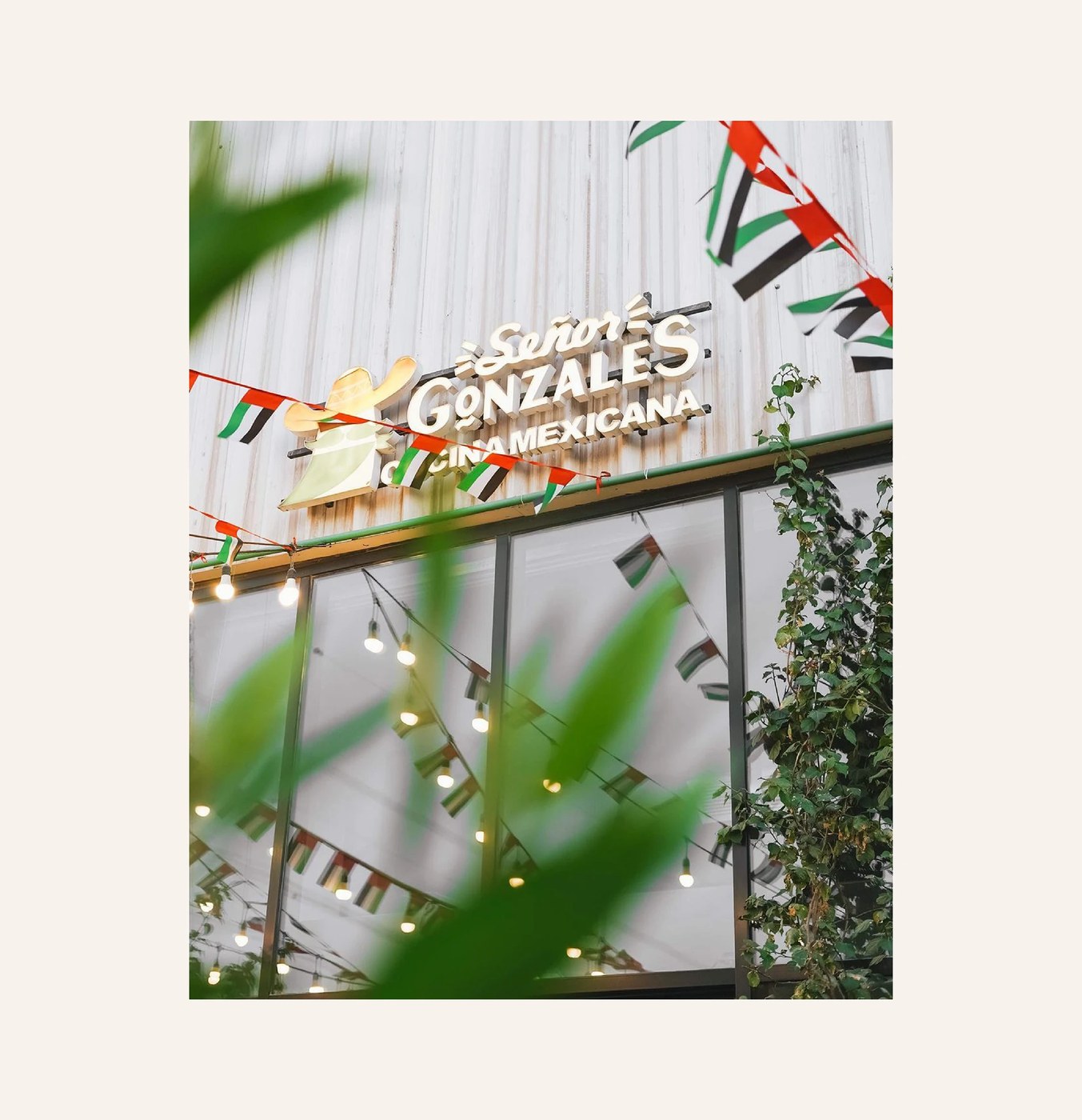
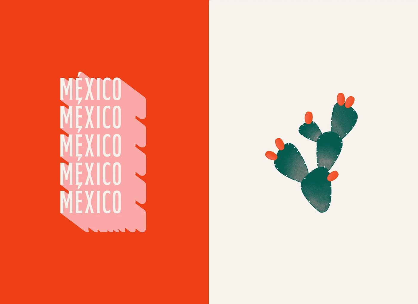
The custom lettering serves as a primary anchor for the brand. The wordmark pairs a casual, flowing script with a heavy, stylized sans-serif. This combination defines a unique typographic scaling system. The letterforms carry physical weight. They translate well to illuminated exterior signage. Heavy selected a single, disciplined typographic system. It scales across physical menus and packaging without losing structural integrity. The primary color palette relies on high chromatic contrast. A saturated orange-red field pairs with crisp white elements. This choice brings an active visual energy to the space.
Ultimately, Heavy establishes a new benchmark for this dining category. They demonstrate how a mexican restaurant branding visual identity can thrive on minimalism. By combining traditional motifs with modern layouts, the studio creates a lasting design system. It addresses both physical spaces and digital interfaces. The identity feels rooted in heritage yet perfectly calibrated for an international cosmopolitan center. See more of their outstanding work on the Heavy portfolio.