Microsonic | Typography by Estúdio BRN BRANDS
Microsonic by Estúdio BRN BRANDS: Microsonic was born from the belief that true growth comes from intelligence, not improvisation, a display typography design project.
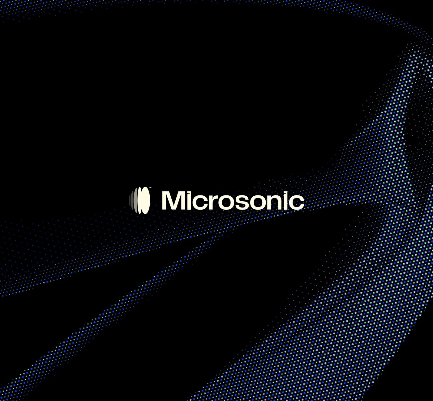
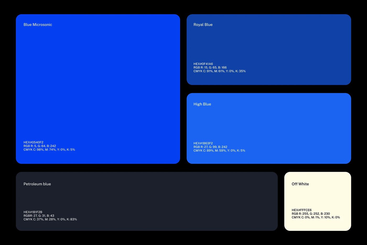
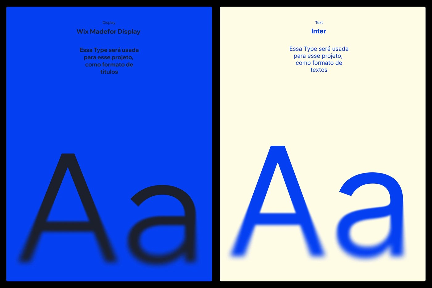
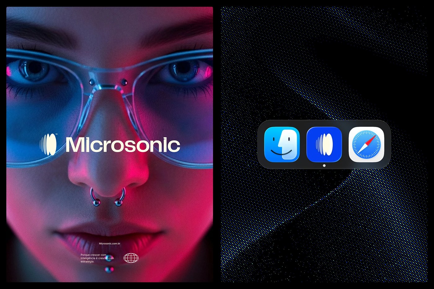
Electric blue gradients and azure tones anchor the visual identity for this AI strategy firm. Estúdio BRN BRANDS focuses on translating complex automation into a legible brand language. The work avoids generic tech tropes by emphasizing precision through its specific display typography design approach. Instead of chaotic patterns, the studio uses structured layouts to reflect how custom AI agents connect data and business vision.
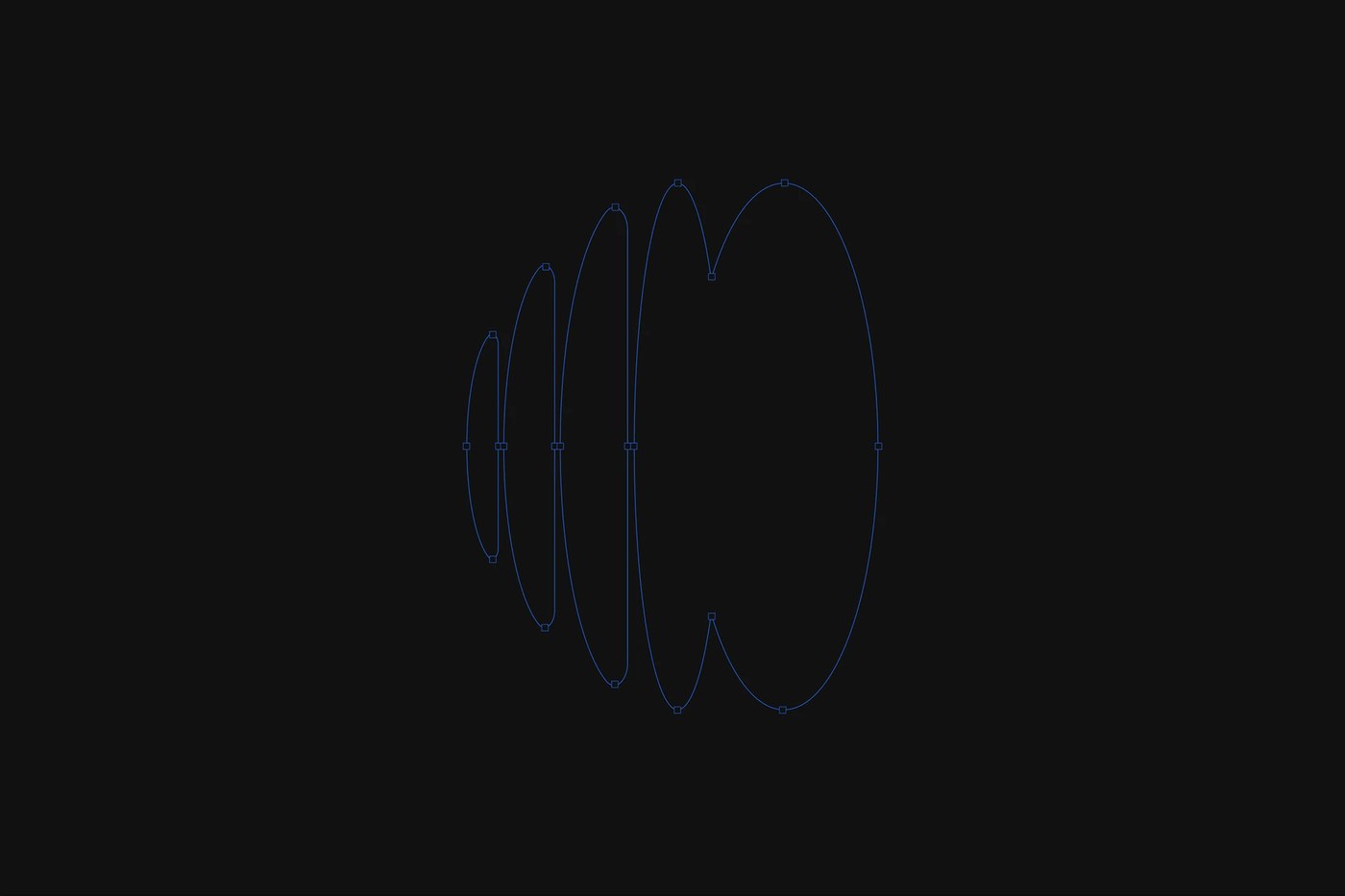
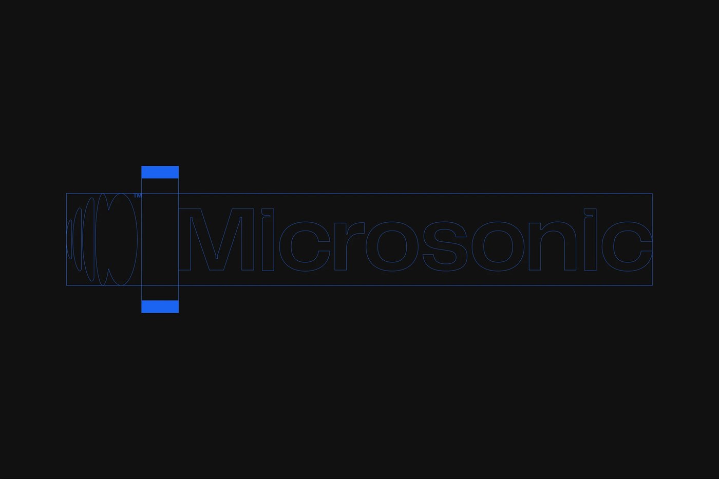
Precision in display typography design
The identity centers on moving away from improvisation toward intentionality. Through a series of digital screenshots and abstract compositions, the brand visualizes its role as a tech partner for smart growth. These elements utilize an electric blue palette to signal speed and impact across different interfaces. By prioritizing this specific display typography design style, Microsonic communicates agility within the highly technical sector of artificial intelligence and automation.
See the full project by Estúdio BRN BRANDS on Behance.