MORION Cosmetics Packaging Design by Darina Selischeva
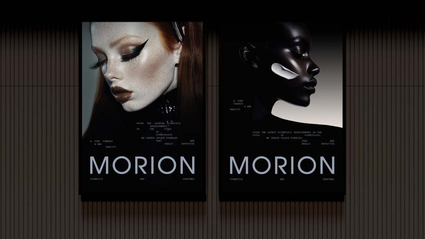
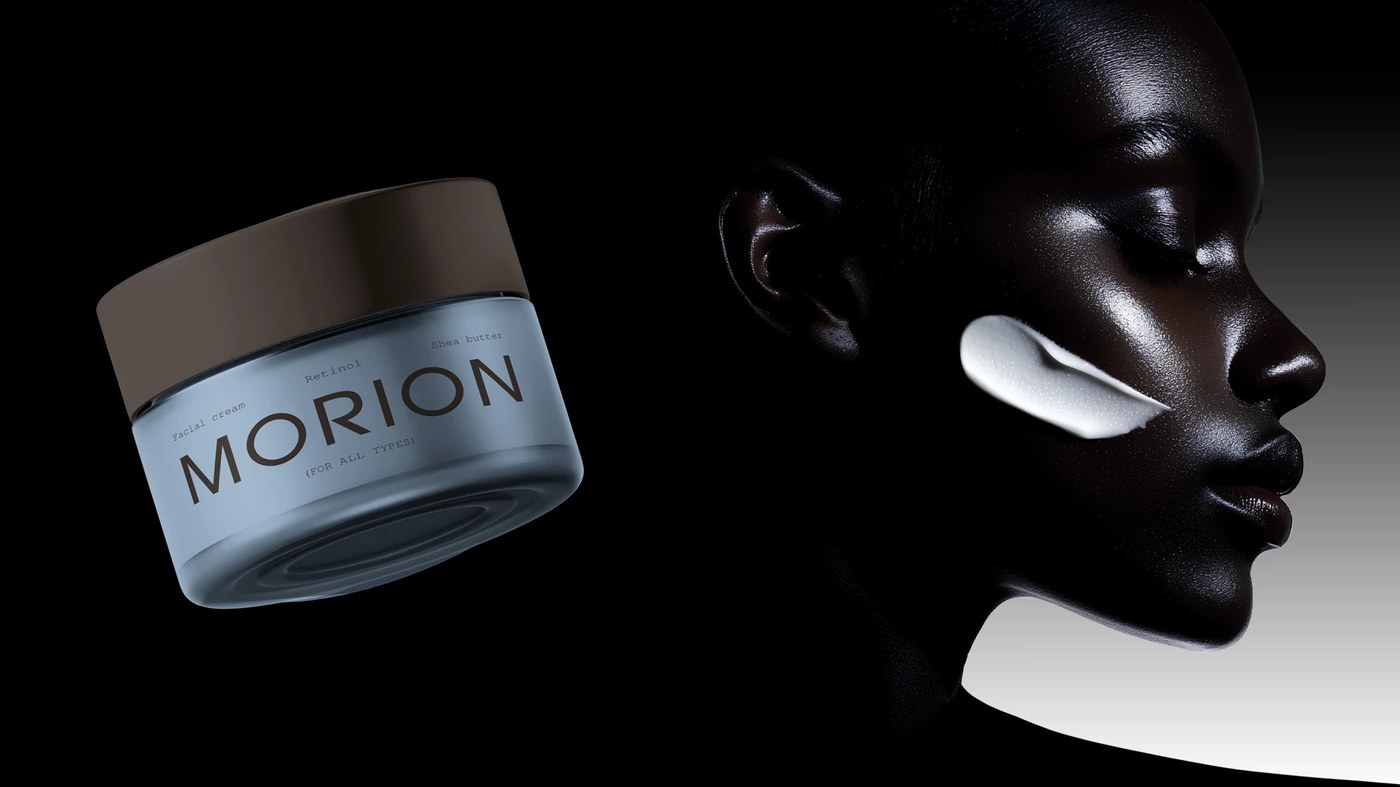
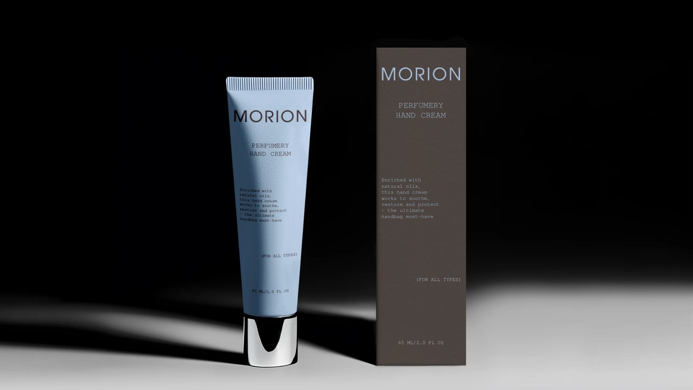
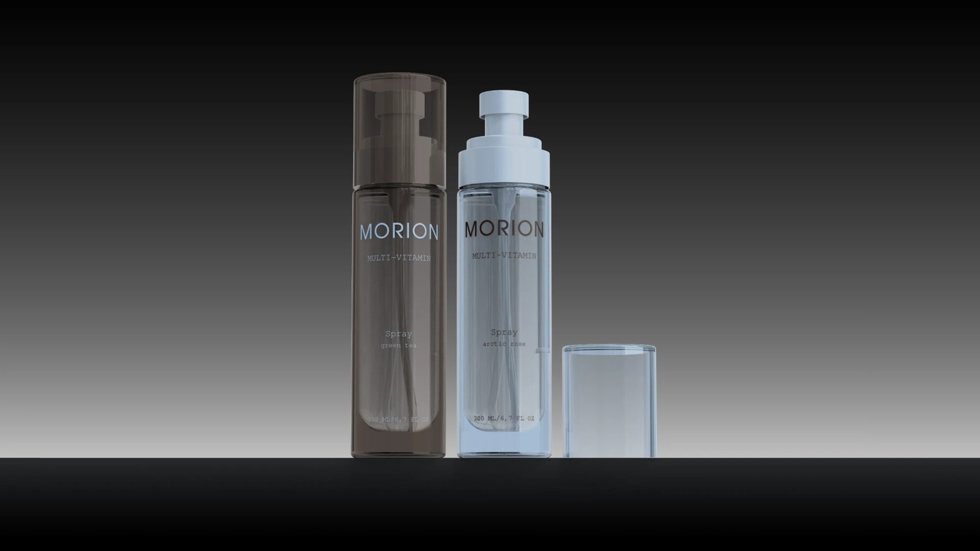
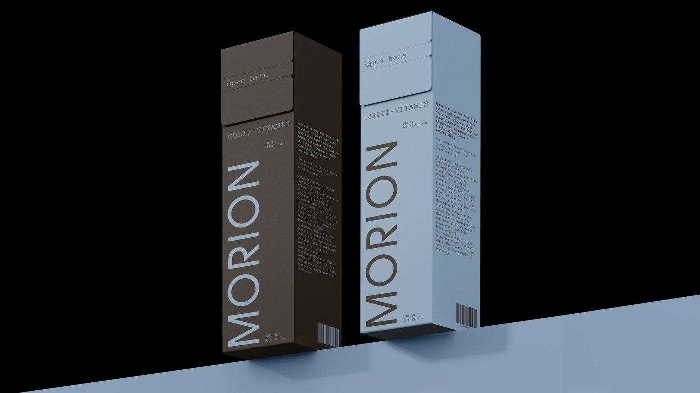
The brand identity for MORION, a modern skincare and perfumery label designed by Finland-based designer Darina Selischeva, establishes a clinical yet elegant aesthetic. Through structured type layouts and slate grey tones, the project showcases how cosmetics packaging design can communicate confidence and inner strength. In a crowded beauty market, this cosmetics packaging design provides a clear alternative to excess embellishment.
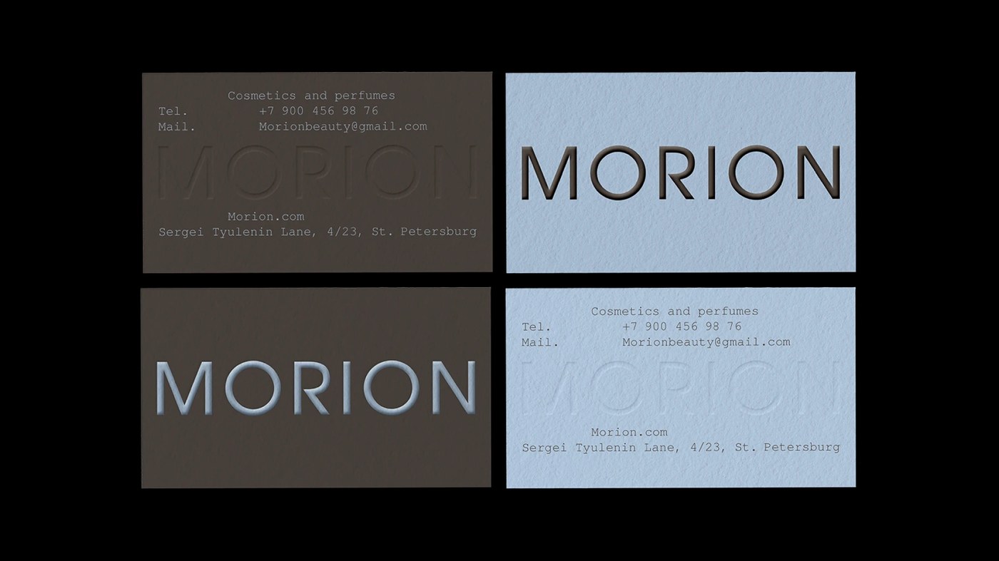
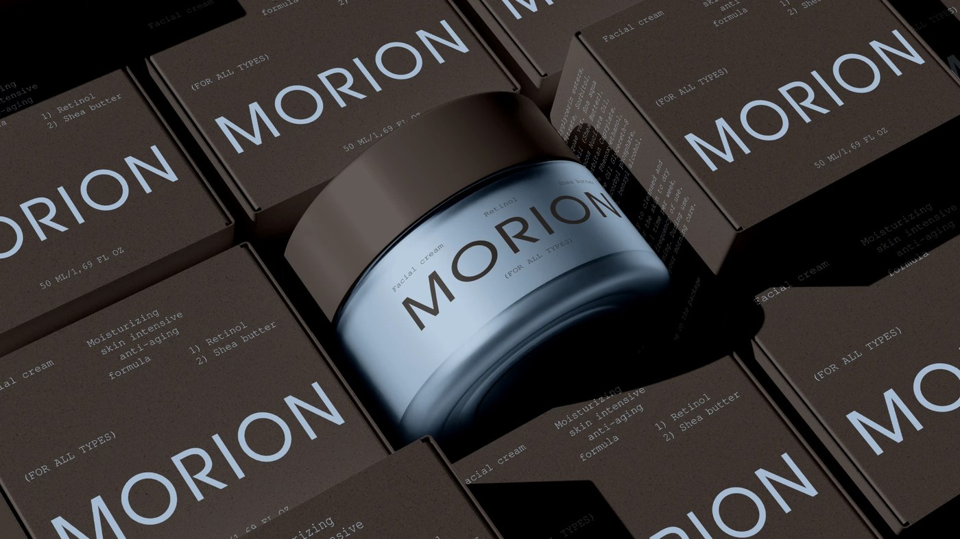
Selischeva relies on a high-contrast serif typeface for the wordmark, anchoring the composition with physical presence. By placing bold, high-weight letterforms alongside clinical, thin sans-serif product details, the visual tension creates a compelling hierarchy. Extreme close-ups of the packaging highlight the textured, off-white paper stock, transforming the physical container into the visual subject. The near-monochrome palette of soft powder blue and deep charcoal grey reinforces a laboratory-like precision without losing warmth. This quiet approach demonstrates how a cosmetics packaging design can feel modern and human.
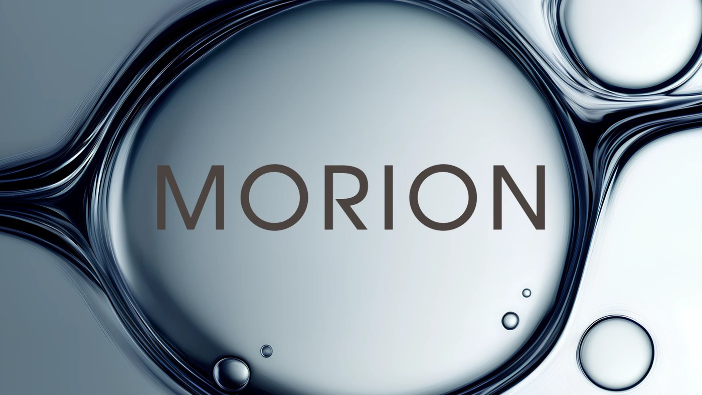
A Slate Grey Approach to Cosmetics Packaging Design
Beyond the visual rhythm, the project addresses the positioning of modern self-care products. By removing unnecessary graphics, this cosmetics packaging design relies entirely on material texture and type hierarchy to speak to the user, a design philosophy that connects contemporary identity with classic apothecary traditions.
This cosmetics packaging design is fully documented on Behance, where you can view the complete brand identity case study by Darina Selischeva.