Music Artist Brand Identity Design: Maya Music
Linhares, Matosinhos & Fadul built a music artist brand identity design for Clara Maya: bold custom type, five-color palette, vinyl sleeves to tooth gem.
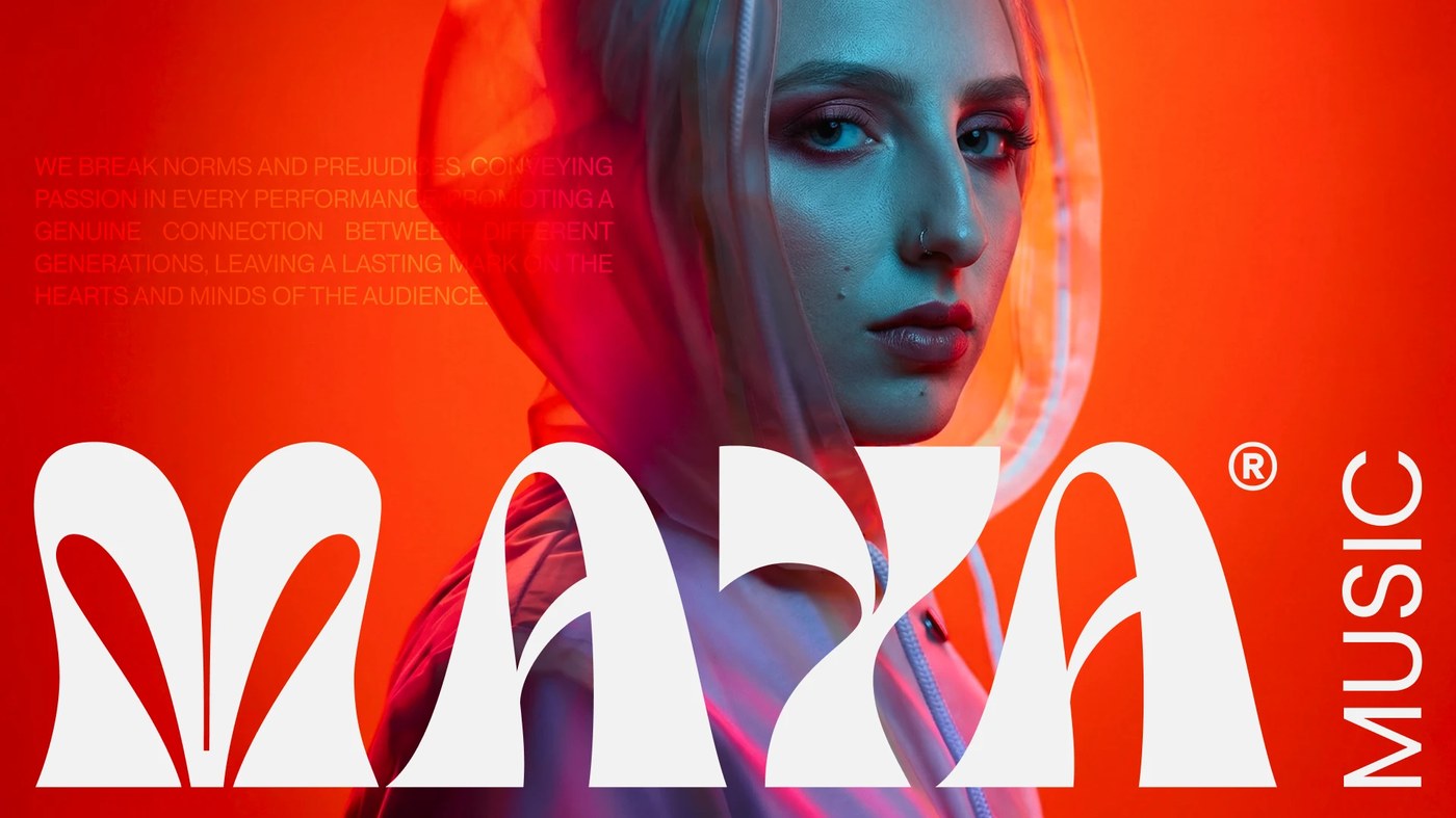
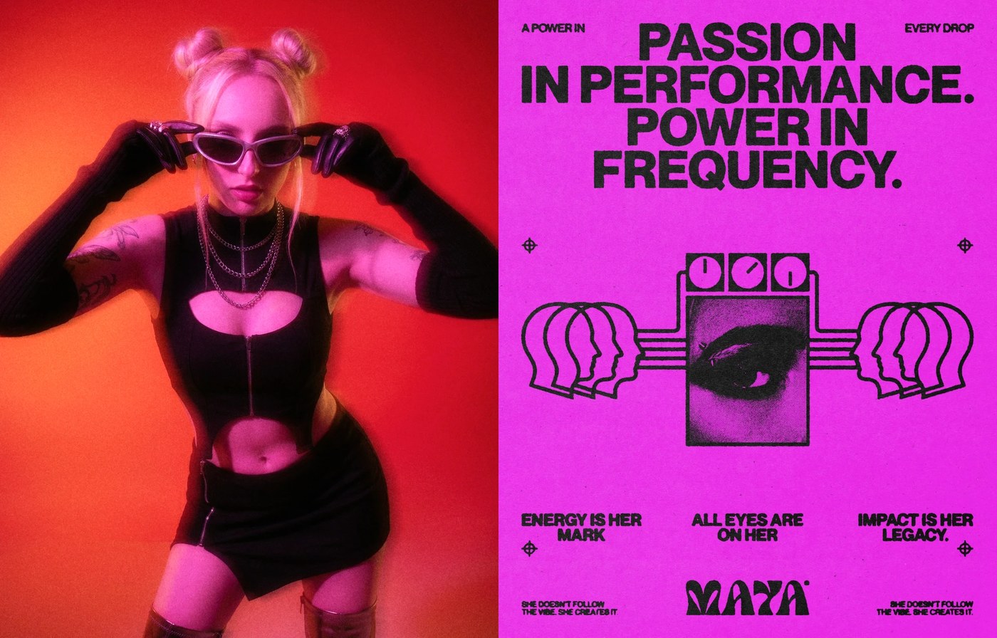
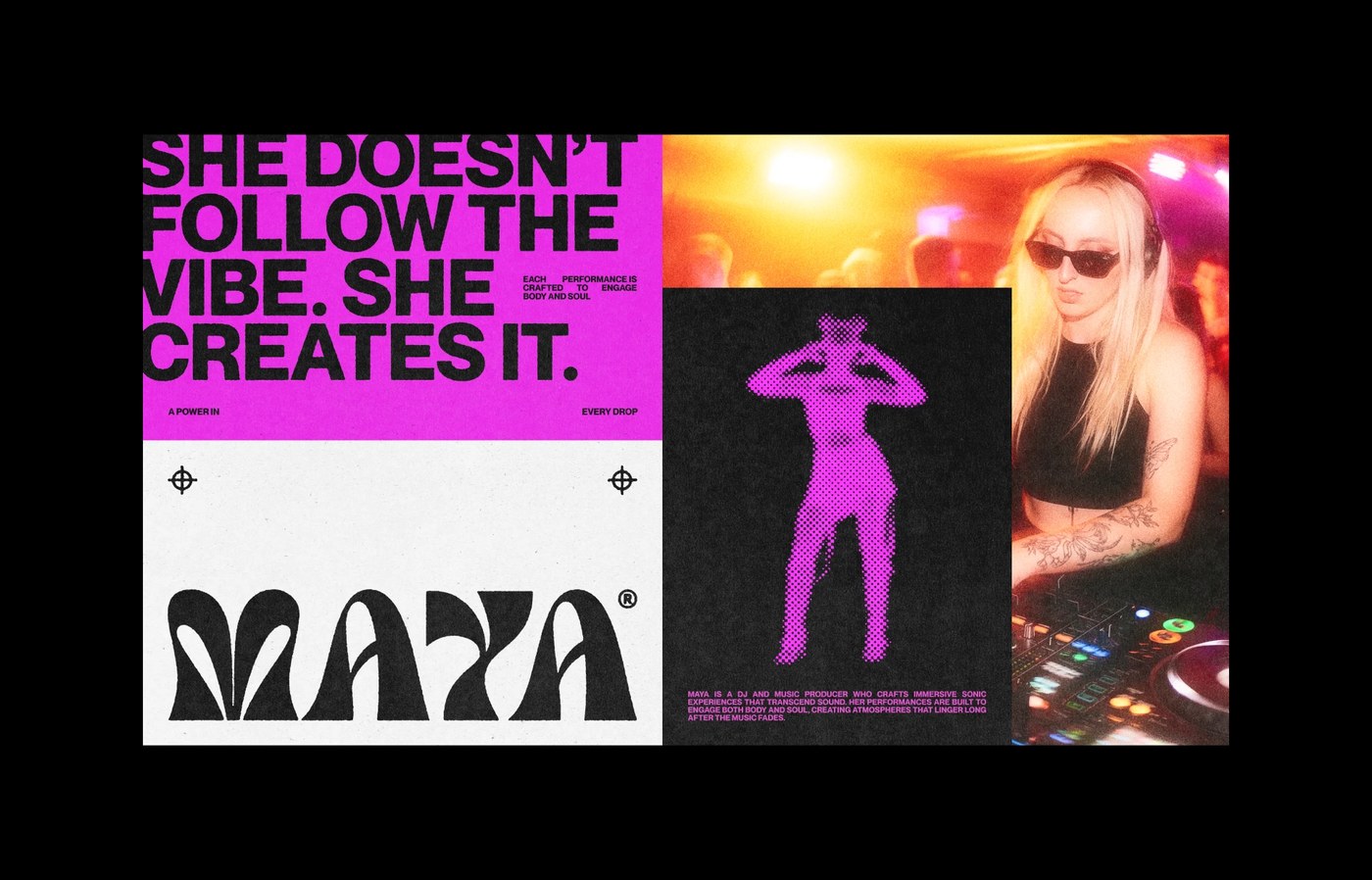
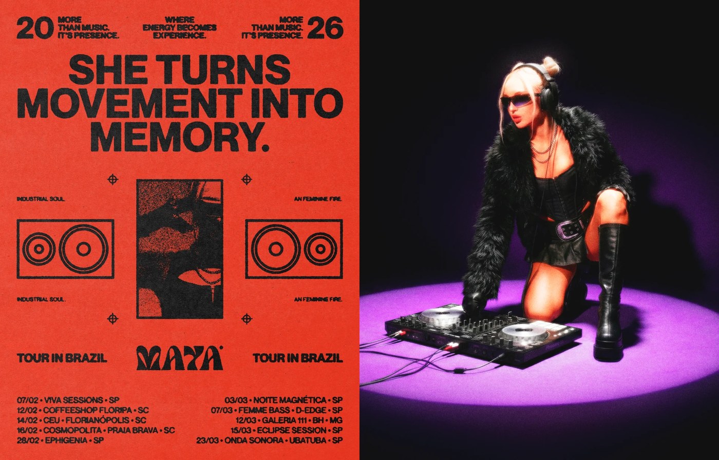
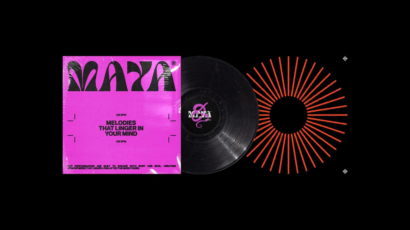
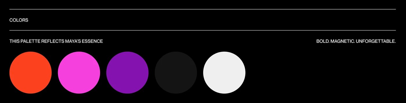
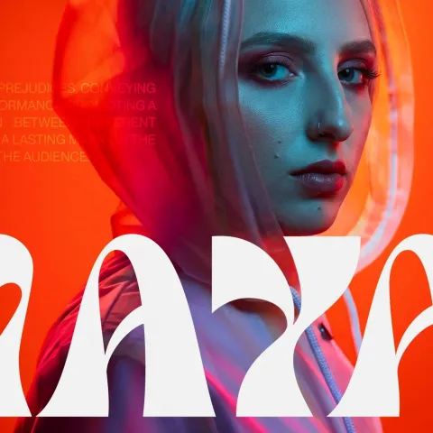
Clara Maya is a Brazilian DJ and music producer whose music artist brand identity design starts with the wordmark doing the heaviest lifting: white ultra-rounded custom type filling the lower half of a frame, overlapping an orange-lit portrait with no buffer between letterforms and skin. No outline, no drop shadow — just type pressed directly against the image. The five-color palette runs orange-red (#E8401C), magenta (#E040C0), purple (#7B20C8), black, and near-white, and the discipline is absolute: every surface gets the same five options, no exceptions. The vinyl sleeve puts a distorted MAYA logotype on magenta, a glossy black record at center, and an orange radial burst on solid black — three panels, three color fields, one unmistakable system.
Music Artist Brand Identity Design That Works at Every Scale
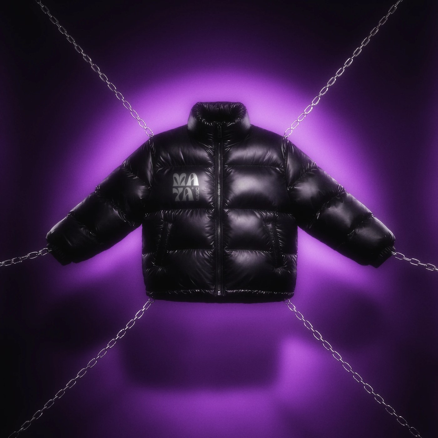
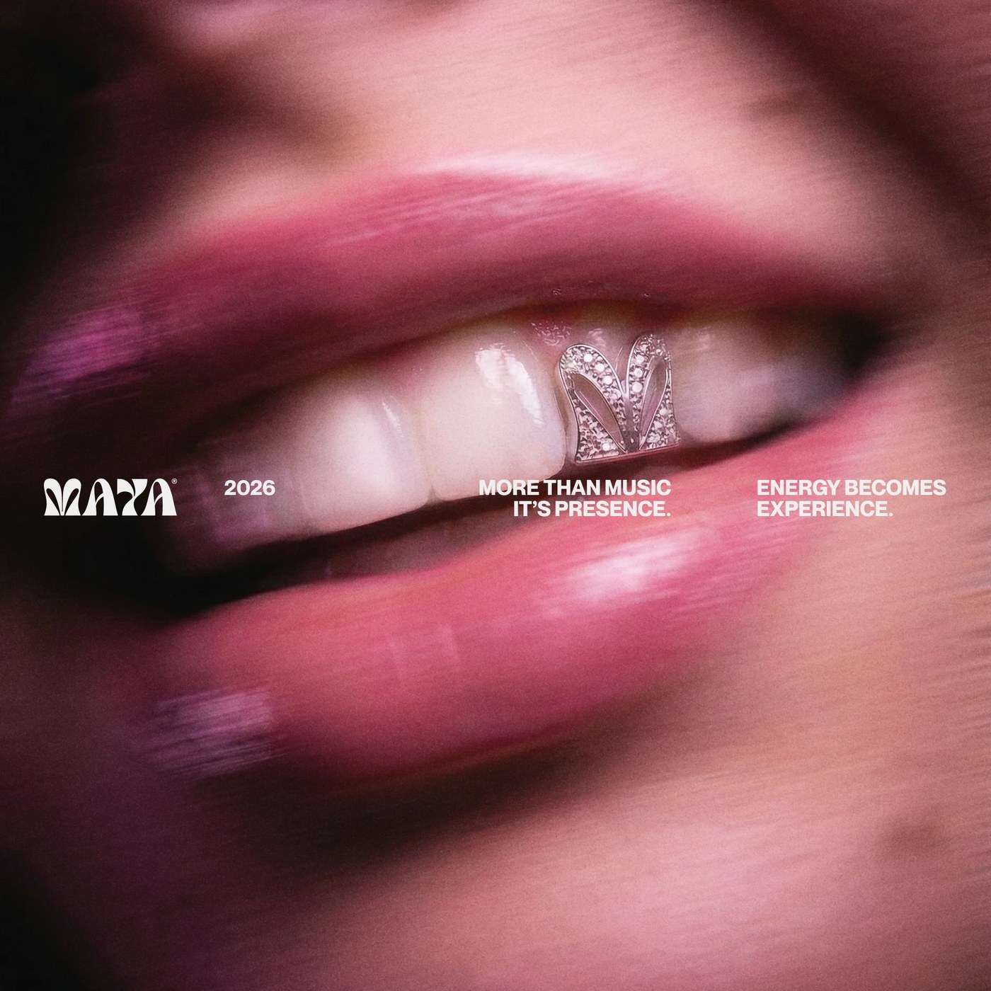
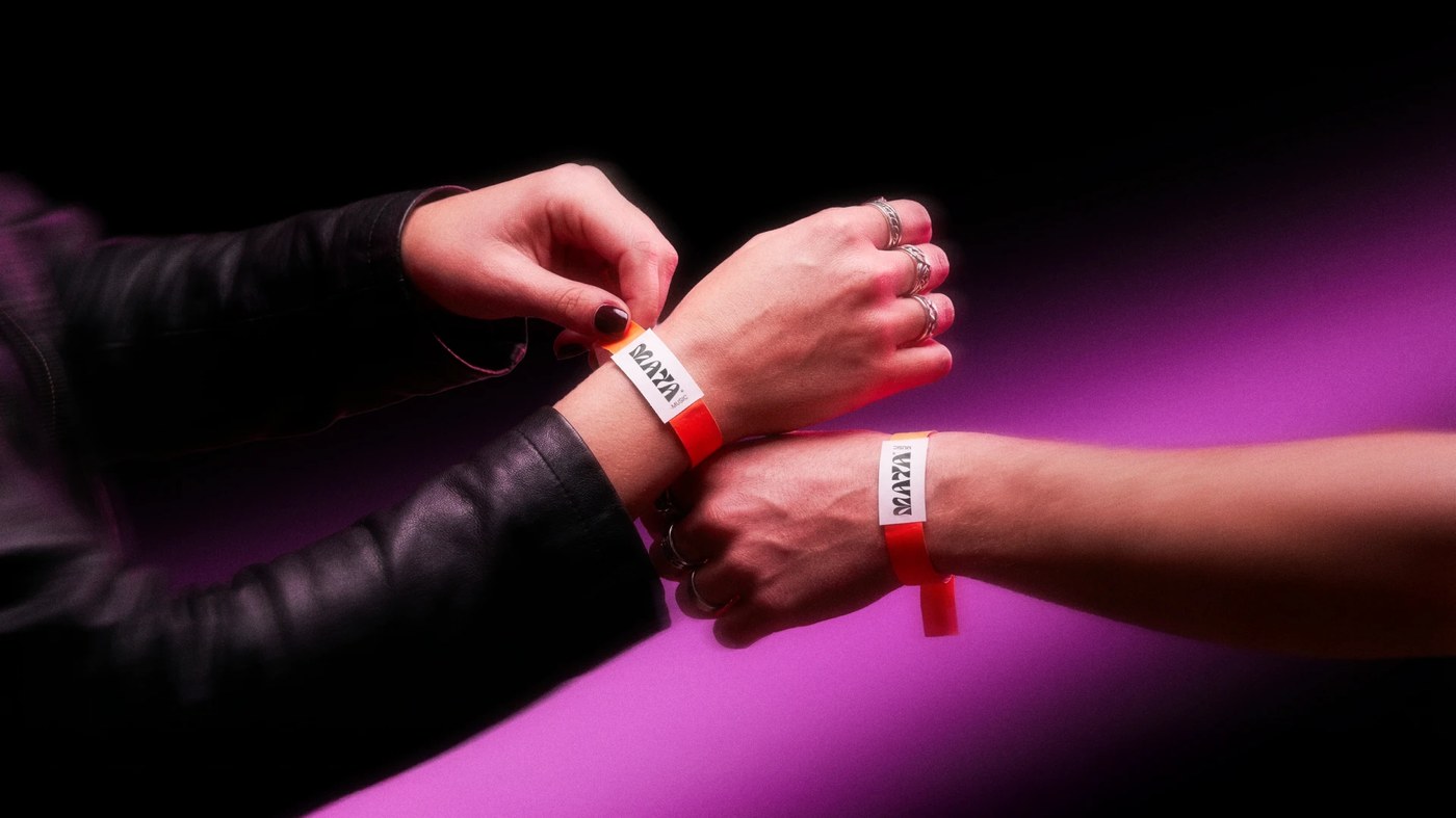
The most unexpected application is also the sharpest: a macro portrait of a smile with a diamond tooth gem engraved with the MAYA wordmark, three lines of white micro-type set just below. It is brand identity operating at the scale of a body part. The same logic extends outward — embossed logo on a glossy black puffer jacket, red nylon tour wristbands with white MAYA label, condensed all-caps type blown up over crowd photography. This music artist brand identity design holds across every scale because the system is tight enough to have no weak applications. When music artist brand identity design reaches from vinyl packaging to a tooth gem without losing coherence, the system is working.
See the full project by Vitor Linhares, Vitor Matosinhos & Klayton Fadul on Behance.