Nova Root: Natural Skincare Brand Identity Design
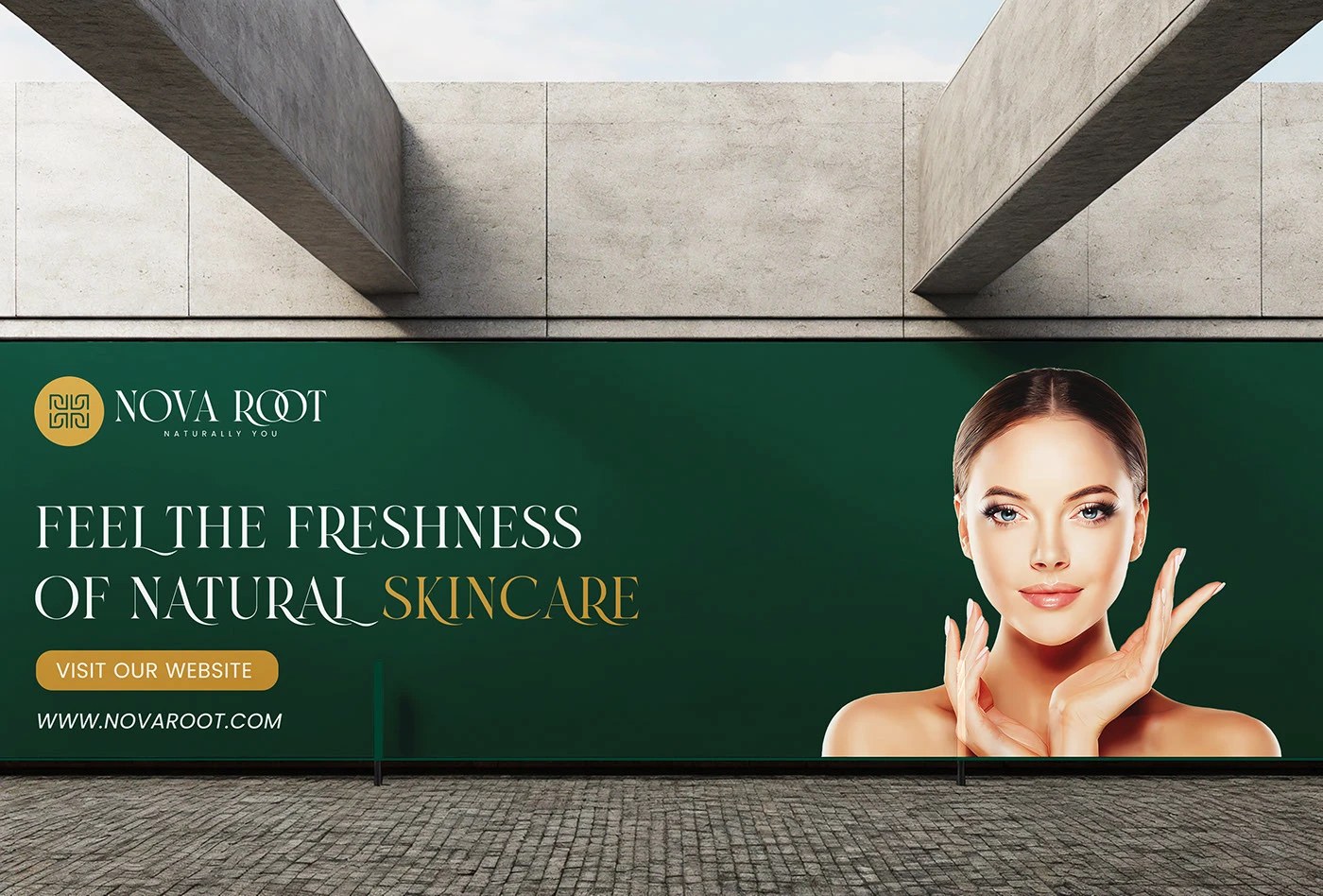
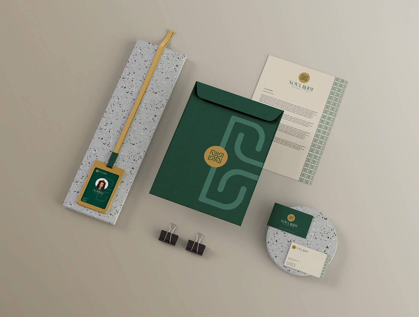
Nova Root is a skincare brand identity by Hammad Ali Shah built on a geometric monogram in hunter green and antique gold across packaging and stationery.
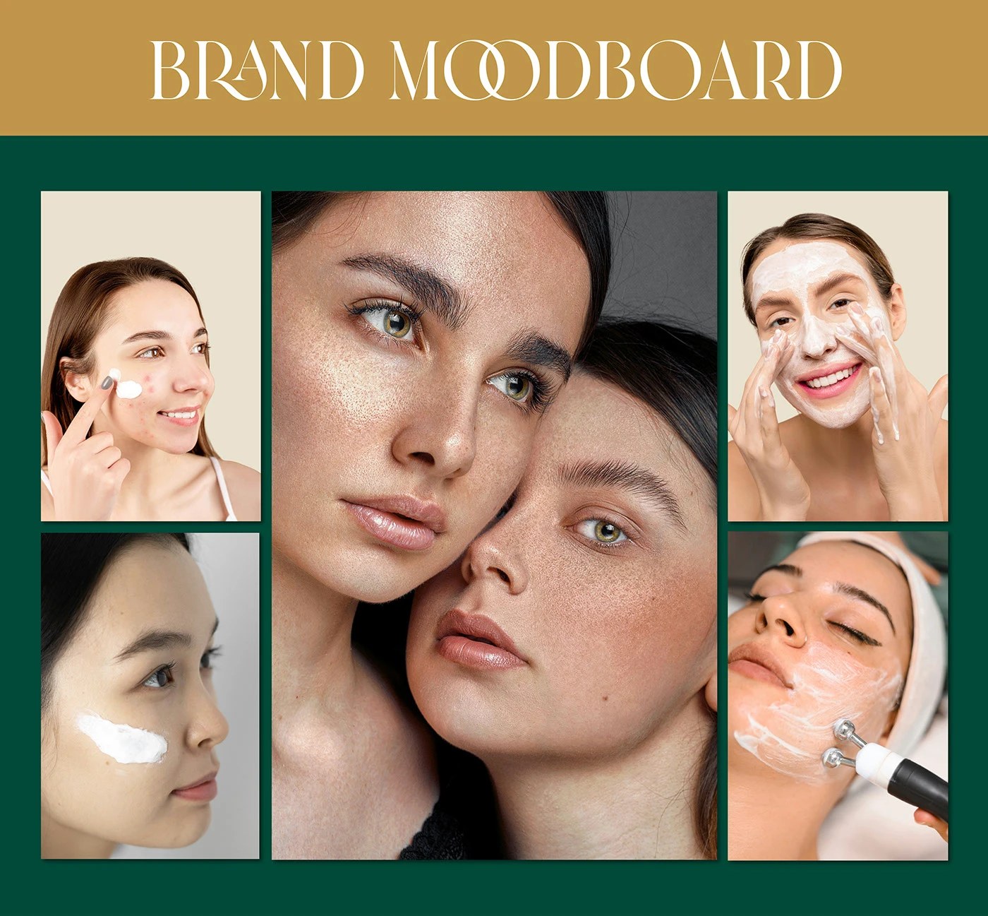
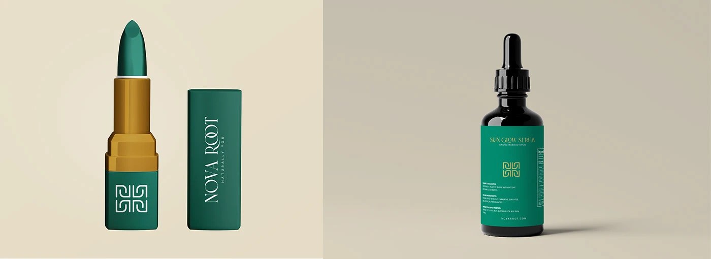
The mark anchoring this skincare brand identity is a 2×2 grid of interlocking square spirals — a structure more architectural than botanical, yet it reads as organic through sheer repetition. Hammad Ali Shah renders it in antique gold pressed into a deep forest green circle badge, then carries that pairing without variation across every surface. The wordmark earns its keep through one detail: the two Os in NOVA ROOT share a single circular bowl, a custom ligature that mirrors the badge geometry exactly. Hunter green holds the dominant field across business cards, a dark glass dropper bottle, and a lipstick tube. Gold foil stamps the cards; a terrazzo-textured notebook introduces a tactile counterpoint. Nothing strays from the two-color lock.
Skincare Brand Identity Built on Geometric Precision
What Hammad Ali Shah avoids is as deliberate as what he uses. No leaf motifs, no sans-serif naturalism, no warm-beige-only softness. The skincare brand identity earns its natural claim through restraint — the geometry does the work of authority, and the palette does the work of warmth. The packaging, a dark glass dropper and a slim lipstick tube set against warm beige, closes the loop between clinical precision and sensory appeal.
See the full skincare brand identity project by Hammad Ali Shah on Behance.