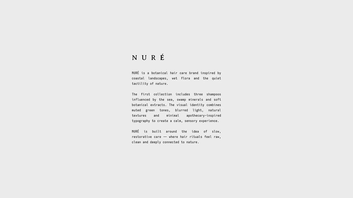
NURE: Packaging by Shcherbashyna Olha
Discover NURÉ, a premium botanical hair care concept and packaging design project by Shcherbashyna Olha.
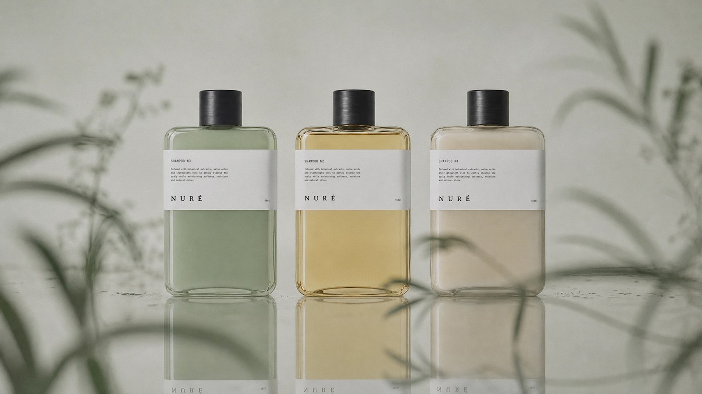
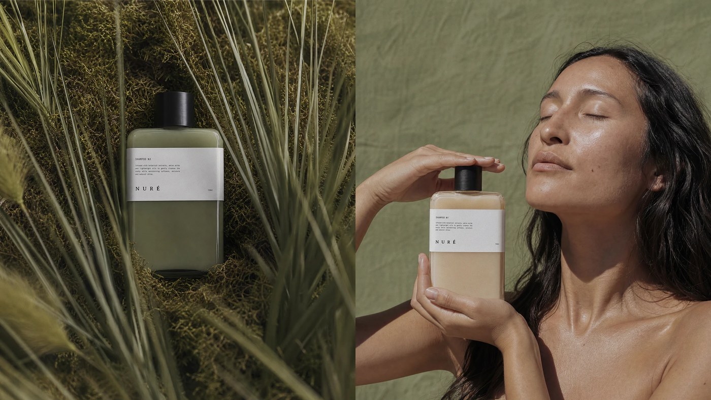
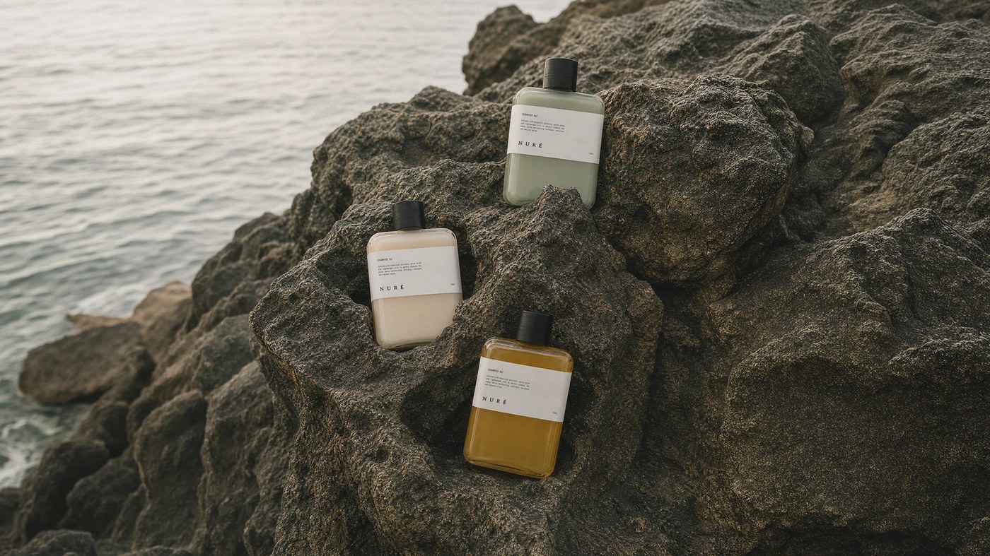
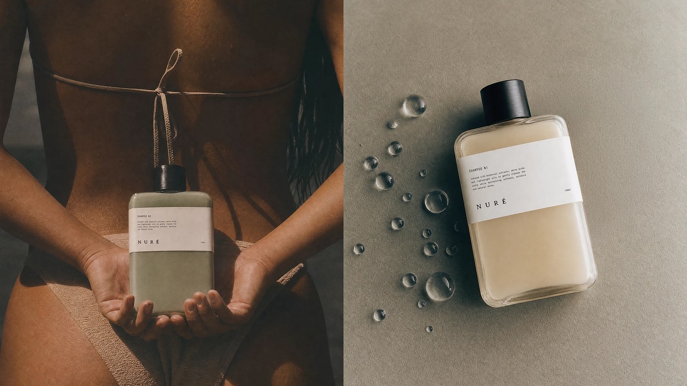
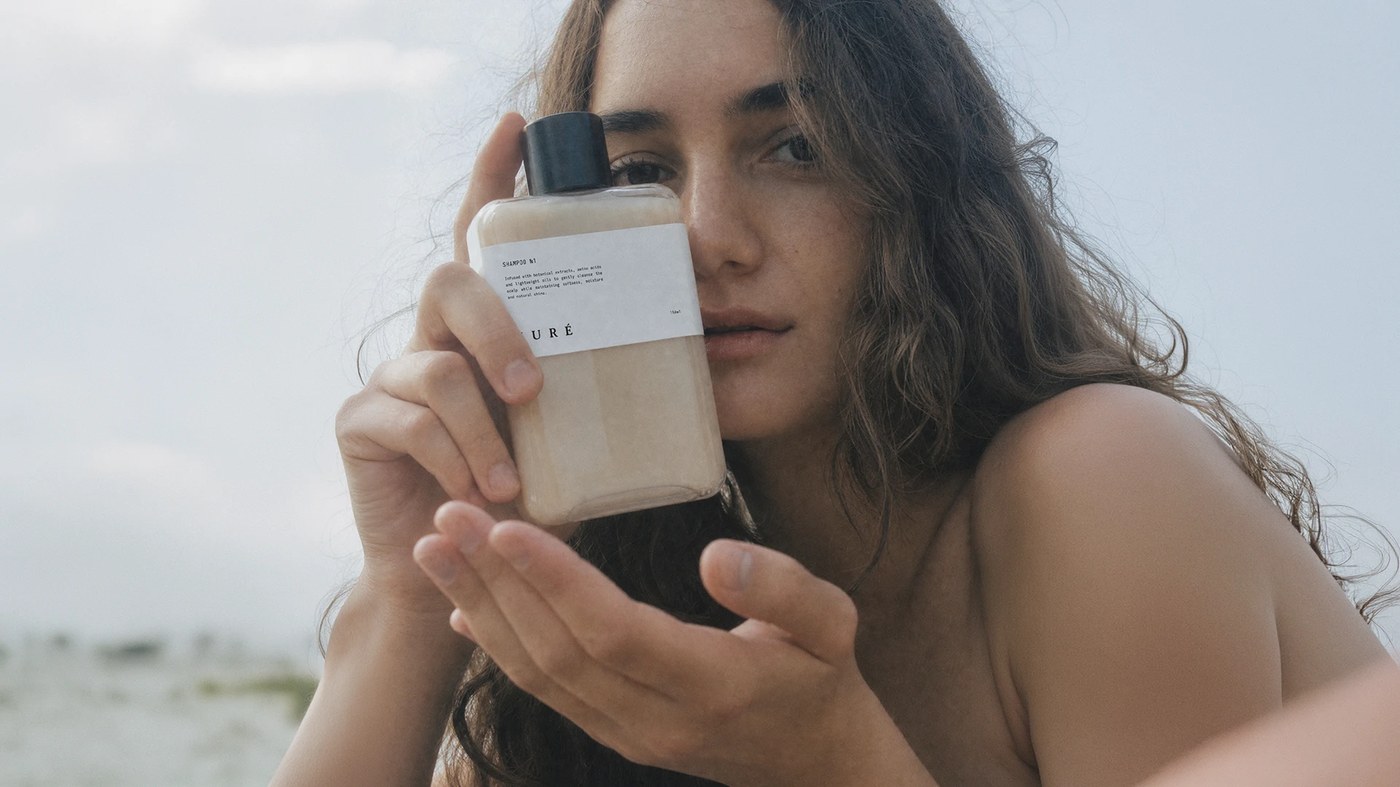
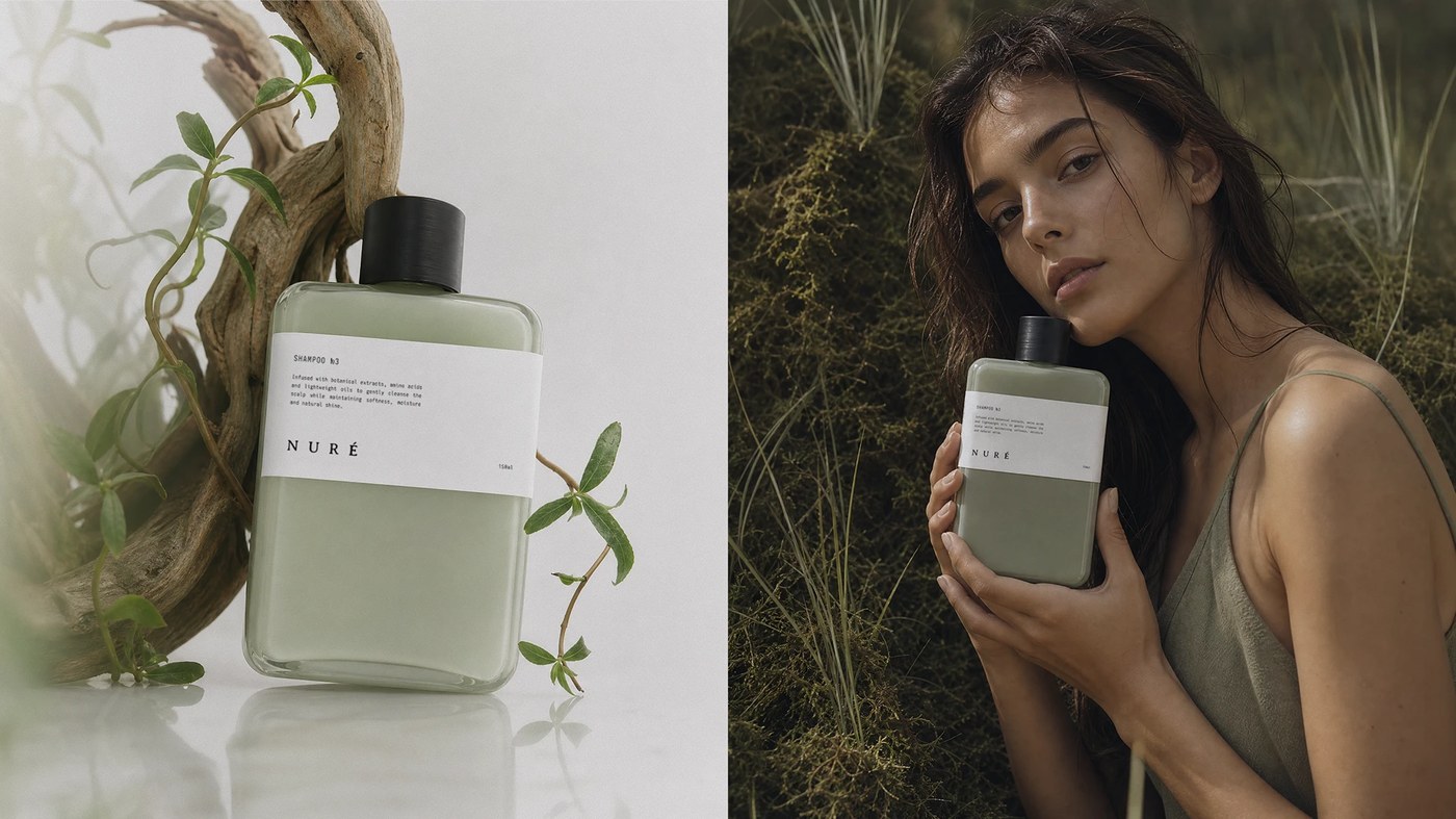
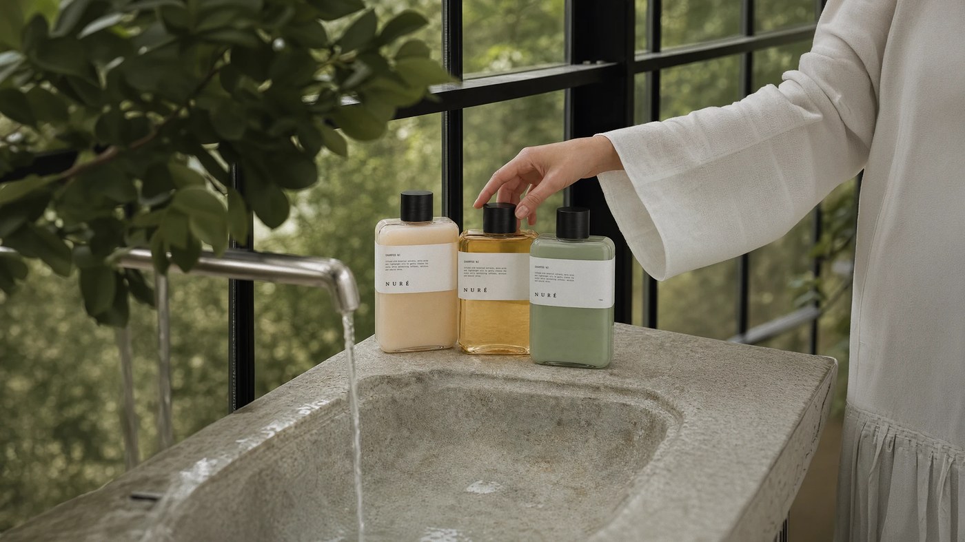
Inspired by marine elements, swamp minerals, and wild flora, this cosmetic brand identity utilizes minimal apothecary aesthetics, tactile photography, and a muted green color palette to establish a calm, sensory visual ritual. The project serves as a masterclass in modern sustainable packaging design, proving how a cohesive brand system translates effortlessly from digital renders to physical shelf presentation.
Inside the packaging design system
Packaging design is the ultimate stress test for any brand system; the typography and material choices must survive the realities of printing textures, physical lighting, and competitive shelf contexts. NURÉ handles this challenge through a highly disciplined, tactile approach:
- Apothecary Aesthetics: The clean, understated typographic layouts evoke a sense of clinical expertise blended with organic nature, balancing utility with luxury.
- The Palette: Muted, earth-toned greens dominate the system, directly anchoring the product line in its botanical and mineral origins.
- Physical Presence: Rather than relying on flat digital presentation, the project emphasizes texture and materiality, treating the bottle and outer boxing as three-dimensional tactile objects.
Created by Ukraine-based designer Shcherbashyna Olha, the complete case study offers an in-depth look at the brand’s component architecture, sequenced framing, and production annotations.
See the full project by Shcherbashyna Olha on Behance.