Ruda: AI Brand Identity Design with Full Creative Direction
Yai Salinas turned an abandoned client brief into Ruda — a self-directed AI brand identity design where every Midjourney campaign image was art-directed.
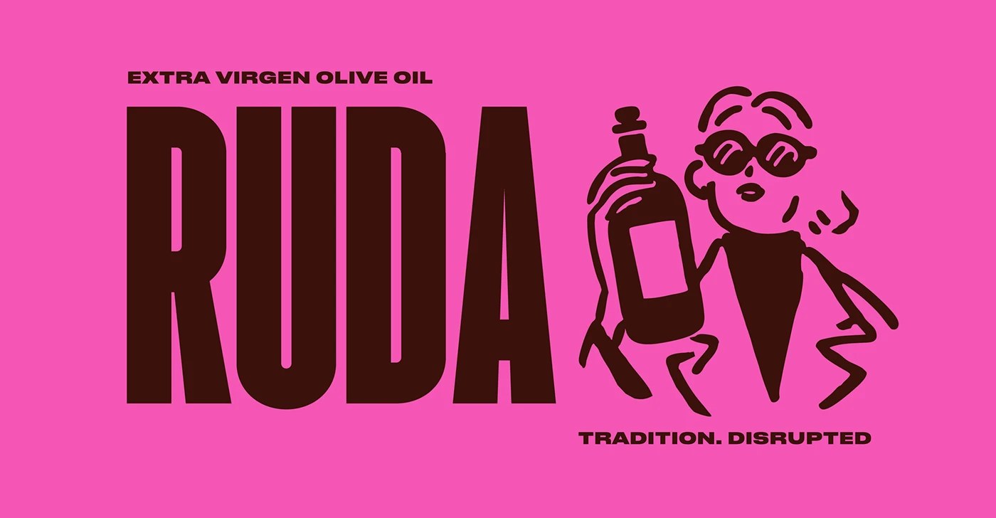
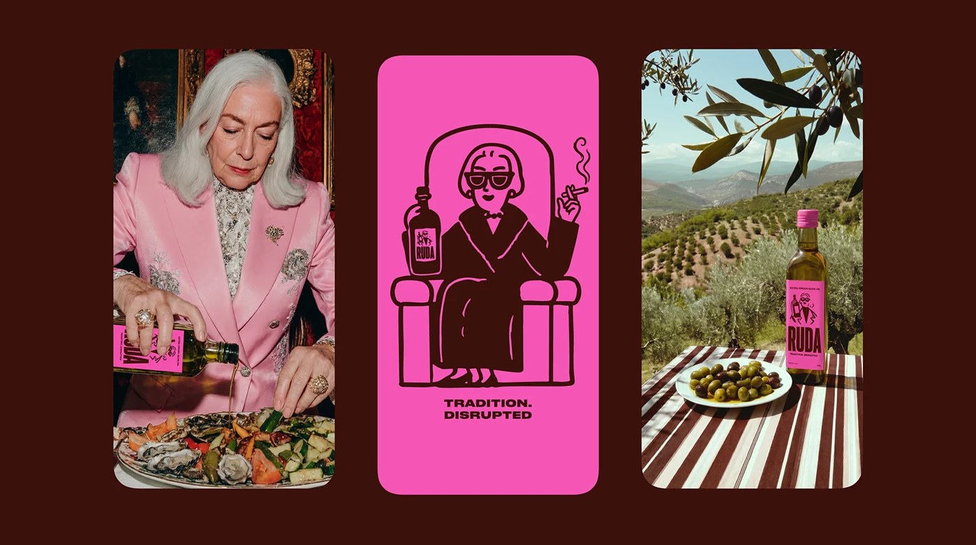
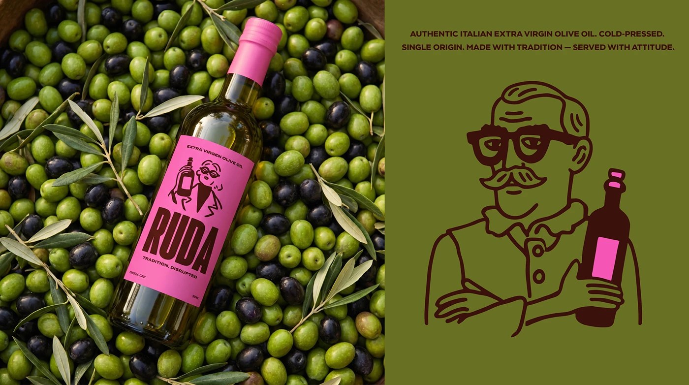
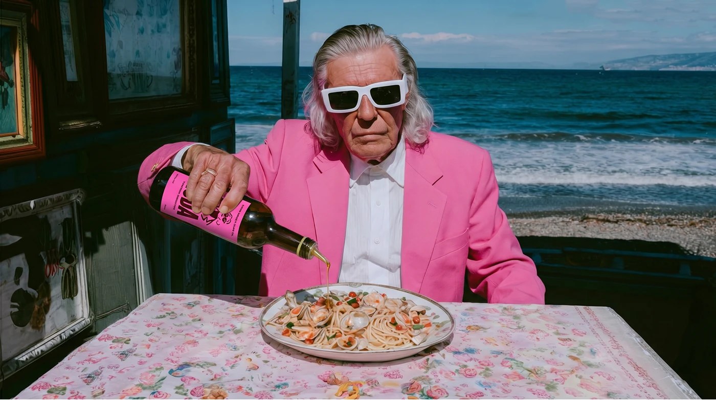
The brand system Yai Salinas built for Ruda runs on two colors: hot pink in the #FF3EAE range and dark chocolate brown. The wordmark is condensed black sans-serif — RUDA at full horizontal scale — with a hand-drawn line-art mascot beside it: a sunglasses-wearing woman holding a bottle, drawn in brown on pink. The AI brand identity campaign photography follows the same logic. Elderly Mediterranean figures — a silver-haired man in a pink blazer by the sea, an older woman in a pink kitchen — are styled, not found. Every scene was Midjourney-generated with the Ruda bottle placed deliberately in frame. The look reads traditional. The attitude does not.
AI Brand Identity Design: When Creative Direction Does the Heavy Lifting
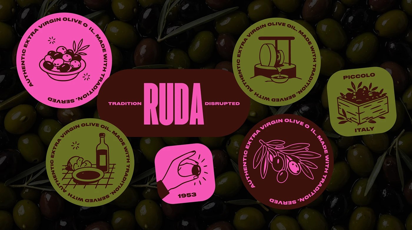
The five circular badge system — in alternating pink, olive green, and dark brown — each carries a mono-line olive illustration and circular text reading “Authentic Extra Virgin Olive Oil. Made with Tradition. Served.” That typographic ring is doing the same work the campaign photography does: anchoring the AI brand identity in something legible while the color makes clear it is not playing heritage straight. When the original Italian olive oil client walked, Salinas kept building. What Ruda shows is that AI brand identity design done at this level requires the same curatorial discipline as any other production path — the prompt is the brief, and the edit is still the job.
See the full AI brand identity project by Yai Salinas on Behance.