Solspill Beverage Packaging Design by Holman Design
Holman Design built Solspill's beverage packaging design from strategy to can design, visual identity and its applications for a premium hydration brand.
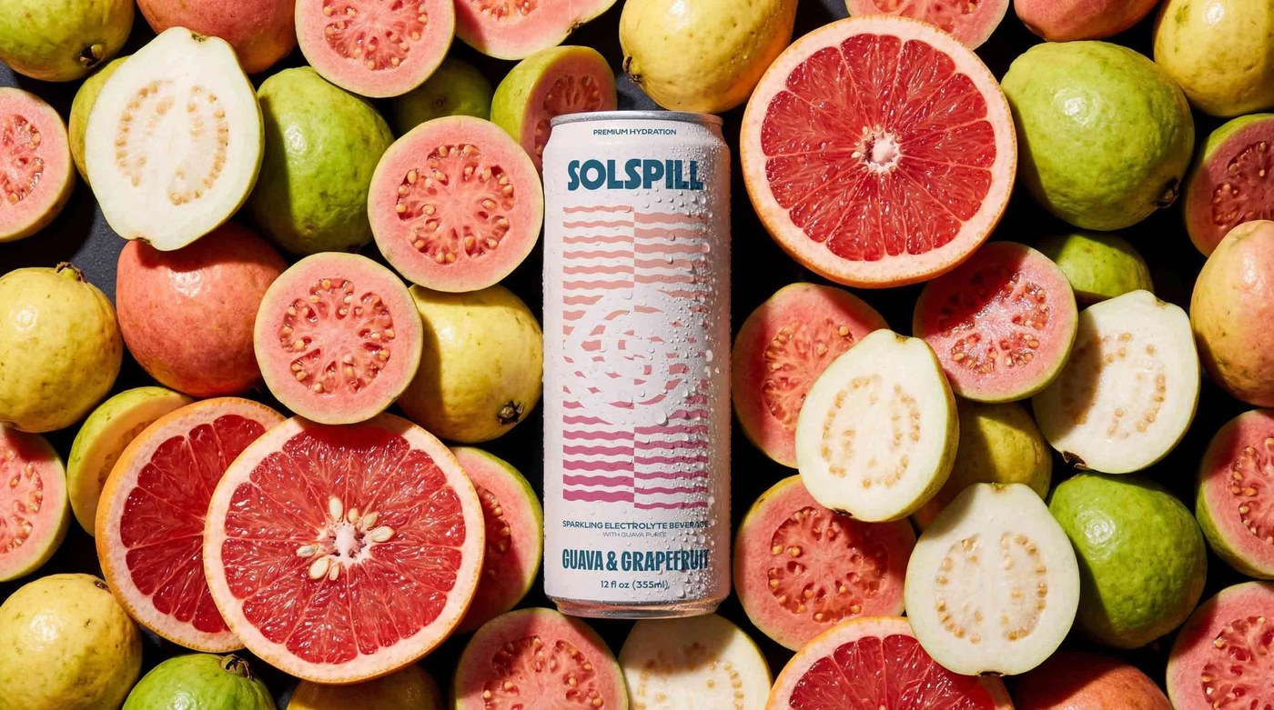
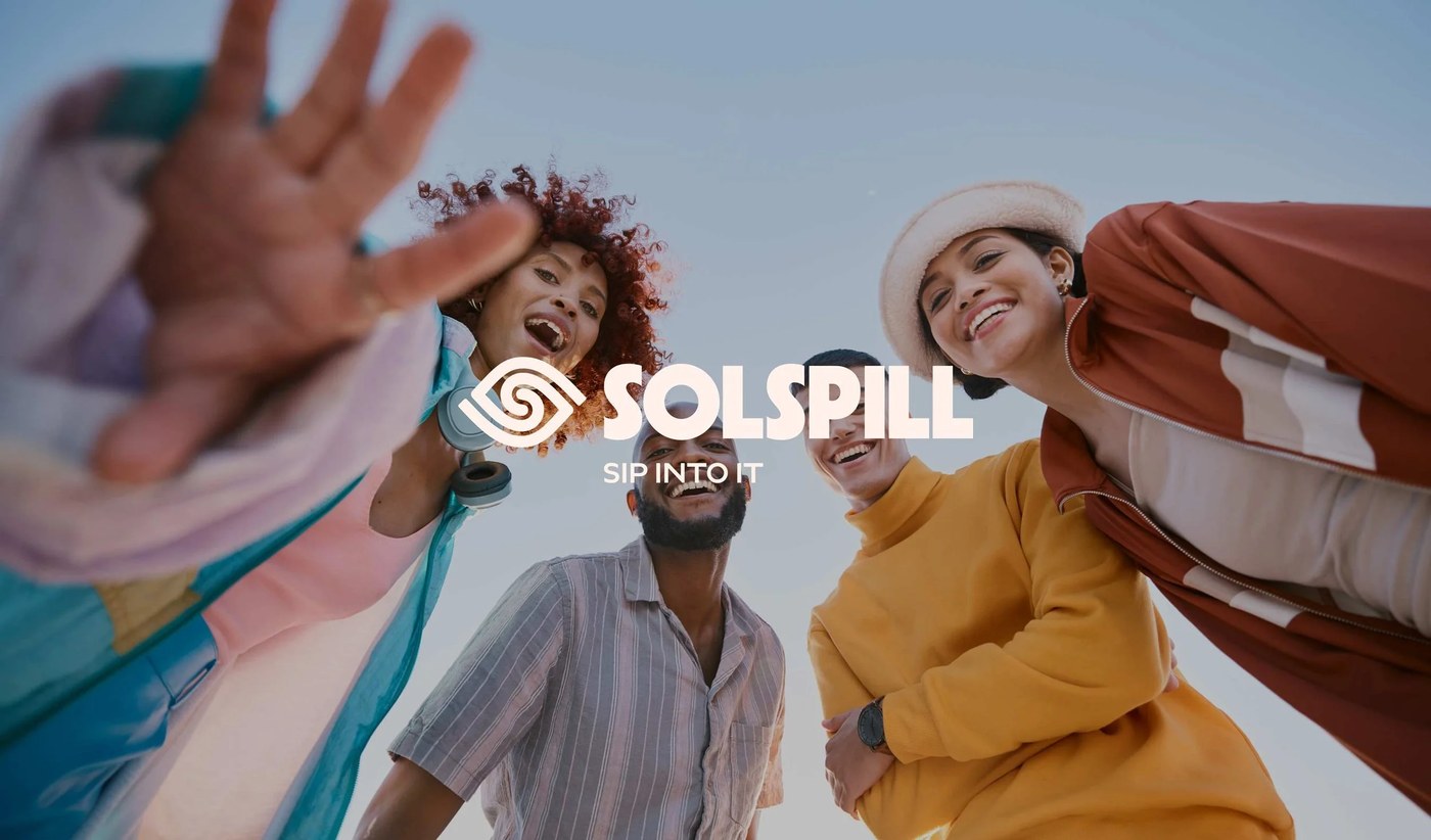
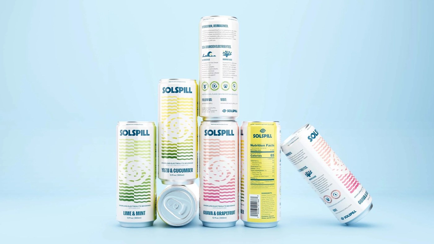
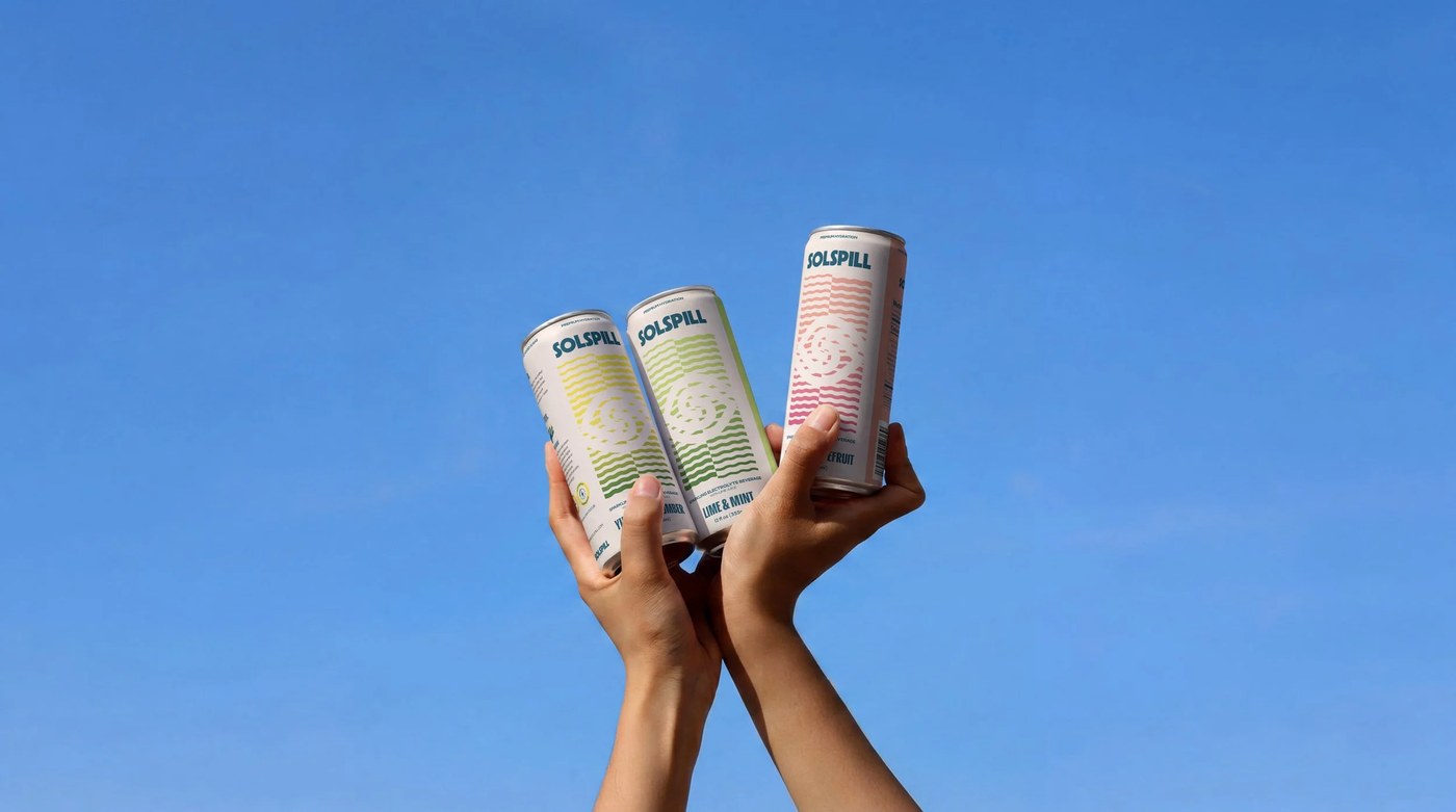
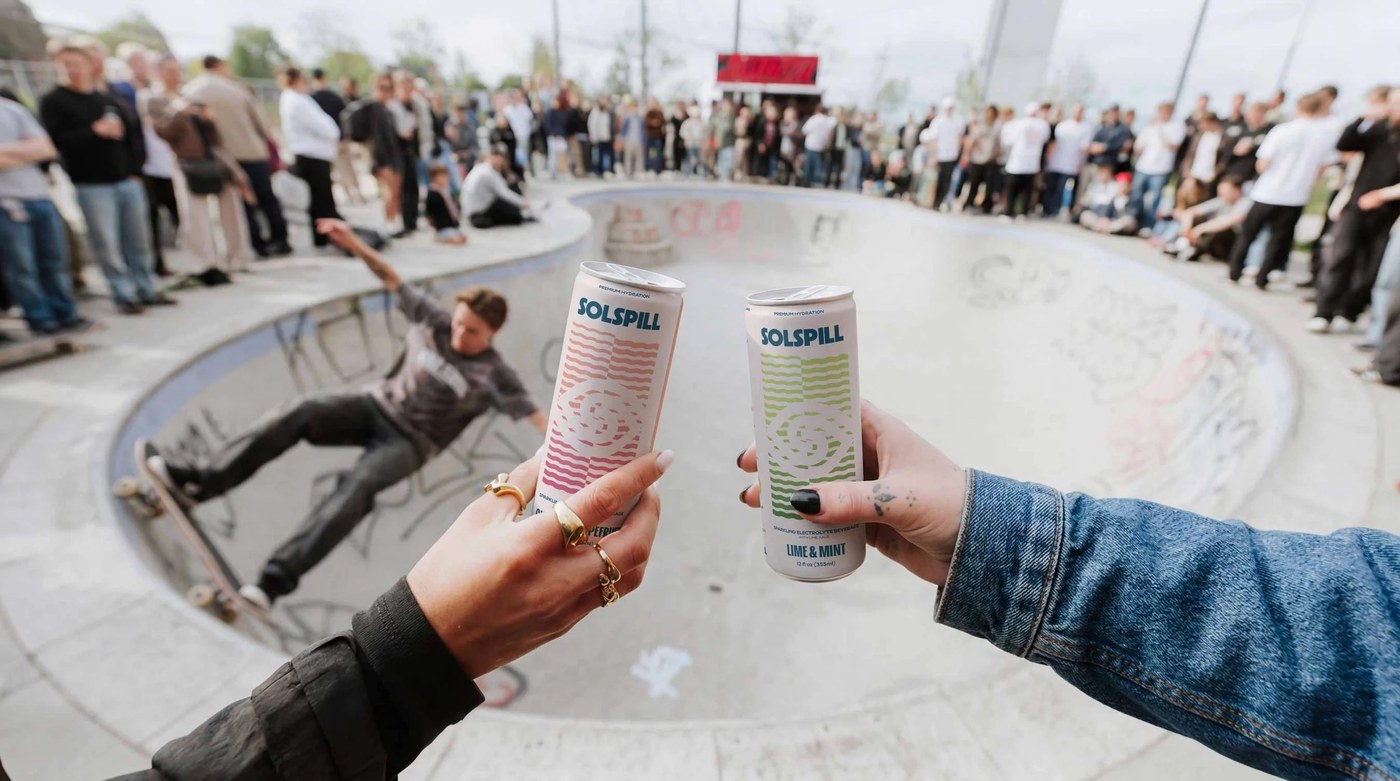
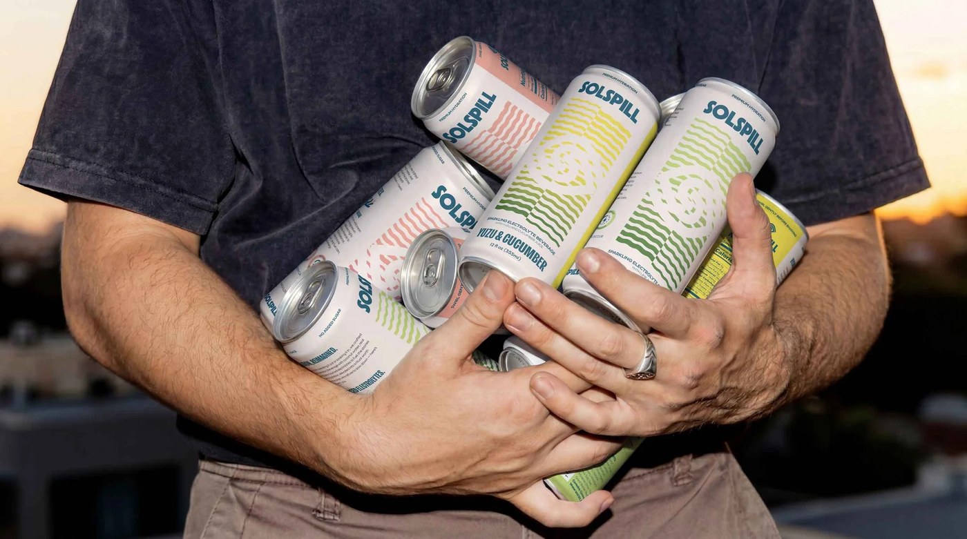
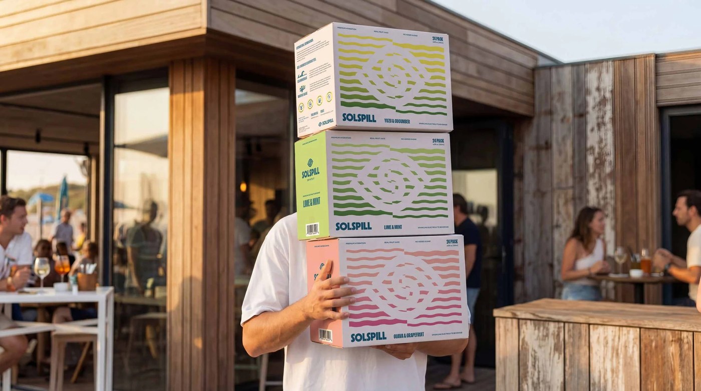
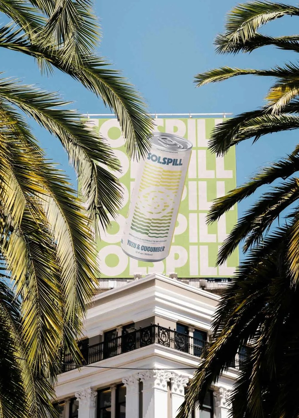
Solspill's beverage packaging design centers on a slim aluminum can wrapped in deep midnight blue, with a single horizontal wordmark in a condensed grotesque. The logotype sits low on the can face, giving the upper third of the surface over to open color — a deliberate choice that reads as restraint rather than emptiness. Across the brand system, Holman Design carried that same economy into secondary applications: flat lay photography with hard directional shadows, identity lockups on cool white grounds, and merchandise that repeats the can's tonal palette without variation.
Beverage Packaging Design That Leads With Restraint
Beverage packaging design in the premium hydration category tends toward gradients and illustrative excess. Solspill holds the opposite position — no illustration, no pattern, no secondary color. The beverage packaging design works because every element earns its place. Holman Design's case study documents the complete arc from positioning through production-ready beverage packaging design assets, making the strategic logic behind each visual decision legible.
See the full beverage packaging design project by Holman Design.