Starville Goods: Constellation Packaging Design by MAUM STUDIO
MAUM STUDIO's constellation packaging for Starville Jeju gives each zodiac sign a flat color field and cartoon creature across keyrings, boxes, booklets.
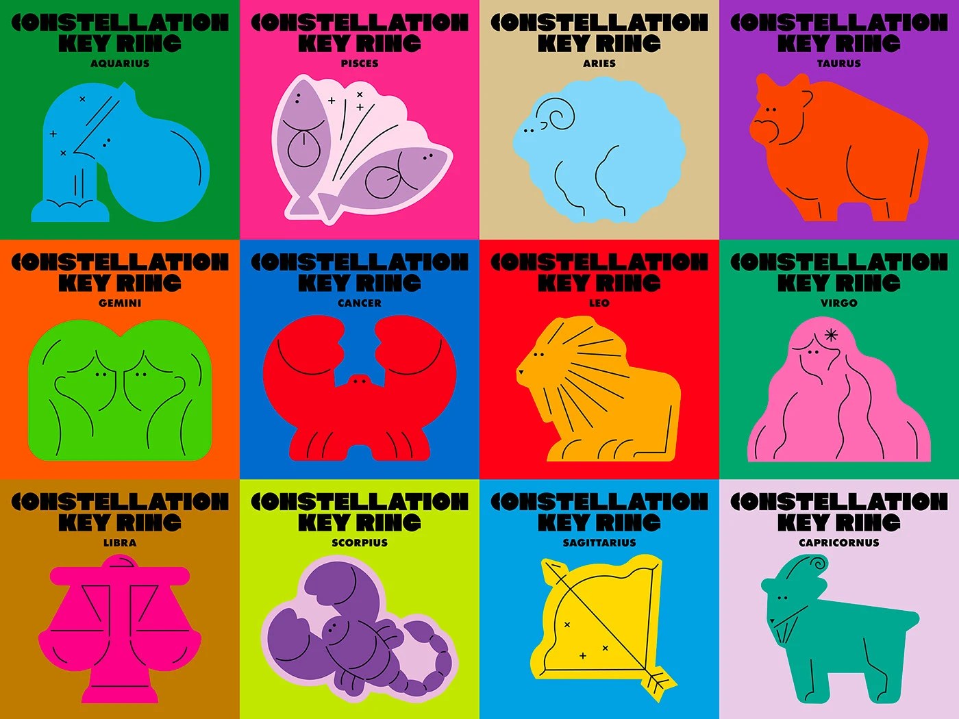
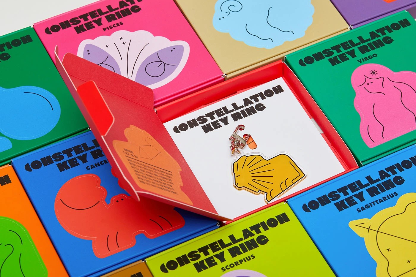
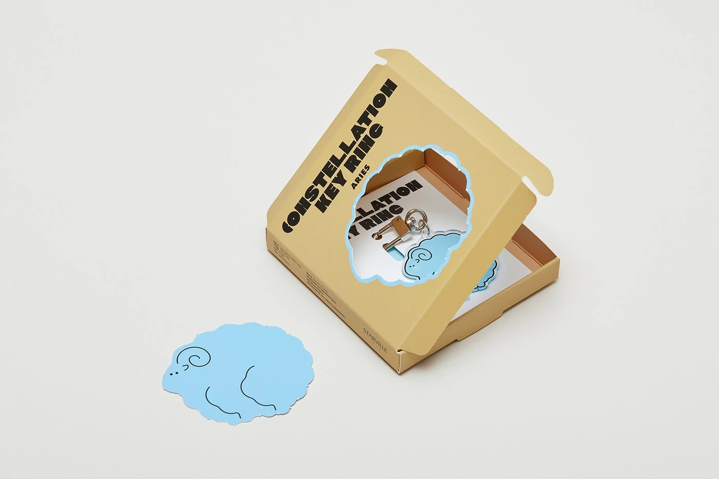
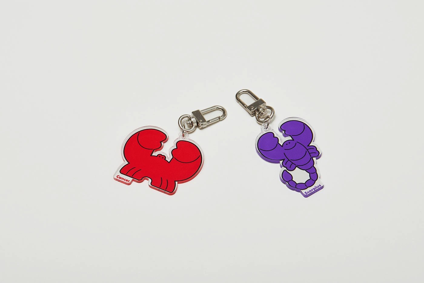
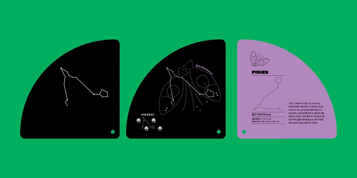
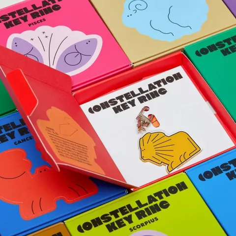
Starville is a dark-sky resort on Jeju Island where guests come to watch the stars. MAUM STUDIO built the merchandise system around one idea: each guest leaves with the sign they observed. The constellation packaging design covers 12 distinct identities — electric green for one sign, hot pink for another, acid yellow, teal, lavender — each box wearing a bold cartoon creature at large scale with its zodiac name in ultra-condensed type. The constellation packaging design extends to acrylic keyrings (a red Cancer crab, a purple Scorpius scorpion, silver swivel clasp) and a fan-format observation booklet on acid green, where dot-map star charts and line illustrations spread across three quarter-circle cards. Every element — sticker, box, keyring, booklet — shares the same flat-color logic. Nothing deviates.
A Constellation Packaging Design Built Around Personal Identity
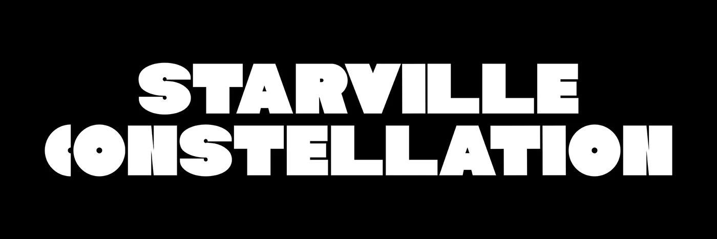
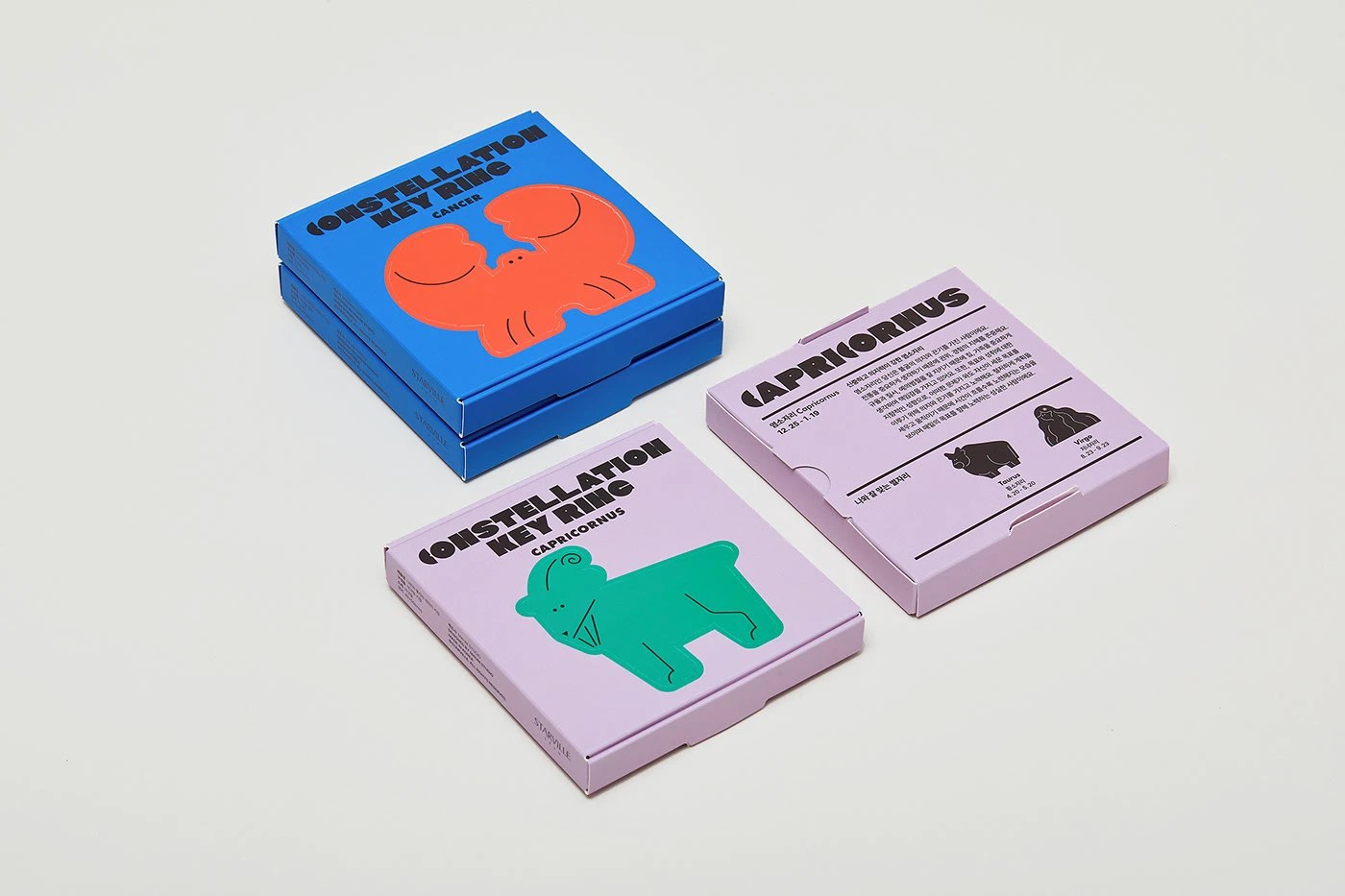
The black-and-white lockup — 'STARVILLE CONSTELLATION' in ultra-condensed white at full bleed — anchors the whole range. It is the only moment without color. Everything else in this constellation packaging design is saturated: 12 colors, one per sign, coordinated so the full set reads as a collection while each piece still works alone. The Cancer dieline in electric blue, red crab at large scale, bold condensed type at the top — zero decoration. MAUM STUDIO treated the zodiac as an identity problem, not a novelty one, and that restraint keeps it from tipping into souvenir kitsch.
See the full project by MAUM STUDIO on Behance.