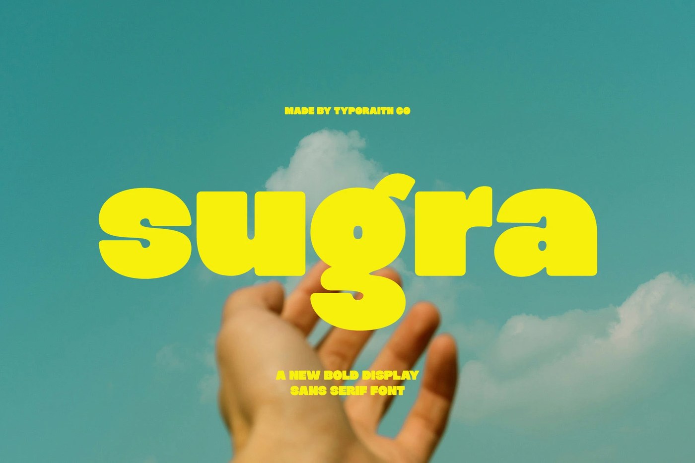
Sugra Gives the Bold Display Sans Serif a Soft Read
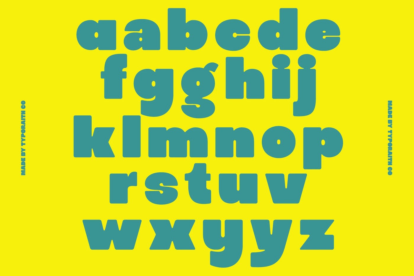
Typoraith Co built Sugra, a bold display sans serif with rounded terminals which give heavy weights a warm tone without softening their visual authority.
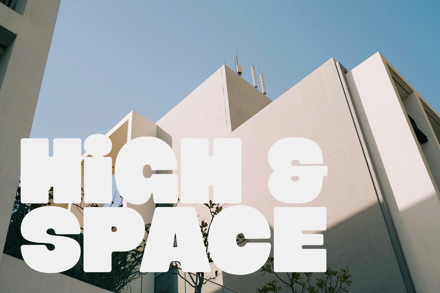
The rounded terminals do most of the work. At display weight, a standard grotesque turns into a brick — Sugra's curves keep that mass readable without softening the silhouette. This is a chunky display sans serif built around one core decision: every stroke ends in a small radius. That single move changes how the typeface reads at 200pt — weight without aggression, presence without intimidation. The specimen pages stack the family at poster scale to demonstrate exactly that point, where the display sans serif behaves more like a material object than a string of letters.
Why a Bold Display Sans Serif Still Earns a Warm Read
Sugra fits a wider shift. Packaging studios and wordmark designers are moving away from sharp-terminal grotesques toward letterforms with material warmth, and a rounded display sans serif sits exactly in that gap. The radius logic carries from poster headlines down to small wordmark applications without losing identity — a quality most heavy display sans serif faces lose at scale. See the full release by Typoraith Co on Behance.