Swissted: Swiss Modernist Poster Art by Mike Joyce
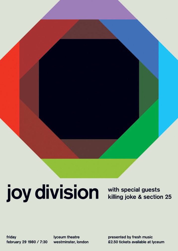
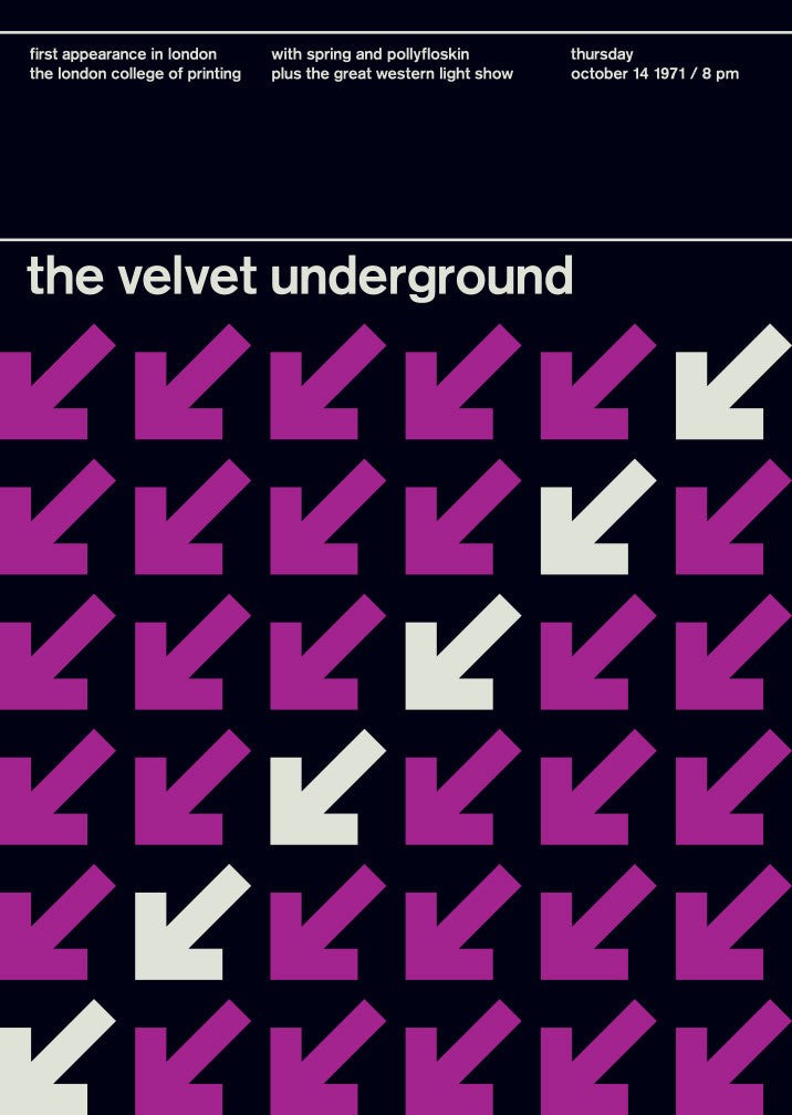
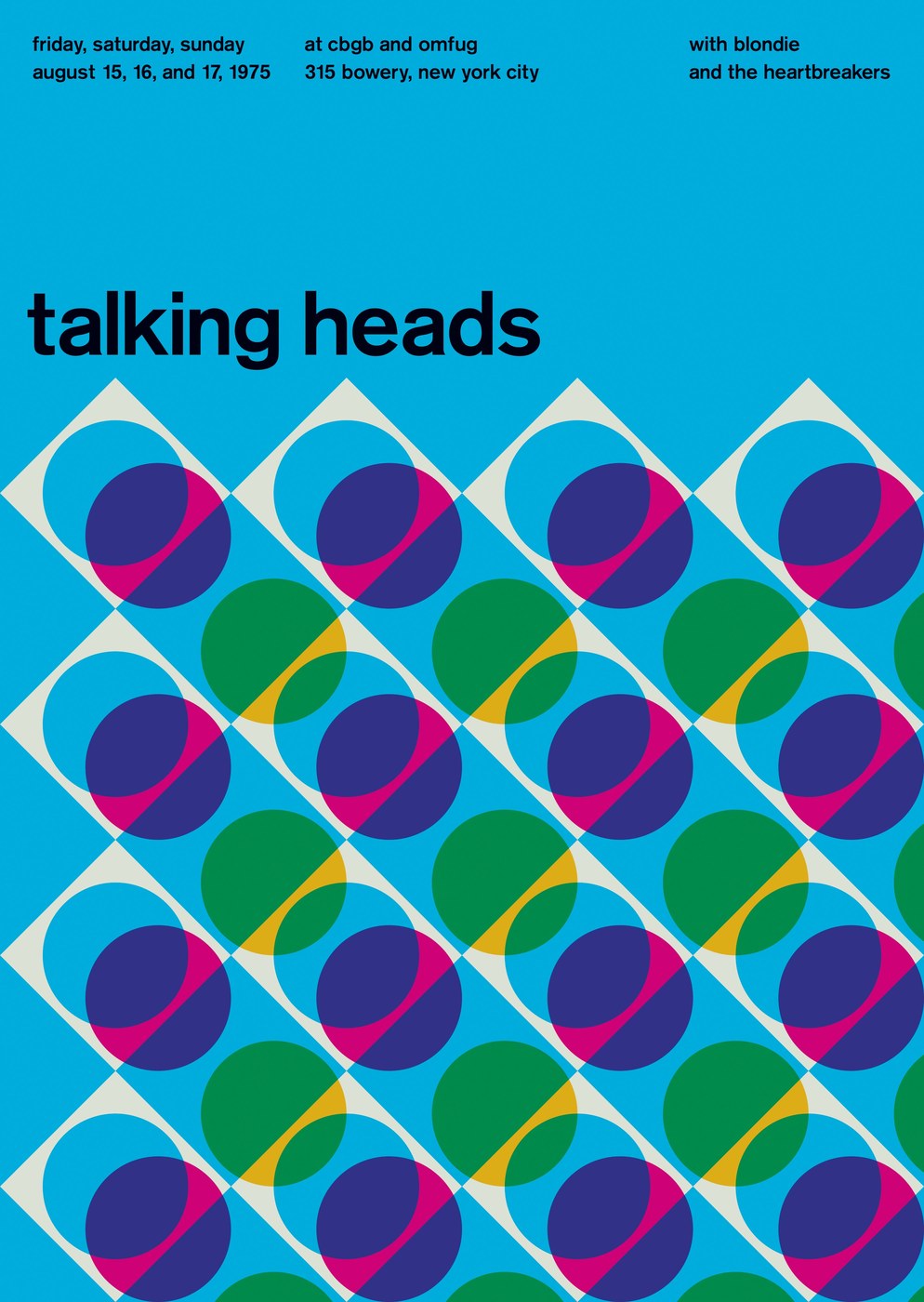
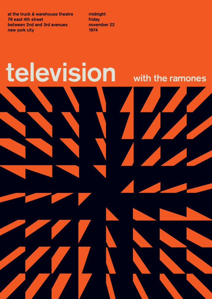
Mike Joyce’s Swissted turns vintage punk and new wave concert flyers into swiss modernist poster art using one typeface, two colors, and zero decoration.
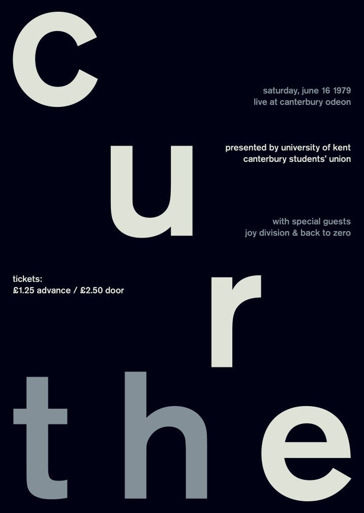
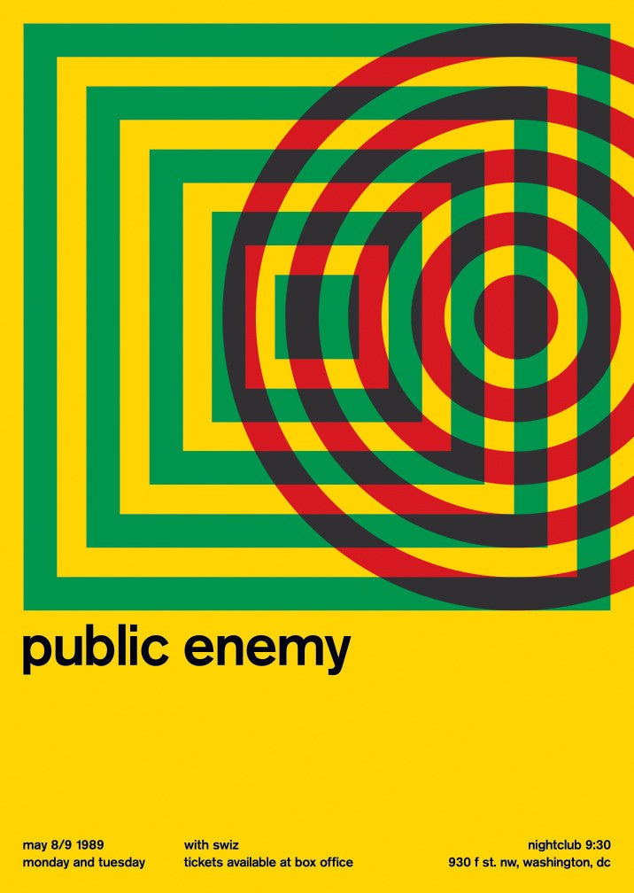
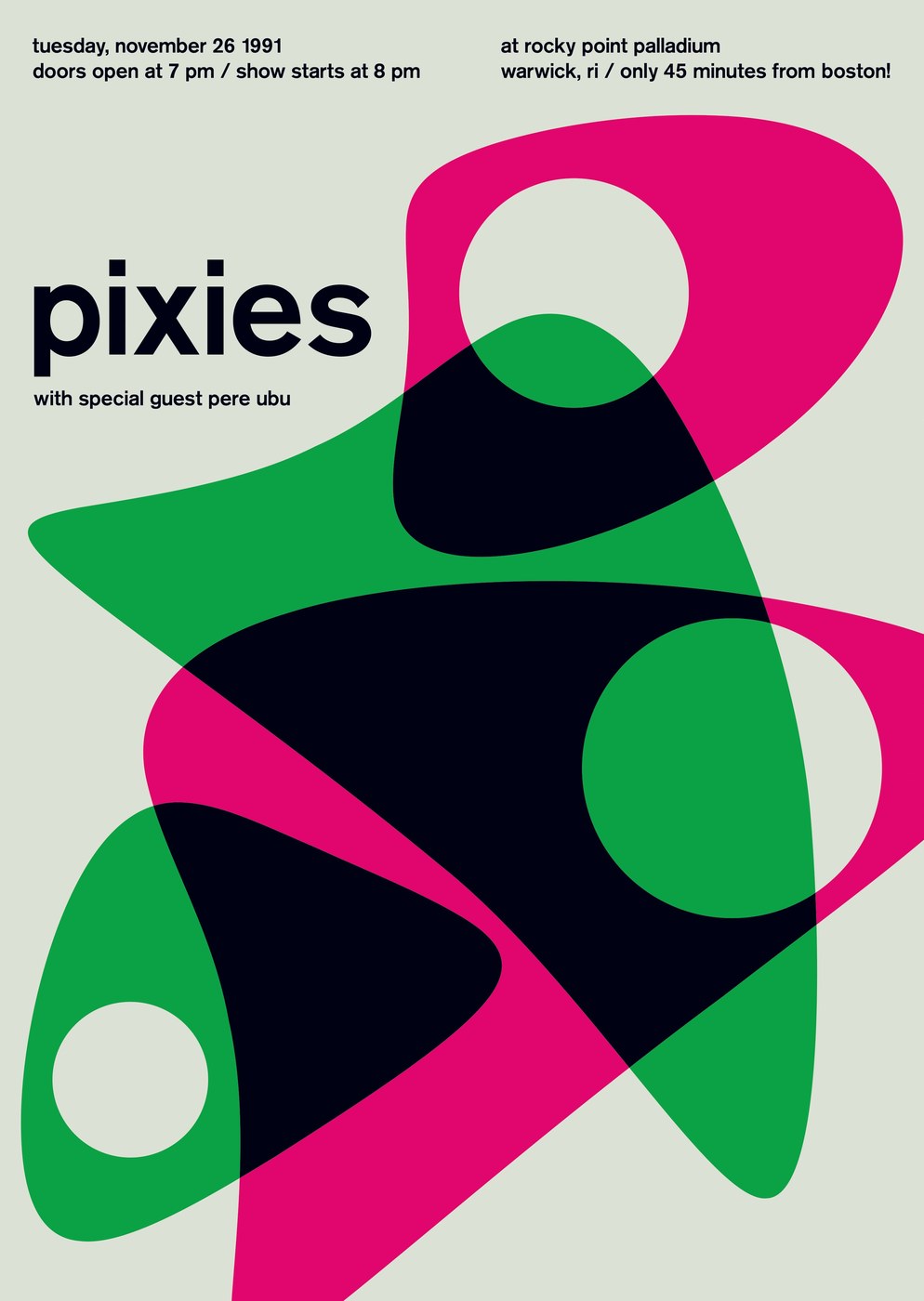
The rules are strict: lowercase Berthold Akzidenz-Grotesk medium — Joyce is insistent it is not Helvetica — set at a scale where the band name fills the top third of the frame. Below it, venue, city, and date drop in a tightly regulated descending sequence. Two flat colors per swiss modernist poster, no more: a deep field and one contrasting tone. No rules, borders, imagery, or ornament. The result looks nothing like a punk flyer and exactly like one at the same time — the information is identical, only the noise is gone.
Swiss Modernist Poster Design Meets Punk Archive
The project now spans over 300 swiss modernist poster prints, covering shows from 1970 to 1997 across punk, post-punk, hardcore, new wave, and hip-hop. Six were selected for a 2015 Swiss Style exhibition at the Museum of Design Zürich — the city where the style was invented — which closes the loop on a project that could have been a surface-level exercise. Each swiss modernist poster ships as archival Epson output on enhanced matte stock; the collection is now held permanently at the V&A, MoMA Chicago, and the Poster House in New York. Designed to be hung, not scrolled.
See the full archive at Swissted by Mike Joyce.