TEMPO: Redefining Conceptual Packaging Design Through the Daily Rhythm of Time
Explore TEMPO, a conceptual confectionery brand that elevates packaging design into a structured daily ritual.
Moving beyond traditional indulgence, this innovative food branding and packaging design project uses a systematic, time-based naming logic and minimalist graphics to match chocolate consumption with a consumer’s daily energy levels. The resulting visual identity balances premium structural elements with a highly scalable retail system, setting a new benchmark for modern artisan product design.
Brand Strategy: Chocolate Built Around Daily Rhythm
The core strategy behind TEMPO rethinks confectionery consumption entirely. Instead of positioning chocolate as a spontaneous treat, the brand structures its product lineup around specific times of day, moods, and functional energy states.
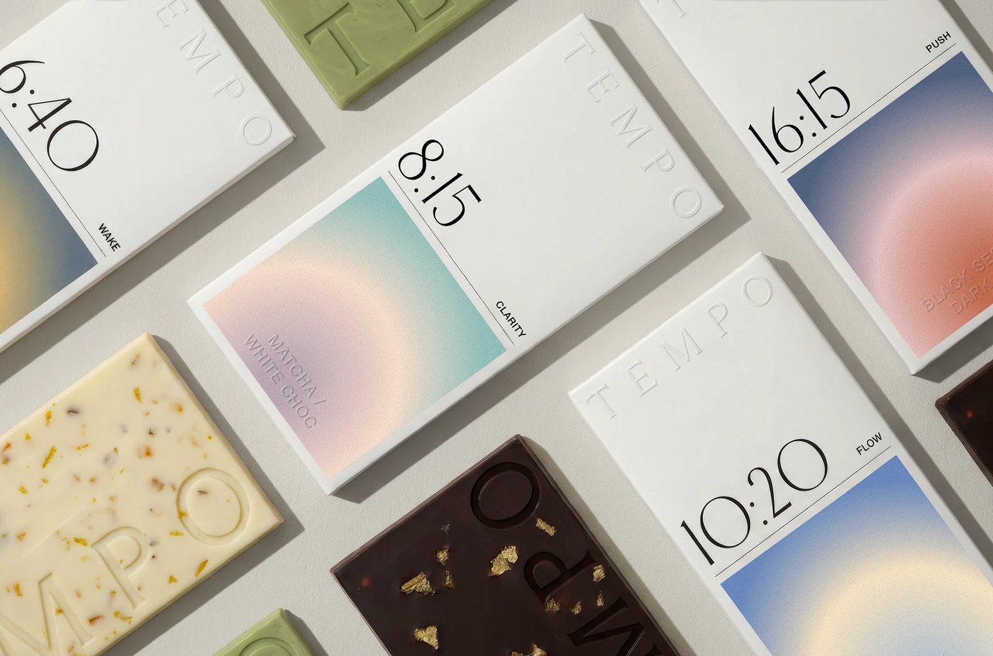
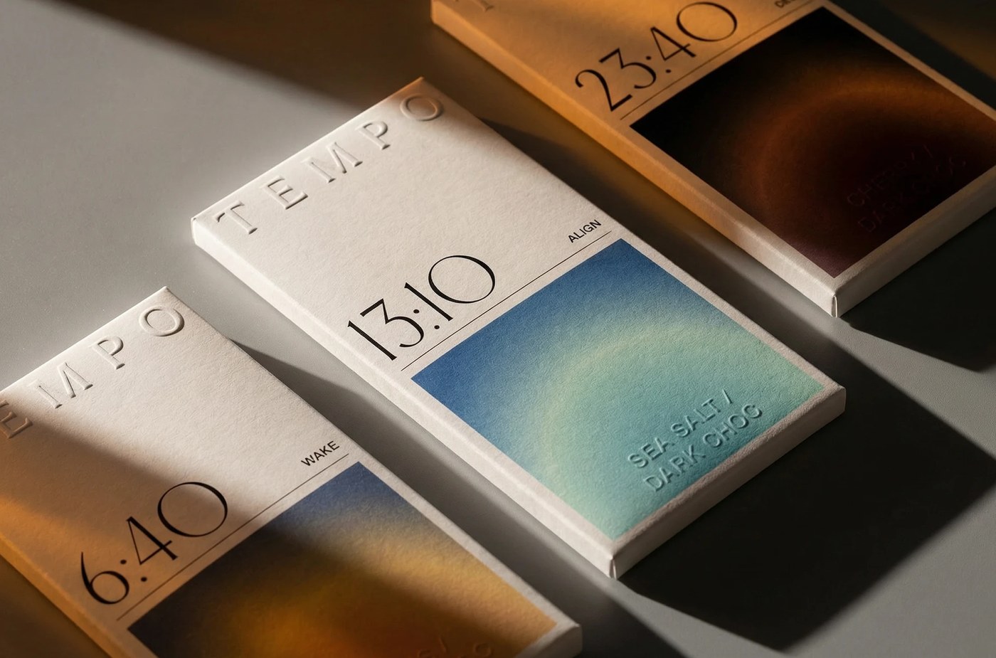
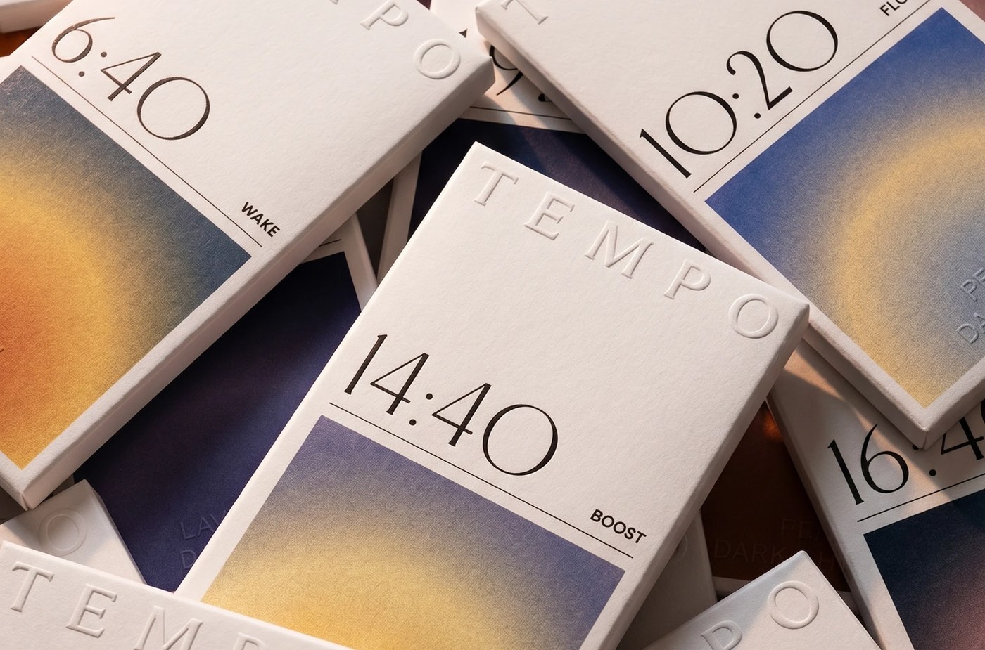
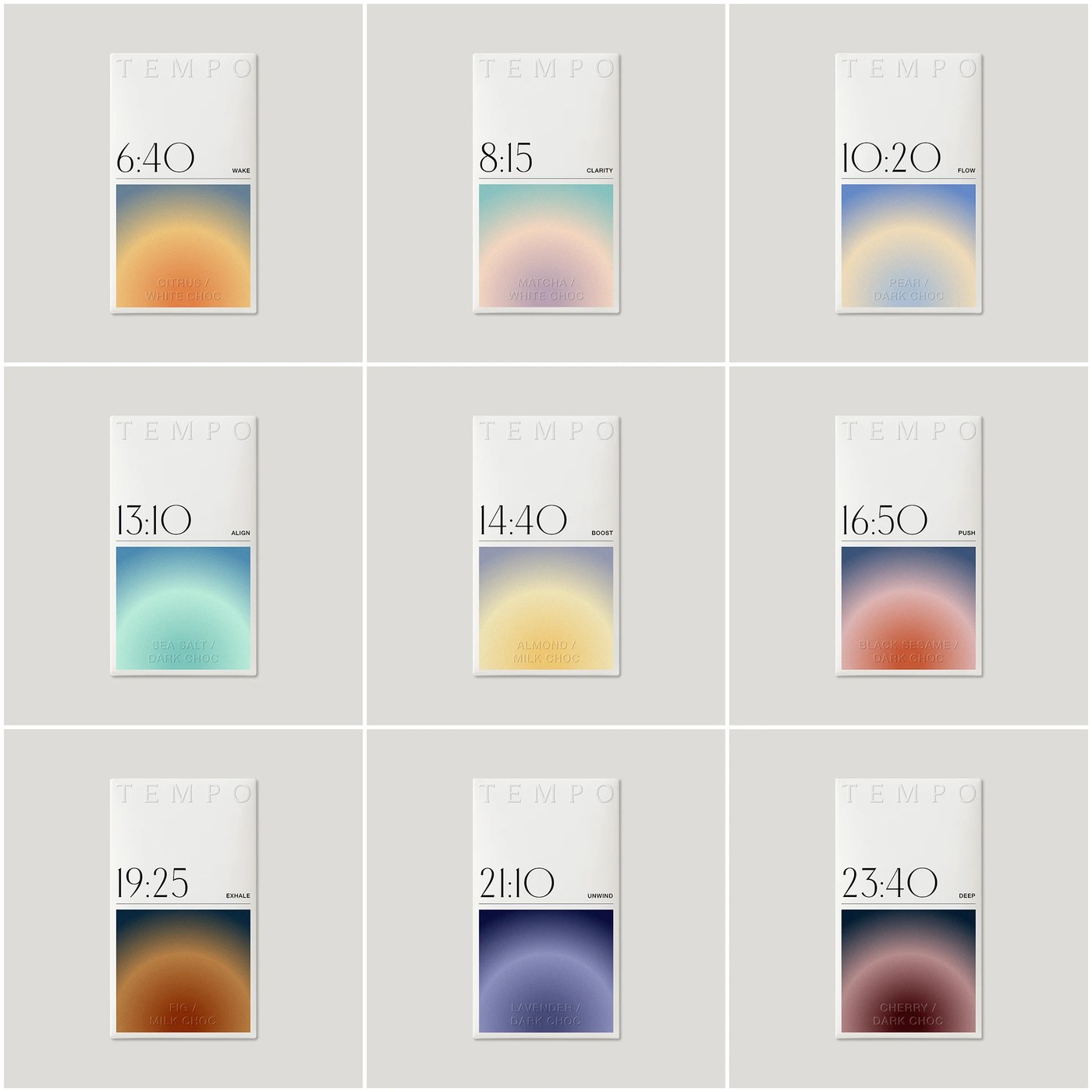
Each bar corresponds to a precise timestamp and emotional anchor—such as 6:40 (Wake), 8:15 (Clarity), 10:20 (Flow), 13:10 (Align), and 16:15 (Push). This systematic approach transforms a simple food product into an intentional, daily wellness ritual, bridging the gap between functional supplements and premium confectionery.
Inside the packaging design system
The design execution translates this rigid, time-based framework into a clean, architectural layout that stands out effortlessly on retail shelves.
- The Typography: The packaging relies on an austere, high-contrast typographic layout. Oversized digital timestamps dominate the left margin, balanced by clean vertical labels indicating the mood and flavor profile. The brand name, TEMPO, is subtly integrated via blind debossing across the top white field, letting texture take precedence over heavy ink.
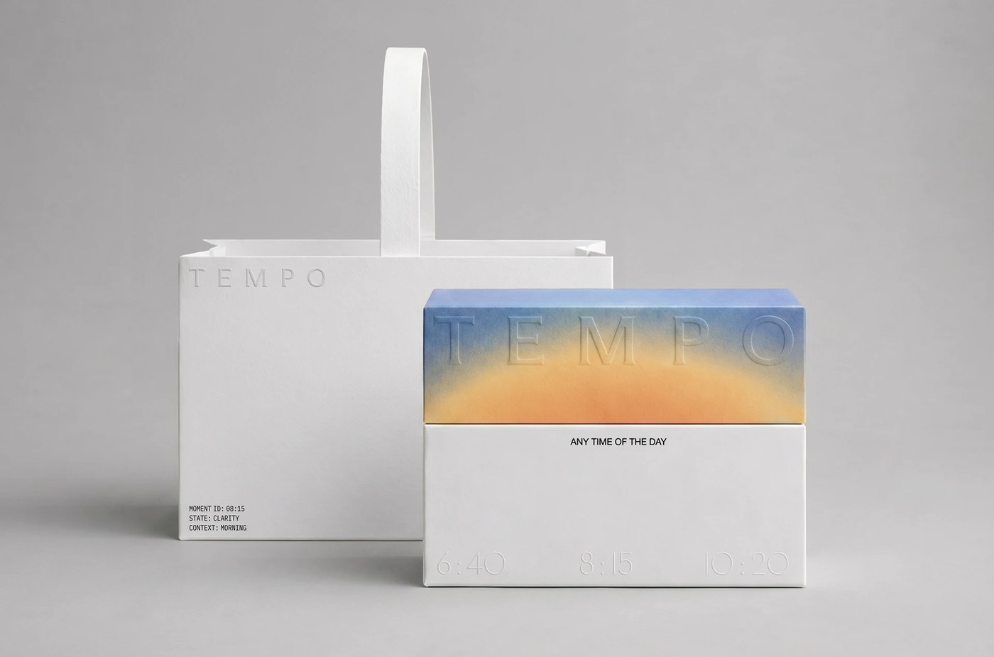
- The Palette & Materiality: Each box is split cleanly down the center. The top half utilizes a stark, uncoated white paper stock that emphasizes the debossed branding. The lower half features a vibrant, smooth aura-gradient—shifting from soft lavender-mint to deep twilight blues and warm amber sunbursts—visually replicating the sky's shifting light across the day.
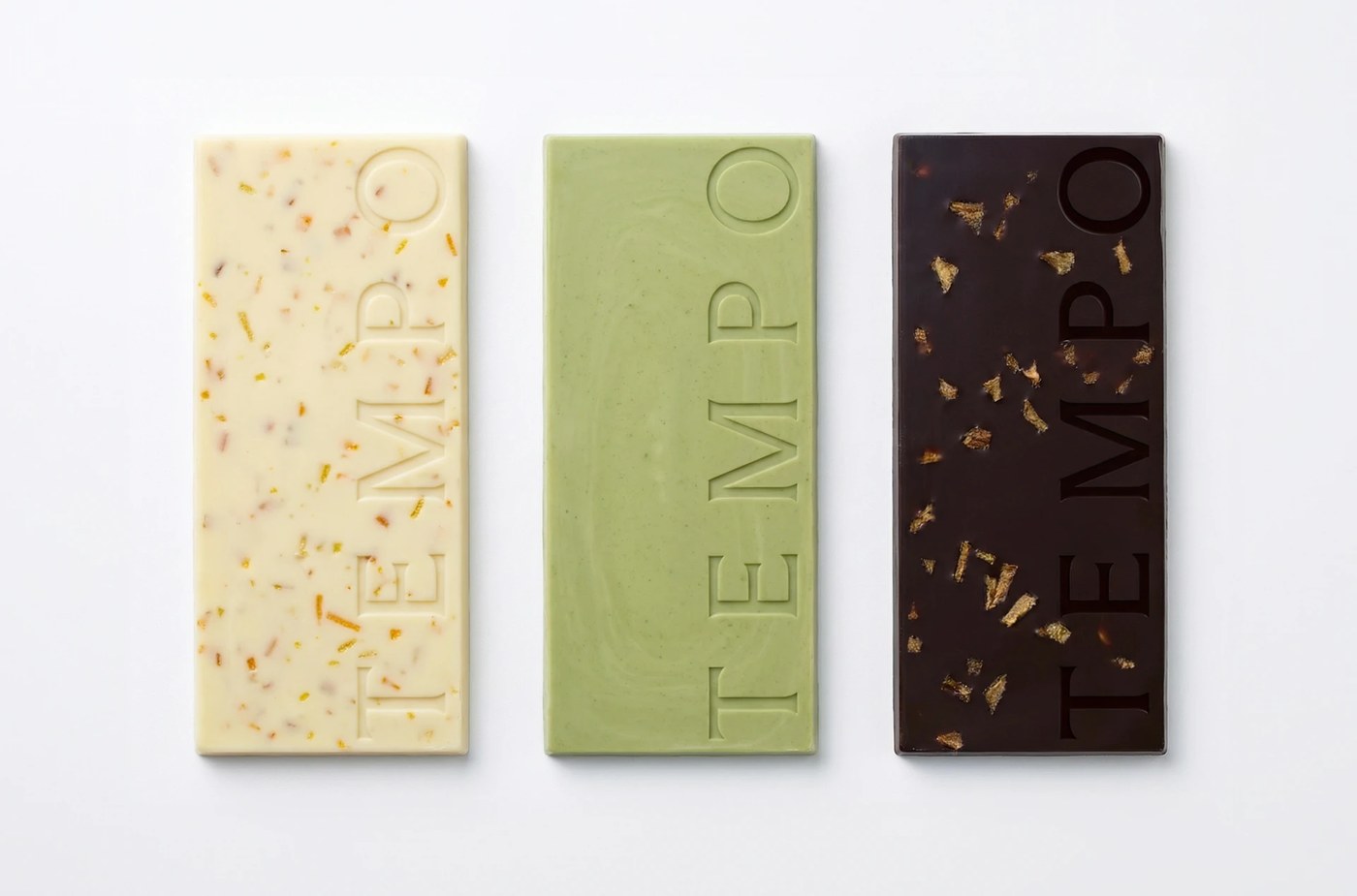
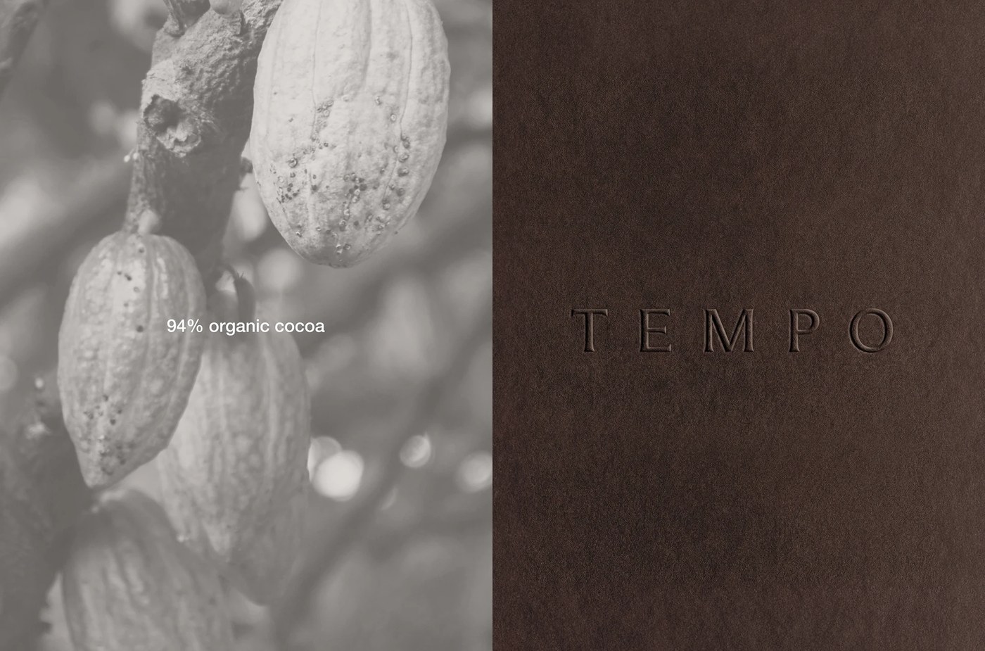
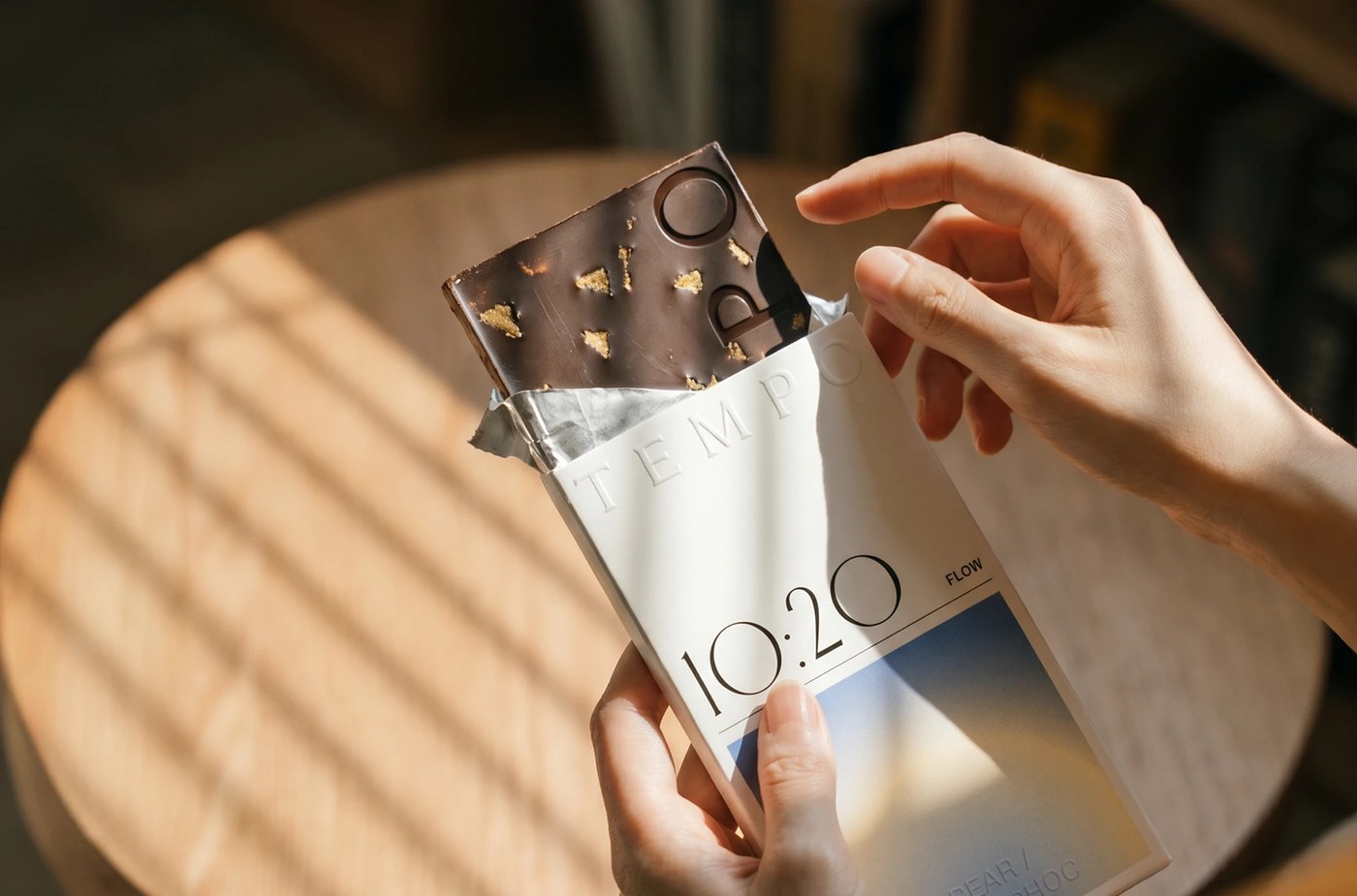
- Product Architecture: The systemic discipline extends straight to the chocolate bars themselves. Rather than a standard grid, the chocolate molds feature a clean, minimal surface stamped with deep, structural TEMPO typography. The ingredients, ranging from flecked orange peel in white chocolate to gold leaf in dark cacao, visually mirror the premium, artisanal nature of the outer packaging.
By executing a highly conceptual brief with extreme discipline, TEMPO delivers a masterclass in modern packaging. It proves that a commercial product can remain accessible and scalable while carrying the intellectual weight of a high-end design exhibition.
See the full project by LYM DESIGN STUDIO on Behance.