Tout Moi Real Estate Brand Identity by TMN Studios
TMN Studios built a real estate brand identity for Tout Moi — a TM monogram that moves from business card to 2m glazing, five earthy tones, and no black.
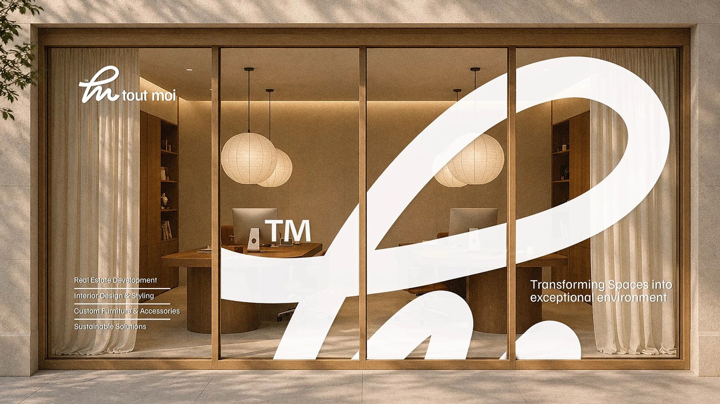
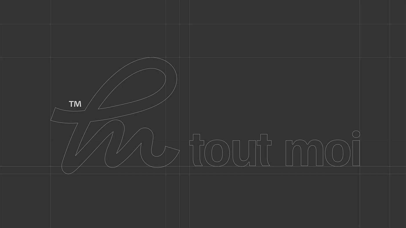
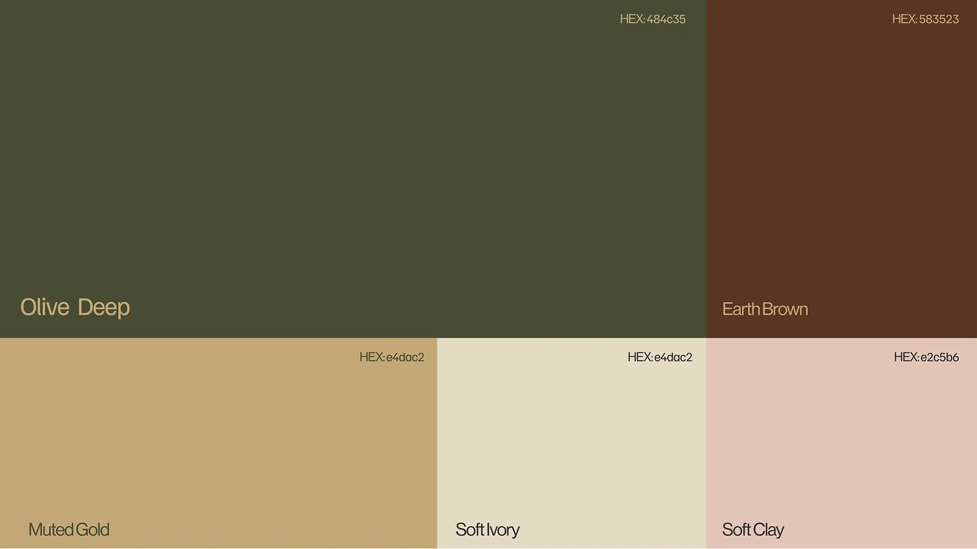
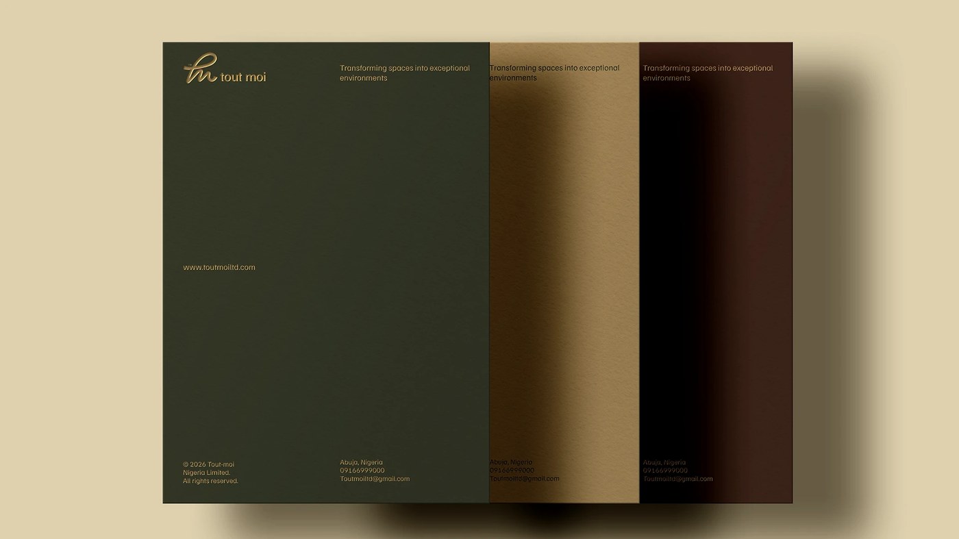
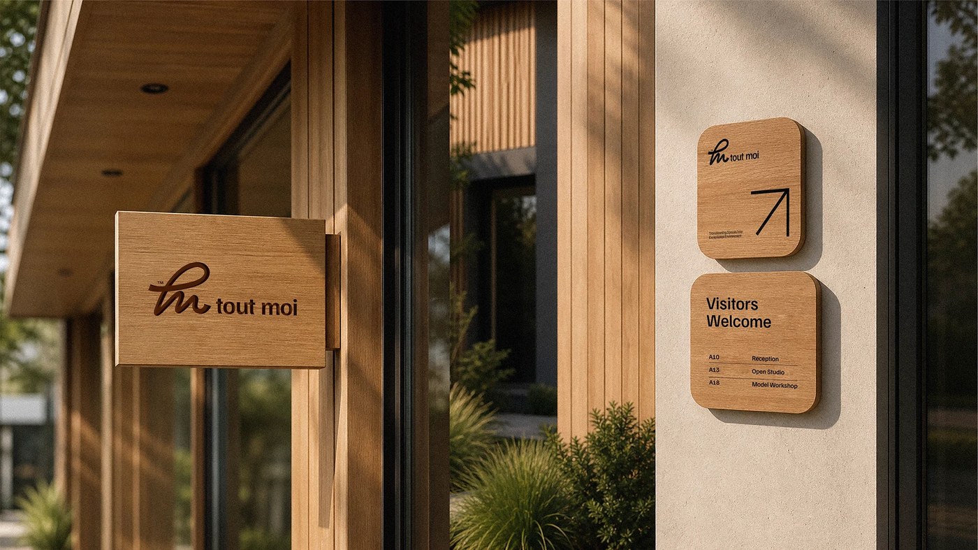
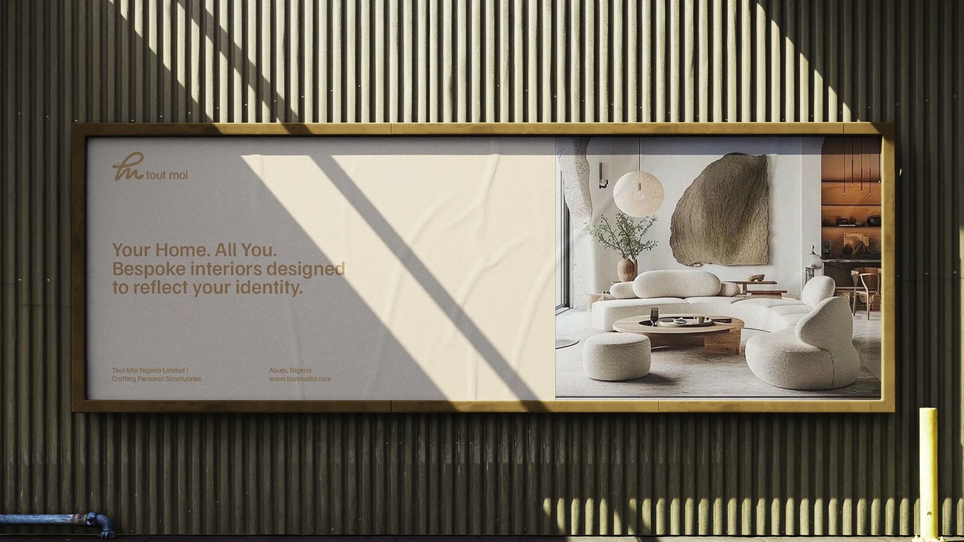
This real estate brand identity is anchored by a single continuous stroke. The T crossbar feeds directly into the M, forming a script ligature that holds without adjustment from business card to 2m-tall office glazing, the interior visible through the letterforms. TMN Studios, led by Nasir Muhammad in Abuja, built the five-color palette around Olive Deep (#484c35) and Earth Brown (#583523) for the dark register, with Muted Gold, Soft Ivory, and Soft Clay for the light. No black, no white. The letterhead runs the palette as surface: three colorways — olive, metallic gold, earth brown — each carrying the logo in contrasting foil-weight gold.
A Real Estate Brand Identity Built From Material, Not Luxury Signals
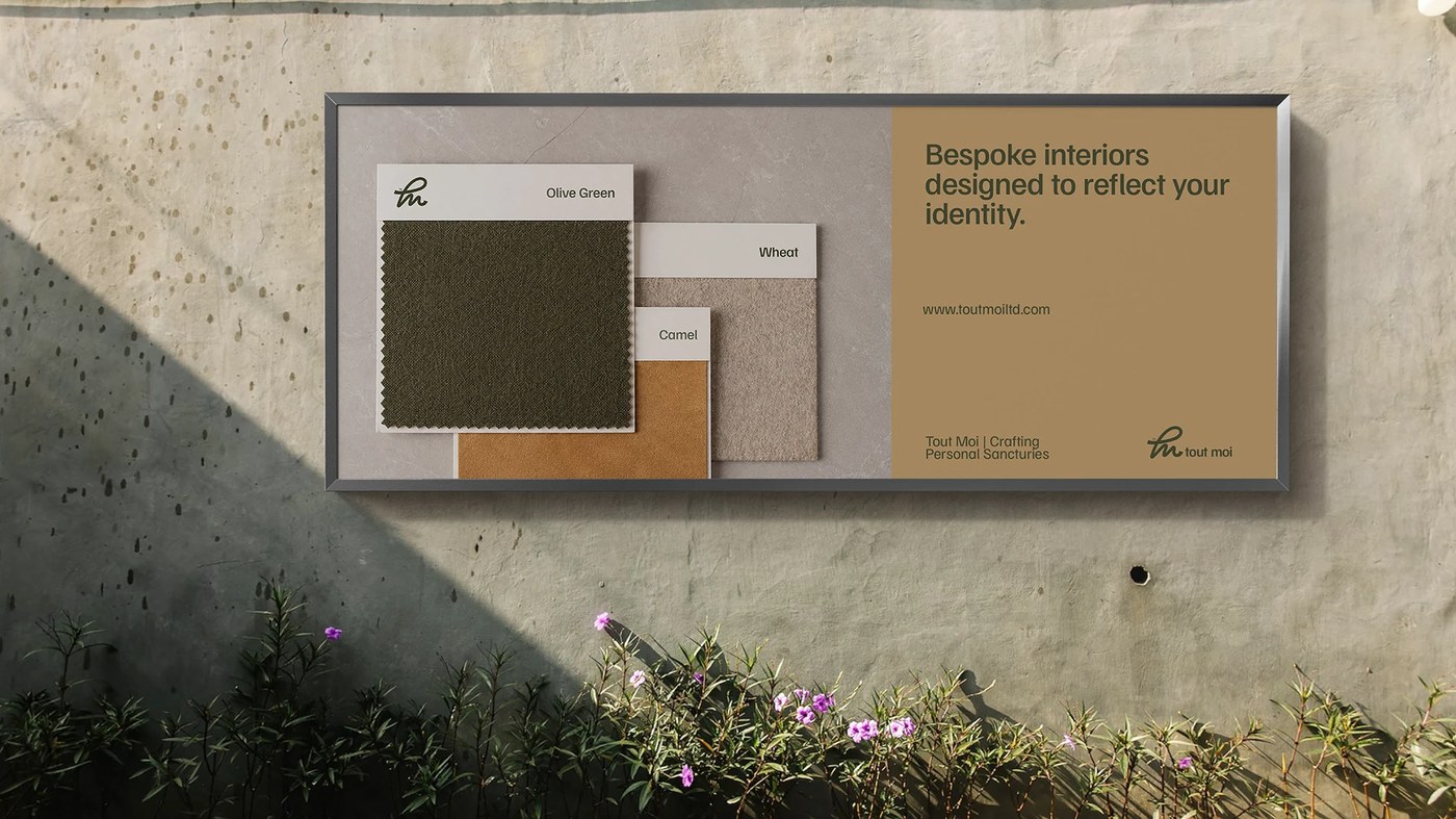
The most deliberate moment in this real estate brand identity is the outdoor advertising. TMN Studios pinned physical fabric swatches — Olive Green, Camel, Wheat — directly onto the billboard surface, connecting the brand palette to the material vocabulary of interior design. Wayfinding panels are warm timber with routed letterforms, not printed vinyl. The real estate brand identity refuses the gold-on-black luxury default: Tout Moi's palette feels found in natural pigment, not assembled for effect.
See the full project by TMN Studios on Behance.