Vilarejo's Gestaliz Rebrand Puts Structure Before Performance
Vilarejo Design's new educational brand identity for Gestaliz prioritizes structural visual clarity over decorative SaaS tropes.
Brazilian studio Vilarejo developed this mature visual system. The design team created a cohesive language to represent learning as an active construction. Their framework rejects superficial motivational aesthetics. Instead, it relies on systematic logic to establish a quiet and reliable presence.
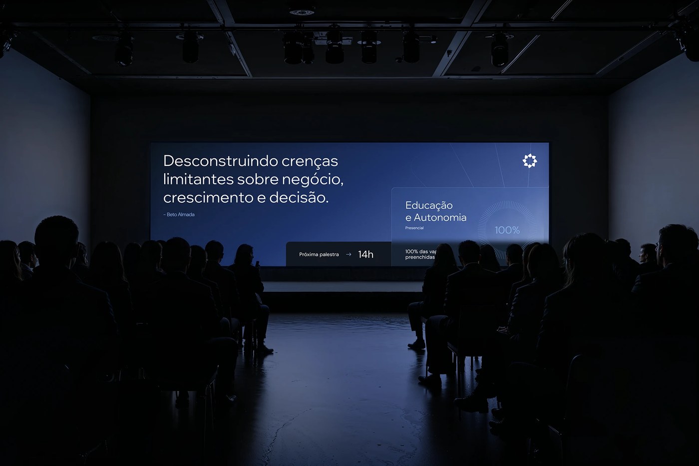
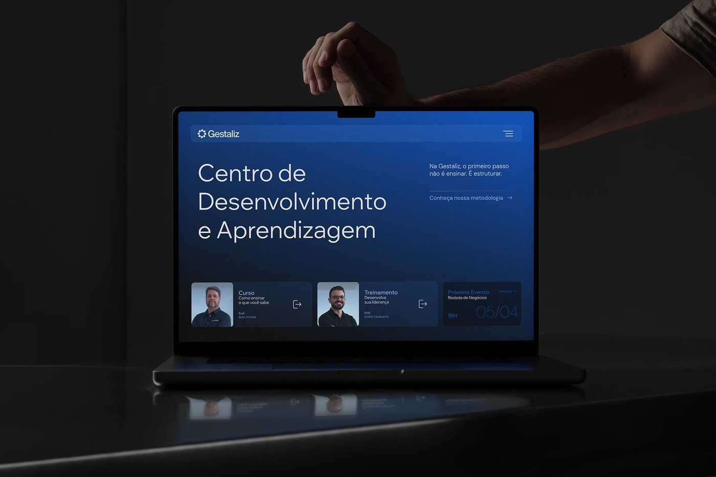
The visual layout relies on clear alignment and distinct physical planes. These overlapping components establish compositional tension across digital and physical touchpoints. A rigorous modular grid guides the viewer. This structure helps clarify the learning pathway for an educational brand identity. Negative space functions as an active design element. It organizes complex information with ease. The final layouts feel systematic, quiet, and balanced.
Structuring an Educational Brand Identity
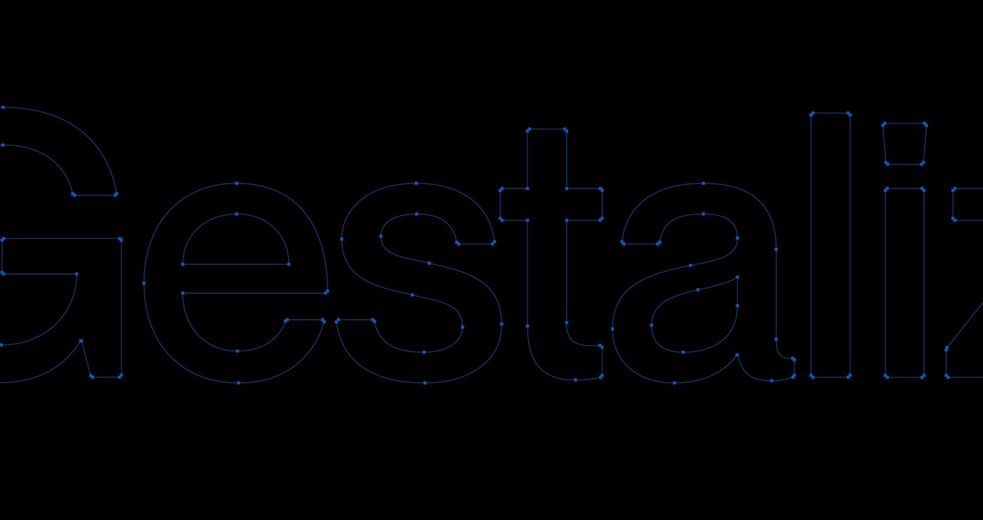
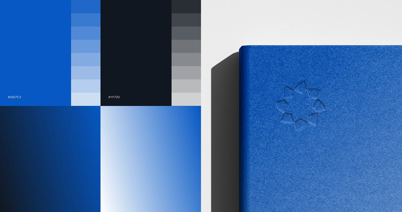
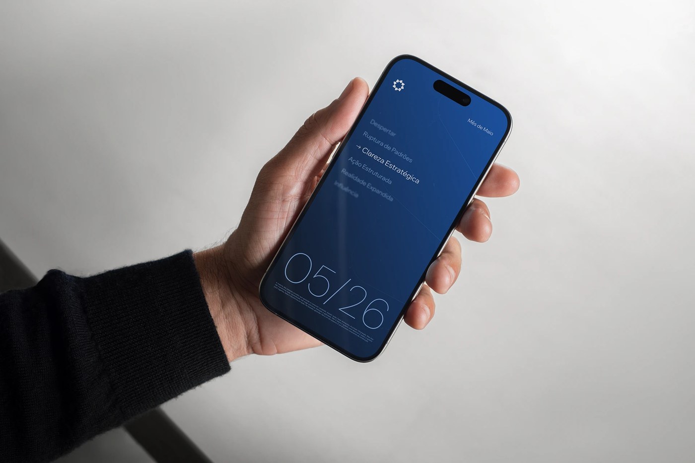
The color system operates with strict geometric restraint. A saturated cobalt blue dominates the palette, paired with a dark navy anchor. These tones establish high contrast and baseline alignment. Tactile contrast comes to life on physical assets. For example, the studio debossed the hollow star logo onto textured blue paper. The typographic scaling remains disciplined. The logotype deliberately recedes, allowing the modular grid to dictate the hierarchy. Clean vector outlines define the wordmark. Every detail feels deliberate and structured.
The photography direction shifts away from staged, aspirational imagery. The brand favors authentic moments captured in real motion. People appear in natural contexts. These active scenes reinforce the brand's focus on actual development. By avoiding generic stock photos, the imagery retains a strong human dimension. High-contrast shots complement the clean layout system.
This project highlights a broader industry shift. Modern SaaS platforms are moving toward technical precision. Designers now reject friendly-approachable tropes in favor of structural clarity. By prioritizing organization over performance, Vilarejo Design builds lasting credibility. This framework successfully positions the platform as a mature system for real development. It offers valuable lessons for educational brand identity designers working in saturated markets.
Discover the complete project files on the Vilarejo Design portfolio.